1. Introduction
CSS Levels 1 and 2 allowed for the alignment of text via text-align and the alignment of blocks by balancing auto margins. However, except in table cells, vertical alignment was not possible. As CSS adds further capabilities, the ability to align boxes in various dimensions becomes more critical. This module attempts to create a cohesive and common box alignment model to share among all of CSS.
Note: The alignment of text and inline-level content is defined in [CSS-TEXT-3] and [CSS-INLINE-3].
Note: This specification is not intended to change any of the behavior defined in CSS2.1 when the properties defined here are set to their initial values. If implementors or anyone else notices a discrepancy, please report this to the CSSWG as an error.
This section (above) is not normative.
1.1. Module Interactions
This module adds some new alignment capabilities to the block layout model described in [CSS2] chapters 9 and 10, redefines how overconstrained block-level box margins are resolved, and defines the interaction of these new alignment properties with the alignment of table cell content using vertical-align, as defined in [CSS2] chapter 17.
The interaction of these properties with Grid Layout [CSS-GRID-1] and Flexible Box Layout [CSS-FLEXBOX-1] is defined in their respective modules. The property definitions here supersede those in [CSS-FLEXBOX-1] (which have a smaller, earlier subset of permissible values).
No properties in this module apply to the ::first-line
or ::first-letter pseudo-elements.
1.2. Value Definitions
This specification follows the CSS property definition conventions from [CSS2] using the value definition syntax from [CSS-VALUES-3]. Value types not defined in this specification are defined in CSS Values & Units [CSS-VALUES-3]. Combination with other CSS modules may expand the definitions of these value types.
In addition to the property-specific values listed in their definitions, all properties defined in this specification also accept the CSS-wide keywords as their property value. For readability they have not been repeated explicitly.
1.3. Partial Implementations
Since it is expected that support for the features in this module will be deployed in stages corresponding to the various layout models affected, it is hereby clarified that the rules for partial implementations that require treating as invalid any unsupported feature apply to any alignment keyword which is not supported across all layout modules to which it applies for layout models in which the implementation supports the property in general.
For example, if an implementation supports align-self in [CSS-GRID-1] and [CSS-FLEXBOX-1], then it must treat start as invalid unless it is supported in both grid and flex containers. However if that same implementation does not support align-self for block-level elements at all, then a lack of implementation of align-self: start does not trigger this requirement to treat it as invalid.
2. Overview of Alignment Properties
The box alignment properties in CSS are a set of 6 properties that control alignment of boxes within other boxes. They can be described along two axises:
- which dimension they apply to (main/inline vs. cross/block), and
- whether they control the position of the box within its parent, or the box’s content within itself.
Note: This specification uses the terms “justify” and “align” to distinguish between alignment in the main/inline and cross/block dimensions, respectively. The choice is somewhat arbitrary, but having the two terms allows for a consistent naming scheme that works across all of CSS’s layout models (including CSS Flexbox 1 § 2 Flex Layout Box Model and Terminology)
The following table summarizes the box alignment properties and the display types they can apply to.
| Common | Axis | Aligns | Applies to |
|---|---|---|---|
| justify-content | main/inline |
 content within element
(effectively adjusts padding)
content within element
(effectively adjusts padding)
| block containers, flex containers, and grid containers |
| align-content | cross/block | ||
| justify-self | inline |
 element within parent
(effectively adjusts margins)
element within parent
(effectively adjusts margins)
| block-level boxes, absolutely-positioned boxes, and grid items |
| align-self | cross/block | absolutely-positioned boxes, flex items, and grid items | |
| justify-items | inline |
 items inside box
(controls child items’ justify-self: auto)
items inside box
(controls child items’ justify-self: auto)
| block containers and grid containers |
| align-items | cross/block | flex containers and grid containers |
Note: The *-items properties don’t affect the element itself. When set on a container, they specify the interpretation of any *-self: auto used on children of the container element.
3. Alignment Terminology
Since this module defines alignment properties for all layout modes in CSS, some abstract terminology is introduced:
- alignment subject
- The alignment subject is the thing or things being aligned by the property. For justify-self and align-self, the alignment subject is the margin box of the box the property is set on, and assumes the writing mode of that box. For justify-content and align-content, the alignment subject is defined by the layout mode and refers to some aspect of its contents; it also assumes the writing mode of the box the property is set on.
- alignment container
- The alignment container is the rectangle that the alignment subject is aligned within. This is defined by the layout mode, but is usually the alignment subject’s containing block, and assumes the writing mode of the box establishing the containing block.
- fallback alignment
- Some alignments can only be fulfilled in certain situations or are limited in how much space they can consume; for example, space-between can only operate when there is more than one alignment subject, and baseline alignment, once fulfilled, might not be enough to absorb all the excess space. In these cases a fallback alignment takes effect (as defined below) to fully consume the excess space.
4. Alignment Keywords
All of the alignment properties use a common set of keyword values, which are defined in this section. Keywords fall into three categories:
- positional alignment
- These keywords define alignment as an absolute position within the alignment container.
- baseline alignment
- These keywords define alignment as a relationship among the baselines of multiple alignment subjects within an alignment context.
- distributed alignment
- These keywords define alignment as a distribution of space among alignment subjects.
4.1. Positional Alignment: the center, start, end, self-start, self-end, flex-start, flex-end, left, and right keywords
The positional alignment keywords specify a position for an alignment subject with respect to its alignment container.
Values have the following meanings:
- center (self, content)
- Centers the alignment subject within its alignment container.
- start (self, content)
- Aligns the alignment subject to be flush with the alignment container’s start edge in the appropriate axis.
- end (self, content)
- Aligns the alignment subject to be flush with the alignment container’s end edge in the appropriate axis.
- self-start (self)
- Aligns the alignment subject to be flush with the edge of the alignment container corresponding to the alignment subject’s start side in the appropriate axis.
- self-end (self)
- Aligns the alignment subject to be flush with the edge of the alignment container corresponding to the alignment subject’s end side in the appropriate axis.
- flex-start (self, content)
-
Only used in flex layout. [CSS-FLEXBOX-1]
Aligns the alignment subject to be flush with the edge of the alignment container
corresponding to the flex container’s main-start or cross-start side, as appropriate.
When used outside of a flex formatting context, this value behaves as start. That is, on boxes that are not flex items (or pretending to be flex items, such as when determining the static position of an absolutely-positioned box that is a child of a flex container), this value behaves as start when used in the self-alignment properties, and on boxes that are not flex containers, this value behaves as start when used in the content-distribution properties.
- flex-end (self, content)
-
Only used in flex layout.
Aligns the alignment subject to be flush with the edge of the alignment container
corresponding to the flex container’s main-end or cross-end side, as appropriate.
When used outside of a flex formatting context, this value behaves as end. That is, on boxes that are not flex items (or pretending to be flex items, such as when determining the static position of an absolutely-positioned box that is a child of a flex container), this value behaves as end when used in the self-alignment properties, and on boxes that are not flex containers, this value behaves as end when used in the content-distribution properties.
- left (only justify-*)
-
Aligns the alignment subject to be flush with
the alignment container’s line-left
or physical left edge,
whichever is in the appropriate axis.
If the property’s axis is not parallel with either left↔right axis, this value behaves as start. Currently, the only case where the property’s axis is not parallel with either left↔right axis is in a column flexbox.
- right (only justify-*)
-
Aligns the alignment subject to be flush with
the alignment container’s line-right
or physical right edge,
whichever is in the appropriate axis.
If the property’s axis is not parallel with either left↔right axis, this value behaves as start. Currently, the only case where the property’s axis is not parallel with either left↔right axis is in a column flexbox.
Two grammar terms are used to denote certain subsets of these values:
- <self-position>
-
This set is used by justify-self and align-self
to align the box within its alignment container,
and also by justify-items and align-items
(to specify default values for justify-self and align-self).
<self-position> = center | start | end | self-start | self-end | flex-start | flex-end - <content-position>
-
This set is used by justify-content and align-content
to align the box’s contents within itself.
<content-position> = center | start | end | flex-start | flex-end
Note: left and right are excluded from <self-position> and <content-position>, despite being valid positional alignment values for justify-content/justify-self/justify-items, because they are not allowed in the align-* properties. They are instead explicitly included in the justify-* properties’ grammars.
Flexbox, on the other hand, has justify-* align things in the main axis and align-* align things in the cross axis. This depends on the value of flex-direction: when flex-direction is row or row-reverse, it matches the other layout modes (inline axis with justify-*, block axis with align-*); when flex-direction is column or column-reverse, it has the opposite correspondence.
Make it easier to understand the dual-axis nature of "start" and "end" wrt orthogonal flows.
4.2. Baseline Alignment: the baseline keyword and first/last modifiers
See CSS Writing Modes 3 § 4.1 Introduction to Baselines.
Baseline alignment is a form of positional alignment that aligns multiple alignment subjects within a shared alignment context (such as cells within a row) by matching up their alignment baselines. If the position of the alignment subjects within a baseline-sharing group is not fully constrained by baseline alignment (i.e., they could be shifted within their respective alignment containers while maintaining baseline-alignment), they are fallback-aligned insofar as possible while preserving their baseline alignment.
The baseline alignment keywords are represented with the <baseline-position> grammar term:
<baseline-position> = [ first | last ]? && baseline
The first and last values give a box a baseline alignment preference: either “first” or “last”, respectively, defaulting to “first”.
Values have the following meanings:
- baseline
- Computes to first baseline, defined below.
- first baseline
-
Specifies participation in first-baseline alignment:
aligns the alignment baseline of the box’s first baseline set
with the corresponding baseline
of its baseline-sharing group.
See § 9.3 Aligning Boxes by Baseline for more details.
The fallback alignment for first baseline is safe self-start (for self-alignment) or safe start (for content-distribution).
- last baseline
-
Specifies participation in last-baseline alignment:
aligns the alignment baseline of the box’s last baseline set
with the corresponding baseline
of its baseline-sharing group.̣
See § 9.3 Aligning Boxes by Baseline for more details.
The fallback alignment for last baseline is safe self-end (for self-alignment) or safe end (for content-distribution).
When specified for align-content, these values trigger baseline content-alignment, shifting the content of the box within its content box, and may also affect the sizing of the box itself. See § 5.4 Baseline Content-Alignment.
When specified for align-self/justify-self, these values trigger baseline self-alignment, shifting the entire box within its container, which may affect the sizing of its container. See § 6.4 Baseline Self-Alignment.
When baseline self-alignment is specified on a box, content distribution is performed first, then the resulting box and its contents are self-aligned However, if the box also has baseline content-alignment in the same axis or if its content-distribution property in the same axis is normal, its used content-distribution property in that axis is start or safe end for a baseline alignment preference of its baseline self-alignment of “first” or “last”, respectively.
If a box does not belong to a shared alignment context, then the fallback alignment is used. For example, align-content: baseline on a block box falls back to start alignment. The fallback alignment is also used to align the baseline-sharing group within its alignment container.
Note: Because they are equivalent, and baseline is shorter, the CSSOM serializes first baseline as baseline. See CSSOM § 6.7.2 Serializing CSS Values.
Note: For the somewhat-related vertical-align property, due to inconsistent design decisions in CSS2.1, baseline is not equivalent to first baseline as an inline-level box’s baseline alignment preference depends on display. (E.g., inline-block uses its last baseline by default, while inline-table uses its first baseline by default.)
4.3. Distributed Alignment: the stretch, space-between, space-around, and space-evenly keywords
The distributed alignment values are used by justify-content and align-content to disperse a container’s extra space among its alignment subjects.

When space cannot be distributed in this way, these values behave as their fallback alignment. Each distribution value has an associated default fallback alignment. (A future level of this module may allow the fallback alignment to be specified explicitly.)
- space-between
-
The alignment subjects are evenly distributed in the alignment container.
The first alignment subject is placed flush with the start edge of the alignment container,
the last alignment subject is placed flush with the end edge of the alignment container,
and the remaining alignment subjects are distributed so that the spacing between any two adjacent alignment subjects is the same.

The default fallback alignment for this value is safe flex-start. (For layout modes other than flex layout, flex-start is identical to start.)
- space-around
-
The alignment subjects are evenly distributed in the alignment container,
with a half-size space on either end.
The alignment subjects are distributed so that the spacing between any two adjacent alignment subjects is the same,
and the spacing before the first and after the last alignment subject is half the size of the other spacing.

The default fallback alignment for this value is safe center.
- space-evenly
-
The alignment subjects are evenly distributed in the alignment container,
with a full-size space on either end.
The alignment subjects are distributed so that the spacing between any two adjacent alignment subjects,
before the first alignment subject,
and after the last alignment subject
is the same.

The default fallback alignment for this value is safe center.
- stretch
-
If the combined size of the alignment subjects is less than the size of the alignment container,
any auto-sized alignment subjects have their size increased equally (not proportionally),
while still respecting the constraints imposed by max-height/max-width
(or equivalent functionality),
so that the combined size exactly fills the alignment container.

The default fallback alignment for this value is flex-start. (For layout modes other than flex layout, flex-start is identical to start.)
Note: This `align-content/stretch` definition applies to the content-distribution properties; the self-alignment properties justify-self/align-self have their own stretch value, which can grow or shrink the alignment subject to ensure it exactly fits the alignment container.
These values are represented with the <content-distribution> grammar term:
<content-distribution> = space-between | space-around | space-evenly | stretch
4.4. Overflow Alignment: the safe and unsafe keywords and scroll safety limits
In some situations, aligning exactly as specified would cause the alignment subject to overflow its alignment container, possibly causing data loss. For example, if the contents of a sidebar are unconditionally centered, items large enough to overflow it might extend beyond the viewport’s start edge, which can’t be scrolled to.
The items in the figure on the left are centered unless they overflow, in which case all the overflow goes off the end edge, while those in the figure on the right are are all strictly centered, even if the one that is too long to fit overflows on both sides.
If the container was placed against the left edge of the page, the “safe” behavior would be more desirable, as the long item would be fully readable, rather than clipped by the left edge of the screen. In other circumstances, the “unsafe” centering behavior might be better, as it correctly centers all the items.
To control this situation, an overflow alignment mode can be explicitly specified. “Unsafe” alignment honors the specified alignment mode in overflow situations, even if it causes data loss, while “safe” alignment changes the alignment mode in overflow situations in an attempt to avoid data loss. The default behavior is to contain the alignment subject within the scrollable area, though at the time of writing this safety feature is not yet implemented.
<overflow-position> = unsafe | safe
- safe
- If the size of the alignment subject overflows the alignment container, the alignment subject is instead aligned as if the alignment mode were flex-start.
- unsafe
- Regardless of the relative sizes of the alignment subject and alignment container, the given alignment value is honored.
- (no value specified)
- If the overflow alignment isn’t explicitly specified, the default overflow alignment is a blend of “safe” and “unsafe”. See § 4.4.1 Automatic Overflow Alignment Safety for details.
4.4.1. Automatic Overflow Alignment Safety
If no overflow alignment mode is specified for a property, the default behavior lies somewhere between safe and unsafe, and also varies by layout mode.
4.4.1.1. Content Distribution for Scroll Containers
In a scrollable axis of a scroll container, the default overflow alignment behavior for content distribution is unsafe. Non-normal values of the content-distribution properties instead alter the scrollable overflow area in order to allow access to the overflowing content. See § 5.3 Alignment Overflow and Scroll Containers.
4.4.1.2. Self-Alignment for Absolutely Positioned Boxes
For absolutely positioned alignment subjects whose relevant used self-alignment property is not normal, the default overflow alignment behavior is as follows:
-
If the alignment subject fits within the inset-modified containing block, align as specified to the extent possible without overflowing the inset-modified containing block.
-
Otherwise, if the alignment subject fits within the overflow limit rect, align the alignment subject such that it fully covers the inset-modified containing block and is otherwise aligned as specified to the extent possible without overflowing the overflow limit rect.
-
Otherwise, start-align the alignment subject within the overflow limit rect (similar to safe).
For this purpose, the overflow limit rect is the bounding rectangle of the alignment subject’s inset-modified containing block and its original containing block. However, because the scrollable overflow area of a scroll container can be extended to ensure the visibility of overflowing absolutely positioned boxes, if the original containing block is generated by a scroll container (and is not its fixed containing block), the overflow limit rect is extended to infinity in the scrollable axises in any direction that does not extend into the unreachable scrollable overflow region.
(For absolutely-positioned alignment subjects that fail the above condition, see § 4.4.1.3 All Other Alignment.)
Note: These rules constrain the position of the box to minimize overflow while honoring the specified alignment insofar as possible, and ensuring continuous behavior as the sizes of the boxes change.
4.4.1.3. All Other Alignment
For all other elements:
-
If the alignment subject overflows its alignment container, align as specified (unsafe).
-
If the alignment subject would overflow the scrollable overflow area of its nearest ancestor scroll container, (thus extending into the “unscrollable” region), then its overflow in that direction is limited by biasing any remaining overflow to the opposite side.
It may not be Web-compatible to implement the “smart” default behavior (though we hope so, and believe it to be likely), so UAs should pass any feedback on this point to the WG. UAs that have not implemented the “smart” default behavior must behave as safe for align-content on block containers and unsafe otherwise.
5. Content Distribution: Aligning a Box’s Contents Within Itself
Content distribution controls alignment of the box’s content within its content box. It is specified by the content-distribution properties align-content and justify-content (and their place-content shorthand).
5.1. The justify-content and align-content Properties
| Name: | align-content |
|---|---|
| Value: | normal | <baseline-position> | <content-distribution> | <overflow-position>? <content-position> |
| Initial: | normal |
| Applies to: | block containers, multicol containers, flex containers, and grid containers |
| Inherited: | no |
| Percentages: | n/a |
| Computed value: | specified keyword(s) |
| Canonical order: | per grammar |
| Animation type: | discrete |
| Name: | justify-content |
|---|---|
| Value: | normal | <content-distribution> | <overflow-position>? [ <content-position> | left | right ] |
| Initial: | normal |
| Applies to: | multicol containers, flex containers, and grid containers |
| Inherited: | no |
| Percentages: | n/a |
| Computed value: | specified keyword(s) |
| Canonical order: | per grammar |
| Animation type: | discrete |
Aligns the contents of the box as a whole (as the alignment subject) within the box itself (as the alignment container): along the inline/row/main axis of the box (for justify-content) or the block/column/cross axis of the box (for align-content). Values other than normal are defined in § 4 Alignment Keywords, above.
For all layout modes, the alignment subject and alignment container both assume the writing mode of the box the *-content property is set on.
5.1.1. Block Containers (Including Table Cells)
| Alignment Container | The block container’s content box. |
|---|---|
| Alignment Subject(s) | The entire contents of the block, as a unit. |
| align-content Axis | The block axis. If a <content-distribution> is specified its fallback alignment is used instead. If no <overflow-position> is specified, and the block container is not a block-axis scroll container, then alignment is safe. |
| justify-content Axis | Does not apply to and has no effect on block containers. |
| normal Behavior |
All values other than normal force the block container to establish an independent formatting context.
For table cells, the behavior of align-content: normal depends on the computed value of vertical-align: top makes it behave as start and bottom makes it behave as end; otherwise middle makes it behave as center, and all other values make it behave as baseline. [CSS2] |
5.1.2. Multicol Containers
| Alignment Container | The multi-column container’s content box. |
|---|---|
| Alignment Subject(s) | The column boxes, with any spacing inserted between column boxes added to the relevant column gaps. |
| align-content Axis | The block axis, treating the column boxes (and any column-spanning elements), as a singular unit. If a <content-distribution> is specified its fallback alignment is used instead. |
| justify-content Axis | The inline axis. |
| normal Behavior |
normal behaves as stretch;
both are defined as described in the column-sizing rules
of [CSS-MULTICOL-1].
In the case of multi-column containers with a non-auto column-width, justify-content values other than normal or stretch cause the columns to take their specified column-width rather than stretching to fill the container. The column boxes are then aligned as specified by justify-content. |
5.1.3. Flex Containers
| Alignment Container | The flex container’s content box. |
|---|---|
| Alignment Subject(s) |
For justify-content,
the flex items in each flex line.
For align-content, the flex lines. Note, this only has an effect on multi-line flex containers. |
| align-content Axis | The cross axis. |
| justify-content Axis | The justify-content property applies along the main axis, but since stretching in the main axis is controlled by flex, stretch behaves as flex-start. |
| normal Behavior | normal behaves as stretch. |
See [CSS-FLEXBOX-1] for details.
5.1.4. Grid Containers
| Alignment Container | The grid container’s content box. |
|---|---|
| Alignment Subject(s) | The grid tracks in the appropriate axis, with any spacing inserted between tracks added to the relevant gutters, and treating collapsed gutters as a single opportunity for space insertion. |
| align-content Axis | The block axis, aligning the grid rows. |
| justify-content Axis | The inline axis, aligning the grid columns. |
| normal Behavior | normal behaves as stretch. |
See [CSS-GRID-1] for details.
5.2. Content-Distribution Shorthand: the place-content property
| Name: | place-content |
|---|---|
| Value: | <'align-content'> <'justify-content'>? |
| Initial: | normal |
| Applies to: | see individual properties |
| Inherited: | no |
| Percentages: | n/a |
| Computed value: | see individual properties |
| Canonical order: | per grammar |
| Animation type: | discrete |
This shorthand property sets both the align-content and justify-content properties in one declaration. The first value is assigned to align-content. The second value is assigned to justify-content; if omitted, it is copied from the first value, unless that value is a <baseline-position> in which case it is defaulted to start.
5.3. Alignment Overflow and Scroll Containers
When the content-distribution properties are set in a scrollable axis of a scroll container with an overflowing alignment subject, they reduce the clipping of the unreachable scrollable overflow region just enough to ensure that alignment subject can be scrolled into its start-aligned position.
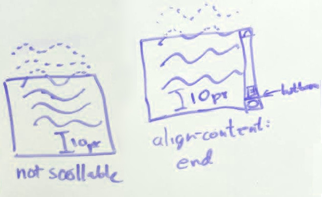
Note: The alignment subject is not necessarily identical to the scrollable overflow area: content overflowing the alignment subject—such as an out-of-flow box—grows the scrollable overflow area but not the alignment subject. Thus an end-aligned scroll container might not be initially scrolled all the way to the bottom, and positioned content can still be clipped if it is further into the unreachable scrollable overflow region than the in-flow content forming the alignment subject.
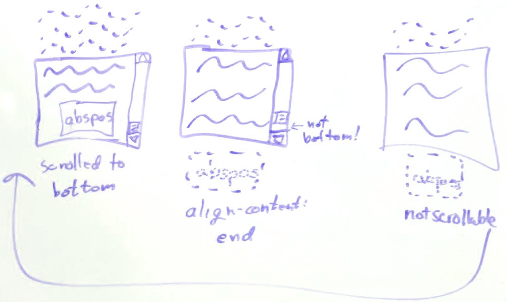
Replace this image too.
Note: The presence of scrollbars can change the size of the scroll container’s content box—and thus the size of the alignment container and/or alignment subject.
5.4. Baseline Content-Alignment
The content of boxes participating in row-like layout contexts (shared alignment contexts) can be baseline-aligned to each other. Baseline content-alignment effectively increases the padding on the box to align the alignment baseline of its contents with that of other baseline-aligned boxes in its baseline-sharing group.
Baseline content-alignment can only apply if the align-content axis is parallel with the box’s block axis (i.e. it does not apply to “column” flex containers); otherwise the fallback alignment is used.
The set of boxes that participate in baseline content-alignment depends on the layout model:
- Table Cells:
-
A (non-replaced) table cell participates in
first/last baseline content-alignment
in its startmost/endmost row
if its inline axis is parallel to that of the table itself and
its computed align-content is first baseline (last baseline).
Note: Baseline content-alignment of cells sharing a column is not supported; however this may be added in a future level if there is sufficient demand and implementer interest.
- Flex Items:
- A non-replaced flex item participates in first/last baseline content-alignment in its flex line if its computed align-content is first baseline/last baseline and its inline axis is parallel to the main axis.
- Grid Items:
- A non-replaced grid item participates in first/last baseline content-alignment in its startmost/endmost row or column (whichever is parallel to its inline axis) and if its computed align-content is first baseline/last baseline.
Additionally, in order to participate in baseline content-alignment it must also have a coordinated self-alignment preference, to guarantee that the box lines up the relevant edge with other boxes in its baseline-sharing group. That is, the box’s start (end) margin edge must be intended to align—and actually align—to the corresponding edge of its containing block when its baseline alignment preference is “first” (“last”). It otherwise takes its fallback alignment.
When is a self-alignment preference coordinated?
A box’s start margin edge is aligned to the corresponding edge of its containing block and it has a coordinated self-alignment preference for a “first” baseline alignment preference when, in the relevant axis:
-
There are no auto margins and the relevant self-alignment property either is or aligns identically to stretch or self-start; or
-
There is only an auto end-edge margin, which absorbs any positive free space and disables the effects of any self-alignment property, and its margin box does not overflow its containing block under circumstances that would cause it to effectively end-align instead (such as having a containing block with an opposite writing mode).
A box’s end margin edge is aligned to the corresponding edge of its containing block and it has a coordinated self-alignment preference for a “last” baseline alignment preference when, in the relevant axis:
-
There are no auto margins and the relevant self-alignment property either is or aligns identically to self-end and its self-alignment is what would result from an unsafe overflow alignment; or
-
There is only an auto start-edge margin, which absorbs any positive free space and disables the effects of any self-alignment property and its margin box does not overflow its containing block under circumstances that would cause it to effectively start-align instead.
See § 9.3 Aligning Boxes by Baseline for additional details. Baseline content-alignment can increase the intrinsic size of the box.
6. Self-Alignment: Aligning the Box Within Its Parent
Self-alignment controls alignment of the box within its containing block. It is specified by the self-alignment properties align-self and justify-self (and their place-self shorthand).
6.1. Inline-Axis (or Main-Axis) Self-Alignment: the justify-self property
| Name: | justify-self |
|---|---|
| Value: | auto | <overflow-position>? [ normal | <self-position> | left | right ] | stretch | <baseline-position> |
| Initial: | auto |
| Applies to: | block-level boxes, absolutely-positioned boxes, and grid items |
| Inherited: | no |
| Percentages: | n/a |
| Computed value: | specified keyword(s) |
| Canonical order: | per grammar |
| Animation type: | discrete |
Justifies the box (as the alignment subject) within its containing block (as the alignment container) along the inline/row/main axis of the alignment container: the box’s outer edges are aligned within its alignment container as described by its alignment value. Values have the following meanings:
- auto
-
Behaves as normal if the box has no parent, or when determining the actual position of an absolutely positioned box. It behaves as the computed justify-items value of the parent box (minus any legacy keywords) otherwise (including when determining the static position of an absolutely positioned box).
- normal
-
Represents the “default” alignment for the layout mode. Its behavior depends on the layout mode, as described below.
- <self-position> | left | right
-
Shifts the position of the box as specified, see § 4 Alignment Keywords.
- <overflow-position>
-
Controls how the box aligns when it overflows, see § 4.4 Overflow Alignment: the safe and unsafe keywords and scroll safety limits.
- stretch
-
When the box’s computed width/height (as appropriate to the axis) is auto and neither of its margins (in the appropriate axis) are auto, sets the box’s used size to the length necessary to make its outer size as close to filling the alignment container as possible while still respecting the constraints imposed by min-height/min-width/max-height/max-width.
Unless otherwise specified, this value falls back to flex-start generally, and to self-start or self-end if the box has also specified first baseline or last baseline baseline content-alignment (respectively) in the same axis.
Note: The stretch keyword can cause elements to shrink, to fit their container.
- <baseline-position>
-
Indicates baseline self-alignment, as defined in § 4.2 Baseline Alignment: the baseline keyword and first/last modifiers, § 6.4 Baseline Self-Alignment, and § 9 Baseline Alignment Details.
Values other than stretch cause a width/height of auto to be treated as fit-content.
Note: auto margins, because they effectively adjust the size of the margin area, take precedence over justify-self.
6.1.1. Block-Level Boxes
| justify-self Axis | The block’s containing block’s inline axis, generally. The static-position containing block’s inline axis when determining the static position. |
|---|---|
| Alignment Container | The box’s containing block, except that for block-level elements that establish a block formatting context and are placed next to a float, the alignment container is reduced by the space taken up by the float, assuming the writing mode of the containing block. |
| Alignment Subject | The block’s margin box, assuming the writing mode of the block. |
| normal Behavior | The box lays out according to the default rules for block layout (see CSS2.1§10.3). |
| Other Details |
The automatic size of a block-level box
whose justify-self is not normal
is equivalent to fit-content
(rather than e.g. stretch, as is typical for a non-replaced block-level box).
Additionally,
in terms of CSS2.1 block-level formatting [CSS2],
the rules for “over-constrained” computations in section 10.3.3
are ignored in favor of alignment as specified here
and the used value of the margin properties are therefore not adjusted to correct for the over-constraint.
This property does not apply to floats. Anonymous block boxes always behave as normal. |
6.1.2. Absolutely-Positioned Boxes
This section describes the effect of justify-self on how the margin box of an absolutely-positioned box is positioned with respect to its (absolute-positioning) containing block.
| justify-self Axis | The block’s containing block’s inline axis. |
|---|---|
| Alignment Container | The box’s containing block, as modified by the inset properties (top/right/bottom/left), assuming the writing mode of the containing block. If both inset properties in the relevant axis are auto, then use the box’s static-position rectangle (i.e. set both insets to the box’s static position) and assume the writing mode of the static-position containing block. |
| Alignment Subject | The box’s margin box, assuming the writing mode of the box. |
| normal Behavior | Behaves as stretch or start, depending on the type of box. See CSS Positioned Layout 3 § 4 Absolute Positioning Layout Model. |
| Other Details |
In terms of CSS2.1 formatting [CSS2],
the rules for “over-constrained” computations in section 10.3.7
are ignored in favor of alignment as specified here,
and the used value of the inset properties are not adjusted to correct for the over-constraint.
Values other than stretch or normal cause non-replaced absolutely-positioned boxes to use fit-content sizing for calculating auto sizes in the affected axis. Note that stretch does cause replaced absolutely-positioned boxes to fill their containing block just as non-replaced ones do. Note: If only one inset property is auto, the computations in CSS2 section 10.3.7 fully determine its size and position, and justify-self has no effect. (If both are auto, then the box is statically-positioned, see above, and can be aligned within the static-position rectangle.) |
6.1.3. Table Cells
This property does not apply to table cells, because their position and size is fully constrained by table layout.
6.1.4. Flex Items
This property does not apply to flex items, because there is more than one item in the main axis. See flex for stretching and justify-content for main-axis alignment. [CSS-FLEXBOX-1]
6.1.5. Grid Items
| justify-self Axis | The grid’s inline axis. |
|---|---|
| Alignment Container | The grid item’s grid area, assuming the writing mode of the grid container. |
| Alignment Subject | The grid item’s margin box, assuming the writing mode of the grid item. |
| normal Behavior | Sizes as either stretch (typical non-replaced elements) or start (typical replaced elements); see Grid Item Sizing in [CSS-GRID-1]. The resulting box is then start-aligned. |
See [CSS-GRID-1] for details.
6.2. Block-Axis (or Cross-Axis) Self-Alignment: the align-self property
| Name: | align-self |
|---|---|
| Value: | auto | <overflow-position>? [ normal | <self-position> ] | stretch | <baseline-position> |
| Initial: | auto |
| Applies to: | flex items, grid items, and absolutely-positioned boxes |
| Inherited: | no |
| Percentages: | n/a |
| Computed value: | specified keyword(s) |
| Canonical order: | per grammar |
| Animation type: | discrete |
Aligns the box (as the alignment subject) within its containing block (as the alignment container) along the block/column/cross axis of the alignment container: the box’s outer edges are aligned within its alignment container as described by its alignment value. Values have the following meanings:
- auto
-
Behaves as normal if the box has no parent, or when determining the actual position of an absolutely positioned box. It behaves as the computed align-items value of the parent box (minus any legacy keywords) otherwise (including when determining the static position of an absolutely positioned box).
- normal
-
Represents the “default” alignment for the layout mode, as defined below.
- <self-position>
-
Shifts the position of the box as specified, see § 4 Alignment Keywords.
- <overflow-position>
-
Controls how the box aligns when it overflows, see § 4.4 Overflow Alignment: the safe and unsafe keywords and scroll safety limits.
- stretch
-
As defined for justify-self in § 6.1 Inline-Axis (or Main-Axis) Self-Alignment: the justify-self property.
- <baseline-position>
-
Indicates baseline self-alignment, as defined in § 4.2 Baseline Alignment: the baseline keyword and first/last modifiers, § 6.4 Baseline Self-Alignment, and § 9 Baseline Alignment Details.
Note: auto margins, because they effectively adjust the size of the margin area, take precedence over align-self.
6.2.1. Block-Level Boxes
The align-self property does not apply to block-level boxes (including floats), because there is more than one item in the block axis.
6.2.2. Absolutely-Positioned Boxes
This section describes the effect of align-self on how the margin box of an absolutely-positioned box is positioned with respect to its (absolute-positioning) containing block.
| align-self Axis | The box’s containing block’s block axis, generally. The static-position containing block’s block axis when determining the static position. |
|---|---|
| Alignment Container | The box’s containing block, as modified by the inset properties (top/right/bottom/left), assuming the writing mode of the containing block. If both inset properties in the relevant axis are auto, then use the box’s static-position rectangle (i.e. set both insets to the box’s static position) and assume the writing mode of the static-position containing block. |
| Alignment Subject | The box’s margin box, assuming the writing mode of the box. |
| normal Behavior | Behaves as stretch or start, depending on the type of box. See CSS Positioned Layout 3 § 4 Absolute Positioning Layout Model. |
| Other Details |
In terms of CSS2.1 formatting [CSS2],
the rules for "over-constrained" computations in section 10.6.4
are ignored in favor of alignment as specified here
and the used value of the inset properties are not adjusted to correct for the over-constraint.
Values other than stretch or normal cause non-replaced absolutely-positioned boxes to use fit-content sizing for calculating auto sizes in the affected axis. Note that stretch does cause replaced absolutely-positioned boxes to fill their containing block just as non-replaced ones do. Note: If only one inset property is auto, the computations in CSS2 section 10.6.4 fully determine its size and position, and align-self has no effect. (If both are auto, then the box is statically-positioned, see above, and can be aligned within the static-position rectangle.) |
6.2.3. Table Cells
This property does not apply to table cells, because their position and size is fully constrained by table layout.
6.2.4. Flex Items
| align-self Axis | The flex container’s cross axis. |
|---|---|
| Alignment Container | The flex line the flex item is in, assuming the writing mode of the flex container. |
| Alignment Subject | The flex item’s margin box, assuming the writing mode of the flex item. |
| normal Behavior | Behaves as stretch. |
See [CSS-FLEXBOX-1] for details.
6.2.5. Grid Items
| align-self Axis | The grid’s block axis. |
|---|---|
| Alignment Container | The grid item’s grid area, assuming the writing mode of the grid container. |
| Alignment Subject | The grid item’s margin box, assuming the writing mode of the grid item. |
| normal Behavior | Sizes as either stretch (typical non-replaced elements) or start (typical replaced elements); see Grid Item Sizing in [CSS-GRID-1]. The resulting box is then start-aligned. |
See [CSS-GRID-1] for details.
6.3. Self-Alignment Shorthand: the place-self property
| Name: | place-self |
|---|---|
| Value: | <'align-self'> <'justify-self'>? |
| Initial: | auto |
| Applies to: | see individual properties |
| Inherited: | no |
| Percentages: | n/a |
| Computed value: | see individual properties |
| Canonical order: | per grammar |
| Animation type: | discrete |
This shorthand property sets both the align-self and justify-self properties in a single declaration. The first value is assigned to align-self. The second value is assigned to justify-self; if omitted, it is copied from the first value.
6.4. Baseline Self-Alignment
Boxes participating in row-like layout contexts (shared alignment contexts) can be baseline-aligned to each other. Baseline self-alignment effectively increases the margins on the box to align its alignment baseline with that of other baseline-aligned boxes in its baseline-sharing group.
The set of boxes that participate in baseline self-alignment depends on the layout model:
- Flex Items:
- A flex item participates in first/last baseline self-alignment in its flex line if its computed align-self is first baseline/last baseline. See [CSS-FLEXBOX-1] for details.
- Grid Items:
- A grid item participates in first/last baseline self-alignment in its startmost/endmost row or column if its align-self or justify-self property (respectively) computes to first baseline/last baseline.
See § 9.3 Aligning Boxes by Baseline for exact details. Baseline self-alignment can increase the intrinsic size contribution of the box.
6.5. Effects on Sizing of Absolutely Positioned Boxes with Static-Position Insets
For absolutely-positioned boxes whose inline-axis offsets are both auto, the available space for calculating the inline size is also affected by alignment.
Note: In [CSS2], the available space is keyed off of the direction property of the static-position containing block. (See CSS2§10.3.7 and CSS2§10.3.8.) Fundamentally these rules set one of the auto insets (by default, the start-edge inset) to the corresponding edge of the static-position rectangle and the other to the corresponding edge of the containing block (i.e. set the inset to zero). Just as the self-alignment properties replace the containing block’s direction lookup for placement, they also replace this lookup for sizing, as specified here.
Thus, when interpreting the rules in CSS2§10.3.7 and CSS2§10.3.8, wherever the direction property of the static-position containing block is referenced, instead reference the value of the align-self or justify-self property (whichever is defined to apply to the relevant axis), treating left-equivalent alignment as defined for ltr and right-equivalent alignment as defined for rtl. Treat normal as start and any distributed alignment value as its fallback alignment.
In the case of center alignment, the available space for the box is double the distance between the center of the static-position rectangle and the closest edge of the containing block in the relevant axis.

Note: The align-self/justify-self properties can also modify additional aspects of sizing: for example, justify-self: stretch will replace “shrink-to-fit” (fit-content) sizing into the available space with stretch-fit sizing (consuming all of the available space). This is an independent effect from the available space adjustment here.
Note: This only affect how available space is calculated for sizing the absolutely-positioned box; its alignment is as specified in previous sections.
7. Default Alignment
The align-items and justify-items properties (and their place-items shorthand) set the default align-self and justify-self behavior of the element’s child boxes.
7.1. Inline-Axis (or Main-Axis) Default Alignment: the justify-items property
| Name: | justify-items |
|---|---|
| Value: | normal | stretch | <baseline-position> | <overflow-position>? [ <self-position> | left | right ] | legacy | legacy && [ left | right | center ] |
| Initial: | legacy |
| Applies to: | all elements |
| Inherited: | no |
| Percentages: | n/a |
| Computed value: | specified keyword(s), except for legacy (see prose) |
| Canonical order: | per grammar |
| Animation type: | discrete |
This property specifies the default justify-self for all of the child boxes (including anonymous boxes) participating in this box’s formatting context. Values have the following meanings:
- legacy
-
This keyword causes the value to effectively inherit into descendants.
If the legacy keyword appears on its own (without an accompanying left, right, or center keyword): if the inherited value of justify-items includes the legacy keyword, this value computes to the inherited value; otherwise it computes to normal.
When justify-self:auto references the value of justify-items, only the alignment keyword, not the legacy keyword, is referenced by it. It exists to implement the legacy alignment behavior of HTML’s
<center>element andalignattribute.
Other values have no special handling and are merely referenced by justify-self.
7.2. Block-Axis (or Cross-Axis) Default Alignment: the align-items property
| Name: | align-items |
|---|---|
| Value: | normal | stretch | <baseline-position> | <overflow-position>? <self-position> |
| Initial: | normal |
| Applies to: | all elements |
| Inherited: | no |
| Percentages: | n/a |
| Computed value: | specified keyword(s) |
| Canonical order: | per grammar |
| Animation type: | discrete |
This property specifies the default align-self for all of the child boxes (including anonymous boxes) participating in this box’s formatting context.
Values have no special handling and are merely referenced by align-self.
7.3. Default Alignment Shorthand: the place-items property
| Name: | place-items |
|---|---|
| Value: | <'align-items'> <'justify-items'>? |
| Initial: | see individual properties |
| Applies to: | all elements |
| Inherited: | no |
| Percentages: | n/a |
| Computed value: | see individual properties |
| Canonical order: | per grammar |
| Animation type: | discrete |
This shorthand property sets both the align-items and justify-items properties in a single declaration. The first value is assigned to align-items. The second value is assigned to justify-items; if omitted, it is copied from the first value.
8. Gaps Between Boxes
This section has been moved to CSS Gaps 1 § 2 Gaps Between Boxes.
9. Baseline Alignment Details
Boxes in a baseline-sharing group are aligned to each other using their alignment baselines. For example, in horizontal writing modes, specifying align-content: baseline on table cells in the same row will align the baselines of their first formatted lines. This section defines exactly how baseline alignment is performed in consideration of the myriad baselines and writing modes that exist in internationalized modern CSS.
A baseline set is a set of baselines (alphabetic, central, etc.) associated with a common baseline table. Typically, a typesetting tradition will use only one of these, but different writing systems use different baselines, and mixing writing systems can result in using more than one within a single line. Refer to CSS Writing Modes 3 § 4.1 Introduction to Baselines for more information on baselines and writing modes.
9.1. Determining the Baselines of a Box
Each box, for a given axis, has potentially a first baseline set (and last baseline set) that nominally corresponds to the baseline set of the first/last line of text within the box. The alignment baseline, which is the baseline used to align the box in its alignment context, is one of the baselines in its baseline set, usually the dominant baseline associated with the . (See the dominant-baseline and alignment-baseline properties in [CSS-INLINE-3].)
The first and last baseline sets of a box are determined differently based on the layout model, as follows:
- line box
- The first/last baseline set of a line box is generated from the dominant baseline and the font settings of its root inline box.
- block containers
-
The first/last baseline set of a block container
is taken from the first/last in-flow line box in the block container
or the first/last in-flow block-level child in the block container
that contributes a set of first/last baselines,
whichever comes first/last.
If there is no such line box or child,
then the block container has no baseline set.
However, for legacy reasons if its baseline-source is auto (the initial value) a block-level or inline-level block container that is a block-axis scroll container always has a last baseline set, whose baselines all correspond to its block-end margin edge.
- multi-column containers
-
The first baseline set of a multi-column container
is the first baseline set of the column or multi-column spanner
with the highest (block-start–most) baseline
corresponding to the multi-column container’s alignment baseline.
If there is no such line box or child,
then the multi-column container has no first baseline set.
The last baseline set is analogous, but uses the last baseline set and lowest (block-end–most) baseline.
- tables
-
The first/last baseline set of a table box
is the first/last baseline set of its first/last row
(after any reordering of table row groups).
When finding the first/last baseline set of an inline-block, any baselines contributed by table boxes must be skipped. (This quirk is a legacy behavior from [CSS2].)
- table rows
-
The first baseline set of a table row box
is taken from the first available of:
-
If any cells in the row participate in first baseline alignment along the table’s inline axis, generate a baseline set from their shared alignment baseline and the row’s first available font, after alignment has been performed.
-
Otherwise, if any cells in the row participate in last baseline alignment along the table’s inline axis, generate from that alignment baseline.
-
Otherwise, if the row is not empty, synthesize from the lowest and highest content edges of all the cells in the row. See .
-
Otherwise, use the block-start content edge of the table row box itself as the alignment baseline.
For this purpose, any table cell that spans multiple rows is ignored if it’s span does not start in this row; except that for step 2, it’s ignored if its span does not end in this row.
Last baselines are analogous (with “first”/“last” and “start”/“end” inverted).
Spanning cells participate only in the first/last row that they span for the purpose of first baseline/last baseline.
-
- flex containers
- See Flex Baselines in [CSS-FLEXBOX-1].
- grid containers
- See Grid Baselines in [CSS-GRID-1].
To generate baselines for a box from a single baseline, use the baseline table from the font settings and first available font of that box, and align that baseline set to the given single baseline.
If a box that participates in baseline alignment has no baseline set, then its alignment baseline is synthesized according to the rules of the formatting context in which it participates. To synthesize baselines from a rectangle (or two parallel lines), synthesize the alphabetic baseline from the line-under line, and the central baseline by averaging the positions of the two edges or lines. See CSS Inline Layout 3 § A Synthesizing Alignment Metrics for rules on synthesizing additional baselines.
Note: The edges used to synthesize baselines from a box depend on their formatting context: inline-level boxes synthesize from their margin edges [CSS-INLINE-3], table cells synthesize from their content edges [CSS2], and grid and flex items synthesize from their border edges [CSS-GRID-1] [CSS-FLEXBOX-1].
In general, the writing mode of the box, shape, or other object being aligned is used to determine the line-under and line-over edges for synthesis. However, when that writing mode’s block flow direction is parallel to the axis of the alignment context, an axis-compatible writing mode must be assumed:
-
If the box establishing the alignment context has a block flow direction that is orthogonal to the axis of the , use its writing mode.
-
Otherwise:
-
If the box’s own writing mode is vertical, assume horizontal-tb.
-
If the box’s own writing mode is horizontal, assume vertical-lr if direction is ltr and vertical-rl if direction is rtl.
-
For the purposes of finding the baselines of a box, it and all its in-flow descendants that are block-axis scroll containers must be considered as if scrolled to their initial scroll position. Additionally, if the position of a scroll container’s first/last baseline is outside its border edge, that baseline’s position is clamped to the border edge.
9.2. Baseline Alignment Grouping
A baseline-sharing group is composed of boxes that participate in baseline alignment together. This is possible only if they both:
- Share an alignment context along an axis perpendicular to the axis they’re being baseline-aligned in. (For example, grid items with align-self: baseline are baseline-aligning along the grid’s block axis, and therefore participate with other items in their row.)
- Have compatible baseline alignment preferences (i.e., the baselines that want to align are on the same side of the alignment context).
Note: Boxes participating in baseline content-alignment and boxes participating in baseline self-alignment can be part of the same baseline-sharing group, and can thus align to each other. The difference between the two methods is in where extra space is inserted to perform the alignment (inside or outside the box’s own border).
Boxes share an alignment context, along a particular axis, and established by a particular box, when they are:
- table cells in the same row, along the table’s row (inline) axis, established by the row box
- grid items in the same row, along the grid’s row (inline) axis, established by the grid container
- grid items in the same column, along the grid’s column (block) axis, established by the grid container
- flex items in the same flex line, along the flex container’s main axis, established by the flex container
Note: Conceptually, the inline-level boxes in a line box also share a self-alignment context and participate in a baseline-sharing group; however they only baseline-align in response to the vertical-align property, not any of the properties defined in this module. See [CSS-INLINE-3].
If a box spans multiple shared alignment contexts, then it participates in first/last baseline alignment within its start-most/end-most along that axis. For example, a table cell spanning three rows participates in first-baseline alignment with the table cells in the first row that it spans, or alternatively in last-baseline alignment with the table cells in the last row that it spans.
The baseline alignment preferences of two boxes in a baseline-sharing group are compatible if they have:
-
the same block flow direction and same baseline alignment preference
-
opposite block flow direction and opposite baseline alignment preference
9.3. Aligning Boxes by Baseline
Given a set of alignment subjects and their baselines that all belong to a single baseline-sharing group, the alignment subjects are baseline-aligned as follows:
-
Generate the baseline-sharing group’s baseline table from the first available font of the group’s alignment context and overlay also the mirror of this baseline table by aligning their central baselines. These are the baseline “grids” to which the alignment subjects will align.
-
Align each alignment subject by its specified alignment baseline to the group’s baseline table or its mirror, whichever matches the alignment subject’s line orientation. Unless otherwise specified (e.g. via the alignment-baseline property), the alignment baseline is the dominant baseline of the alignment context.
-
Position the aligned baseline-sharing group within the alignment container according to its fallback alignment. The fallback alignment of a baseline-sharing group is the fallback alignment of its items as resolved to physical directions.
-
For first/last baseline content-alignment, then add the minimum necessary extra space between the alignment container’s start/end content edge and the alignment subject’s edge to align the start/end margin edges of all the alignment containers in the alignment context while maintaining baseline alignment within the baseline-sharing group.
Appendix A: Static Position Terminology
When both inset properties in a given axis are auto on an absolutely positioned box, CSS2 uses its static position to resolve its size and position. See CSS2.1§10.3.7. The box alignment properties modify these calculations, just as they do the sizing and positioning calculations in other layout modes. These modifications refer to a static-position rectangle, whose edges represent the static position of the box from each side of its containing block.
The static-position rectangle and the static positions to which it corresponds are defined by the layout model of its “hypothetical box”:
- Block Layout
- The static positions of a block-level box are defined in [CSS2] Chapter 10. The static-position rectangle is a zero-thickness rectangle spanning between the inline-axis sides of the box’s static-position containing block (see CSS2§10.3.7); and positioned at its block-start static position (see CSS2§10.6.4).
- Inline Layout
- The static positions of an inline-level box are defined in [CSS2] Chapter 10. The static-position rectangle is a zero-thickness rectangle spanning between the line-over/line-under sides of the line box that would have contained its “hypothetical box” (see CSS2§10.3.7); and positioned at its inline-start static position.
- Flex Layout
- The static-position rectangle of the child of a flex container corresponds to the content edges of the flex container. See CSS Flexbox 1 § 4.1 Absolutely-Positioned Flex Children.
- Grid Layout
- By default, the static-position rectangle of the child of a grid container corresponds to the content edges of the grid container. However, if that grid container also establishes the box’s actual containing block, then the grid area specified by the grid-placement properties establishes its static-position rectangle instead. See the static position of a grid container child in [CSS-GRID-1].
10. Changes
Changes since the 11 March 2025 Working Draft include:
-
Ensure all scroll container interactions properly pay attention to the scrollable axises. (Issue 12289)
-
Clarify that § 4.4.1.2 Self-Alignment for Absolutely Positioned Boxes applies when position-area alters the used value of normal.
-
Allow absolutely positioned boxes to honor alignment even when overflowing into the scrollable overflow area of a scroll container containing block. (Issue 12106)
-
Allow safe/unsafe to be specified with normal. (Issue 12920)
-
Change safe alignment to cause the container to fall back to flex-start, so it is correctly safe for a scrollable reversed flexbox. (Issue 11937)
-
Defined anonymous block boxes to always act like justify-self: normal. (Issue 11461)
-
Defined that justify-self affects the automatic size of block-level boxes the same way it does for flex and grid items. (Issue 12102)
-
Moved the gap properties to [CSS-GAPS-1]. (Issue 13089)
See also previous changes.
11. Privacy Considerations
As a simple layout spec, this introduces no new privacy considerations.
12. Security Considerations
As a simple layout spec, this introduces no new security considerations.
Acknowledgments
Special thanks goes to David Baron, Javier Fernandez, Markus Mielke, Alex Mogilevsky, and the participants in the CSSWG’s March 2008 F2F alignment discussions for their contributions to the alignment model described herein, and to Melanie Richards for her illustrations of the various alignment keywords.