Title: CSS Text Decoration Module Level 3
Shortname: css-text-decor
Level: 3
Status: ED
Work Status: Testing
Group: csswg
ED: https://drafts.csswg.org/css-text-decor-3/
TR: https://www.w3.org/TR/css-text-decor-3/
Previous Version: https://www.w3.org/TR/2018/CR-css-text-decor-3-20180703/
Previous Version: https://www.w3.org/TR/2013/CR-css-text-decor-3-20130801/
Previous Version: https://www.w3.org/TR/2013/WD-css-text-decor-3-20130103/
Previous Version: https://www.w3.org/TR/2012/WD-css-text-decor-3-20121113/
Editor: Elika J. Etemad / fantasai, Apple, http://fantasai.inkedblade.net/contact, w3cid 35400
Editor: Koji Ishii, Google, kojiishi@gmail.com, w3cid 45369
Implementation Report: https://wpt.fyi/results/css/css-text-decor
Abstract: This module contains the features of CSS relating to text decoration, such as underlines, text shadows, and emphasis marks.
At Risk: The ability to place both emphasis marks and ruby on the same base text.
Link Defaults: css-color-3 (property) color
spec:css-break-3; type:dfn; text:fragment
spec:css-display-3; type:property; text:display
Introduction
This subsection is non-normative.
This module covers text decoration, i.e. decorating the glyphs
of the text once typeset according to font and typographic rules.
(See [[CSS-TEXT-3]] and [[CSS-FONTS-3]].)
Such features are traditionally used not only for purely decorative purposes,
but also in some cases to show emphasis, for honorifics,
and to indicate editorial changes such as insertions, deletions, and misspellings.
CSS Levels 1 and 2 only defined very basic line decorations
(underlines, overlines, and strike-throughs)
appropriate to Western typographical traditions.
Level 3 of this module adds the ability to change
the color, style, position, and continuity of these decorations,
and also introduces
emphasis marks (traditionally used in East Asian typography),
and shadows (which were proposed then deferred from Level 2).
Module Interactions
This module replaces and extends the text-decorating
features defined in [[!CSS2]] chapter 16.
Value Definitions
This specification follows the CSS property definition conventions from [[!CSS2]]
using the value definition syntax from [[!CSS-VALUES-3]].
Value types not defined in this specification are defined in CSS Values & Units [[!CSS-VALUES-3]].
Combination with other CSS modules may expand the definitions of these value types.
In addition to the property-specific values listed in their definitions,
all properties defined in this specification
also accept the CSS-wide keywords as their property value.
For readability they have not been repeated explicitly.
Terminology
The terms character,
letter, and
content language
as used in this specification are defined in [[!CSS-TEXT-3]].
Other terminology and concepts used in this specification are defined
in [[!CSS2]] and [[!CSS-WRITING-MODES-4]].
Line Decoration: Underline, Overline, and Strike-Through
The following properties describe line decorations that are added to the content of an element.
When specified on or propagated to an inline box,
that box becomes a decorating box for that decoration,
applying the decoration to all its fragments.
The decoration is then further propagated to any in-flow block-level boxes that split the inline
(see CSS2.1 section 9.2.1.1).
When specified on or propagated to a block container that establishes an inline formatting context,
the decorations are propagated to an anonymous inline box that wraps all the in-flow inline-level children of the block container.
When specified on or propagated to a ruby container,
the decorations are propagated only to the ruby base.
For all other box types,
the decorations are propagated to all in-flow children.
Note that text decorations are not propagated to any out-of-flow descendants,
nor to the contents of atomic inline-level descendants such as inline blocks and inline tables.
They are also not propagated to inline children of inline boxes,
although the decoration is applied to such boxes.
Underlines, overlines, and line-throughs are drawn only for non-replaced inline boxes,
and are drawn across all text (including white space, letter spacing, and word spacing)
except spacing (white space, letter spacing, and word spacing) at the beginning and end of a line.
Atomic inlines, such as images and inline blocks, are not decorated.
Margins, borders, and padding of the [=decorating box=] are always skipped,
however the margins, border, and padding of descendant inline boxes are not.
Note that CSS 2.1 required skipping margins, borders, and padding always.
In this level, by default only the margins, borders, and padding of the [=decorating box=] are skipped.
In the future CSS2.1 may be updated to match this new default.
Also, control over decorating leading/trailing spaces is expected in Level 4,
and will be applied by default to the HTML <{ins}> and <{del}> elements.
UAs may interrupt underlines and overlines where the line would cross glyph ink
and to some distance to either side of the glyph outline;
this behavior is not controllable in this level,
but will be further defined in Level 4.
Line-throughs must remain continuous, however.
When the UA interrupts underlines or overlines at glyph boundaries,
the shape of the line at that boundary should
follow the shape of the glyph.
Note, this specification intentionally does not mandate a particular method
for “following the shape” of the glyph
so that UAs can take appropriate measures to handle
aesthetic and performance considerations.
For example,
a UA could assume square line endings below a certain size threshold
for performance reasons;
or use trapezoidal endings to approximate curves,
especially on thinner line decorations.
In terms of aesthetic considerations,
the UA might also consider what happens when the glyph boundary
intersects only part of the line thickness
or is slanted close to the horizontal--
following the curve exactly
could result in typographically-awkward wisps of underline.
Whether to show the line within enclosed areas of a glyph is yet
another consideration.
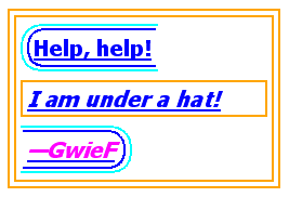
In the following style sheet and document fragment:
		  blockquote { text-decoration: underline; color: blue; }
		  em { display: block; }
		  cite { color: fuchsia; }
		  <blockquote>
		   <p>
		    <span>
		     Help, help!
		     <em> I am under a hat! </em>

		     <cite> —GwieF </cite>
		    </span>
		   </p>
		  </blockquote>
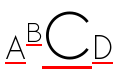
...the underlining for the blockquote element is propagated to an
anonymous inline box that surrounds the span element, causing
the text "Help, help!" to be blue, with the blue underlining from
the anonymous inline underneath it, the color being taken from the
blockquote element. The
<em>text</em>
in the em block is also underlined, as it is in an in-flow block to
which the underline is propagated. The final line of text is fuchsia,
but the underline underneath it is still the blue underline from the
anonymous inline element.
This diagram shows the boxes involved in the example above. The
rounded aqua line represents the anonymous inline element wrapping
the inline contents of the paragraph element, the rounded blue line
represents the span element, and the orange lines represent the
blocks.
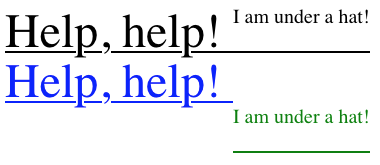
In the following style sheet and document fragment:
		  div { color: black; font-size: 48px; text-decoration: underline; text-shadow: blue 0px 50px 0px; }
		  span { font-size: 20px; vertical-align: top; text-shadow: green 0px 100px 0px; }
<div>Help, help! <span>I am under a hat!</span></div>
...the <div> is the [=decorating box=] for its underline (in black),
which is rendered uninterrupted through both the <div> and the <span>.
Unlike line decorations, however,
`text-shadow` is inherited as a property;
therefore the green text shadow on the <span>
overrides the blue text shadow on the <div>.
As a result, when the shadows are painted,
the shadow of the <div>’s underline is disjoint across the two elements.
Text Decoration Lines: the 'text-decoration-line' property
	Name: text-decoration-line
	Value: none | [ underline || overline || line-through || blink ]
	Initial: none
	Inherited: no (but see prose, above)
	Computed value: specified keyword(s)
	Animation type: discrete
Specifies what line decorations, if any, are added to the element.
Values have the following meanings:
- none
-
Neither produces nor inhibits text decoration.
- underline
-
Each line of text is underlined.
- overline
-
Each line of text has a line over it (i.e. on the opposite
side from an underline).
- line-through
-
Each line of text has a line through the middle.
- blink
-
The text blinks (alternates between visible and invisible).
Conforming user agents may simply not blink the text.
Note that not blinking the text is one technique to satisfy checkpoint 3.3 of WAI-UAAG.
This value is deprecated in favor of Animations [[CSS-ANIMATIONS-1]].
Note: In vertical writing modes,
'text-underline-position' can cause the underline and overline to switch sides.
This allows the position of underlines to key off of language-specific preferences
automatically.
Text Decoration Style: the 'text-decoration-style' property
	Name: text-decoration-style
	Value: solid | double | dotted | dashed | wavy
	Initial: solid
	Inherited: no
	Computed value: specified keyword
	Animation type: discrete
This property specifies the style of the line(s) drawn for
text decoration specified on the element. Values have the
same meaning as for the
border-style
properties [[!CSS-BACKGROUNDS-3]]. ''wavy'' indicates a wavy line.
The style of text decorations must remain the same on all decorations originating from a given element,
even if descendant boxes have different specified styles.
Text Decoration Color: the 'text-decoration-color' property
	Name: text-decoration-color
	Value: <>
	Initial: currentcolor
	Inherited: no
	Computed value: computed color
	Animation type: by computed value type
This property specifies the color of text decoration (underlines
overlines, and line-throughs) set on the element with
'text-decoration-line'.
The color of text decorations must remain the same on all decorations originating from a given element,
even if descendant boxes have different specified colors.
Text Decoration Shorthand: the 'text-decoration' property
	Name: text-decoration
	Value: <<'text-decoration-line'>> || <<'text-decoration-style'>> || <<'text-decoration-color'>>
This property is a shorthand for setting
'text-decoration-line',
'text-decoration-color',
and 'text-decoration-style'
in one declaration.
Omitted values are set to their initial values.
Note: A 'text-decoration' declaration that omits
both the 'text-decoration-color' and 'text-decoration-style' values
is backwards-compatible with CSS Levels 1 and 2.
The following example underlines unvisited links with a solid blue
underline in CSS1 and CSS2 UAs and a navy dotted underline in CSS3 UAs.
			:link {
			  color: blue;
			  text-decoration: underline;
			  text-decoration: navy dotted underline; /* Ignored in CSS1/CSS2 UAs */
			}
Text Underline Position: the 'text-underline-position' property
	Name: text-underline-position
	Value: auto | [ under || [ left | right ] ]
	Initial: auto
	Inherited: yes
	Computed value: specified keyword(s)
	Animation type: discrete
This property sets the position of an underline specified on the element.
(It does not affect underlines specified by ancestor elements.)
If ''text-underline-position/left'' or ''text-underline-position/right'' is specified alone,
''text-underline-position/auto'' is also implied.
The following example styles modern Chinese, Japanese, and Korean
texts with the appropriate underline positions in both horizontal
and vertical text:
			:root:lang(ja), [lang|=ja], :root:lang(ko), [lang|=ko] { text-underline-position: under right; }
			:root:lang(zh), [lang|=zh] { text-underline-position: under left; }
- auto
-
The user agent may use any algorithm to determine the
underline's position; however it must be placed at or under
the alphabetic baseline.
Note: It is suggested that the default underline position
be close to the alphabetic baseline,
unless that would either cross subscripted (or otherwise lowered) text
or draw over glyphs from Asian scripts such as Han or Tibetan
for which an alphabetic underline is too high:
in such cases, shifting the underline lower
or aligning to the em box edge as described for ''text-underline-position/under''
may be more appropriate.
- under
-
The underline is positioned [=under=] the element's text content.
In this case the underline usually does not cross the descenders.
(This is sometimes called “accounting” underline.)
This value can be combined with ''text-underline-position/left'' or ''text-underline-position/right''
if a particular side is preferred in vertical typographic modes.
Because 'text-underline-position' inherits, and is not reset
by the 'text-decoration' shorthand, the following example
switches the document to use ''text-underline-position/under'' underlining, which can
be more appropriate for writing systems with long, complicated
descenders. It is also often useful for mathematical or chemical
texts that use many subscripts.
:root { text-underline-position: under; }
- left
-
In vertical typographic modes, the underline is aligned as for
''text-underline-position/under'', except it is always aligned to the left edge of the text.
If this causes the underline to be drawn on the "over" side of
the text, then an overline also switches sides and is drawn on
the "under" side.
- right
-
In vertical typographic modes, the underline is aligned as for
''text-underline-position/under'', except it is always aligned to the right edge of the text.
If this causes the underline to be drawn on the "over" side of
the text, then an overline also switches sides and is drawn on
the "under" side.

|

|
| ''text-underline-position/left''
| ''text-underline-position/right''
|
In vertical typographic modes, the 'text-underline-position'
values ''text-underline-position/left'' and ''text-underline-position/right'' allow placing the underline on either
side of the text. (In horizontal typographic modes, both values are
treated as ''text-underline-position/auto''.)
The exact position and thickness of line decorations is UA-defined in this level.
However, for underlines and overlines
the UA must use a single thickness and position on each line
for the decorations deriving from a single [=decorating box=].
Note, since line decorations can span elements with varying font sizes and
vertical alignments, the best position for a line decoration is not
necessarily the ideal position dictated by the [=decorating box=].
For example, an overline positioned to a small font
will effectively become a line-through if the element contains text in a significantly larger font-size.
Even for underlines, if the text is not aligned to the alphabetic baseline
(for example, in vertical typesetting styles,
text is aligned by its central baseline by default [[CSS-WRITING-MODES-4]])
an underline will cut through descendant text of a larger font-size.
UA consideration of descendant content will therefore result in better typography.
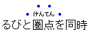
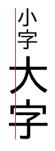
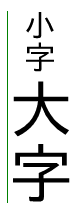
Emphasis Marks
East Asian documents traditionally use small symbols next to each glyph to emphasize
a run of text. For example:
The 'text-emphasis' shorthand, and its 'text-emphasis-style' and 'text-emphasis-color' longhands,
can be used to apply such marks to the text.
The 'text-emphasis-position' property, which inherits separately,
allows setting the emphasis marks’ position with respect to the text.
Emphasis Mark Style: the 'text-emphasis-style' property
	Name: text-emphasis-style
	Value: none | [ [ filled | open ] || [ dot | circle | double-circle | triangle | sesame ] ] | <>
	Initial: none
	Applies to: text
	Inherited: yes
	Computed value: the keyword ''text-emphasis-style/none'', a pair of keywords representing the shape and fill, or a string
	Animation type: discrete
This property applies emphasis marks to the element's text.
Values have the following meanings:
- none
- No emphasis marks.
- filled
- The shape is filled with solid color.
- open
- The shape is hollow.
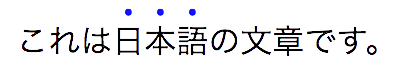
- dot
- Display small circles as marks.
The filled dot is U+2022 '•', and the open dot is U+25E6 '◦'.
- circle
- Display large circles as marks.
The filled circle is U+25CF '●', and the open circle is U+25CB '○'.
- double-circle
- Display double circles as marks.
The filled double-circle is U+25C9 '◉', and the open double-circle is U+25CE '◎'.
- triangle
- Display triangles as marks.
The filled triangle is U+25B2 '▲', and the open triangle is U+25B3 '△'.
- sesame
- Display sesames as marks.
The filled sesame is U+FE45 '﹅', and the open sesame is U+FE46 '﹆'.
- <>
- Display the given string as marks.
Authors should not specify more than one [=character=] in <string>.
The UA may truncate or ignore strings consisting of more than one grapheme cluster.
If a shape keyword is specified but neither of ''filled'' nor ''open'' is
specified, ''filled'' is assumed. If only ''filled'' or ''open'' is specified,
the shape keyword computes to ''circle'' in horizontal typographic modes and
''sesame'' in vertical typographic modes.
The marks should be drawn using the element's font settings
with the addition of the ''font-variant-east-asian/ruby'' feature
and the size scaled down 50%.
However, since not all fonts have all these glyphs,
and some fonts use inappropriate sizes for emphasis marks in these code points,
the UA may opt to use a font known to be good for emphasis marks,
or the marks may instead be synthesized by the UA.
Marks must remain upright in vertical typographic modes:
like CJK characters, they do not rotate to match the writing mode.
The orientation of marks in horizontal typographic modes of vertical writing modes
is undefined in this level
(but may be defined in a future level if definitive use cases arise).
Note: One example of good fonts for emphasis marks is Adobe's open source
Kenten Generic OpenType Font,
which is specially designed for the emphasis marks.
The marks are drawn once for each typographic character unit.
However, emphasis marks are not drawn for:
- Word separators
or other characters that
belong to the Unicode separator classes (Z*).
(But note that emphasis marks are drawn for a space
that combines with any combining characters.)
- Punctuation--specifically,
any characters that belong to the
Unicode P* general category and
do not
NFKD normalize [[!UAX15]] to
any of the following symbols:
| # | U+0023 | NUMBER SIGN
|
| % | U+0025 | PERCENT SIGN
|
| ‰ | U+2030 | PER MILLE SIGN
|
| ‱ | U+2031 | PER TEN THOUSAND SIGN
|
| ٪ | U+066A | ARABIC PERCENT SIGN
|
| ؉ | U+0609 | ARABIC-INDIC PER MILLE SIGN
|
| ؊ | U+060A | ARABIC-INDIC PER TEN THOUSAND SIGN
|
| & | U+0026 | AMPERSAND
|
| ⁊ | U+204A | TIRONIAN SIGN ET
|
| @ | U+0040 | COMMERCIAL AT
|
| § | U+00A7 | SECTION SIGN
|
| ¶ | U+00B6 | PILCROW SIGN
|
| ⁋ | U+204B | REVERSED PILCROW SIGN
|
| ⁓ | U+2053 | SWUNG DASH
|
| 〽️ | U+303D | PART ALTERNATION MARK
|
- Characters belonging to the Unicode classes for control codes
and unassigned characters (Cc, Cf, Cn).
Note: Control over which characters are marked will be added in Level 4.
(The list of punctuation may also be further refined,
particularly for non-CJK punctuation.)
Emphasis Mark Color: the 'text-emphasis-color' property
	Name: text-emphasis-color
	Value: <>
	Initial: currentcolor
	Applies to: text
	Inherited: yes
	Computed value: computed color
	Animation type: by computed value type
This property specifies the foreground color of the emphasis marks.
Note: ''currentcolor'' keyword computes to itself
and is resolved to the value of 'color' after inheritance is performed.
This means 'text-emphasis-color' by default matches the text 'color'
even as 'color' changes across elements.
Emphasis Mark Shorthand: the 'text-emphasis' property
	Name: text-emphasis
	Value: <<'text-emphasis-style'>> || <<'text-emphasis-color'>>
This property is a shorthand for setting
'text-emphasis-style' and 'text-emphasis-color'
in one declaration.
Omitted values are set to their initial values.
Note that 'text-emphasis-position' is not reset in this
shorthand. This is because typically the shape and color vary, but the
position is consistent for a particular language throughout the document.
Therefore the position should inherit independently.
Emphasis Mark Position: the 'text-emphasis-position' property
	Name: text-emphasis-position
	Value: [ over | under ] && [ right | left ]?
	Initial: over right
	Applies to: text
	Inherited: yes
	Computed value: specified keyword(s)
	Animation type: discrete
This property describes where emphasis marks are drawn at.
If ''[ right | left ]'' is omitted, it defaults to ''text-emphasis-position/right''.
The values have following meanings:
- over
- Draw marks over the text in horizontal typographic modes.
- under
- Draw marks under the text in horizontal typographic modes.
- right
- Draw marks to the right of the text in vertical typographic modes.
- left
- Draw marks to the left of the text in vertical typographic modes.
Emphasis marks are drawn exactly as if each character was
assigned the mark as its ruby annotation text with the ruby position
given by 'text-emphasis-position' and the ruby alignment as centered.
Note that this position may be adjusted if it would conflict
with underline or overline decorations.
The effect of emphasis marks on the line height is the same as for
ruby text.
If emphasis marks are applied to characters
for which ruby is drawn in the same position as the emphasis mark,
the emphasis marks are placed outside the ruby.
This includes auto-hidden
and empty ruby annotations.
Some editors prefer to hide emphasis marks when they conflict with ruby.
In HTML, this can be done with the following style rule:
ruby { text-emphasis: none; }
Some other editors prefer to hide ruby when they conflict with emphasis marks.
In HTML, this can be done with the following pattern:
			em { text-emphasis: dot; } /* Set text-emphasis for <em> elements */
			em rt { display: none; }   /* Hide ruby inside <em> elements */
Text Shadows: the 'text-shadow' property
	Name: text-shadow
	Value: none | [ <>? && [ <>{2} <>? ] ]#
	Initial: none
	Applies to: text
	Inherited: yes
	Computed value: either the keyword ''box-shadow/none'' or
		a list, each item consisting of three absolute lengths
		plus a computed color
	Animation type: as shadow list
This property accepts a comma-separated list of shadow effects
to be applied to the text of the element.
Values are interpreted as for 'box-shadow' [[!CSS-BACKGROUNDS-3]].
(But note that spread values and the ''box-shadow/inset'' keyword are not allowed.)
Each layer shadows the element's text and all its text decorations
(composited together).
The shadow effects are applied front-to-back:
the first shadow is on top.
The shadows may thus overlay each other,
but they never overlay the text itself.
The shadow must be painted at a stack level
between the element's border and/or background (if present)
and the elements text and text decoration.
UAs should avoid painting text shadows over text
in adjacent elements belonging to the same stack level and stacking context.
(This may mean that the exact stack level of the shadows depends
on whether the element has a border or background:
the exact stacking behavior of text shadows is thus UA-defined.)
It is undefined whether a given shadow layer shadows
each glyph or decoration independently
or if the text and/or decorations are flattened and then shadowed.
Unlike 'box-shadow', text shadows are not clipped to the shadowed shape
and may show through if the text is partially-transparent.
Like 'box-shadow', text shadows do not influence layout,
and do not trigger scrolling
or increase the size of the scrollable overflow area.
Note: The painting order of shadows defined here is the opposite
of that defined in the 1998
CSS2 Recommendation.
The ''text-shadow'' property applies to both the
::first-line and ::first-letter
pseudo-elements.
Painting Text Decorations
Painting Order of Text Decorations
As in [[!CSS2]], text decorations are drawn immediately over/under the text they decorate,
in the following order (bottommost first):
- shadows ('text-shadow')
- underlines ('text-decoration')
- overlines ('text-decoration')
- text
- emphasis marks ('text-emphasis')
- line-through ('text-decoration')
Where line decorations are drawn across box decorations or atomic inlines,
they are drawn over non-positioned content and just below any positioned descendants
(immediately below layer #8 in CSS2.1 Appendix E).
Overflow of Text Decorations
Text decorations that leak outside a box
are considered ink overflow:
they do not extend the scrollable overflow area.
[[css-overflow-3]]
Appendix A: Acknowledgements
This specification would not have been possible without the help from:
Ayman Aldahleh, Bert Bos, Tantek Çelik, Stephen Deach, John Daggett,
Martin Dürst,
Laurie Anna Edlund, Ben Errez, Yaniv Feinberg, Arye Gittelman, Ian
Hickson, Martin Heijdra, Richard Ishida, Masayasu Ishikawa,
Michael Jochimsen, Eric LeVine, Ambrose Li, Håkon Wium Lie, Chris Lilley,
Ken Lunde, Nat McCully, Shinyu Murakami, Paul Nelson, Chris Pratley, Marcin Sawicki,
Arnold Schrijver, Rahul Sonnad, Michel Suignard, Takao Suzuki,
Frank Tang, Chris Thrasher, Etan Wexler, Chris Wilson, Masafumi Yabe
and Steve Zilles.
Appendix B: Default UA Stylesheet
This appendix is informative,
and is to help UA developers to implement default stylesheet,
but UA developers are free to ignore or change.
		  /* typical styling of HTML */
		  blink {
		    text-decoration-line: blink;
		  }
		  s, strike, del {
		    text-decoration: line-through;
		  }
		  u, ins, :link, :visited {
		    text-decoration: underline;
		  }
		  abbr[title], acronym[title] {
		    text-decoration: dotted underline;
		  }

		  /* disable inheritance of text-emphasis marks to ruby text:
		    emphasis marks should only apply to base text */
		  rt { text-emphasis: none; }

		  /* set language-appropriate default emphasis mark position */
		  :root:lang(zh), [lang|=zh] { text-emphasis-position: under right; }
		  [lang|=ja], [lang|=ko]     { text-emphasis-position: over right; }

		  /* set language-appropriate default underline position */
		  :root:lang(ja), [lang|=ja],
		  :root:lang(mn), [lang|=mn],
		  :root:lang(ko), [lang|=ko] { text-underline-position: right; }
		  :root:lang(zh), [lang|=zh] { text-underline-position: left;  }
		  /* auto is chosen (implied) above instead of under
		     due to content-compatibility concerns */
If you find any issues, recommendations to add, or corrections,
please send the information to www-style@w3.org
with [css-text-decor] in the subject line.
While ''text-decoration-line: blink'' can't be fully reproduced with other existing properties,
authors can achieve a very similar effect with the following CSS:
			@keyframes blink {
			  0% {
			    visibility: hidden;
			    animation-timing-function: step-end;
			  }
			  25%, 100% {
			    visibility: visible;
			  }
			}
			blink {
			  animation: blink 1s infinite;
			}
Appendix C:
Changes
Changes include:
- Clarify that 'text-shadow' animates as a [=shadow list=] like 'box-shadow'.
(Issue 4375)
- Be explicit about properties that apply to text.
(Issue 5303)
- Minor editorial fixes.
Changes include:
- Clarified that text decoration overflow is ink overflow.
(Issue 3272)
- Fixed inconsistencies in sample 'text-underline-position' rules.
(Issue 3441)
- Cleaned up “Computed value” lines to match new conventions.
A Disposition of Comments is available.
Significant changes include:
- Deferred text-decoration-skip to Level 4 to allow for major changes.
Defined behavioral defaults in prose.
(Issue 1,
Issue 22,
Issue 26)
- Specified that line-throughs are unaffected by ink-skipping feature.
(Issue 24)
- Recommended that when ink is skipped, line endings conform to the glyph shape.
(Issue 30)
- Updated writing-mode–sensitive conditions to depend on typographic mode,
to account for addition of ''sideways-lr'' and ''sideways-rl'' values to 'writing-mode' property.
Marked orientation of emphasis marks under ''sideways-lr'' and ''sideways-rl'' undefined.
(Issue 10, Issue 20)
- Made ''[ right | left ]'' option of 'text-emphasis-position' optional,
defaulting to ''text-emphasis-position/right''.
(Issue 17)
- Made 'text-underline-position' imply ''text-underline-position/auto''
instead of ''text-underline-position/under''
when only ''text-underline-position/left'' or ''text-underline-position/right'' is specified.
(Issue 18)
- Changed text decoration to skip leading and trailing spaces.
(Issue 6)
- Noted that the positions of ruby annotations may be adjusted
to avoid conflicts with text decorations.
(Issue 21)
- Changed initial value of 'text-shadow' to be
currentColor.
(Issue 28)
- Fixed error in “Computed value” line for 'text-shadow'.
(Issue 7)
- Fixed canonical order of 'text-shadow' values to match implementations.
(Issue 35)
- Defined positioning of emphasis marks with respect to auto-hidden and empty ruby annotations.
(Issue 9)
If emphasis marks are applied to characters
for which ruby is drawn in the same position as the emphasis mark,
the emphasis marks are placed outside the ruby.
This includes auto-hidden
and empty ruby annotations.
- Made 'text-emphasis' skip punctuation by default.
(Issue 16)
- Added rule to apply ''font-variant-east-asian/ruby'' to emphasis marks' font.
(Issue 13)
- Various corrections and improvements to the default UA rules
for 'text-emphasis-position' and 'text-underline-position'.
(Issue 11,
Issue 12,
Issue 18,
Issue 19,
Issue 36)
Privacy Considerations
No new privacy considerations have been reported on this specification.
Security Considerations
No new security considerations have been reported on this specification.


 vs.
vs.

 applied below a fragment of Chinese text")