1. Introduction
This section is not normative.
This module introduces additional ways of representing 2D images, for example as a URL with color fallback, as conic gradients, or as the rendering of another element in the document.
1.1. Value Definitions
This specification follows the CSS property definition conventions from [CSS2] using the value definition syntax from [CSS-VALUES-3]. Value types not defined in this specification are defined in CSS Values & Units [CSS-VALUES-3]. Combination with other CSS modules may expand the definitions of these value types.
In addition to the property-specific values listed in their definitions, all properties defined in this specification also accept the CSS-wide keywords as their property value. For readability they have not been repeated explicitly.
2. 2D Image Values: the <image> type
The <image> value type denotes a 2D image. It can be a url reference, image notation, or gradient notation. Its syntax is:
<image> = <url> | <image () > | <image-set () > | <cross-fade () > | <element () > | <gradient>
An <image> can be used in many CSS properties, including the background-image, list-style-image, cursor properties [CSS2] (where it replaces the <url> component in the property’s value).
In some cases an image is invalid, such as a <url> pointing to a resource that is not a valid image format or that has failed to load. An invalid image is rendered as a solid-color transparent image with no natural dimensions. However, invalid images can trigger error-handling clauses in some contexts. For example, an invalid image in list-style-image it is treated as none, allowing the list-style-type to render in its place. [CSS2]
While an image is loading, is a loading image. Loading images are not invalid images, but have similar behavior: they are rendered as a solid-color transparent image with no natural dimensions, and may trigger fallback rendering in contexts that offer it, but must not trigger loading of fallback resources. Alternately, if a loading image happens to be replacing an already-loaded image (for example due to changes in the document or style sheet) and the UA is tracking this information, it may continue to render the already-loaded image in place of the loading image.
Partially-loaded images (whose natural dimensions are known, but whose image data is not fully loaded) may be either treated as loading images or as loaded images rendered with partial data. For example, a UA may render an interlaced GIF in place as soon as its first pass of pixel data has loaded or even as soon as the image header (which contains sizing data) has parsed and refresh the rendering as more data loads; or it may wait until the entire image has loaded before using it.
A computed <image> value is the specified value with any <url>s, <color>s, and <length>s computed.
2.1. Image File Formats
At minimum, the UA must support the following image file formats when referenced from an <image> value, for all the properties in which using <image> is valid:
- PNG, as specified in [PNG]
- SVG, as specified in [SVG11], using the secure static mode (See [SVG-INTEGRATION])
- If the UA supports animated <image>s, SVG, as specified in [SVG11], using the secure animated mode (See [SVG-INTEGRATION])
The UA may support other file formats as well.
2.2. Image References: the url() notation
Note: No change from [css-images-3].
2.3. Fetching External Images
To fetch an external image for a stylesheet, given a <url> url and a CSS declaration block declaration, fetch a style resource given url, with ruleOrDeclaration being declaration, destination "image", CORS mode "no-cors", and processResponse being the following steps given response res and null, failure or a byte stream byteStream: If byteStream is a byte stream, load the image from the byte stream.
2.4. Resolution/Type Negotiation: the image-set() notation
Delivering the most appropriate image resolution for a user’s device can be a difficult task. Ideally, images should be in the same resolution as the device they’re being viewed in, which can vary between users. However, other factors can factor into the decision of which image to send; for example, if the user is on a slow mobile connection, they may prefer to receive lower-res images rather than waiting for a large proper-res image to load. The image-set() function allows an author to ignore most of these issues, simply providing multiple resolutions of an image and letting the UA decide which is most appropriate in a given situation.
This solution assumes that resolution is a proxy for filesize, and therefore doesn’t appropriately handle multi-resolution sets of vector images, or mixing vector images with raster ones (e.g. for icons). For example, use a vector for high-res, pixel-optimized bitmap for low-res, and same vector again for low-bandwidth (because it’s much smaller, even though it’s higher resolution).
The syntax for image-set() is:
<image-set () > =image-set ( <image-set-option>#) <image-set-option> =[ <image> | <string>] [ <resolution> ||type ( <string>) ] ?
We should add "w" and "h" dimensions as a possibility to match the functionality of HTML’s picture.
Each <string> inside image-set() represents a <url>.
The image-set() function can not be nested inside of itself, either directly or indirectly (as an argument to another <image> type).
Each <image-set-option> defines a possible image for the image-set() function to represent, composed of three parts:
-
An image reference (required). This can be a URL, or a CSS generated image, such as a linear-gradient().
-
A <resolution> (optional). This is used to help the UA decide which <image-set-option> to choose. If the image reference is for a raster image, it also specifies the image’s natural resolution, overriding any other source of data that might supply a natural resolution.
If not specified, it behaves as 1x for the purpose of selecting which <image-set-option> to use. It also defaults the image’s natural resolution to 1x, but if some other source of data supplies a natural resolution, that resolution must be honored instead.
-
A type( <string> ) function (optional), specifying the image’s MIME type in the <string>.
If the <string>, when parsed as a valid MIME type string, is either not valid, or is valid but doesn’t specify a supported image format, the <image-set-option> does not define a valid option. (This has no effect on the validity of the image-set() function.)
It does not have any effect on the image itself; an <image-set-option> like
url ( "picture.png" ) 1 x type ( "image/jpeg" ) If not specified, it has no effect on the <image-set-option>.
Tests
- image-set-all-options-invalid.html (live test) (source)
- image-set-calc-x-rendering-2.html (live test) (source)
- image-set-calc-x-rendering.html (live test) (source)
- image-set-computed.sub.html (live test) (source)
- image-set-conic-gradient-rendering.html (live test) (source)
- image-set-content-rendering.html (live test) (source)
- image-set-dpcm-rendering.html (live test) (source)
- image-set-dpi-rendering-2.html (live test) (source)
- image-set-dpi-rendering.html (live test) (source)
- image-set-dppx-rendering.html (live test) (source)
- image-set-empty-url-rendering.html (live test) (source)
- image-set-first-match-rendering.html (live test) (source)
- image-set-linear-gradient-rendering.html (live test) (source)
- image-set-negative-resolution-rendering-2.html (live test) (source)
- image-set-negative-resolution-rendering-3.html (live test) (source)
- image-set-negative-resolution-rendering.html (live test) (source)
- image-set-no-res-rendering-2.html (live test) (source)
- image-set-no-res-rendering.html (live test) (source)
- image-set-no-url-rendering.html (live test) (source)
- image-set-parsing.html (live test) (source)
- image-set-radial-gradient-rendering.html (live test) (source)
- image-set-rendering-2.html (live test) (source)
- image-set-rendering.html (live test) (source)
- image-set-repeating-conic-gradient-rendering.html (live test) (source)
- image-set-repeating-linear-gradient-rendering.html (live test) (source)
- image-set-repeating-radial-gradient-rendering.html (live test) (source)
- image-set-resolution-001.html (live test) (source)
- image-set-resolution-002.html (live test) (source)
- image-set-resolution-003.html (live test) (source)
- image-set-type-first-match-rendering.html (live test) (source)
- image-set-type-rendering-2.html (live test) (source)
- image-set-type-rendering-3.html (live test) (source)
- image-set-type-rendering.html (live test) (source)
- image-set-type-skip-unsupported-rendering.html (live test) (source)
- image-set-type-unsupported-rendering-2.html (live test) (source)
- image-set-type-unsupported-rendering.html (live test) (source)
- image-set-unordered-res-rendering.html (live test) (source)
- image-set-zero-resolution-rendering-2.html (live test) (source)
- image-set-zero-resolution-rendering.html (live test) (source)
An image-set() function contains a list of one or more <image-set-option>s, and must select only one of them to determine what image it will represent:
-
First, remove any <image-set-option>s from the list that specify an unknown or unsupported MIME type in their type() value.
-
Second, remove any <image-set-option>s from the list that have the same <resolution> as a previous option in the list.
-
If there are no <image-set-option> left at this point, the function represents an invalid image.
-
Finally, among the remaining <image-set-option>s, make a UA-specific choice of which to load, based on whatever criteria deemed relevant (such as the resolution of the display, connection speed, etc).
-
The image-set() function then represents the <image> of the chosen <image-set-option>.
UAs may change which <image-set-option> they wish to use for a given image-set() over the lifetime of the page, if the criteria used to determine which option to choose change significantly enough to make it worthwhile in the UA’s estimation.
background-image : image-set ( "foo.png" 1 x , "foo-2x.png" 2 x , "foo-print.png" 600 dpi );
background-image : image-set ( "foo.avif" type ( "image/avif" ), "foo.jpg" type ( "image/jpeg" ) );
Note that the AVIF image is given first; since both images have the same resolution (defaulting to 1x since it’s unspecified), the JPEG image, coming second, is automatically dropped in UAs that support AVIF images.
In older UAs, however,
the AVIF image is ignored
(because the UA knows it doesn’t support
For example, in this code snippet a high-resolution image with subtle details is used on screens that can do it justice, while an ordinary CSS linear-gradient() is used instead for low-resolution situations:
background-image : image-set ( linear-gradient ( cornflowerblue, white) 1 x , url ( "detailed-gradient.png" ) 3 x );
2.5. Image Fallbacks and Annotations: the image() notation
The image() function allows an author to easily generate a solid-color image from any color. Its syntax is:
image () =image ( <color>)
The image() function represents a solid-color image of the specified color with no natural dimensions.
background-image : image ( rgba ( 0 , 0 , 255 , .5 )), url ( "bg-image.png" );
This is equivalent to a single color stop gradient:
background-image : linear-gradient ( rgba ( 0 , 0 , 255 , .5 )), url ( "bg-image.png" );
background-color does not work for this, as the solid color it generates always lies beneath all the background images.
Note: This function previously defined a number of additional behaviors, but those have been shifted to [css-images-5].
2.6. Combining images: the cross-fade() notation
When transitioning between images, CSS requires a way to explicitly refer to the intermediate image that is a combination of the start and end images. This is accomplished with the cross-fade() function, which indicates the two images to be combined and how far along in the transition the combination is.
Note: Authors can also use the cross-fade() function for many simple image manipulations, such as tinting an image with a solid color or highlighting a particular area of the page by combining an image with a radial gradient.
The syntax for cross-fade() is defined as:
cross-fade () =cross-fade ( <cf-image>#) <cf-image> =[ <image> | <color>] && <percentage[ 0 , 100 ] >?
The function represents an image generated by combining one or more images.
The <percentage> represents how much of each image is retained when it is blended with the other images. The <percentage> must be between 0% and 100% inclusive; any other value is invalid.
If any percentages are omitted, all the specified percentages are summed together and subtracted from 100%, the result is floored at 0%, then divided equally between all images with omitted percentages at computed-value time.
On the other hand, when the sum is less than 100%, the sizing/painting details effectively act like there’s an additional transparent argument, with its percentage set to the remaining value necessary to make the sum equal 100%.
If a <color> is provided, it represents a solid-color image with “automatic” dimensions (it doesn’t participate in the sizing of the result image at all; see details in the sizing details below).
Tests
- cross-fade-basic.html (live test) (source)
- cross-fade-computed-value.html (live test) (source)
- cross-fade-legacy-crash.html (live test) (source)
- cross-fade-legacy-2-crash.html (live test) (source)
- cross-fade-natural-size.html (live test) (source)
- cross-fade-premultiplied-alpha.html (live test) (source)
- cross-fade-target-alpha.html (live test) (source)
2.6.1. cross-fade() Sizing
The dimensions of the image represented by a cross-fade() are a weighted average of dimensions of the <image> arguments to the function; the <color> arguments have no effect. They are calculated as follows:
-
Normalize mix percentages from the function’s arguments, and let args and leftover be the result.
-
If leftover is 100%, return no natural dimensions.
-
Let images be an empty list.
-
For each <cf-image> argument of the function’s arguments:
-
If argument is not an <image>, or is an <image> with no natural dimensions, continue.
-
Let item be a tuple consisting of a width, a height, and a percentage.
-
Run the object size negotiation algorithm for the <image>, as appropriate for the context in which the cross-fade() appears, and set item’s width and height to the width and height of the resulting concrete object size.
-
Set item’s percentage to the argument’s percentage.
-
-
If images is empty, return no natural dimensions.
-
Return a natural width and natural height that are weighted averages of the width and height of each item in images, according to their corresponding percentages.
Note: The percentages might sum to a value less than 100%, so a naive weighted-averaging process might need to normalize them first.
2.6.2. cross-fade() Painting
The image represented by a cross-fade() is a weighted average of the input arguments to the function, calculated as follows:
-
Normalize mix percentages from the function’s arguments, and let args and leftover be the result.
-
Let images be an empty list.
-
Let size be a tuple of width and height, initialized to the result of finding the concrete object size of the cross-fade() function (using the natural dimensions of a cross-fade()).
-
For each argument of the cross-fade() function:
-
Let item be a tuple consisting of an image and a percentage.
-
If argument has an <image>, rescale it to size’s width and height and set item’s image to the result. Otherwise, argument has a <color>; set item’s image to a solid-color image of the <color>, with size’s dimensions.
-
Set item’s percentage to the argument’s percentage.
-
-
If leftover is greater than 0%, append a tuple to images consisting of a solid-color transparent-black image with size’s dimensions, and a percentage equal to leftover.
-
Let final image be an image with size’s dimensions, and every pixel being the weighted linear average of the corresponding pixels of each item’s image in images, weighted according to the item’s percentage. (Average both the color channels and the alpha channel of the pixels.) For the purpose of this calculation, each pixel’s color must be in pre-multiplied sRGB.
Details on the above operation
This is applying an N-way Porter-Duff
dissolveoperation to the source images. Wikipedia definesdissolveas a stochastic operation, with the result pixels independently randomly chosen from the source images’ corresponding pixels according to their source images’ weights, but as pixels shrink to infinitely small, this converges to doing color-averaging in pre-multiplied color space.In particular, this means that `cross-fade(white 50%, transparent 50%)` will produce a partially-transparent solid white image. (Rather than a partially-transparent gray, which is what you’d get if you averaged the opaque white and transparent black pixels in non-premultiplied space.)
As converting to pre-multiplied does entail some loss of precision, and graphics libraries may or may not support this operation natively, as per usual any method can be used so long as it achieves the specified effect.
For example, one can instead rebalance the percentages according to the alphas of each pixel, then do the color-channel averages in non-premultiplied space. E.g., to render cross-fade(rgb(255 0 0 / 1) 40%, rgb(0 255 0 / .5) 20%, rgb(0 0 255 / 0) 40%), rebalancing the percentages according to the 1 / .5 / 0 alphas would produce 40% / 10% / 0% (which renormalizes to 80% / 20% / 0%), at which point you can average the raw color channel values and end up with an rgb(204 51 0 / .5) image. (Note that the alpha channel is still averaged using the original percentages, not the rebalanced ones.)
-
Return final image.
2.6.3. Simplifying Complex cross-fade()
Per WG resolution, define a notion of "equality" for images, and combine "same" images at computed-value time, summing their percentages.
Per WG resolution, simplify directly-nested cross-fade() at computed-value time by just distributing the percentage and flattening; cross-fade(A 10%, cross-fade(B 30%, C 70%) 90%) becomes cross-fade(A 10%, B 27%, C 63%).
2.7. Using Elements as Images: the element() notation
The element() function allows an author to use an element in the document as an image. As the referenced element changes appearance, the image changes as well. This can be used, for example, to create live previews of the next/previous slide in a slideshow, or to reference a canvas element for a fancy generated gradient or even an animated background.
Note: The element() function only reproduces the appearance of the referenced element, not the actual content and its structure. Authors should only use this for decorative purposes, and must not use element() to reproduce an element with significant content across the page. Instead, just insert multiple copies of the element into the document.
The syntax for element() is:
element () =element ( <id-selector>)
where <id-selector> is an ID selector [SELECT].
Do we need to be able to refer to elements in external documents (such as SVG paint servers)? Or is it enough to just use url() for this?
This name conflicts with a somewhat similar function in GCPM. This needs to be resolved somehow.
Want the ability to do "reflections" of an element, either as a background-image on the element or in a pseudo-element. This needs to be specially-handled to avoid triggering the cycle-detection.
When we have overflow:paged, how can we address a single page in the view?
The element() function references the element matched by its argument. The ID is first looked up in the elementSources map, as described in that section. If it’s not found, it’s then matched against the document. If multiple elements are matched, the function references the first such element.
The image represented by the element() function can vary based on whether the element is visible in the document:
- an element that is rendered, is not a descendant of a replaced element, and generates a stacking context
-
The function represents an image with its natural size
equal to the decorated bounding box of the referenced element:
- for an element rendered using a CSS rendering model, the decorated bounding box is the smallest axis-aligned rectangle that contains the border image areas of all the fragments of the principal box
- for an element rendered using the SVG rendering model, the decorated bounding box is defined by SVG
Note: Because images clip anything outside their bounds by default, this means that decorations that extend outside the decorated bounding box, like box shadows, may be clipped.
The image is constructed by rendering the referenced element and its descendants (at the same size that they would be in the document) over an infinite transparent canvas, positioned so that the edges of the decorated bounding box are flush with the edges of the image.
Requiring some degree of stacking context on the element appears to be required for an efficient implementation. Do we need a full stacking context, or just a pseudo-stacking context? Should it need to be a stacking context normally, or can we just render it as a stacking context when rendering it to element()?
If the referenced element has a transform applied to it or an ancestor, the transform must be ignored when rendering the element as an image. [CSS3-TRANSFORMS]
If the referenced element is broken across pages, the element is displayed as if the page content areas were joined flush in the pagination direction, with pages' edges corresponding to the initial containing block’s start edge aligned. Elements broken across lines or columns are just rendered with their decorated bounding box.
Implementations may either re-use existing bitmap data generated for the referenced element or regenerate the display of the element to maximize quality at the image’s size (for example, if the implementation detects that the referenced element is an SVG fragment); in the latter case, the layout of the referenced element in the image must not be changed by the regeneration process. That is, the image must look identical to the referenced element, modulo rasterization quality.
As a somewhat silly example, a
pelement can be reused as a background elsewhere in the document:< style > # src { color : white ; background : lime ; width : 300 px ; height : 40 px ; position : relative ; } # dst { color : black ; background : element ( #src ); padding : 20 px ; margin : 20 px 0 ; } </ style > < p id = 'src' > I'm an ordinary element!</ p > < p id = 'dst' > I'm using the previous element as my background!</ p > 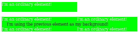
- an element that is not rendered, but which provides a paint source
-
The function represents an image with the natural dimensions and appearance of the paint source.
The host language defines the size and appearance of paint sources.
For example, the element() function can reference an SVG
<pattern>element in an HTML document:<!DOCTYPE html> < svg > < defs > < pattern id = 'pattern1' > < path d = '...' > </ pattern > </ defs > </ svg > < p style = "background: element(#pattern1)" > I'm using the pattern as a background! If the pattern is changed or animated, my background will be updated too!</ p > HTML also defines that a handful of elements, such as
canvas,img, andvideo, provide a paint source. This means that CSS can, for example, reference a canvas that’s being drawn into, but not displayed in the page:<!DOCTYPE html> < script > var canvas= document. querySelector( '#animated-bullet' ); canvas. width= 20 ; canvas. height= 20 ; drawAnimation( canvas); </ script > < canvas id = 'animated-bullet' style = 'display:none' ></ canvas > < ul style = "list-style-image: element(#animated-bullet);" > < li > I'm using the canvas as a bullet!</ li > < li > So am I!</ li > < li > As the canvas is changed over time with Javascript, we'll all update our bullet image with it!</ li > </ ul > - anything else
-
The function represents an invalid image.
For example, all of the following element() uses will result in a transparent background:
<!DOCTYPE html> < p id = 'one' style = "display:none; position: relative;" > one</ p > < iframe src = "http://example.com" > < p id = 'two' style = "position: relative;" > I'm fallback content!</ p > </ iframe > < ul > < li style = "background: element(#one);" > A display:none element isn't rendered, and a P element doesn't provide a paint source.</ li > < li style = "background: element(#two);" > The descendants of a replaced element like an IFRAME can't be used in element() either.</ li > < li style = "background: element(#three);" > There's no element with an id of "three", so this also gets rendered as a transparent image.</ li > </ ul >
An element is not rendered if it does not have an associated box.
This can happen, for example,
if the element or an ancestor is display:none.
Host languages may define additional ways in which an element can be considered not rendered;
for example, in SVG,
any descendant of a <defs> element is considered to be not rendered.
The element() function can be put to many uses. For example, it can be used to show a preview of the previous or next slide in a slideshow:
<!DOCTYPE html> < script > function navigateSlides() { var currentSlide= ...; document. querySelector( '#prev-slide' ). id= '' ; document. querySelector( '#next-slide' ). id= '' ; currentSlide. previousElementSibling. id= 'prev-slide' ; currentSlide. nextElementSibling. id= 'next-slide' ; } </ script > < style > . slide { /* Need to be a stacking context to be element()-able. */ position : relative ; } # prev-preview , # next-preview { position : fixed ; ...} # prev-preview { background : element ( #prev -slide ); } # next-preview { background : element ( #next -slide ); } </ style > < a id = 'prev-preview' > Previous Slide</ a > < a id = 'next-preview' > Next Slide</ a > < section class = 'slide' > ...</ section > < section class = 'slide current-slide' > ...</ section > ...
In this example, the navigateSlides function updates the ids of the next and previous slides,
which are then displayed in small floating boxes alongside the slides.
Since you can’t interact with the slides through the element() function (it’s just an image),
you could even use click handlers on the preview boxes to help navigate through the page.
2.7.1. Paint Sources
Host languages may define that some elements provide a paint source. Paint sources have an intrinsic appearance and can obtain a concrete object size without having to do layout or rendering, and so may be used as images even when they’re not rendered.
In HTML, the img, video, and canvas elements provide paint sources.
In SVG, any element that provides a paint server provides a paint source.
Note: In SVG1.1,
the <linearGradient>,
<radialGradient>,
and <pattern> elements
provide paint sources.
They are drawn as described in the spec,
with the coordinate systems defined as follows:
- objectBoundingBox
- The coordinate system has its origin at the top left corner of the rectangle defined by the concrete object size that it’s being drawn into, and the same width and height as the concrete object size. A single user coordinate is the width and height of the concrete object size.
- userSpaceOnUse
- The coordinate system has its origin at the top left corner of the rectangle defined by the concrete object size that it’s being drawn into, and the same width and height as the concrete object size. User coordinates are sized equivalently to the CSS px unit.
Note: It is expected that a future version of this module will define ways to refer to paint sources in external documents, or ones that are created solely by script and never inserted into a document at all.
2.7.2.
Using Out-Of-Document Sources: the ElementSources interface
The element() function normally selects elements within a document,
but elements that provide a paint source don’t necessarily need to be in-document.
For example, an HTML canvas element can be created, maintained, and drawn into entirely in script,
with no need for it to be inserted into the document directly.
All that’s needed is a way to refer to the element, as an ID selector cannot select elements outside of the document. The elementSources Map object provides this.
partial namespace CSS { [SameObject ]readonly attribute any ; };elementSources
Any entries in the elementSources map with a string key and a value that is an object providing a paint source are made available to the element() function.
Whenever element() uses an <id-selector>,
the ID’s value (without the leading # character)
is first looked up in the elementSources map:
- If it’s found, and the object associated with it provides a paint source, the element() function represents that paint source.
- If it’s found, but the object associated with it doesn’t provide a paint source, the element() function represent an invalid image.
- If the ID isn’t found in the map at all, it’s then looked for in the document as normal.
This reuse of the ID selector matches Moz behavior. I’m trying to avoid slapping a <custom-ident> right in the beginning of the grammar, as that eats too much syntax-space. Another possibility, though, is to start the value with a language-defined keyword followed by a <custom-ident>, like element(external fancy) or something. Naming suggestions welcome.
< script > var bg= document. createElement( 'canvas' ); bg. height= 200 ; bg. width= 1000 ; drawFancyBackground( bg); CSS. elementSources. set( 'fancy' , bg); </ script > < style > h1 { background-image : element ( #fancy ); } </ style >
As the "fancy" canvas is drawn into and animated, the backgrounds of all the H1 elements will automatically update in tandem.
Note that the elementSources map is consulted before the document to match the ID selector, so even if there’s an element in the document that would match #fancy, the backgrounds will still predictably come from the elementSources value instead.
2.7.3. Cycle Detection
The element() function can produce nonsensical circular relationships, such as an element using itself as its own background. These relationships can be easily and reliably detected and resolved, however, by keeping track of a dependency graph and using common cycle-detection algorithms.
The dependency graph consists of edges such that:
- every element depends on its children
- for any element A with a property using the element() function pointing to an element B, A depends on B
-
if a host language defines a way for elements to refer to the rendering of other elements,
the referencing element depends on the referenced element.
For example, in SVG,
a
<use>element depends on the element it referenced.
If the graph contains a cycle, any element() functions participating in the cycle are invalid images.
3. Gradients
A gradient is an image that smoothly fades from one color to another. These are commonly used for subtle shading in background images, buttons, and many other things. The gradient functions described in this section allow an author to specify such an image in a terse syntax, so that the UA can generate the image automatically when rendering the page. The syntax of a <gradient> is:
<gradient> =[ <linear-gradient () > | <repeating-linear-gradient () > | <radial-gradient () > | <repeating-radial-gradient () > | <conic-gradient () > | <repeating-conic-gradient () >]
As with the other <image> types defined in this specification, gradients can be used in any property that accepts images. For example:
background : linear-gradient ( white, gray); list-style-image : radial-gradient ( circle, #006, #00a90 % , #0000af100 % , white100 % )
A gradient is drawn into a box with the dimensions of the concrete object size, referred to as the gradient box. However, the gradient itself has no natural dimensions.
Gradients are specified by defining the starting point and ending point of a gradient line (which, depending on the type of gradient, may be technically a line, or a ray, or a spiral), and then specifying colors at points along this line. The colors are smoothly blended to fill in the rest of the line, and then each type of gradient defines how to use the color of the gradient line to produce the actual gradient.
3.1. Linear Gradients: the linear-gradient() notation
This level adds a <color-interpolation-method> argument to linear-gradient() and repeating-linear-gradient(), indicating the color space and path to use when interpolating colors on the gradient line. See CSS Color 4 § 13. Color Interpolation.
<linear-gradient-syntax> =[ [ <angle> | <zero> | to <side-or-corner>] || <color-interpolation-method>] ?, <color-stop-list> <side-or-corner> =[ left | right] ||[ top | bottom]
Tests
- color-stop-currentcolor.html (live test) (source)
- gradient-border-box.html (live test) (source)
- gradient-button.html (live test) (source)
- gradient-content-box.html (live test) (source)
- linear-gradient-1.html (live test) (source)
- linear-gradient-2.html (live test) (source)
- linear-gradient-body-sibling-index.html (live test) (source)
- linear-gradient-calc-em-units.html (live test) (source)
- linear-gradient-non-square.html (live test) (source)
- linear-gradient-sibling-index.html (live test) (source)
- multiple-position-color-stop-linear-2.html (live test) (source)
- multiple-position-color-stop-linear.html (live test) (source)
- normalization-linear-2.html (live test) (source)
- normalization-linear-degenerate.html (live test) (source)
- normalization-linear.html (live test) (source)
- tiled-gradients.html (live test) (source)
- color-stops-parsing.html (live test) (source)
- display-p3-linear-gradient.html (live test) (source)
- linear-gradient-relative-currentcolor-stop.html (live test) (source)
- gradient-single-stop-001.html (live test) (source)
- gradient-single-stop-002.html (live test) (source)
- gradient-single-stop-003.html (live test) (source)
- gradient-single-stop-004.html (live test) (source)
- gradient-single-stop-005.html (live test) (source)
- gradient-single-stop-006.html (live test) (source)
- gradient-single-stop-007.html (live test) (source)
- gradient-single-stop-008.html (live test) (source)
- gradient-single-stop-longer-hue-hsl-002.html (live test) (source)
- gradient-single-stop-longer-hue-hsl.html (live test) (source)
- gradient-single-stop-longer-hue-oklch.html (live test) (source)
- gradient-single-stop-none-interpolation.html (live test) (source)
- gradient-interpolation-method-computed.html (live test) (source)
- gradient-interpolation-method-invalid.html (live test) (source)
- gradient-interpolation-method-valid.html (live test) (source)
- gradient-position-invalid.html (live test) (source)
- gradient-position-valid.html (live test) (source)
- gradient-position-computed.html (live test) (source)
3.1.1. Effects of color space on interpolation: examples
This section is non-normative.
The effect of colorspace on interpolation can be significant.
linear-gradient ( in lab to right, #F01, #081) linear-gradient ( in srgb to right, #F01, #081) linear-gradient ( in Oklab to right, #F01, #081)
linear-gradient ( in lab to right, white, #01E) linear-gradient ( in srgb to right, white, #01E) linear-gradient ( in Oklab to right, white, #01E)
linear-gradient ( in lab to right, #44C, #795) linear-gradient ( in srgb to right, #44C, #795) linear-gradient ( in Oklab to right, #44C, #795)
Choosing a polar, rather than rectangular, colorspace for gradient interpolation avoids desaturation if the hues of the color stops are far apart. Interpolating in a polar colorspaces is inherently chroma-preserving, although it is easy for the intermediate colors to fall out of gamut; they will then be gamut mapped to bring them back into gamut.
The rectangular spaces have a greyish midpoint, while the intermediate colors in the polar spaces follow a curved, chroma-preserving path.
linear-gradient ( in lch to right, #A37, #595) linear-gradient ( in lab to right, #A37, #595) linear-gradient ( in srgb to right, #A37, #595) linear-gradient ( in Oklab to right, #A37, #595) linear-gradient ( in oklch to right, #A37, #595)
3.2. Radial Gradients: the radial-gradient() notation
3.2.1. Adding <color-interpolation-method>
This level adds a <color-interpolation-method> argument to radial-gradient() and repeating-radial-gradient(), indicating the color space and path to use when interpolating colors on the gradient line. See CSS Color 4 § 13. Color Interpolation.
<radial-gradient-syntax> =[ [ [ <radial-shape> || <radial-size>] ?[ at <position>] ?] || <color-interpolation-method>] ?, <color-stop-list>
Tests
- empty-radial-gradient-crash.html (live test) (source)
- infinite-radial-gradient-refcrash.html (live test) (source)
- multiple-position-color-stop-radial-2.html (live test) (source)
- multiple-position-color-stop-radial.html (live test) (source)
- normalization-radial-2.html (live test) (source)
- normalization-radial-3.html (live test) (source)
- normalization-radial-4.html (live test) (source)
- normalization-radial-degenerate.html (live test) (source)
- normalization-radial.html (live test) (source)
- radial-gradient-container-relative-units-001.html (live test) (source)
- radial-gradient-container-relative-units-002.html (live test) (source)
- radial-gradient-container-relative-units-003.html (live test) (source)
- radial-gradient-container-relative-units-004.html (live test) (source)
- radial-gradient-transition-hint-crash.html (live test) (source)
- tiled-radial-gradients.html (live test) (source)
- color-stops-parsing.html (live test) (source)
- gradient-interpolation-method-computed.html (live test) (source)
- gradient-interpolation-method-invalid.html (live test) (source)
- gradient-interpolation-method-valid.html (live test) (source)
- gradient-position-invalid.html (live test) (source)
- gradient-position-valid.html (live test) (source)
radial-gradient ( in lab farthest-side at left bottom, color ( display-p30.918 0.2 0.161 ), #081) radial-gradient ( in srgb farthest-side at left bottom, color ( display-p30.918 0.2 0.161 ), #081) radial-gradient ( in Oklab farthest-side at left bottom, color ( display-p30.918 0.2 0.161 ), #081)

3.2.2. Expanding <radial-size>
This level extends the <radial-size> options to include the additions from the circle() and ellipse() <basic-shape> values:
<radial-size> = <radial-extent>{ 1 , 2 } | <length-percentage[ 0 , ∞] >{ 1 , 2 }
Two-component values remain invalid when specifying circle as the <radial-shape>, and otherwise indicate the horizontal (first) and vertical (second) radii of the ellipse.
For circle,
a <percentage> value is resolved against
the “scaled diagonal” of the gradient box’s width and height:
3.3. Conic Gradients: the conic-gradient() notation
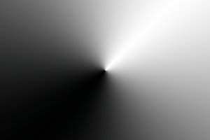
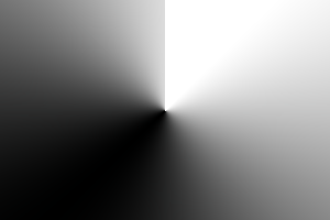
A conic gradient starts by specifying the center of a circle, similar to radial gradients, except that conic gradient color-stops are placed around the circumference of the circle, rather than on a line emerging from the center, causing the color to smoothly transition as you spin around the center, rather than as you progress outward from the center.
A conic gradient is specified by indicating a rotation angle, the center of the gradient, and then specifying a list of color-stops. Unlike linear and radial gradients, whose color-stops are placed by specifying a <length>, the color-stops of a conic gradient are specified with an <angle>. Rays are then drawn emerging from the center and pointing in all directions, with the color of each ray equal to the color of the gradient-line where they intersect it.
Note: These gradients are called "conic" or "conical" because, if the color stops are chosen to be significantly lighter on one side than the other, it produces a pattern that looks like a cone observed from above. They are also known as "angle" gradients in some contexts, since they are produced by varying the rotation angle of a ray.
![[An image showing a box with a background shading gradually clockwise from white to black, starting from the top. A gradient circle is shown, and the colors at 0 and 216 degrees respectively.]](images/conic-diagram.png)
3.3.1. conic-gradient() Syntax
The syntax for a conic gradient is:
conic-gradient () =conic-gradient ( [ <conic-gradient-syntax>] ) <conic-gradient-syntax> =[ [ [ from[ <angle> | <zero>] ] ?[ at <position>] ?] || <color-interpolation-method>] ?, <angular-color-stop-list>
The arguments are defined as follows:
- <angle> | <zero>
- The entire gradient is rotated by this angle. If omitted, defaults to 0deg. The unit identifier may be omitted if the <angle> is zero.
- <position>
- Determines the gradient center of the gradient. The <position> value type (which is also used for background-position) is defined in [CSS-VALUES-3], and is resolved using the center-point as the object area and the gradient box as the positioning area. If this argument is omitted, it defaults to center.
Usually in conic gradients the sharp transition at 0deg is undesirable, which is typically avoided by making sure the first and last color stops are the same color. Perhaps it would be useful to have a keyword for automatically achieving this.
Would a radius (inner & outer) for clipping the gradient be useful? If so, we could also support lengths in color stop positions, since we now have a specific radius.
Are elliptical conic gradients useful? Do graphics libraries support them?
Tests
- conic-gradient-001.html (live test) (source)
- conic-gradient-angle-negative.html (live test) (source)
- conic-gradient-angle.html (live test) (source)
- conic-gradient-center.html (live test) (source)
- repeating-conic-gradient.html (live test) (source)
- tiled-conic-gradients.html (live test) (source)
- multiple-position-color-stop-conic-2.html (live test) (source)
- multiple-position-color-stop-conic.html (live test) (source)
- normalization-conic-2.html (live test) (source)
- normalization-conic-degenerate.html (live test) (source)
- normalization-conic.html (live test) (source)
- out-of-range-color-stop-conic.html (live test) (source)
- tiled-conic-gradients.html (live test) (source)
- color-stops-parsing.html (live test) (source)
- gradient-interpolation-method-computed.html (live test) (source)
- gradient-interpolation-method-invalid.html (live test) (source)
- gradient-interpolation-method-valid.html (live test) (source)
- gradient-position-invalid.html (live test) (source)
- gradient-position-valid.html (live test) (source)
3.3.2. Placing Color Stops
Color stops are placed on a gradient line that curves around the gradient center in a circle, with both the 0% and 100% locations at 0deg. Just like linear gradients, 0deg points to the top of the page, and increasing angles correspond to clockwise movement around the circle.
Note: It may be more helpful to think of the gradient line as forming a spiral, where only the segment from 0deg to 360deg is rendered. This avoids any confusion about "overlap" when you have angles outside of the rendered region.
A color-stop can be placed at a location before 0% or after 100%; though these regions are never directly consulted for rendering, color stops placed there can affect the color of color-stops within the rendered region through interpolation or repetition (see repeating gradients). For example, conic-gradient(red -50%, yellow 150%) produces a conic gradient that starts with a reddish-orange color at 0deg (specifically, #f50), and transitions to an orangish-yellow color at 360deg (specifically, #fa0).
The color of the gradient at any point is determined by first finding the unique ray anchored at the center of the gradient that passes through the given point. The point’s color is then the color of the gradient line at the location where this ray intersects it.
3.3.3. Conic Gradient Examples
All of the following conic-gradient() examples are presumed to be applied to a box that is 300px wide and 200px tall, unless otherwise specified.
background : conic-gradient ( #f06, gold); background : conic-gradient ( at50 % 50 % , #f06, gold); background : conic-gradient ( from0 deg , #f06, gold); background : conic-gradient ( from0 deg at center, #f06, gold); background : conic-gradient ( #f060 % , gold100 % ); background : conic-gradient ( #f060 deg , gold1 turn );
background : conic-gradient ( white-50 % , black150 % ); background : conic-gradient ( white-180 deg , black540 deg ); background : conic-gradient ( hsl ( 0 , 0 % , 75 % ), hsl ( 0 , 0 % , 25 % ));
background : conic-gradient ( from45 deg , white, black, white); background : conic-gradient ( hsl ( 0 , 0 % , 75 % ), white45 deg , black225 deg , hsl ( 0 , 0 % , 75 % ));
Note that offsetting every color stop by the rotation angle instead would not work and produces an entirely different gradient:
background : conic-gradient ( white45 deg , black225 deg , white405 deg );
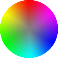
background : radial-gradient ( closest-side, gray, transparent), conic-gradient ( red, magenta, blue, aqua, lime, yellow, red); border-radius : 50 % ; width : 200 px ; height : 200 px ;
You can also achieve the same effect using "longer" hue interpolation. This is more concise and makes it easy to switch to other color spaces.
background : radial-gradient ( closest-side, gray, transparent), conic-gradient ( in hsl longer hue, red0 100 % ); transform : scaleX ( -1 ); border-radius : 50 % ; width : 200 px ; height : 200 px ;
background : conic-gradient ( yellowgreen40 % , gold0 deg 75 % , #f060 deg ); border-radius : 50 % ; width : 200 px ; height : 200 px ;

3.4. Repeating Gradients: the repeating-linear-gradient(), repeating-radial-gradient(), and repeating-conic-gradient() notations
In addition to linear-gradient(), radial-gradient(), and conic-gradient(), this specification defines repeating-linear-gradient(), repeating-radial-gradient(), and repeating-conic-gradient() values. These notations take the same values and are interpreted the same as their respective non-repeating siblings defined previously.
<repeating-conic-gradient () > =repeating-conic-gradient ( [ <conic-gradient-syntax>] ) <repeating-linear-gradient () > =repeating-linear-gradient ( [ <linear-gradient-syntax>] ) <repeating-radial-gradient () > =repeating-radial-gradient ( [ <radial-gradient-syntax>] )
Tests
background : repeating-conic-gradient ( hsla ( 0 , 0 % , 100 % , .2 ) 0 deg 15 deg , hsla ( 0 , 0 % , 100 % , 0 ) 0 deg 30 deg ) #0ac;

background : repeating-conic-gradient ( black0 deg 25 % , white0 deg 50 % ); background-size : 60 px 60 px ;
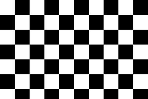
The same checkerboard can be created via non-repeating conic gradients:
background : conic-gradient ( black25 % , white0 deg 50 % , black0 deg 75 % , white0 deg ); background-size : 60 px 60 px ;
3.5. Defining Gradient Color
The colors in gradients are specified using color stops (a <color> and a corresponding position on the gradient line) and color transition hints (a position between two color stops representing the halfway point in the color transition) which are placed on the gradient line, defining the color at every point of the line. (Each gradient function defines the shape and length of the gradient line, along with its starting point and ending point; see above.)
Colors throughout the gradient field are then determined by tying them to specific points along the gradient line as specified by the gradient function. UAs may “dither” gradient colors slightly (randomly alternate individual pixels with nearby colors on the gradient line) to effect a smoother gradient.
3.5.1. Color Stop Lists
Color stops and transition hints are specified in a color stop list, which is a list of one or more color stops interleaved with optional transition hints:
<color-stop-list> = <linear-color-stop>, [ <linear-color-hint>?, <linear-color-stop>] #? <linear-color-stop> = <color> <color-stop-length>? <linear-color-hint> = <length-percentage> <color-stop-length> = <length-percentage>{ 1 , 2 } <angular-color-stop-list> = <angular-color-stop>, [ <angular-color-hint>?, <angular-color-stop>] #? <angular-color-stop> = <color> <color-stop-angle>? <angular-color-hint> = <angle-percentage> | <zero> <color-stop-angle> =[ <angle-percentage> | <zero>] { 1 , 2 } <color-stop> = <color-stop-length> | <color-stop-angle>
Tests
- color-stops-parsing.html (live test) (source)
- gradient-single-stop-001.html (live test) (source)
- gradient-single-stop-002.html (live test) (source)
- gradient-single-stop-003.html (live test) (source)
- gradient-single-stop-004.html (live test) (source)
- gradient-single-stop-005.html (live test) (source)
- gradient-single-stop-006.html (live test) (source)
- gradient-single-stop-007.html (live test) (source)
- gradient-single-stop-008.html (live test) (source)
- gradient-single-stop-longer-hue-hsl-002.html (live test) (source)
- gradient-single-stop-longer-hue-hsl.html (live test) (source)
- gradient-single-stop-longer-hue-oklch.html (live test) (source)
- gradient-single-stop-none-interpolation.html (live test) (source)
Visualized with a railroad diagram, both of them follow this pattern:
A color stop with two positions is equivalent to specifying two color stops with the same color, one for each position.
Note: Usually, this results in a solid-color "stripe" between the two positions, but using a longer <color-interpolation-method> will instead create a "rainbow" between the two positions.
Percentages are resolved against the length of the gradient line between the starting point and ending point, with 0% being at the starting point and 100% being at the ending point. Lengths are measured along the gradient line from the starting point in the direction of the ending point.
Color stop and transition hint positions are usually placed between the starting point and ending point, but that’s not required: the gradient line extends infinitely in both directions, and positions can be specified anywhere on the gradient line.
When the position of a color stop is omitted, it is automatically assigned a position. The first or last color stop in the color stop list is assigned the gradient line’s starting point or ending point (respectively). Otherwise, it’s assigned the position halfway between the two surrounding stops. If multiple stops in a row lack a position, they space themselves out equally between the surrounding positioned stops. See § 3.5.3 Color Stop “Fixup” for details.
3.5.2. Coloring the Gradient Line
At each color stop position, the gradient line is the color of the color stop. Before the first color stop, the gradient line is the color of the first color stop, and after the last color stop, the gradient line is the color of the last color stop. Between each pair of color stops, the gradient line’s color is interpolated between the colors of the two color stops, with the interpolation taking place in the specified color space, with missing components handled as defined in CSS Color 4 § 13.2 Interpolating with Missing Components, hue interpolation as defined in CSS Color 4 § 13.4 Hue Interpolation, and using premultiplied alpha, as defined in CSS Color 4 § 13.3 Interpolating with Alpha. If no <color-interpolation-method> is specified in the gradient function, the color space used for gradient interpolation is the default interpolation color space, Oklab, as defined in [css-color-4].
Note: The <color-interpolation-method> only affects the colors between stops. The color before the first and after the last stop is equal to the first/last stop, regardless of the interpolation method.
Tests
- gradients-with-transparent.html (live test) (source)
- gradient-analogous-missing-components-001.html (live test) (source)
- gradient-analogous-missing-components-002.html (live test) (source)
- gradient-analogous-missing-components-003.html (live test) (source)
- gradient-analogous-missing-components-004.html (live test) (source)
- css-color-4-colors-default-to-oklab-gradient.html (live test) (source)
- gradient-decreasing-hue-hsl.html (live test) (source)
- gradient-decreasing-hue-lch.html (live test) (source)
- gradient-eval-predefined-color-spaces.html (live test) (source)
- gradient-eval-001.html (live test) (source)
- gradient-eval-002.html (live test) (source)
- gradient-eval-003.html (live test) (source)
- gradient-eval-004.html (live test) (source)
- gradient-eval-005.html (live test) (source)
- gradient-eval-006.html (live test) (source)
- gradient-eval-007.html (live test) (source)
- gradient-eval-008.html (live test) (source)
- gradient-eval-009.html (live test) (source)
- gradient-eval-010.html (visual test) (source)
- gradient-none-interpolation.html (live test) (source)
- gradient-to-transparent.html (live test) (source)
- legacy-color-gradient.html (live test) (source)
- oklab-gradient.html (live test) (source)
- srgb-gradient.html (live test) (source)
- srgb-linear-gradient.html (live test) (source)
- xyz-gradient.html (live test) (source)
- color-scheme-dependent-color-stops.html (live test) (source)
- gradient-hue-direction.html (live test) (source)
- gradient-increasing-hue-hsl.html (live test) (source)
- gradient-increasing-hue-lch.html (live test) (source)
- gradient-infinity-001.html (live test) (source)
- gradient-infinity-002.html (live test) (source)
- gradient-infinity-003.html (live test) (source)
- gradient-longer-hue-hsl-001.html (live test) (source)
- gradient-longer-hue-hsl-002.html (live test) (source)
- gradient-longer-hue-hsl-003.html (live test) (source)
- gradient-longer-hue-hsl-004.html (live test) (source)
- gradient-longer-hue-hsl-005.html (live test) (source)
- gradient-longer-hue-hsl-006.html (live test) (source)
- gradient-longer-hue-hsl-007.html (live test) (source)
- gradient-longer-hue-hsl-008.html (live test) (source)
- gradient-longer-hue-hsl-009.html (live test) (source)
- gradient-longer-hue-hsl-010.html (live test) (source)
- gradient-longer-hue-hsl-011.html (live test) (source)
- gradient-longer-hue-hsl-012.html (live test) (source)
- gradient-longer-hue-hsl-013.html (live test) (source)
- gradient-longer-hue-lch-001.html (live test) (source)
- gradient-longer-hue-lch-002.html (live test) (source)
- gradient-longer-hue-lch-003.html (live test) (source)
- gradient-longer-hue-lch-004.html (live test) (source)
- gradient-longer-hue-lch-005.html (live test) (source)
- gradient-longer-hue-lch-006.html (live test) (source)
- gradient-longer-hue-lch-007.html (live test) (source)
- gradient-longer-hue-lch-008.html (live test) (source)
- gradient-longer-hue-lch-009.html (live test) (source)
- gradient-longer-hue-lch-010.html (live test) (source)
- gradient-longer-hue-lch-011.html (live test) (source)
- gradient-longer-hue-lch-012.html (live test) (source)
- gradient-powerless-hue-hsl.html (live test) (source)
- gradient-powerless-hue-hwb.html (live test) (source)
- gradient-powerless-hue-lch.html (live test) (source)
- gradient-powerless-hue-oklch.html (live test) (source)
linear-gradient ( in oklch, red, #888, green)
the conversion of the neutral #888 to oklch gives a missing hue component: oklch(0.6268 0 none)
and thus, in the first gradient segment, the hue is taken from red, which is oklch(0.628 0.2577 29.234); while in the second segment it is taken from green, which is oklch(0.5198 0.1769 142.5)
By default, this interpolation is linear—at 25%, 50%, or 75% of the distance between two color stops, the color is a 25%, 50%, or 75% blend of the colors of the two stops.
However, if a transition hint was provided between two color stops, the interpolation is non-linear, and controlled by the hint:
- Determine the location of the transition hint as a percentage of the distance between the two color stops, denoted as a number between 0 and 1, where 0 indicates the hint is placed right on the first color stop, and 1 indicates the hint is placed right on the second color stop. Let this percentage be H.
- For any given point between the two color stops, determine the point’s location as a percentage of the distance between the two color stops, in the same way as the previous step. Let this percentage be P.
-
Let C, the color weighting at that point,
be equal to
P log H ( .5 ) -
The color at that point is then a linear blend between the colors of the two color stops,
blending
( 1 - C)
Note: The transition hint specifies where the “halfway color”—the 50% blend between the colors of the two surrounding color stops—should be placed. When the hint is exactly halfway between the two surrounding color stops, the above interpolation algorithm happens to produce the ordinary linear interpolation. If the hint is placed anywhere else, it produces a smooth exponential curve between the surrounding color stops, with the “halfway color” occurring exactly where the hint specifies.
Top - Without transition hint (falling back to the default halfway transition hint):
background : linear-gradient ( to right, red0 % , blue100 % );
Bottom - With transition hint:
background : linear-gradient ( to right, red0 % , 25 % , blue100 % );
If multiple color stops have the same position, they produce an infinitesimal transition from the one specified first in the list to the one specified last. In effect, the color suddenly changes at that position rather than smoothly transitioning.
3.5.3. Color Stop “Fixup”
When resolving the used positions of each color stop, the following steps must be applied in order:
- If the first color stop does not have a position, set its position to 0%.
- If the last color stop does not have a position, set its position to 100%.
- If a color stop or transition hint has a position that is less than the specified position of any color stop or transition hint before it in the list, set its position to be equal to the largest specified position of any color stop or transition hint before it.
- If any color stop still does not have a position, then, for each run of adjacent color stops without positions, set their positions so that they are evenly spaced between the preceding and following color stops with positions.
After applying these rules, all color stops and transition hints will have a definite position and color and they will be in ascending order.
Tests
Note: It is recommended that authors exercise caution when mixing different types of units, such as px, em, or %, as this can cause a color stop to unintentionally try to move before an earlier one. For example, the rule background-image: linear-gradient(yellow 100px, blue 50%) wouldn’t trigger any fix-up while the background area is at least 200px tall. If it was 150px tall, however, the blue color stop’s position would be equivalent to 75px, which precedes the yellow color stop, and would be corrected to a position of 100px. Additionally, since the relative ordering of such color stops cannot be determined without performing layout, they will not interpolate smoothly in animations or transitions.
1 .linear-gradient ( red, white20 % , blue) =1 =>linear-gradient ( red0 % , white20 % , blue100 % ) 2 .linear-gradient ( red40 % , white, black, blue) =1 , 3 =>linear-gradient ( red40 % , white60 % , black80 % , blue100 % ) 3 .linear-gradient ( red-50 % , white, blue) =1 , 3 =>linear-gradient ( red-50 % , white25 % , blue100 % ) 4 .linear-gradient ( red-50 px , white, blue) =1 , 3 =>linear-gradient ( red-50 px , whitecalc ( -25 px +50 % ), blue100 % ) 5 .linear-gradient ( red20 px , white0 px , blue40 px ) =2 =>linear-gradient ( red20 px , white20 px , blue40 px ) 6 .linear-gradient ( red, white-50 % , black150 % , blue) =1 , 2 =>linear-gradient ( red0 % , white0 % , black150 % , blue150 % ) 7 .linear-gradient ( red80 px , white0 px , black, blue100 px ) =2 , 3 =>linear-gradient ( red80 px , white80 px , black90 px , blue100 px )
4. 1D Image Values: the <image-1D> type and stripes() notation
While <image> values represent a 2-dimensional (2D) image, and <color> can be thought of as a 0-dimensional (0D) image (unvarying in either axis), some contexts require a 1-dimensional (1D) image, which specifies colors along an abstract, directionless, single-axis paint line. The <image-1D> type represents such 1D images, including the stripes() functional notation:
<image-1D> = <stripes () > <stripes () > =stripes ( <color-stripe>#) <color-stripe> = <color> &&[ <length-percentage> | <flex>] ?
The stripes() function defines a 1D image as a comma-separated list of colored stripes, each placed end-to-end on the paint line in the order given.
Each <color-stripe> entry defines a solid-color stripe with the specified <color> and thickness. If the thickness is omitted, it defaults to 1fr. Thickness values are interpreted as follows:
- <percentage [0,100]>
- Percentage thicknesses are relative to the total width. Only values between 0% and 100% (inclusive) are valid.
- <length [0,∞]>
- Negative length values are invalid.
- <flex>
- A <flex> is evaluated as a fraction of the total width relative to the total sum of <flex> entries in the function, after subtracting the thickness of any non-<flex> entries (flooring the subtraction result at zero). If the sum of <flex> values is less than 1fr, the result of the subtraction is multiplied by the sum’s value before being distributed.
The total width refers to the length of the paint line. It is defined by the context in which the stripes() function is used. If the sum of the stripes is smaller than the total width, the paint line is transparent black for its remaining length, as if a final transparent argument were given. If the sum is larger, any stripes or portions beyond the total width are truncated.

On the other hand, stripes(red .1fr, green .2fr, blue 100px) with a total width of 400px will instead give a 30px red stripe and 60px green stripe, followed by 100px of blue and then 210px of transparent. The 300px of leftover space is multiplied by .3, the value of the sum of the <flex> values, to obtain only 90px, which is then distributed in the 1:2 ratio dictated by the <flex> values.

(This is similar to how flex layout deals with small <flex> sums on a line, and ensures smoothly continuous behavior as the <flex> values approach zero.)
The computed value of this function is an ordered list of stripes, each given as a computed color and a thickness represented either a <flex> value or a computed <length-percentage> value.
5. Sizing Images and Objects in CSS
5.1. Sizing Objects: the object-fit property
| Name: | object-fit |
|---|---|
| Value: | fill | none | [contain | cover] || scale-down |
| Initial: | fill |
| Applies to: | replaced elements |
| Inherited: | no |
| Percentages: | n/a |
| Computed value: | specified keyword(s) |
| Canonical order: | per grammar |
| Animation type: | discrete |
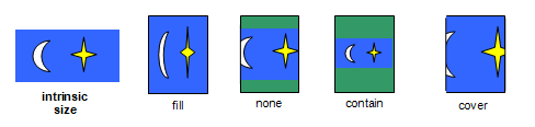
The object-fit property specifies how the contents of a replaced element should be fitted to the box established by its used height and width.
- fill
- The replaced content is sized to fill the element’s content box: the object’s concrete object size is the element’s used width and height.
- none
- The replaced content is not resized to fit inside the element’s content box: determine the object’s concrete object size using the default sizing algorithm with no specified size, and a default object size equal to the replaced element’s used width and height.
- contain
-
The replaced content is sized to maintain its aspect ratio
while fitting within the element’s content box:
its concrete object size is resolved as a contain constraint
against the element’s used width and height.
If the scale-down flag is used, size the content as if none or contain were specified, whichever would result in a smaller concrete object size.
Note: Both none and contain respect the content’s natural aspect ratio, so the concept of "smaller" is well-defined.
- cover
-
The replaced content is sized to maintain its aspect ratio
while filling the element’s entire content box:
its concrete object size is resolved as a cover constraint
against the element’s used width and height.
If the scale-down flag is used, size the content as if none or cover were specified, whichever would result in a smaller concrete object size.
Note: Both none and cover respect the content’s natural aspect ratio, so the concept of "smaller" is well-defined.
- scale-down
- Equivalent to contain scale-down.
Tests
- inheritance.html (live test) (source)
- object-fit-contain-png-001c.html (live test) (source)
- object-fit-contain-png-001e.html (live test) (source)
- object-fit-contain-png-001i.html (live test) (source)
- object-fit-contain-png-001o.html (live test) (source)
- object-fit-contain-png-001p.html (live test) (source)
- object-fit-contain-png-002c.html (live test) (source)
- object-fit-contain-png-002e.html (live test) (source)
- object-fit-contain-png-002i.html (live test) (source)
- object-fit-contain-png-002o.html (live test) (source)
- object-fit-contain-png-002p.html (live test) (source)
- object-fit-contain-svg-001e.html (live test) (source)
- object-fit-contain-svg-001i.html (live test) (source)
- object-fit-contain-svg-001o.html (live test) (source)
- object-fit-contain-svg-001p.html (live test) (source)
- object-fit-contain-svg-002e.html (live test) (source)
- object-fit-contain-svg-002i.html (live test) (source)
- object-fit-contain-svg-002o.html (live test) (source)
- object-fit-contain-svg-002p.html (live test) (source)
- object-fit-contain-svg-003e.html (live test) (source)
- object-fit-contain-svg-003i.html (live test) (source)
- object-fit-contain-svg-003o.html (live test) (source)
- object-fit-contain-svg-003p.html (live test) (source)
- object-fit-contain-svg-004e.html (live test) (source)
- object-fit-contain-svg-004i.html (live test) (source)
- object-fit-contain-svg-004o.html (live test) (source)
- object-fit-contain-svg-004p.html (live test) (source)
- object-fit-contain-svg-005e.html (live test) (source)
- object-fit-contain-svg-005i.html (live test) (source)
- object-fit-contain-svg-005o.html (live test) (source)
- object-fit-contain-svg-005p.html (live test) (source)
- object-fit-contain-svg-006e.html (live test) (source)
- object-fit-contain-svg-006i.html (live test) (source)
- object-fit-contain-svg-006o.html (live test) (source)
- object-fit-contain-svg-006p.html (live test) (source)
- object-fit-cover-png-001c.html (live test) (source)
- object-fit-cover-png-001e.html (live test) (source)
- object-fit-cover-png-001i.html (live test) (source)
- object-fit-cover-png-001o.html (live test) (source)
- object-fit-cover-png-001p.html (live test) (source)
- object-fit-cover-png-002c.html (live test) (source)
- object-fit-cover-png-002e.html (live test) (source)
- object-fit-cover-png-002i.html (live test) (source)
- object-fit-cover-png-002o.html (live test) (source)
- object-fit-cover-png-002p.html (live test) (source)
- object-fit-cover-svg-001e.html (live test) (source)
- object-fit-cover-svg-001i.html (live test) (source)
- object-fit-cover-svg-001o.html (live test) (source)
- object-fit-cover-svg-001p.html (live test) (source)
- object-fit-cover-svg-002e.html (live test) (source)
- object-fit-cover-svg-002i.html (live test) (source)
- object-fit-cover-svg-002o.html (live test) (source)
- object-fit-cover-svg-002p.html (live test) (source)
- object-fit-cover-svg-003e.html (live test) (source)
- object-fit-cover-svg-003i.html (live test) (source)
- object-fit-cover-svg-003o.html (live test) (source)
- object-fit-cover-svg-003p.html (live test) (source)
- object-fit-cover-svg-004e.html (live test) (source)
- object-fit-cover-svg-004i.html (live test) (source)
- object-fit-cover-svg-004o.html (live test) (source)
- object-fit-cover-svg-004p.html (live test) (source)
- object-fit-cover-svg-005e.html (live test) (source)
- object-fit-cover-svg-005i.html (live test) (source)
- object-fit-cover-svg-005o.html (live test) (source)
- object-fit-cover-svg-005p.html (live test) (source)
- object-fit-cover-svg-006e.html (live test) (source)
- object-fit-cover-svg-006i.html (live test) (source)
- object-fit-cover-svg-006o.html (live test) (source)
- object-fit-cover-svg-006p.html (live test) (source)
- object-fit-dyn-aspect-ratio-001.html (live test) (source)
- object-fit-dyn-aspect-ratio-002.html (live test) (source)
- object-fit-fill-png-001c.html (live test) (source)
- object-fit-fill-png-001e.html (live test) (source)
- object-fit-fill-png-001i.html (live test) (source)
- object-fit-fill-png-001o.html (live test) (source)
- object-fit-fill-png-001p.html (live test) (source)
- object-fit-fill-png-002c.html (live test) (source)
- object-fit-fill-png-002e.html (live test) (source)
- object-fit-fill-png-002i.html (live test) (source)
- object-fit-fill-png-002o.html (live test) (source)
- object-fit-fill-png-002p.html (live test) (source)
- object-fit-fill-svg-001e.html (live test) (source)
- object-fit-fill-svg-001i.html (live test) (source)
- object-fit-fill-svg-001o.html (live test) (source)
- object-fit-fill-svg-001p.html (live test) (source)
- object-fit-fill-svg-002e.html (live test) (source)
- object-fit-fill-svg-002i.html (live test) (source)
- object-fit-fill-svg-002o.html (live test) (source)
- object-fit-fill-svg-002p.html (live test) (source)
- object-fit-fill-svg-003e.html (live test) (source)
- object-fit-fill-svg-003i.html (live test) (source)
- object-fit-fill-svg-003o.html (live test) (source)
- object-fit-fill-svg-003p.html (live test) (source)
- object-fit-fill-svg-004e.html (live test) (source)
- object-fit-fill-svg-004i.html (live test) (source)
- object-fit-fill-svg-004o.html (live test) (source)
- object-fit-fill-svg-004p.html (live test) (source)
- object-fit-fill-svg-005e.html (live test) (source)
- object-fit-fill-svg-005i.html (live test) (source)
- object-fit-fill-svg-005o.html (live test) (source)
- object-fit-fill-svg-005p.html (live test) (source)
- object-fit-fill-svg-006e.html (live test) (source)
- object-fit-fill-svg-006i.html (live test) (source)
- object-fit-fill-svg-006o.html (live test) (source)
- object-fit-fill-svg-006p.html (live test) (source)
- object-fit-none-png-001c.html (live test) (source)
- object-fit-none-png-001e.html (live test) (source)
- object-fit-none-png-001i.html (live test) (source)
- object-fit-none-png-001o.html (live test) (source)
- object-fit-none-png-001p.html (live test) (source)
- object-fit-none-png-002c.html (live test) (source)
- object-fit-none-png-002e.html (live test) (source)
- object-fit-none-png-002i.html (live test) (source)
- object-fit-none-png-002o.html (live test) (source)
- object-fit-none-png-002p.html (live test) (source)
- object-fit-none-svg-001e.html (live test) (source)
- object-fit-none-svg-001i.html (live test) (source)
- object-fit-none-svg-001o.html (live test) (source)
- object-fit-none-svg-001p.html (live test) (source)
- object-fit-none-svg-002e.html (live test) (source)
- object-fit-none-svg-002i.html (live test) (source)
- object-fit-none-svg-002o.html (live test) (source)
- object-fit-none-svg-002p.html (live test) (source)
- object-fit-none-svg-003e.html (live test) (source)
- object-fit-none-svg-003i.html (live test) (source)
- object-fit-none-svg-003o.html (live test) (source)
- object-fit-none-svg-003p.html (live test) (source)
- object-fit-none-svg-004e.html (live test) (source)
- object-fit-none-svg-004i.html (live test) (source)
- object-fit-none-svg-004o.html (live test) (source)
- object-fit-none-svg-004p.html (live test) (source)
- object-fit-none-svg-005e.html (live test) (source)
- object-fit-none-svg-005i.html (live test) (source)
- object-fit-none-svg-005o.html (live test) (source)
- object-fit-none-svg-005p.html (live test) (source)
- object-fit-none-svg-006e.html (live test) (source)
- object-fit-none-svg-006i.html (live test) (source)
- object-fit-none-svg-006o.html (live test) (source)
- object-fit-none-svg-006p.html (live test) (source)
- object-fit-scale-down-png-001c.html (live test) (source)
- object-fit-scale-down-png-001e.html (live test) (source)
- object-fit-scale-down-png-001i.html (live test) (source)
- object-fit-scale-down-png-001o.html (live test) (source)
- object-fit-scale-down-png-001p.html (live test) (source)
- object-fit-scale-down-png-002c.html (live test) (source)
- object-fit-scale-down-png-002e.html (live test) (source)
- object-fit-scale-down-png-002i.html (live test) (source)
- object-fit-scale-down-png-002o.html (live test) (source)
- object-fit-scale-down-png-002p.html (live test) (source)
- object-fit-scale-down-svg-001e.html (live test) (source)
- object-fit-scale-down-svg-001i.html (live test) (source)
- object-fit-scale-down-svg-001o.html (live test) (source)
- object-fit-scale-down-svg-001p.html (live test) (source)
- object-fit-scale-down-svg-002e.html (live test) (source)
- object-fit-scale-down-svg-002i.html (live test) (source)
- object-fit-scale-down-svg-002o.html (live test) (source)
- object-fit-scale-down-svg-002p.html (live test) (source)
- object-fit-scale-down-svg-003e.html (live test) (source)
- object-fit-scale-down-svg-003i.html (live test) (source)
- object-fit-scale-down-svg-003o.html (live test) (source)
- object-fit-scale-down-svg-003p.html (live test) (source)
- object-fit-scale-down-svg-004e.html (live test) (source)
- object-fit-scale-down-svg-004i.html (live test) (source)
- object-fit-scale-down-svg-004o.html (live test) (source)
- object-fit-scale-down-svg-004p.html (live test) (source)
- object-fit-scale-down-svg-005e.html (live test) (source)
- object-fit-scale-down-svg-005i.html (live test) (source)
- object-fit-scale-down-svg-005o.html (live test) (source)
- object-fit-scale-down-svg-005p.html (live test) (source)
- object-fit-scale-down-svg-006e.html (live test) (source)
- object-fit-scale-down-svg-006i.html (live test) (source)
- object-fit-scale-down-svg-006o.html (live test) (source)
- object-fit-scale-down-svg-006p.html (live test) (source)
- object-fit-computed.html (live test) (source)
- object-fit-invalid.html (live test) (source)
- object-fit-valid.html (live test) (source)
If the content does not completely fill the replaced element’s content box, the unfilled space shows the replaced element’s background. Since replaced elements always clip their contents to the content box, the content will never overflow. See the object-position property for positioning the object with respect to the content box.
Note: The object-fit property has similar semantics to
the fit attribute in [SMIL10]
and the <meetOrSlice> parameter
on the preserveAspectRatio attribute in [SVG11].
Note: Per the object size negotiation algorithm,
the concrete object size
(or, in this case, the size of the content)
does not directly scale the object itself -
it is merely passed to the object as information about the size of the visible canvas.
How to then draw into that size is up to the image format.
In particular, raster images always scale to the given size,
while SVG uses the given size as the size of the "SVG Viewport"
(a term defined by SVG)
and then uses the values of several attributes on the root <svg> element to determine how to draw itself.
6. Image Processing
6.1. Overriding Image Resolutions: the image-resolution property
The image resolution is defined as the number of image pixels per unit length, e.g., pixels per inch. Some image formats can record information about the resolution of images. This information can be helpful when determining the actual size of the image in the formatting process. However, the information can also be wrong, in which case it should be ignored. By default, CSS assumes a resolution of one image pixel per CSS px unit; however, the image-resolution property allows using some other resolution.
| Name: | image-resolution |
|---|---|
| Value: | [ from-image || <resolution> ] && snap? |
| Initial: | 1dppx |
| Applies to: | all elements |
| Inherited: | yes |
| Percentages: | n/a |
| Computed value: | specified keyword(s) and/or <resolution> (possibly adjusted for snap, see below) |
| Canonical order: | per grammar |
| Animation type: | discrete |
The image-set() notation can alter the natural resolution of an image, which ideally would be automatically honored without having to set this property. How should we best address this? Change the initial value to auto, meaning "1dppx, unless CSS says otherwise"? Say that image-resolution has no effect on images whose resolution was set by something else in CSS? Or somehow wordsmithing image-set() in some way such that it always produces 1dppx images somehow?
The image-resolution property specifies the preferred resolution of all raster images used in or on the element. It affects both content images (e.g. replaced elements and generated content) and decorative images (such as background-image). The preferred resolution of an image is used to determine the image’s natural dimensions. Values have the following meanings:
- <resolution>
- Specifies the preferred resolution explicitly. A "dot" in this case corresponds to a single image pixel.
- from-image
-
The image’s preferred resolution is taken as that specified by the image format
(the natural resolution).
If the image does not specify its own resolution,
the explicitly specified resolution is used (if given),
else it defaults to 1dppx.
Note: CSS Images 3 § 2.1.2 Image Metadata imposes some restrictions on what metadata can be used.
- snap
- If the "snap" keyword is provided, the computed <resolution> (if any) is the specified resolution rounded to the nearest value that would map one image pixel to an integer number of device pixels. If the resolution is taken from the image, then the used natural resolution is the image’s native resolution similarly adjusted.
As vector formats such as SVG do not have a natural resolution, this property has no effect on vector images.
img.high-res{ image-resolution : 300 dpi ; }
With this set, an image meant to be 5 inches wide at 300dpi will actually display as 5in wide; without this set, the image would display as approximately 15.6in wide since the image is 15000 image pixels across, and by default CSS displays 96 image pixels per inch.
img{ image-resolution : from-image}
These rules both specify that the UA should use the image resolution found in the image itself, but if the image has no resolution, the resolution is set to 300dpi instead of the default 1dppx.
img{ image-resolution : from-image300 dpi } img{ image-resolution : 300 dpi from-image}
img{ image-resolution : 300 dpi }
This rule, on the other hand, if used when the screen’s resolution is 96dpi, would instead render the image at 288dpi (so that 3 image pixels map to 1 device pixel):
img{ image-resolution : 300 dpi snap; }
The snap keyword can also be used when the resolution is taken from the image:
img{ image-resolution : snap from-image; }
An image declaring itself as 300dpi will, in the situation above, display at 288dpi (3 image pixels per device pixel) whereas an image declaring 72dpi will render at 96dpi (1 image pixel per device pixel).
7. Interpolation
This section describes how to interpolate between new value types defined in this specification, for use with modules such as CSS Transitions and CSS Animations.
If an algorithm below simply states that two values should be "interpolated" or "transitioned" without further details, then the value should be interpolated as described by the Transitions spec. Otherwise, the algorithm may reference a variable t in its detailed description of the interpolation. This is a number which starts at 0% and goes to 100%, and is set to a value that represents the progress through the transition, based on the duration of the transition, the elapsed time, and the timing function in use. For example, with a linear timing function and a 1s duration, after .3s t is equal to 30%.
7.1. Interpolating <image>
All images can be interpolated, though some special types of images (like some gradients) have their own special interpolation rules. In general terms, images are interpolated by scaling them to the size of the start image and cross-fading the two while they transition to the size of the end image.
In specific terms,
at each point in the interpolation
the image is equal to
Special-case interpolating to/from no image, like "background-image: url(foo);" to "background-image: none;".
7.2. Interpolating cross-fade()
The three components of cross-fade() are interpolated independently. Note this may result in nested cross-fade() notations.
7.3. Interpolating <gradient>
This section needs review and improvement. In particular, I believe the handling of linear-gradient() is incomplete - I think we want to specifically interpolate the "length" of the gradient line (the distance between 0% and 100%) between the starting and ending positions explicitly, so it doesn’t grow and then shrink over a single animation.
Gradient images can be interpolated directly in CSS transitions and animations, smoothly animating from one gradient to another. There are only a few restrictions on what gradients are allowed to be interpolated:
-
Both the starting and ending gradient must be expressed with the same function. (For example, you can transition from a linear-gradient() to a linear-gradient(), but not from a linear-gradient() to a radial-gradient() or a repeating-linear-gradient().)
-
Both the starting and ending gradient must have the same number of <color-stop>s. For this purpose, all repeating gradients are considered to have infinite color stops, and thus all repeating gradients match in this respect.
-
Neither gradient uses a combination of <length> and <percentage> color stops.
If the two gradients satisfy all of those constraints, they must be interpolated as described below. If they fail the third one only, they must be abruptly transitioned at 50% (unless otherwise specified by a future specification). If they fail either of the first two constraints, they must be interpolated using cross-fade() as for generic images.
Note: The abrupt transition at 50% is so that content will not rely on cross-fading, and smarter interpolation rules can be added for this case in the future.
-
Convert both the start and end gradients to their explicit forms:
- For linear gradients:
-
-
If the direction is specified as an <angle>, it is already in its explicit form.
-
Otherwise, change its direction to an <angle> in [0deg,360deg) that would produce an equivalent rendering.
If both the start and end gradients had their direction specified with keywords, and the absolute difference between the angles their directions mapped to is greater than 180deg, add 360deg to the direction of the gradient with the smaller angle. This ensures that a transition from, for example, "to left" (270deg) to "to top" (0deg) rotates the gradient a quarter-turn clockwise, as expected, rather than rotating three-quarters of a turn counter-clockwise.
-
- For radial gradients:
-
-
If the size is specified as two <length>s or <percentage>s, it is already in its explicit form.
-
Otherwise, the size must be changed to a pair of <length>s that would produce an equivalent ending-shape. If the <radial-shape> was specified as circle, change it to ellipse.
-
-
Interpolate each component and color-stop of the gradients independently. For linear gradients, the only component is the angle. For radial gradients, the components are the horizontal and vertical position of the center and the horizontal and vertical axis lengths.
-
To interpolate a color-stop, first match each color-stop in the start gradient to the corresponding color-stop at the same index in the end gradient. For repeating gradients, the first specified color-stop in the start and end gradients are considered to be at the same index, and all other color-stops following and preceding are indexed appropriately, repeating and shifting each gradient’s list of color-stops as needed. Then, for each pair of color-stops, interpolate the position and color independently.
7.4. Interpolating stripes()
Similar to gradients, two stripes() can be interpolated, allowing for smooth animations from one image to another. There is only one restriction on what stripes() are allowed to be interpolated. Both the starting and ending image must have the same number of <color-stripe>s. If the two images satisfy this constraint, they must be interpolated as described below. If they fail the constraint, they must be interpolated using cross-fade() as for generic images.
-
Interpolate each component and stripe of the images independently.
-
To interpolate a stripe, first match each stripe in the start image to the corresponding stripe at the same index in the end image. Then, for each pair of stripes, interpolate the thickness and color independently. <flex> values are interpolated as <length-percentage>s using the following formula:
max ( 0 , 100 % - sum-of-percents - sum-of-fixed) * flex value /max ( 1 , sum-of-flexes) where sum-of-percents is the sum of all <percentage>s in the stripes() function, sum-of-fixed is the sum of all fixed <length>s in the function, and sum-of-flexes is the sum of all <flex> values.
8. Serialization
This section describes the serialization of all new properties and value types introduced in this specification, for the purpose of interfacing with the CSS Object Model [CSSOM].
To serialize any function defined in this module, serialize it per its individual grammar, in the order its grammar is written in, omitting components when possible without changing the meaning, joining space-separated tokens with a single space, and following each serialized comma with a single space.
For cross-fade(), always serialize the <percentage>.
Linear-Gradient ( to bottom, red0 % , yellow, black100 px )
must serialize as:
linear-gradient ( rgb ( 255 , 0 , 0 ), rgb ( 255 , 255 , 0 ), rgb ( 0 , 0 , 0 ) 100 px )
Appendix A: Deprecated Features and Aliases
Implementations must accept -webkit-image-set() as a parse-time alias of image-set(). (It’s a valid value, with identical arguments to image-set(), and is turned into image-set() during parsing.)
9. Privacy Considerations
Note: No change from [css-images-3].
10. Security Considerations
Note: No change from [css-images-3].
11. Changes
Changes Since the 30 September 2025 Working Draft
- (none)
Changes Since the 17 February 2023 Working Draft
-
Cleaned up the use of fetching external URLs for style resources (Issue 12065, Issue 12068, Issue 12086, Issue 12147)
-
Made cross-fade() accept 1+ arguments (Issue 11530)
-
Allowed <zero> for angular color stop/hint
-
Explicitly allowed <zero> for gradient rotation
-
Fixed note about double positions making a stripe. Added note about color before/after the stop lists. (Issue 11381)
-
Separated the first and last stop fixing into separate steps, so it’s clearer what happens with a single stop (Issue 10092)
-
Allow just one color stop (Issue 10092)
-
Made cross-fade() have same order as color-mix() (Issue 9405)
-
Added example images for the stripes() function (PR 9749)
-
Added <percentage> values to radial-gradient(circle), and dual <radial-extent> values to radial-gradient(ellipse) to make radial-gradient() consistent with the circle() and ellipse() <basic-shape>s. (Issue 824)
-
Added example of missing hues when interpolating with neutrals (Issue 4928)
-
Explicitly linked to CSS Color 4 hue interpolation, and handling of missing components (Issue 4928)
-
Allowed omitting resolution/type in image-set()
-
Applied fix from PR #8021 to gradient definitions in CSS Images 4 (Issue 9147)
-
Made explicit what the default interpolation color space is. (Issue 7947)
-
Fixed duplicate repeating gradient definitions (Issue 8797)
-
Added basic syntax of repeating gradient types (Issue 8775)
-
Fixed interpolation of stripes() with different types (Issue 8614)
-
Added url request modifiers to enable request parameters (PR 8222)
-
Specified that image-set() is an invalid image if you remove all the options. (Issue 8266)
Changes Since the 13 April 2017 Working Draft
-
Major editorial rewrite of § 3.5 Defining Gradient Color.
-
Added new <image-1D> data type and stripes() function. (Issue 2532)
-
Added <color-interpolation-method> to all gradient functions. (Issues 6094, 6667)
-
Added new object-view-box property. (Issue 7058)
-
Pulled definition of image-set() from [css-images-3] and:
-
Added type() to image-set(). (Issue 656)
-
Added the -webkit-image-set() compatibility alias. (Issue 6285)
-
-
Pulled definition of cross-fade() from [css-images-3] and:
-
Clarified that cross-fade() takes 1+ arguments.
-
Updated to allow mixing colors as well as images.
-
Defined sizing and painting of the new function arguments in detail.
-
Fixed incorrect definition of cross-fade() image blending.
-
Add issue about computation planned simplification and comparison. (Issue 2852)
-
-
Pulled interpolation and serialization of images from [css-images-3].
-
Defined that image metadata placed after the image data should be ignored, see CSS Images 3 § 2.1.2 Image Metadata. (Issue 4929)
-
Defined image loading. (Issue 1984)
-
Copied definition of loading image from [css-images-3].
-
Integrated loading and error handling into image() behavior.
-
Explicitly allow UA to render the old image while a new image loads in to replace another.
-
Properly defined § 2.3 Fetching External Images. (Issue 562, Pull Request 6715)
-
-
Allowed unitless zero to represent <angle> values in conic-gradient(). (Issue 1162, Changes)
-
Allowed scale-down to be combined with other values in object-fit. (Issue 1578)
-
Added missing <element()> to <image> data type. (issue 5170)
-
Fixed
elementSourcesIDL definition. -
Fixed grammar error requiring color stop positions to be mandatory. (Issue 1334)
-
Updated property definition tables to:
-
Align “Computed Value” and “Animation Type” lines across modules, tighten wording, and correct errors.
-
Use the new CSS bracketed range notation where appropriate.
-
Drop “Media” lines.
-
-
Renamed “intrinsic dimensions” to natural dimensions to avoid confusion with intrinsic sizes. (Issue 4961)
-
Copied over definition of computed <image> from [css-images-3]. (Issue 4042)
-
Explicitly allowed dithering in gradients. (Issue 4793)
-
Assorted markup fixes, corrections to property syntaxes, inline issues, spelling corrections, example fixes and improvements, and minor editorial refinements.
-
Shortened module title.
Changes Since the 11 September 2012 Working Draft
-
Added the two location syntax for gradient color stops
-
Added start angles to conic gradients
-
The position(s) of a color stop can now come before the color
-
Text that is identical to [css-images-3] has been replaced with a reference to [css-images-3].
-
Added the -webkit-image-set() alias.
Changes Since Level 3
-
Added the image() notation (deferred from Level 3)
-
Added the image-resolution property (deferred from Level 3)
-
Added the element() notation (deferred from Level 3)
-
Added conic gradients
-
Added <color-interpolation-method> to all gradient functions