1. Introduction
The properties of this module deal with the decoration of the border area. It also defines decorations that can be applied to the box.
1.1. Module Interactions
This specification extends the parts related to borders and box decorations of CSS Backgrounds and Borders Module Level 3 [CSS3BG].
It provides specifications for the added corner-*-shape and border-shape properties, as well as logical shorthands for border-*-radius, box-shadow-* longhands, and partial borders via the border-limit and border-*-clip properties.
All properties in this module apply to the ::first-letter pseudo-element. The border-radius properties also apply to the ::first-line pseudo-element. The UA may (but is not required to) apply the border-image or box-shadow properties to ::first-line. The UA must not apply the border-color/style/width properties to ::first-line. [CSS2]
1.2. Value Definitions
This specification follows the CSS property definition conventions from [CSS2] using the value definition syntax from [CSS-VALUES-3]. Value types not defined in this specification are defined in CSS Values & Units [CSS-VALUES-3]. Combination with other CSS modules may expand the definitions of these value types. For example, combining with CSS Images allows for using CSS gradients as background-image or border-image values. [CSS-IMAGES-3]
In addition to the property-specific values listed in their definitions, all properties defined in this specification also accept the CSS-wide keywords as their property value. For readability they have not been repeated explicitly.
2. Borders
The border can either be a predefined style (solid line, double line, dotted line, pseudo-3D border, etc.) or it can be an image. In the former case, various properties define the style (border-style), color (border-color), and thickness (border-width) of the border.
Tests
Tests for features Not yet incorporated from Backgrounds 3
- border-image-gradient-zero-size-transform-crash.html (live test) (source)
- border-image-width-interpolation-math-functions.html (live test) (source)
2.1. Line Colors: the border-color properties
| Name: | border-top-color, border-right-color, border-bottom-color, border-left-color, border-block-start-color, border-block-end-color, border-inline-start-color, border-inline-end-color |
|---|---|
| Value: | <color> | <image-1D> |
| Initial: | currentcolor |
| Applies to: | all elements except ruby base containers and ruby annotation containers |
| Inherited: | no |
| Percentages: | N/A |
| Computed value: | the computed color and/or a one-dimensional image function |
| Canonical order: | per grammar |
| Animation type: | see prose |
| Logical property group: | border-color |
These properties set the foreground color of the border specified by the border-style properties.
The stripes defined by <image-1D> follow the shape of the border on the side to which they apply, and are drawn in bands starting from the padding edge and progressing outwards. The border width at each point defines the total width of the stripes at that point.
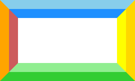
.foo{ border : 30 px solid; border-color : stripes ( dodgerblue, skyblue) stripes ( yellow, gold) stripes ( lightgreen, limegreen) stripes ( indianred, orange); }
Sample rendering:
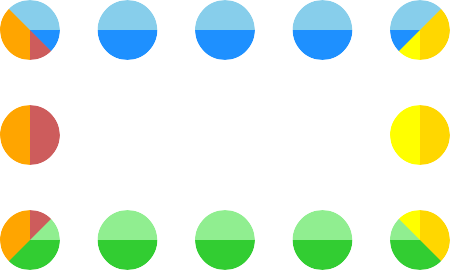
The same border colors with border-style: dotted:
| Name: | border-color |
|---|---|
| Value: | [ <color> | <image-1D> ]{1,4} |
| Initial: | see individual properties |
| Applies to: | see individual properties |
| Inherited: | see individual properties |
| Percentages: | see individual properties |
| Computed value: | see individual properties |
| Animation type: | see individual properties |
| Canonical order: | per grammar |
border-color is a shorthand property for the four physical border-*-color properties. The four values set the top, right, bottom and left border, respectively. A missing left is the same as right, a missing bottom is the same as top, and a missing right is also the same as top. This is resolved individually for each list item.
The flow-relative properties border-block-start-color, border-block-end-color, border-inline-start-color, and border-inline-end-color correspond to the physical properties border-top-color, border-bottom-color, border-left-color, and border-right-color. The mapping depends on the element’s writing-mode, direction, and text-orientation.
| Name: | border-block-color, border-inline-color |
|---|---|
| Value: | <'border-top-color'>{1,2} |
| Initial: | see individual properties |
| Applies to: | see individual properties |
| Inherited: | see individual properties |
| Percentages: | see individual properties |
| Computed value: | see individual properties |
| Animation type: | see individual properties |
| Canonical order: | per grammar |
These two shorthand properties set the border-block-start-color & border-block-end-color and border-inline-start-color & border-inline-end-color, respectively. The first value represents the start side color, and the second value represents the end side color. If only one value is given, it applies to both the start and end sides.
Tests
- border-color-interpolation.html (live test) (source)
- border-image-displayed-with-transparent-border-color.html (live test) (source)
- color-mix-currentcolor-border-repaint-parent.html (live test) (source)
- color-mix-currentcolor-border-repaint.html (live test) (source)
- currentcolor-border-repaint-parent.html (live test) (source)
- inheritance.sub.html (live test) (source)
- border-color-computed.html (live test) (source)
- border-color-invalid.html (live test) (source)
- border-color-shorthand.html (live test) (source)
- border-color-valid.html (live test) (source)
2.2. Line Patterns: the border-style properties
| Name: | border-top-style, border-right-style, border-bottom-style, border-left-style, border-block-start-style, border-block-end-style, border-inline-start-style, border-inline-end-style |
|---|---|
| Value: | <line-style> |
| Initial: | none |
| Applies to: | all elements except ruby base containers and ruby annotation containers |
| Inherited: | no |
| Percentages: | N/A |
| Computed value: | specified keyword |
| Canonical order: | per grammar |
| Animation type: | discrete |
| Logical property group: | border-style |
These properties control whether a border appears, and if it does what style it’s drawn in (if it is not overridden by a border image).
The flow-relative properties border-block-start-style, border-block-end-style, border-inline-start-style, and border-inline-end-style correspond to the physical properties border-top-style, border-bottom-style, border-left-style, and border-right-style. The mapping depends on the element’s writing-mode, direction, and text-orientation.
| Name: | border-block-style, border-inline-style |
|---|---|
| Value: | <'border-top-style'>{1,2} |
| Initial: | see individual properties |
| Applies to: | see individual properties |
| Inherited: | see individual properties |
| Percentages: | see individual properties |
| Computed value: | see individual properties |
| Animation type: | see individual properties |
| Canonical order: | per grammar |
These two shorthand properties set the border-block-start-style & border-block-end-style and border-inline-start-style & border-inline-end-style, respectively. The first value represents the start side style, and the second value represents the end side style. If only one value is given, it applies to both the start and end sides.
| Name: | border-style |
|---|---|
| Value: | <'border-top-style'>{1,4} |
| Initial: | see individual properties |
| Applies to: | see individual properties |
| Inherited: | see individual properties |
| Percentages: | see individual properties |
| Computed value: | see individual properties |
| Animation type: | see individual properties |
| Canonical order: | per grammar |
border-style is a shorthand property for the four physical border-*-style properties. The four values set the top, right, bottom and left border, respectively. A missing left is the same as right, a missing bottom is the same as top, and a missing right is also the same as top. This is resolved individually for each list item.
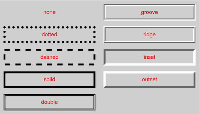
The style is specified as a <line-style> keyword, where
<line-style> = none | hidden | dotted | dashed | solid | double | groove | ridge | inset | outset
Values have the following meanings:
- none
- No border. Color and width are ignored (i.e., the border has width 0). Note this means that the initial value of border-image-width will also resolve to zero.
- hidden
- Same as none, but has different behavior in the border conflict resolution rules for border-collapsed tables [CSS2].
- dotted
- A series of round dots.
- dashed
- A series of square-ended dashes.
- solid
- A single line segment.
- double
- Two parallel solid lines with some space between them. (The thickness of the lines is not specified, but the sum of the lines and the space must equal border-width.)
- groove
- Looks as if it were carved in the canvas. (This is typically achieved by creating a “shadow” from two colors that are slightly lighter and darker than the specified border-color.)
- ridge
- Looks as if it were coming out of the canvas.
- inset
- Looks as if the content on the inside of the border is sunken into the canvas. Treated as ridge in the collapsing border model. [CSS2]
- outset
- Looks as if the content on the inside of the border is raised out of the canvas. Treated as groove in the collapsing border model. [CSS2]
Borders are drawn in front of the element’s background, but behind the element’s content (in case it overlaps).
Note: Border colors close to black or white may need different color calculations than colors in between in order to create the required “3D” effect of groove, ridge, inset, or outset.
Note: There is no control over the spacing of the dots and dashes, nor over the length of the dashes. Implementations are encouraged to choose a spacing that makes the corners symmetrical.
Tests
2.3. Line Thickness: the border-width properties
| Name: | border-top-width, border-right-width, border-bottom-width, border-left-width, border-block-start-width, border-block-end-width, border-inline-start-width, border-inline-end-width |
|---|---|
| Value: | <line-width> |
| Initial: | medium |
| Applies to: | all elements except ruby base containers and ruby annotation containers |
| Inherited: | no |
| Percentages: | N/A |
| Computed value: | absolute length, snapped as a border width |
| Canonical order: | per grammar |
| Animation type: | by computed value |
| Logical property group: | border-width |
These properties specify the thickness of the border, i.e. the border width. Where
<line-width> = <length [0,∞]> | hairline | thin | medium | thick
Negative values are invalid. The thin, medium, and thick keywords are equivalent to 1px, 3px, and 5px, respectively. The hairline keyword is a UA-defined length, less than or equal to 1px and equal to an integer number of device pixels at the default page zoom, which represents a "just visible" line. (While it can be as large as 1px, on many devices it will be approximately 0.3px to 0.5px.)
The resolved value for the border-width properties is the used value.
If the border-style corresponding to a given border-width is none or , then the used width is 0.
The flow-relative properties border-block-start-width, border-block-end-width, border-inline-start-width, and border-inline-end-width correspond to the physical properties border-top-width, border-bottom-width, border-left-width, and border-right-width. The mapping depends on the element’s writing-mode, direction, and text-orientation.
| Name: | border-block-width, border-inline-width |
|---|---|
| Value: | <'border-top-width'>{1,2} |
| Initial: | see individual properties |
| Applies to: | see individual properties |
| Inherited: | see individual properties |
| Percentages: | see individual properties |
| Computed value: | see individual properties |
| Animation type: | see individual properties |
| Canonical order: | per grammar |
These two shorthand properties set the border-block-start-width & border-block-end-width and border-inline-start-width & border-inline-end-width, respectively. The first value represents the start side width, and the second value represents the end side width. If only one value is given, it applies to both the start and end sides.
| Name: | border-width |
|---|---|
| Value: | <'border-top-width'>{1,4} |
| Initial: | see individual properties |
| Applies to: | see individual properties |
| Inherited: | see individual properties |
| Percentages: | see individual properties |
| Computed value: | see individual properties |
| Animation type: | see individual properties |
| Canonical order: | per grammar |
border-width is a shorthand property for the four physical border-*-width properties. The four values set the top, right, bottom and left border, respectively. A missing left is the same as right, a missing bottom is the same as top, and a missing right is also the same as top. This is resolved individually for each list item.
Note: Although the initial width is medium, the initial style is none; therefore the used initial width is 0.
Tests
- border-bottom-width-composition.html (live test) (source)
- border-image-width-composition.html (live test) (source)
- border-image-width-interpolation.html (live test) (source)
- border-left-width-composition.html (live test) (source)
- border-right-width-composition.html (live test) (source)
- border-top-width-composition.html (live test) (source)
- border-width-interpolation.html (live test) (source)
- border-bottom-width-medium.html (live test) (source)
- border-bottom-width-thick.html (live test) (source)
- border-bottom-width-thin.html (live test) (source)
- border-left-width-medium.html (live test) (source)
- border-left-width-thick.html (live test) (source)
- border-left-width-thin.html (live test) (source)
- border-right-width-medium.html (live test) (source)
- border-right-width-thick.html (live test) (source)
- border-right-width-thin.html (live test) (source)
- border-top-width-medium.html (live test) (source)
- border-top-width-thick.html (live test) (source)
- border-top-width-thin.html (live test) (source)
- border-width-cssom.html (live test) (source)
- border-width-pixel-snapping-001-a.html (live test) (source)
- border-width-pixel-snapping-001-b.html (live test) (source)
- border-width-small-values-001-a.html (live test) (source)
- border-width-small-values-001-b.html (live test) (source)
- border-width-small-values-001-c.html (live test) (source)
- border-width-small-values-001-d.html (live test) (source)
- border-width-small-values-001-e.html (live test) (source)
- inheritance.sub.html (live test) (source)
- border-width-computed.html (live test) (source)
- border-width-invalid.html (live test) (source)
- border-width-shorthand.html (live test) (source)
- border-width-valid.html (live test) (source)
2.4. Border Shorthand Properties
| Name: | border-top, border-right, border-bottom, border-left, border-block-start, border-block-end, border-inline-start, border-inline-end |
|---|---|
| Value: | <line-width> || <line-style> || <color> |
| Initial: | See individual properties |
| Applies to: | all elements except ruby base containers and ruby annotation containers |
| Inherited: | no |
| Percentages: | N/A |
| Computed value: | see individual properties |
| Animation type: | see individual properties |
| Canonical order: | per grammar |
These shorthand properties set the border-width, border-color, and border-style of one side of the borders of a box. Omitted values are set to their initial values.
The flow-relative properties border-block-start, border-block-end, border-inline-start, and border-inline-end correspond to the physical properties border-top, border-bottom, border-left, and border-right. The mapping depends on the element’s writing-mode, direction, and text-orientation.
| Name: | border-block, border-inline |
|---|---|
| Value: | <'border-block-start'> |
| Initial: | see individual properties |
| Applies to: | see individual properties |
| Inherited: | see individual properties |
| Percentages: | see individual properties |
| Computed value: | see individual properties |
| Animation type: | see individual properties |
| Canonical order: | per grammar |
These two shorthand properties set the border-block-start & border-block-end or border-inline-start & border-inline-end, respectively, both to the same style.
| Name: | border |
|---|---|
| Value: | <line-width> || <line-style> || <color> |
| Initial: | see individual properties |
| Applies to: | see individual properties |
| Inherited: | see individual properties |
| Percentages: | see individual properties |
| Computed value: | see individual properties |
| Animation type: | see individual properties |
| Canonical order: | per grammar |
Tests
The border property is a shorthand property for setting the same border-width, border-color, and border-style for all four borders of a box. Unlike the shorthand margin and padding properties, the border property cannot set different values on the four borders. To do so, one or more of the other border properties must be used.
The border shorthand also resets border-image to its initial value. It is therefore recommended that authors use the border shorthand, rather than other shorthands or the individual properties, to override any border settings earlier in the cascade. This will ensure that border-image has also been reset to allow the new styles to take effect.
Note: The CSS Working Group intends for the border shorthand to reset all border properties in future levels of CSS as well. For example, if a border-characters property is introduced in the future to allow glyphs as borders, it will also be reset by the border shorthand. By using the border shorthand to reset borders, authors can be guaranteed a “blank canvas” no matter what properties are introduced in the future.
p { border: solid red }
p {
  border-top: solid red;
  border-right: solid red;
  border-bottom: solid red;
  border-left: solid red;
  border-image: none;
}
Since, to some extent, the properties have overlapping functionality, the order in which the rules are specified is important.
blockquote {
  border-color: red;
  border-left: double;
  color: black
}
In the above example, the color of the left border is black, while the other borders are red. This is due to border-left setting the width, style, and color. Since the color value is not given by the border-left property, it will be taken from the color property. The fact that the color property is set after the border-left property is not relevant.
3. Corners
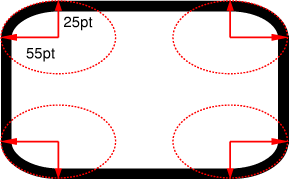
The padding edge (inner border) radius is the outer border radius minus the corresponding border thickness. In the case where this results in a negative value, the inner radius is zero. (In such cases the center of the border’s inner curve might not coincide with that of its outer curve.) Likewise the content edge radius is the padding edge radius minus the corresponding padding, or if that is negative, zero. The border and padding thicknesses in the curved region are thus interpolated from the adjoining sides, and when two adjoining borders are of different thicknesses the corner will show a smooth transition between the thicker and thinner borders.
All border styles (solid, dotted, inset, etc.) follow the curve of the border.
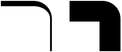
Note: If the center of a corner’s outer curve is past an opposite padding edge (in the border area of a side opposite the corner), the inner curve will not be a full quarter ellipse.
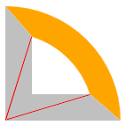
p { width: 70px; height: 70px; border: solid 30px;
border-color: orange orange silver silver;
border-top-right-radius: 100%; }
|
|
The margin edge, being outside the border edge, calculates its radius by adding the corresponding margin thickness to each border radius, with the corresponding outset-adjusted border radius applied.
When expanding an edge that has a border radius, e.g. for computing the margin edge, box-shadow spread, or overflow-clip-margin, the different border radius values are adjusted so that a small rounded corner with a big outset does not appear to be disproportionally round.
This is done by computing the corresponding outset-adjusted border radius.
To compute the outset-adjusted border radius given the 2-dimensional size’s edge, radius, and outset:
-
Let coverage be
2 * min(radius’s width / edge’s width, radius’s height / edge’s height). -
Let adustedRadiusWidth be the adjusted radius dimension given coverage, radius’s width, and outset’s width.
-
Let adustedRadiusHeight be the adjusted radius dimension given coverage, radius’s height, and outset’s height.
-
Return (adustedRadiusWidth, adustedRadiusHeight).
To compute the adjusted radius dimension given numbers coverage, radius, and outset:
-
If radius is greater than spread, or if coverage is greater than 1, then return
radius + outset. -
Let ratio be
radius / outset. -
Return
radius + outset * (1 - (1 - ratio)3 * (1 - coverage3)).
Note: this algorithm is designed to reduce the effect of the outset (or spread) on the shape of the corner. The coverage factor makes this reduction more pronounced for rectangular shapes (where the border radius is close to 0), and less pronounced for elliptical shapes (where the border radius is close to 50%).
3.1. Corner Clipping
Although border images are not affected by border-radius, other effects that clip painting or event handling to the border, padding, or content edge must clip to their respective curves. For example, backgrounds clip to the curve specified by background-clip, overflow values other than visible to the curved padding edge (when overflow on both axes is not visible), replaced element content to the curved content edge, pointer events to the curved border edge, etc.
Note: As border-radius reduces the interactive area of an element authors should make sure the remaining interactive area conforms to recommended minima for the platforms they target; in particular, conforming to recommended minimum touch target sizes may require larger widths and heights when border-radius is used.
DIV {
    background: black;
    color: white;
    border-radius: 1em;
    padding: 1em }
3.2. Color and Style Transitions
Color and style transitions must be contained within the segment of the border that intersects the smallest rectangle that contains both border radii as well as the center of the inner curve (which may be a point representing the corner of the padding edge, if the border radii are smaller than the border width).
If one of these borders is zero-width, then the other border takes up the entire transitional area. Otherwise, the center of color and style transitions between adjoining borders is a point along the curve that is a continuous monotonic function of the ratio of the border widths. However it is not defined what these transitions look like or what function maps from this ratio to a point on the curve.
3.3. Overlapping Curves
Corner curves must not overlap: When the sum of any two adjacent border radii exceeds the size of the border box, UAs must proportionally reduce the used values of all border radii until none of them overlap. The algorithm for reducing radii is as follows:
Let f = min(Li/Si), where i ∈ {top, right, bottom, left}, Si is the sum of the two corresponding radii of the corners on side i, and Ltop = Lbottom = the width of the box, and Lleft = Lright = the height of the box. If f < 1, then all corner radii are reduced by multiplying them by f.
Note: This formula ensures that quarter circles remain quarter circles and large radii remain larger than smaller ones, but it may reduce corners that were already small enough, which may make borders of nearby elements that should look the same look different.
If the curve interferes with UI elements such as scrollbars, the UA may further reduce the used value of the affected border radii (and only the affected border radii) as much as necessary, but no more.
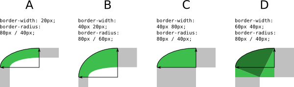
box-sizing: border-box;
width: 6em;
height: 2.5em;
border-radius: 0.5em 2em 0.5em 2em
The height (2.5em) is enough for the specified radii (0.5em plus 2.0em). However, if the height is only 2em,
box-sizing: border-box;
width: 6em;
height: 2em;
border-radius: 0.5em 2em 0.5em 2em
all corners need to be reduced by a factor 0.8 to make them fit. The used border radii thus are 0.4em (instead of 0.5em) and 1.6em (instead of 2em). See borders B in the figure.
3.4. Effect on Tables
The border-radius properties do apply to table, inline-table, and table-cell boxes in separated borders mode (border-collapse: separate). When border-collapse is collapse, they have no effect.
3.5. Corner Sizing: the border-*-*-radius properties
| Name: | border-top-left-radius, border-top-right-radius, border-bottom-right-radius, border-bottom-left-radius, border-start-start-radius, border-start-end-radius, border-end-start-radius, border-end-end-radius |
|---|---|
| Value: | <border-radius> |
| Initial: | 0 |
| Applies to: | all elements (but see prose) |
| Inherited: | no |
| Percentages: | Refer to corresponding dimension of the border box. |
| Computed value: | pair of computed <length-percentage> values |
| Canonical order: | per grammar |
| Animation type: | by computed value |
| Logical property group: | border-radius |
The radius is specified as a <border-radius> value, where
<border-radius> = <slash-separated-border-radius-syntax> | <legacy-border-radius-syntax>
<slash-separated-border-radius-syntax> = <length-percentage [0,∞]> [ / <length-percentage [0,∞]> ]?
<legacy-border-radius-syntax> = <length-percentage [0,∞]>{1,2}
The two <length-percentage> values of the border-*-radius properties define the radii of a quarter ellipse that defines the shape of the corner of the outer border edge (see the diagram below). The first value is the horizontal radius, the second the vertical radius. If the second value is omitted it is copied from the first. If either length is zero, the corner is square, not rounded. Percentages for the horizontal radius refer to the width of the border box, whereas percentages for the vertical radius refer to the height of the border box. Negative values are invalid.
Note: Authors should use the slash syntax, which is preferred for new content, but the legacy syntax (two values separated by whitespace) is supported for backwards compatibility.
DIV.standout {
    width: 13em;
    height: 8em;
    border: solid black 1em;
    border-radius: 7.5em 5em }
The flow-relative properties border-start-start-radius, border-start-end-radius, border-end-start-radius, and border-end-end-radius correspond to the physical properties border-top-left-radius, border-bottom-left-radius, border-top-right-radius, and border-bottom-right-radius. The mapping depends on the element’s writing-mode, direction, and text-orientation, with the first start/end giving the block axis side, and the second the inline-axis side (i.e. patterned as 'border-block-inline-radius').
3.6. Corner Sizing Shorthands: the border-radius and border-*-radius shorthand properties
3.6.1. Sizing The Corners Of One Side: The border-top-radius, border-right-radius, border-bottom-radius, border-left-radius, border-block-start-radius, border-block-end-radius, border-inline-start-radius, border-inline-end-radius shorthands
| Name: | border-top-radius, border-right-radius, border-bottom-radius, border-left-radius, border-block-start-radius, border-block-end-radius, border-inline-start-radius, border-inline-end-radius |
|---|---|
| Value: | <length-percentage [0,∞]>{1,2} [ / <length-percentage [0,∞]>{1,2} ]? |
| Initial: | 0 |
| Applies to: | all elements (but see prose) |
| Inherited: | no |
| Percentages: | Refer to corresponding dimension of the border box. |
| Computed value: | see individual properties |
| Animation type: | see individual properties |
| Canonical order: | per grammar |
The border-*-radius shorthands set the two border-*-*-radius
longhand properties of the related side. If values are given before
and after the slash, then the values before the slash set the
horizontal radius and the values after the slash set the vertical radius.
If there is no slash, then the values set both radii equally.
The two values for the radii are given in the order
top-left, top-right for border-top-radius,
top-right, bottom-right for border-right-radius,
bottom-left, bottom-right for border-bottom-radius,
top-left, bottom-left for border-left-radius,
start-start, start-end for border-block-start-radius,
end-start, end-end for border-block-end-radius
start-start, end-start for border-inline-start-radius,
and start-end, end-end for border-inline-end-radius.
If the second value is omitted it is copied from the first.
Tests
3.6.2. Sizing All Corners At Once: The border-radius shorthand
| Name: | border-radius |
|---|---|
| Value: | <length-percentage [0,∞]>{1,4} [ / <length-percentage [0,∞]>{1,4} ]? |
| Initial: | see individual properties |
| Applies to: | see individual properties |
| Inherited: | see individual properties |
| Percentages: | see individual properties |
| Computed value: | see individual properties |
| Animation type: | see individual properties |
| Canonical order: | per grammar |
The border-radius shorthand sets all four border-*-radius properties. If values are given before and after the slash, then the values before the slash set the horizontal radii and the values after the slash set the vertical radii. If there is no slash, then the values set the radii in both axes equally. The four values for each radii are given in the order top-left, top-right, bottom-right, bottom-left. If bottom-left is omitted it is the same as top-right. If bottom-right is omitted it is the same as top-left. If top-right is omitted it is the same as top-left.
border-radius: 4em;is equivalent to
border-top-left-radius:     4em;
border-top-right-radius:    4em;
border-bottom-right-radius: 4em;
border-bottom-left-radius:  4em;
and
border-radius: 2em 1em 4em / 0.5em 3em;is equivalent to
border-top-left-radius:     2em 0.5em;
border-top-right-radius:    1em 3em;
border-bottom-right-radius: 4em 0.5em;
border-bottom-left-radius:  1em 3em;
3.7. Corner Shaping: the corner-*-shape properties
By default, non-zero border-radius values define a quarter-ellipse corner shape that rounds the affected corners, filling the corner area defined by the border-radius for that corner. However in some cases, other corner shapes are desired. The corner-*-shape properties (and their shorthands) specify exactly what corner shapes a box will use for the region defined by its border-*-radius values.
The different corner shapes can all be expressed as different parameters to a superellipse. A superellipse is a generalization of an ellipse, and based on its `k` parameter can express all the shapes between a square, an ellipse, and a notch.
How does a superellipse work?
A unit circle is defined by the equation:
The circle is made from all points (x,y) that satisfy the equation. A given ellipse can then be produced by scaling this shape in the X and/or Y axis.
The unit superellipse equation just changes the 2 exponent into a variable. For this spec’s purposes, we’ll write it as 2K:
The K in this equation is the superellipse() argument.
K can be any value; setting K to 1 gives the standard circle/ellipse equation, but other values define the entire family of superellipse curves:
-
Values larger than 1 make it more "square": the traditional "squircle" uses a K of 2, and a K of infinity is a perfect square. (A K of only 10 is already nearly indistinguishable from a square; it scales very quickly.)
-
Values between 0 and 1 make it "flatter"; when K is 0 it’s a diamond with perfectly flat sides.
-
Negative values define concave curves, roughly opposite of what you get with positive values: a K of -1 gives a nearly elliptical "scoop" that’s roughly the opposite of a K of 1, a K of -2 gives a "squircle" scoop, a K of negative infinity gives a square scoop, etc.
(Note that most literature on superellipses will write the equation with a simpler exponent. The form was chosen here to make the argument ranges easier to reason about: all possible values are valid, the symmetrical shapes are just positive/negative, the "middle" bevel is 0, etc.)
To allow full expression as well as interpolation, the corner-shape properties can provide the superellipse parameter directly using the superellipse() function, or use one of the supplied keywords which represent commonly used parameters. See the <corner-shape-value> definition for details.
Tests
- corner-shape-backdrop-filter.html (live test) (source)
- corner-shape-backdrop-filter-overflow.html (live test) (source)
- corner-shape-bevel-overflow-composite.html (live test) (source)
- corner-shape-bevel-overflow.html (live test) (source)
- corner-shape-computed.html (live test) (source)
- corner-shape-fill.html (live test) (source)
- corner-shape-hittest.html (live test) (source)
- corner-shape-iframe-border.html (live test) (source)
- corner-shape-img-border.html (live test) (source)
- corner-shape-img.html (live test) (source)
- corner-shape-inset-shadow.html (live test) (source)
- corner-shape-invalid.html (live test) (source)
- corner-shape-notch.html (live test) (source)
- corner-shape-outside-left.html (live test) (source)
- corner-shape-outside-right.html (live test) (source)
- corner-shape-overflow-clip-margin.html (live test) (source)
- corner-shape-square.html (live test) (source)
- corner-shape-svg-border.html (live test) (source)
- corner-shape-valid.html (live test) (source)
- corner-shape-video-border.html (live test) (source)
- corner-shape-noop-keyframe.html (live test) (source)
- corner-shape-zoom-overlap-extreme-values-crash.html (live test) (source)
- render-corner-shape.html (live test) (source)
| Name: | corner-top-left-shape, corner-top-right-shape, corner-bottom-right-shape, corner-bottom-left-shape, corner-start-start-shape, corner-start-end-shape, corner-end-start-shape, corner-end-end-shape |
|---|---|
| Value: | <corner-shape-value> |
| Initial: | round |
| Applies to: | all elements where border-radius can apply |
| Inherited: | no |
| Percentages: | n/a |
| Computed value: | the corresponding superellipse() value |
| Canonical order: | per grammar |
| Animation type: | see superellipse interpolation |
| Logical property group: | corner-shape |
The corner-*-*-shape longhand properties set the corner shape for the given corner.
The flow-relative longhands (corner-start-start-shape, etc.) correspond to the physical longhands (corner-top-left-shape, etc.) depending on the element’s writing-mode, direction, and text-orientation. The first start/end gives the block axis side, and the second the inline-axis side (i.e. patterned as corner-block-inline-shape).
<corner-shape-value> = round | scoop | bevel | notch | square | squircle |
                       <superellipse()>
superellipse() = superellipse(<number> | infinity | -infinity)
- round
-
The corner shape is a quarter of a convex ellipse.
Equivalent to superellipse(1).
Note: This is the initial value of corner-shape properties, as it was the behavior of border-radius before corner-shape existed.
- squircle
- The corner shape is a quarter of a "squircle", a convex curve between round and square. Equivalent to superellipse(2).
- square
-
The corner shape is a convex 90deg angle.
Equivalent to superellipse(infinity).
Note: This looks identical to the "normal" square corner you get from border-radius: 0, but it can smoothly animate with the other corner-shape values.
- bevel
- The corner shape is a straight diagonal line, neither convex nor concave. Equivalent to superellipse(0).
- scoop
- The corner shape is a concave quarter-ellipse. Equivalent to superellipse(-1).
- notch
- The corner shape is a concave 90deg angle. Equivalent to superellipse(-infinity).
- superellipse(K)
-
The corner shape is a quarter of a superellipse.
The argument K is the superellipse parameter,
and it defines a superellipse
using an exponent of 2K.
See the note in § 3.7 Corner Shaping: the corner-*-shape properties for an explanation of the mathematical definition of a superellipse, and what various K values mean. See § 3.9.4 Rendering corner-shape for precise details of how the superellipse is computed and rendered.

Note: If border-radius is not specified (or is set to 0), the corner area is zero-sized as well, and corner-shape won’t have any effect.
corner-*-shape does not alter the overflow rules for border-*-radius, except insofar as it shapes the corners differently; elements are still clipped by the shaped border as normal.
The curve specified by corner-*-shape defines the outer edge of the border. The inner edge of the border follows the curve of the outer edge (in a way that’s not necessarily expressible as a superellipse curve), with a nearly consistent distance from the outer edge throughout, (or a linearly increasing distance if the border-width of the two border edges meeting at the the corner are not uniform).
corner-*-shape also affects the rendering of box-shadow, and how the overflow clip edge is shaped when it’s extended from the box, but these do not directly follow the corner-*-shape path like the inner border edge does. Instead, it scales the corner-shape path in an axis-aligned manner.
3.8. Corner Shaping Shorthands: the corner-shape and corner-*-shape shorthand properties
3.8.1. Shaping The Corners Of One Side: The corner-*-shape shorthands:
| Name: | corner-top-shape, corner-right-shape, corner-bottom-shape, corner-left-shape, corner-block-start-shape, corner-block-end-shape, corner-inline-start-shape, corner-inline-end-shape |
|---|---|
| Value: | <'corner-top-left-shape'>{1,2} |
| Initial: | see individual properties |
| Applies to: | see individual properties |
| Inherited: | see individual properties |
| Percentages: | see individual properties |
| Computed value: | see individual properties |
| Animation type: | see individual properties |
| Canonical order: | per grammar |
The corner-*-shape shorthands set the two corner-*-*-shape properties of the related side. If only one value is given, the second value defaults to the same value.
For the physical shorthands (corner-top-shape, etc.), the values are either in left/right order, or top/bottom order, whichever axis is meaningful for the property. That is, corner-top-shape: round square sets corner-top-left-shape: round; corner-top-right-shape: square;.
For the logical shorthands (corner-block-start-shape, etc.), the values are always in start/end order in the other axis. That is, corner-block-start-shape: round square sets corner-start-start-shape: round; corner-start-end-shape: square;.
3.8.2. Shaping All Corners At Once: The corner-shape shorthand
| Name: | corner-shape |
|---|---|
| Value: | <'corner-top-left-shape'>{1,4} |
| Initial: | round |
| Applies to: | all elements where border-radius can apply |
| Inherited: | no |
| Percentages: | see individual properties |
| Computed value: | see individual properties |
| Animation type: | see individual properties |
| Canonical order: | per grammar |
The corner-shape property specifies the shape of the box’s corners, within the region specified by border-radius. The four values set the top, right, bottom and left shape, respectively. A missing left is the same as right, a missing bottom is the same as top, and a missing right is also the same as top.
3.9. Corner Sizing & Shaping Shorthands: the corner and corner-* shorthand properties
3.9.1. Sizing & shaping a corner: The corner-top-left, corner-top-right, corner-bottom-right, corner-bottom-left, corner-start-start, corner-start-end, corner-end-start, corner-end-end shorthands
| Name: | corner-top-left, corner-top-right, corner-bottom-left, corner-bottom-right, corner-start-start, corner-start-end, corner-end-start, corner-end-end |
|---|---|
| Value: | <'border-top-left-radius'> || <'corner-top-left-shape'> |
| Initial: | 0 |
| Applies to: | all elements (but see prose) |
| Inherited: | no |
| Percentages: | Refer to corresponding dimension of the border box. |
| Computed value: | see individual properties |
| Canonical order: | per grammar |
| Animation type: | see individual properties |
The corner-*-* shorthands set the two corner-*-*-shape and border-*-*-radius longhand properties of the related side. See the corresponding corner-*-*-shape and border-*-*-radius properties for further details.
3.9.2. Sizing & shaping rhe Corners Of One Side: The corner-top, corner-right, corner-bottom, corner-left, corner-block-start, corner-block-end, corner-inline-start, corner-inline-end shorthands
| Name: | corner-top, corner-right, corner-bottom, corner-left, corner-block-start, corner-block-end, corner-inline-start, corner-inline-end |
|---|---|
| Value: | <'border-top-radius'> || <'corner-top-shape'> |
| Initial: | 0 |
| Applies to: | all elements (but see prose) |
| Inherited: | no |
| Percentages: | Refer to corresponding dimension of the border box. |
| Computed value: | see individual properties |
| Animation type: | see individual properties |
| Canonical order: | per grammar |
The corner-* shorthands set the two corner-*-shape longhand properties and two border-*-radius longhand properties of the related side. See the corresponding corner-*-shape and border-*-radius properties for further details.
3.9.3. Sizing & Shaping All Corners At Once: The corner shorthand
| Name: | corner |
|---|---|
| Value: | <'border-radius'> || <'corner-shape'> |
| Initial: | 0 |
| Applies to: | all elements (but see prose) |
| Inherited: | no |
| Percentages: | Refer to corresponding dimension of the border box. |
| Computed value: | see individual properties |
| Canonical order: | per grammar |
| Animation type: | see individual properties |
The corner shorthand sets the corner-*-shape and border-*-radius longhands all together.
3.9.4. Rendering corner-shape
When rendering elements with shaped corners, the element’s border contour path needs to be offset, based on border, outline, box-shadow, overflow-clip-margin and more.
When rendering borders or outlines, the offset is aligned to the curve of the element’s shape. When rendering box-shadow or offsetting for overflow-clip-margin, the offset is also aligned to the same curve in the other direction, and the curve continues to the outer edge.
An element element’s outer contour is the border contour path given element and element’s border edge.
An element element’s inner contour is the border contour path given element and element’s border width.
An element’s border is rendered in the area between its outer contour and its inner contour.
An element’s outline follows the outer contour with the used outline-width and outline-offset. The precise way in which it is rendered is implementation-defined.
An element’s overflow area is shaped by its inner contour. An element’s overflow clip edge is shaped by the border contour path given element, and an uniform inset from an outset given element’s used overflow-clip-margin.
Each shadow of element’s box-shadow is shaped by the border contour path given element, and an uniform inset from an outset given the shadow’s used box-shadow-spread.
An uniform inset from an outset given a number outset is an edge whose value is -outset in all directions.
3.9.4.1. Vector Math Helpers
A two-dimensional vector is a pair of numbers (x, y).
DOMPointReadOnly p and a list of two-dimensional vectors vectors:
To scale a two-dimensional vector v by a number factor, return (v[0] ⋅ factor, v[1] ⋅ factor).
-
Let l be
hypot(v[0], v[1]). -
If l is 0, return v.
-
Return
(v[0] / l, v[1] / l).
The perpendicular of a two-dimensional vector v is (-v[1], v[0]).
The vector between two points, given DOMPoints a and b, is (b’s .x - a’s x, b’s y - a’s y)
3.9.4.2. Computing a contoured path
This algorithm describes how to compute a path with shaped corners (a path that is either inset or outset from the original). To avoid the complexities of defining how superellipses intersect, the algorithm simplifies the process by specifying that each corner is "clipped out" of the path. The specific implementation details of this clipping operation are left to implementations.
-
Let borderRect be element’s border box.
-
Let unshapedTargetRect be borderRect, inset by topInset, rightInset, bottomInset, leftInset.
Note: If this is a shadow or overflow-clip-margin, the insets would have negative values and unshapedTargetRect would become an outset of borderRect.
-
Let path be a path that contains unshapedTargetRect.
-
Let scaleFactor be the opposite corner scale factor given element.
-
Let adjustedRadius be the following steps given a property P, and numbers insetX and insetY:
-
Let radius be element’s used value of P.
-
If insetX and insetY are zero, return radius.
-
If insetX or insetY are positive, then return
(radius’s width ⋅ scaleFactor, radius’s height ⋅ scaleFactor). -
Let adjustedRadiusInOutsetCoordinates be the outset-adjusted border radius given borderRect’s size, radius, and
(-insetX, -insetY). -
Return
(adjustedRadiusInOutsetCoordinates’s width - insetX, adjustedRadiusInOutsetCoordinates’s height - insetY).
-
-
Let adjustedTopRightRadius be the adjustedRadius given border-top-right-radius, insetRight, and insetTop.
-
Let adjustedBottomRightRadius be the adjustedRadius given border-bottom-right-radius, insetRight, and insetBottom.
-
Let adjustedBottomLeftRadius be the adjustedRadius given border-bottom-left-radius, insetLeft, and insetBottom.
-
Let adjustedTopLeftRadius be the adjustedRadius given border-top-left-radius, insetLeft, and insetTop.
-
Clip out from path, the border-aligned corner clip-out path given borderRect’s right, borderRect’s top,
(-adjustedTopRightRadius[0], 0),(0, adjustedTopRightRadius[1]), element’s computed corner-top-right-shape, topInset, and rightInset. -
Clip out from path, the border-aligned corner clip-out path given borderRect’s right, borderRect’s bottom,
(0, -adjustedBottomRightRadius[1]),(-adjustedBottomRightRadius[0], 0), element’s computed corner-bottom-right-shape, rightInset, and bottomInset. -
Clip out from path, the border-aligned corner clip-out path given borderRect’s left, borderRect’s bottom,
(adjustedBottomLeftRadius[0], 0),(0, -adjustedBottomLeftRadius[1]), element’s computed corner-bottom-left-shape, bottomInset, and leftInset. -
Clip out from path, the border-aligned corner clip-out path given borderRect’s left, borderRect’s top,
(0, adjustedTopLeftRadius[1]),(adjustedTopLeftRadius[0], 0), element’s computed corner-top-left-shape, leftInset, and topInset. -
Return path.
To get the border-aligned corner clip-out path given a DOMPointReadOnly originalCornerOuter, a two-dimensional vector vectorTowardsStart, a two-dimensional vector vectorTowardsEnd, a superellipse parameter curvature, and numbers startInset and endInset:
-
If curvature is ∞, then return an empty path.
-
Let clampedHalfCorner be the normalized superellipse half corner given
clamp(curvature, -1, 1). -
Let originalCornerStart be originalCornerOuter, extended by « vectorTowardsStart ».
-
Let originalCornerEnd be originalCornerOuter, extended by « vectorTowardsEnd ».
-
Let originalCornerCenter be originalCornerOuter, extended by « vectorTowardsStart, vectorTowardsEnd ».
-
Let extendStart be a vector between originalCornerStart and originalCornerCenter, normalized and scaled by startInset.
-
Let extendEnd be a vector between originalCornerEnd and originalCornerCenter, normalized and scaled by endInset.
-
Let clipStart be originalCornerStart, extended by « extendStart ».
-
Let clipEnd be originalCornerEnd, extended by « extendEnd ».
-
Let clipOuter be originalCornerOuter, extended by « extendStart, extendEnd ».
-
Let vectorFromStartToControlPoint be the the two-dimensional vector
(2 ⋅ clampedHalfCorner - 0.5, 1.5 - 2 ⋅ clampedHalfCorner). -
Let singlePixelVectorFromStartToControlPoint be the vectorFromStartToControlPoint, normalized.
-
Let
strokeA, strokeBbe the perpendicular of singlePixelVectorFromStartToControlPoint. -
Let offset1 be the vector between originalCornerStart and outerCorner, normalized and scaled by
startInset ⋅ strokeA. -
Let offset2 be the vector between outerCorner and originalCornerEnd, normalized and scaled by
startInset ⋅ strokeB. -
Let offset3 be the vector between originalCornerEnd and originalCornerCenter, normalized and scaled by
endInset ⋅ strokeB. -
Let offset4 be the vector between originalCornerCenter and originalCornerStart, normalized and scaled by
endInset ⋅ strokeA. -
Let adjustedCornerStart be originalCornerStart, extended by « offset1, offset2 ».
-
Let adjustedCornerEnd be originalCornerEnd, extended by « offset3, offset4 ».
-
Let adjustedCornerCenter be originalCornerCenter, extended by « offset4, offset1 ».
-
Let adjustedCornerOuter be originalCornerOuter, extended by « offset2, offset3 ».
-
Let curveCenter be adjustedCornerOuter if curvature is less than 0, adjustedCornerCenter otherwise.
-
Let mapPointToCorner be the following steps: given numbers x and y:
-
Let v1 be the vector between curveCenter and adjustedCornerEnd, scaled by x.
-
Let v2 be the vector between curveCenter and adjustedCornerStart, scaled by y.
-
Return the
DOMPointReadOnlyat(x, y), extended by « v1, v2 ».
-
-
Let controlPoint be the result of calling mapPointToCorner given vectorFromStartToControlPoint’s
yand1 - unitVectorFromStartToControlPoint’s.x -
Let axisAlignedCornerStart be the intersection between the lines
(adjustedCornerStart, controlPoint)and(clipStart, clipOuter). If the lines are parallel, let it beadjustedCornerStart. -
Let axisAlignedCornerEnd be the intersection between the lines
(adjustedCornerEnd, controlPoint)and(clipEnd, clipOuter). If the lines are parallel, let it beadjustedCornerEnd.Note: axisAlignedCornerStart and axisAlignedCornerEnd act as "miters" when rendering an outset. They are a straight extension of the curve’s tangent, intersecting with the unshaped target rect.
-
Let path be a path, starting at axisAlignedCornerStart.
-
If curvature is -∞:
-
Extend path to adjustedCornerStart.
-
Extend path to adjustedCornerCenter.
-
Extend path to adjustedCornerEnd.
-
-
Otherwise:
-
Let K be
0.5-abs(curvature). -
For every T between 0 and 1, in an implementation-approximated manner, extend path to the result of calling mapPointToCorner given
TKand(1 - T)K.
-
-
Extend path to axisAlignedCornerEnd.
-
Extend path to clipOuter.
-
Return path.
3.9.5. Constraining opposite radii
When concave corner-shape values are present (the superellipse parameter is negative), diagonally opposite corners might overlap each other.
The following example would create overlapping corners if not constrained.
div{ corner-shape : scoop; border-top-left-radius : 80 % ; border-bottom-right-radius : 80 % ; }
To prevent this, the four radii are constrained to prevent overlaps. This is done by computing a hull polygon for each of the opposite corners, and finding the highest downscale factor which, if applied to both corners, would make it so that the polygons would not intersect.
-
Let rect be element’s border box.
-
Let topRightHull be a the normalized inner corner hull given element’s computed corner-top-right-shape, mapped to the rectangle (rect’s width dimension - element’s computed horizontal border-top-right-radius, 0, rect’s computed border-top-right-radius).
-
Let bottomRightHull be a the normalized inner corner hull given element’s computed corner-bottom-right-shape, rotated by 90deg with (0.5, 0.5) as an origin, and mapped to the rectangle (rect’s width dimension - element’s computed horizontal border-bottom-right-radius, rect’s height dimension - element’s computed vertical border-bottom-right-radius, element’s computed border-bottom-right-radius).
-
Let bottomLeftHull be a the normalized inner corner hull given element’s computed corner-bottom-right-shape, rotated by 180deg with (0.5, 0.5) as an origin, and mapped to the rectangle (0, rect’s height dimension - element’s computed vertical border-bottom-left-radius, element’s computed border-bottom-left-radius).
-
Let topLeftHull be a the normalized inner corner hull given element’s computed corner-top-left-shape, rotated by 270deg with (0.5, 0.5) as an origin, mapped to (0, 0, element’s computed border-top-left-radius).
-
Let scaleFactorA be the highest number which, if both topLeftHull and bottomRightHull were scaled by, using their first point as the origin, those polygons would not intersect.
-
Let scaleFactorB be the highest number which, if both topRightHull and bottomLeftHull were scaled by, using their first point as the origin, those polygons would not intersect.
-
Return
min(1, scaleFactorA, scaleFactorB).
3.9.6. Interpolating corner shapes
Since a <corner-shape-value> can always be expressed by a superellipse() with an superellipse parameter variable, interpolating between two
<corner-shape-value>s is done by interpolating the superellipse parameter itself.
Since it uses a log2, interpolating it linearly would result in an effect where concave corners interpolate at a much higher velocity than convex corners.
To balance that, the superellipse interpolation formula describes how a superellipse parameter is converted to a value between 0 and 1, and vice versa:
- -∞
-
Return 0.
- ∞
-
Return 1.
- Otherwise
-
-
Let k be
0.5abs(s). -
Let convexHalfCorner be
0.51/k. -
If s is less than 0, return
1 - convexHalfCorner. -
Return convexHalfCorner.
-
-
If curvature is greater than or equal to zero, return a triangle betwen « (1, 1), (1, 0), (0, 1) ».
-
Let axisLineA be a line between
(1, 0)and(1, 1). -
Let axisLineB be a line between
(0, 1)and(1, 1). -
Let normalizedHalfCorner be the normalized superellipse half corner given curvature.
-
Let halfCornerPoint be
(normalizedHalfCorner, 1 - normalizedHalfCorner). -
Let lineFromCenterToHalfCorner be a line between
(0, 0)and halfCornerPoint. -
Let tangentLine be the line perpendicular to lineFromCenterToHalfCorner, at halfCornerPoint.
-
Let intersectionA be the intersection between axisLineA and tangentLine.
-
Let intersectionB be the intersection between axisLineB and tangentLine.
-
Return a pentagon between the points « (1, 1), (1, 0), intersectionA, intersectionB, (0, 1), (1, 1) ».
To interpolate a superellipse parameter s to an interpolation value between 0 and 1, return the normalized superellipse half corner given s.
- 0
-
Return -∞.
- 0.5
-
Return 0.
- 1
-
Return ∞.
- Otherwise
-
-
Let convexHalfCorner be interpolationValue.
-
If interpolationValue is less than 0.5, set convexHalfCorner to 1 - interpolationValue.
-
Let k be
ln(0.5) / ln(convexHalfCorner). -
Let s be
log2(k). -
If interpolationValue is less than 0.5, return -s.
-
Return s.
-
4. Border Images
Authors can specify an image to be used in place of the border styles. In this case, the border’s design is taken from the sides and corners of an image specified with border-image-source, whose pieces may be sliced, scaled, and stretched in various ways to fit the size of the border image area. The border-image properties do not affect layout: layout of the box, its content, and surrounding content is based on the border-width and border-style properties only.

The image is 81 by 81 pixels and has to be divided into 9 equal parts. The style rules could thus be as follows:
DIV {
  border: double orange 1em;
  border-image: url("border.png") 27 round stretch;
 }
The result, when applied to a DIV of 12 by 5em, will be similar to this:

The rest of the border properties then interact to lay out the tiles as follows:
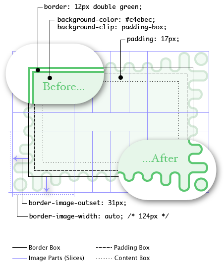
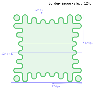
Here, even though the border-width is 12px, the border-image-width property computes to 124px. The border image area is then outset 31px from the border box and into the margin area. If the border-image fails to load (or if border images are not supported by the UA), the fallback rendering uses a green double border.
.notebox {
  border: double orange;
  /* must set 'border' shorthand first, otherwise it erases 'border-image' */
  border-image: url("border.png") 30 round;
  /* but other 'border' properties can be set after */
  border-width: thin thick;
}
...
.sidebar .notebox {
  box-shadow: 0 0 5px gray;
  border-radius: 5px;
  border: none; /* turn off all borders */
  /* 'border' shorthand resets 'border-image' */
}
4.1. Image Source: the border-image-source property
| Name: | border-image-source |
|---|---|
| Value: | none | <image> |
| Initial: | none |
| Applies to: | All elements, except internal table elements when border-collapse is collapse |
| Inherited: | no |
| Percentages: | N/A |
| Computed value: | the keyword none or the computed <image> |
| Canonical order: | per grammar |
| Animation type: | discrete |
Tests
Specifies an image to use as a border in place of the rendering specified by the border-style properties and, if given the fill keyword in border-image-slice, as an additional image backdrop for the element. If the value is none or if the image cannot be displayed (or the property doesn’t apply), the border styles will be used; otherwise the element’s border-style borders are not drawn and this border image is drawn as described in the sections below.
4.2. Image Slicing: the border-image-slice property
| Name: | border-image-slice |
|---|---|
| Value: | [<number [0,∞]> | <percentage [0,∞]>]{1,4} && fill? |
| Initial: | 100% |
| Applies to: | All elements, except internal table elements when border-collapse is collapse |
| Inherited: | no |
| Percentages: | refer to size of the border image |
| Computed value: | four values, each either a number or percentage; plus a fill keyword if specified |
| Canonical order: | per grammar |
| Animation type: | by computed value |
Tests
- border-image-slice-composition.html (live test) (source)
- border-image-slice-interpolation-stability.html (live test) (source)
- border-image-slice-interpolation.html (live test) (source)
- border-image-slice-001.xht (live test) (source)
- border-image-slice-002.xht (live test) (source)
- border-image-slice-003.xht (live test) (source)
- border-image-slice-004.htm (live test) (source)
- border-image-slice-005.htm (live test) (source)
- border-image-slice-006.htm (live test) (source)
- border-image-slice-007.htm (live test) (source)
- border-image-slice-fill-001.html (live test) (source)
- border-image-slice-fill-002.html (live test) (source)
- border-image-slice-fill-003.html (live test) (source)
- border-image-slice-percentage.html (live test) (source)
- border-image-slice-shorthand-reset.html (live test) (source)
- border-image-slice-computed.html (live test) (source)
- border-image-slice-invalid.html (live test) (source)
- border-image-slice-valid.html (live test) (source)
This property specifies inward offsets from the top, right, bottom, and left edges of the image, dividing it into nine regions: four corners, four edges and a middle. The middle image part is discarded (treated as fully transparent) unless the fill keyword is present. (It is drawn over the background; see Drawing the Border Image.)
If there is only one component value, it applies to all sides. If there are two values, the top and bottom are set to the first value and the right and left are set to the second. If there are three values, the top is set to the first value, the left and right are set to the second, and the bottom is set to the third. If there are four values they apply to the top, right, bottom, and left, respectively.
- <percentage [0,∞]>
- Percentages are relative to the size of the image: the width of the image for the horizontal offsets, the height for vertical offsets.
- <number [0,∞]>
- Numbers represent pixels in the image (if the image is a raster image) or vector coordinates (if the image is a vector image).
- fill
- The fill keyword, if present, causes the middle part of the border-image to be preserved. (By default it is discarded, i.e., treated as empty.)
Negative values are invalid. Computed values larger than the size of the image are interpreted as 100%.
The regions given by the border-image-slice values may overlap. However if the sum of the right and left widths is equal to or greater than the width of the image, the images for the top and bottom edge and the middle part are empty—which has the same effect as if a nonempty transparent image had been specified for those parts. Analogously for the top and bottom values.
If the image must be sized to determine the slices (for example, for SVG images with no natural dimensions), then it is sized using the default sizing algorithm with no specified size and the border image area as the default object size.
4.3. Drawing Areas: the border-image-width property
| Name: | border-image-width |
|---|---|
| Value: | [ <length-percentage [0,∞]> | <number [0,∞]> | auto ]{1,4} |
| Initial: | 1 |
| Applies to: | All elements, except internal table elements when border-collapse is collapse |
| Inherited: | no |
| Percentages: | Relative to width/height of the border image area |
| Computed value: | four values, each either a number, the keyword auto, or a computed <length-percentage> value |
| Canonical order: | per grammar |
| Animation type: | by computed value |
Tests
- border-image-width-001.htm (live test) (source)
- border-image-width-005.xht (live test) (source)
- border-image-width-006.xht (live test) (source)
- border-image-width-007.xht (live test) (source)
- border-image-width-008.html (live test) (source)
- border-image-width-009.html (live test) (source)
- border-image-width-should-extend-to-padding.html (live test) (source)
- border-image-width-computed.html (live test) (source)
- border-image-width-invalid.html (live test) (source)
- border-image-width-valid.html (live test) (source)
The border image is drawn inside an area called the border image area. This is an area whose boundaries by default correspond to the border box, see border-image-outset.
The four values of border-image-width specify offsets that are used to divide the border image area into nine regions. The offsets represent inward distances from the top, right, bottom, and left sides of the area, respectively.
If there is only one component value, it applies to all sides. If there are two values, the top and bottom are set to the first value and the right and left are set to the second. If there are three values, the top is set to the first value, the left and right are set to the second, and the bottom is set to the third. If there are four values they apply to the top, right, bottom, and left, respectively.
Values have the following meanings:
- <length-percentage [0,∞]>
- Percentages refer to the size of the border image area: the width of the area for horizontal offsets, the height for vertical offsets.
- <number [0,∞]>
- Numbers represent multiples of the corresponding computed border-width.
- auto
- If auto is specified then the used border-image-width is the natural width or height (whichever is applicable) of the corresponding image slice (see border-image-slice). If the image does not have the required natural dimension then the corresponding computed border-width is used instead.
Negative values are invalid for any border-image-width values.
If two opposite border-image-width offsets are large enough that they overlap, then the used values of all border-image-width offsets are proportionally reduced until they no longer overlap. In mathematical notation: Given Lwidth as the width of the border image area, Lheight as its height, and Wside as the border-image-width offset for the side side, let f = min(Lwidth/(Wleft+Wright), Lheight/(Wtop+Wbottom)). If f < 1, then all W are reduced by multiplying them by f.
4.4. Edge Overhang: the border-image-outset property
| Name: | border-image-outset |
|---|---|
| Value: | [ <length [0,∞]> | <number [0,∞]> ]{1,4} |
| Initial: | 0 |
| Applies to: | All elements, except internal table elements when border-collapse is collapse |
| Inherited: | no |
| Percentages: | N/A |
| Computed value: | four values, each a number or absolute length |
| Canonical order: | per grammar |
| Animation type: | by computed value |
Tests
- border-image-outset-composition.html (live test) (source)
- border-image-outset-interpolation.html (live test) (source)
- border-image-outset-003.html (live test) (source)
- border-image-outset-computed.html (live test) (source)
- border-image-outset-invalid.html (live test) (source)
- border-image-outset-valid.html (live test) (source)
The values specify the amount by which the border image area extends beyond the border box.
If there is only one component value, it applies to all sides. If there are two values, the top and bottom are set to the first value and the right and left are set to the second. If there are three values, the top is set to the first value, the left and right are set to the second, and the bottom is set to the third. If there are four values they apply to the top, right, bottom, and left, respectively.
- <length [0,∞]>
- Represents an outset of the specified length.
- <number [0,∞]>
- Represents an outset of the specified multiple of the corresponding computed border-width.
Negative values are invalid.
Portions of the border-image that are rendered outside the border box are ink overflow and do not trigger scrolling. Also such portions are invisible to mouse events and do not capture such events on behalf of the element.
Note: Even though they never cause a scrolling mechanism, outset images may still be clipped by an ancestor or by the viewport.
4.5. Image Tiling: the border-image-repeat property
| Name: | border-image-repeat |
|---|---|
| Value: | [ stretch | repeat | round | space ]{1,2} |
| Initial: | stretch |
| Applies to: | All elements, except internal table elements when border-collapse is collapse |
| Inherited: | no |
| Percentages: | N/A |
| Computed value: | two keywords, one per axis |
| Canonical order: | per grammar |
| Animation type: | discrete |
Tests
- discrete-no-interpolation.html (live test) (source)
- border-image-repeat-002.htm (live test) (source)
- border-image-repeat-004.htm (live test) (source)
- border-image-repeat-005.html (live test) (source)
- border-image-repeat-1.html (live test) (source)
- border-image-repeat-repeat-001.html (live test) (source)
- border-image-repeat-round-003.html (live test) (source)
- border-image-repeat-round-1.html (live test) (source)
- border-image-repeat-round-2.html (live test) (source)
- border-image-repeat-round-stretch-001.html (live test) (source)
- border-image-repeat-round.html (live test) (source)
- border-image-repeat-space-011.html (live test) (source)
- border-image-repeat-space-1.html (live test) (source)
- border-image-repeat-space-10.html (live test) (source)
- border-image-repeat-space-2.html (live test) (source)
- border-image-repeat-space-3.html (live test) (source)
- border-image-repeat-space-4-ref-1.html (live test) (source)
- border-image-repeat-space-4.html (live test) (source)
- border-image-repeat-space-5-ref-1.html (live test) (source)
- border-image-repeat-space-5.html (live test) (source)
- border-image-repeat-space-6.html (live test) (source)
- border-image-repeat-space-7.html (live test) (source)
- border-image-repeat-space-8.html (live test) (source)
- border-image-repeat-space-9.html (live test) (source)
- border-image-repeat-stretch-round-001.html (live test) (source)
- border-image-repeat_repeatnegx_none_50px.html (live test) (source)
- css3-border-image-repeat-repeat.html (live test) (source)
- css3-border-image-repeat-stretch.html (live test) (source)
- border-image-repeat-computed.html (live test) (source)
- border-image-repeat-invalid.html (live test) (source)
- border-image-repeat-valid.html (live test) (source)
This property specifies how the images for the sides and the middle part of the border image are scaled and tiled. The first keyword applies to the horizontal scaling and tiling of the top, middle and bottom parts, the second to the vertical scaling and tiling of the left, middle and right parts; see Drawing the Border Image. If the second keyword is absent, it is assumed to be the same as the first. Values have the following meanings:
- stretch
- The image is stretched to fill its corresponding region.
- repeat
- The image is tiled (repeated) to fill its corresponding region.
- round
- The image is tiled (repeated) to fill its corresponding region. If it does not fill the area with a whole number of tiles, the image is rescaled so that it does.
- space
- The image is tiled (repeated) to fill its corresponding region. If it does not fill the region with a whole number of tiles, the extra space is distributed around the tiles.
The exact process for scaling and tiling the border-image parts is given in the section below.
4.6. Drawing the Border Image
After the border image given by border-image-source is sliced by the border-image-slice values, the resulting nine images are scaled, positioned, and tiled into their corresponding border image regions in four steps:
-
Scale to border-image-width.
- The two images for the top and bottom edges are made as tall as the top and bottom border image regions, respectively, and their width is scaled proportionally.
- The images for the left and right edges are made as wide as the left and right border image regions, respectively, and their height is scaled proportionally.
- The corner images are scaled to be as wide and as tall as the their respective border image regions.
- The middle image’s width is scaled by the same factor as the top image unless that factor is zero or infinity, in which case the scaling factor of the bottom is substituted, and failing that, the width is not scaled. The height of the middle image is scaled by the same factor as the left image unless that factor is zero or infinity, in which case the scaling factor of the right image is substituted, and failing that, the height is not scaled.
-
Scale to border-image-repeat.
- If the first keyword is stretch, the top, middle and bottom images are further scaled to be as wide as the middle region of the border image area. The height is not changed any further.
- If the first keyword is round, the top, middle and bottom images are resized in width, so that exactly a whole number of them fit in the middle region of the border image area, exactly as for round in the background-repeat property.
- If the first keyword is repeat or space, the top, middle, and bottom images are not changed any further.
- The effects of stretch, round, repeat, and space for the second keyword are analogous, acting on the height of the left, middle and right images.
-
Position the first tile.
- If the first keyword is repeat, the top, middle, and bottom images are centered horizontally in their respective regions. Otherwise the images are placed at the left edge of their respective regions of the border image area.
- If the second keyword is repeat, the left, middle, and right images are centered vertically in their respective regions. Otherwise the images are placed at the top edge of their respective regions of the border image area.
-
Tile and draw.
- The images are then tiled to fill their respective regions.
- In the case of space, any partial tiles are discarded and the extra space distributed before, after, and between the tiles. (I.e. the gap before the first tile, the gap after the last tile, and the gaps between tiles are equalized.) This can result in empty border-image side regions.
- The images are drawn at the same stacking level as normal borders: immediately in front of the background layers.
- The middle image is not drawn unless fill was specified for border-image-source.
4.7. Border Image Shorthand: the border-image property
| Name: | border-image |
|---|---|
| Value: | <'border-image-source'> || <'border-image-slice'> [ / <'border-image-width'> | / <'border-image-width'>? / <'border-image-outset'> ]? || <'border-image-repeat'> |
| Initial: | See individual properties |
| Applies to: | See individual properties |
| Inherited: | no |
| Percentages: | N/A |
| Computed value: | See individual properties |
| Canonical order: | per grammar |
| Animation type: | See individual properties |
Tests
- border-image-002.html (live test) (source)
- border-image-003.html (live test) (source)
- border-image-004.html (live test) (source)
- border-image-006.html (live test) (source)
- border-image-007.html (live test) (source)
- border-image-011.html (live test) (source)
- border-image-012.html (live test) (source)
- border-image-013.html (live test) (source)
- border-image-017.xht (live test) (source)
- border-image-018.xht (live test) (source)
- border-image-019.xht (live test) (source)
- border-image-020.xht (live test) (source)
- border-image-calc.html (live test) (source)
- border-image-image-type-001.htm (live test) (source)
- border-image-image-type-002.htm (live test) (source)
- border-image-image-type-003.htm (live test) (source)
- border-image-image-type-004.htm (live test) (source)
- border-image-image-type-005.htm (live test) (source)
- border-image-round-and-stretch.html (live test) (source)
- border-image-shorthand-001.htm (live test) (source)
- border-image-shorthand-002.htm (live test) (source)
- border-image-shorthand-003.htm (live test) (source)
- border-image-space-001.html (live test) (source)
- border-image-invalid.html (live test) (source)
- border-image-shorthand.sub.html (live test) (source)
- border-image-valid.html (live test) (source)
This is a shorthand property for setting border-image-source, border-image-slice, border-image-width, border-image-outset, and border-image-repeat in a single declaration. Omitted values are set to their initial values.
4.8. Effect on Tables
The border-image properties apply to the border of tables and inline tables that have border-collapse set to collapse. However, this specification does not define how such an image border is rendered. In particular, it does not define how the image border interacts with the borders of cells, rows and row groups at the edges of the table (see border conflict resolution in [CSS2]).
It is expected that a future specification will define the rendering. It is recommended that UAs do not apply border images to tables with collapsed borders until then.
5. Partial borders
Not Ready For Implementation
This section is not yet ready for implementation. It exists in this repository to record the ideas and promote discussion.
Before attempting to implement anything of this section, please contact the CSSWG at www-style@w3.org.
CSS borders traditionally cover an entire border edge. Sometimes, however, it can be useful to hide some parts of the border.
Here are two proposals for doing this: the second one is from GCPM, the first one is an attempt to recast it more readably. The names are terrible, known problem, proposals accepted. There is a problem with conceiving this as clipping: if you have dotted borders, you want whole dots always, not parts of dots. So it should be a drawing limit, not a clip.
5.1. Partial Borders: the border-limit property
| Name: | border-limit |
|---|---|
| Value: | all | [ sides | corners ] <length-percentage [0,∞]>? | [ top | right | bottom | left ] <length-percentage [0,∞]> |
| Initial: | all |
| Applies to: | all elements, except table element when border-collapse is collapse |
| Inherited: | no |
| Percentages: | relative to border-box |
| Computed value: | as specified |
| Canonical order: | per grammar |
| Animation type: | discrete |
By default, the entire border is drawn. However, border rendering can be limited to only part of a border. The keyword specifies which part, and the length or percentage specifies how much.
- all
- The entire border is drawn.
- sides
- The sides are drawn up to but not including the corners (as defined by the border radii). A length or percentage is measured from the center of each side: 50% draws the middle 50% of the border; by default the entire side is drawn.
- corners
- The corners are drawn plus the specified distance into the sides if specified. A length is measured from the closest edge of the corner area. A percentage is measured from the absolute corner of the border box.
- left
- right
- For the left and right (vertical) sides, draws the entire side and corner. For the top and bottom (horizontal) sides, draws the left/right portion, as specified. Distances are measured as for corners.
- top
- bottom
- For the top and bottom (horizontal) sides, draws the entire side and corner. For the left and right (vertical) sides, draws the top/bottom portion, as specified. Distances are measured as for corners.
The following example draws only the middle 50% of the sides.
div{ border : solid; border-limit : sides50 % ; }
The following example draws only the curved parts of the corners.
div{ border : solid; border-radius : 1 em 2 em ; border-limit : corners; }
The following example draws only the left 4em of the top border.
div{ border-top : solid; border-limit : left4 em ; }
The following example draws only the first 10px of each corner:
div{ border : solid; border-limit : corners10 px ; }
The following example draws the curved part of the corner plus 5px along the sides:
div{ border : solid; border-radius : 5 px ; border-limit : corners5 px ; }
The following example draws the curved part of the corner and all of the side except the middle 40%.
div{ border : solid; border-radius : 5 px ; border-limit : corners30 % ; }
5.2. The border-clip properties
| Name: | border-top-clip, border-right-clip, border-bottom-clip, border-left-clip, border-block-start-clip, border-block-end-clip, border-inline-start-clip, border-inline-end-clip |
|---|---|
| Value: | none | [ <length-percentage [0,∞]> | <flex> ]+ |
| Initial: | none |
| Applies to: | all elements |
| Inherited: | no |
| Percentages: | refer to length of border-edge side |
| Computed value: | none, or a list consisting of absolute lengths, or percentages as specified |
| Canonical order: | per grammar |
| Animation type: | by computed value |
| Logical property group: | border-clip |
These properties split their respective borders into parts along the border edge. The first part is visible, the second is invisible, the third part is visible, etc. Parts can be specified with lengths, percentages, or flexible lengths (expressed by the fr unit, as per [CSS3GRID]). The none value means that the border is not split, but shown normally.
The flow-relative longhands (border-block-start-clip, etc.) correspond to the physical longhands (border-top-clip, etc.) depending on the element’s writing-mode, direction, and text-orientation.
| Name: | border-block-clip, border-inline-clip |
|---|---|
| Value: | <'border-top-clip'> |
| Initial: | see individual properties |
| Applies to: | see individual properties |
| Inherited: | see individual properties |
| Percentages: | see individual properties |
| Computed value: | see individual properties |
| Animation type: | see individual properties |
| Canonical order: | per grammar |
These two shorthand properties set the border-block-start-clip & border-block-end-clip and border-inline-start-clip & border-inline-end-clip, respectively.
| Name: | border-clip |
|---|---|
| Value: | <'border-top-clip'> |
| Initial: | see individual properties |
| Applies to: | see individual properties |
| Inherited: | see individual properties |
| Percentages: | see individual properties |
| Computed value: | see individual properties |
| Animation type: | see individual properties |
| Canonical order: | per grammar |
border-clip is a shorthand property for the longhand properties, setting all four sides to the same value.
If the listed parts are shorter than the border, any remaining border is split proportionally between the specified flexible lengths. If there are no flexible lengths, the behavior is as if 1fr had been specified at the end of the list.
If the listed parts are longer than the border, the specified parts will be shown in full until the end of the border. In this case, all flexible lengths will be zero.
For horizontal borders, parts are listed from left to right. For vertical borders, parts are listed from top to bottom.
The exact border parts are determined by laying out the specified border parts with all flexible lengths initially set to zero. Any remaining border is split proportionally between the flexible lengths specified.
border-top-clip: 10px 1fr 10px;
border-bottom-clip: 10px 1fr 10px;
border-right-clip: 5px 1fr 5px;
border-left-clip: 5px 1fr 5px;
By making the first part have zero length, the inverse border of the previous example can easily be created:
border-top-clip: 0 10px 1fr 10px;
border-bottom-clip: 0 10px 1fr 10px;
border-right-clip: 0 5px 1fr 5px;
border-left-clip: 0 5px 1fr 5px;
border: thin solid black;
border-clip: 0 1fr; /* hide borders */
border-top-clip: 10px 1fr 10px; /* make certain borders visible */
border-bottom-clip: 10px 1fr 10px;
border-top: thin solid black;
border-bottom: thin solid black;
border-top-clip: 10px;
border-bottom-clip: 10px;
This rendering:
A sentence consists of words¹.
¹ Most often.
@footnote {
  border-top: thin solid black;
  border-clip: 4em;
}
border: 4px solid black;
border-top-clip: 40px 20px 0 1fr 20px 20px 0 1fr 40px;
In this example, there will be a visible 40px border part on each end of the top border. Inside the 40px border parts, there will be an invisible border part of at least 20px. Inside these invisible border parts, there will be visible border parts, each 20px long with 20px invisible border parts between them.
The fragments are shown in red for illustrative purposes; they should not be visible in compliant UAs.
border: 4px solid black;
border-top-clip: 3fr 10px 2fr 10px 1fr 10px 10px 10px 1fr 10px 2fr 10px 3fr;
All but one of the visible border parts are represented as flexible lengths in this example. The length of these border parts will change when the width of the element changes. Here is one rendering where 1fr ends up being 10px:
Here is another rendering where 1fr ends up being 30px:
The fragments are shown in red for illustrative purposes; they should be black in compliant UAs.
Tests
6. Drop Shadows
6.1. Coloring shadows: the box-shadow-color property
| Name: | box-shadow-color |
|---|---|
| Value: | <color># |
| Initial: | currentcolor |
| Applies to: | all elements |
| Inherited: | no |
| Percentages: | N/A |
| Computed value: | list, each item a computed color |
| Canonical order: | per grammar |
| Animation type: | by computed value |
The box-shadow-color property defines one or more drop shadow colors. The property accepts a comma-separated list of shadow colors.
See the section “Layering, Layout, and Other Details” for how box-shadow-color interacts with other comma-separated drop shadow properties to form each drop shadow layer.
6.2. Offsetting shadows: the box-shadow-offset property
| Name: | box-shadow-offset |
|---|---|
| Value: | [ none | <length>{1,2} ]# |
| Initial: | none |
| Applies to: | all elements |
| Inherited: | no |
| Percentages: | N/A |
| Computed value: | list, each item either none or a pair of offsets (horizontal and vertical) from the element‘s box |
| Canonical order: | per grammar |
| Animation type: | by computed value, treating none as 0 0 when interpolated with non-none values. |
The box-shadow-offset property defines one or more drop shadow offsets. The property accepts a comma-separated list. Each item in that list can either be the none value, which indicates no shadow, a pair of <length> values, which define the horizontal and vertical offsets, or a single <length> value, which sets both offsets to the same value.
- none
- The shadow will not be rendered. The values of other box shadow properties corresponding to this shadow have no effect.
- 1st <length>
-
Specifies the horizontal offset of the shadow.
A positive value draws a shadow that is offset to the right of the box,
a negative length to the left.
If only one <length> value is specified, it sets both the horizontal and vertical offsets to that value.
- 2nd <length>
- Specifies the vertical offset of the shadow. A positive value offsets the shadow down, a negative one up.
See the section “Layering, Layout, and Other Details” for how box-shadow-offset interacts with other comma-separated drop shadow properties to form each drop shadow layer.
6.3. Blurring shadows: the box-shadow-blur property
| Name: | box-shadow-blur |
|---|---|
| Value: | <length [0,∞]># |
| Initial: | 0 |
| Applies to: | all elements |
| Inherited: | no |
| Percentages: | N/A |
| Computed value: | list, each item a <length> |
| Canonical order: | per grammar |
| Animation type: | by computed value |
The box-shadow-blur property defines one or more blur radii for drop shadows. The property accepts a comma-separated list of <length> values.
Negative values are invalid. If the blur value is zero, the shadow’s edge is sharp. Otherwise, the larger the value, the more the shadow’s edge is blurred. See Shadow Blurring, below.
See the section “Layering, Layout, and Other Details” for how box-shadow-blur interacts with other comma-separated drop shadow properties to form each drop shadow layer.
6.4. Spreading shadows: the box-shadow-spread property
| Name: | box-shadow-spread |
|---|---|
| Value: | <length># |
| Initial: | 0 |
| Applies to: | all elements |
| Inherited: | no |
| Percentages: | N/A |
| Computed value: | list, each item a <length> |
| Canonical order: | per grammar |
| Animation type: | by computed value |
The box-shadow-spread property defines one or more spread distances for drop shadows. The property accepts a comma-separated list of <length> values.
Positive values cause the shadow to expand in all directions by the specified radius. Negative values cause the shadow to contract. See Shadow Shape, below.
Note that for inner shadows, expanding the shadow (creating more shadow area) means contracting the shadow’s perimeter shape.
See the section “Layering, Layout, and Other Details” for how box-shadow-spread interacts with other comma-separated drop shadow properties to form each drop shadow layer.
6.5. Spreading shadows: the box-shadow-position property
| Name: | box-shadow-position |
|---|---|
| Value: | [ outset | inset ]# |
| Initial: | outset |
| Applies to: | all elements |
| Inherited: | no |
| Percentages: | N/A |
| Computed value: | list, each item one of the keywords |
| Canonical order: | per grammar |
| Animation type: | by computed value |
The box-shadow-position property defines one or more drop shadow positions. The property accepts a comma-separated list of outset and inset keywords.
- outset
- Causes the drop shadow to be an outer box-shadow. That means, one that shadows the box onto the canvas, as if it were lifted above the canvas.
- inset
- Causes the drop shadow to be an inner box-shadow. That means, one that shadows the canvas onto the box, as if the box were cut out of the canvas and shifted behind it.
See the section “Layering, Layout, and Other Details” for how box-shadow-position interacts with other comma-separated drop shadow properties to form each drop shadow layer.
6.6. Drop Shadows Shorthand: the box-shadow property
| Name: | box-shadow |
|---|---|
| Value: | <spread-shadow># |
| Initial: | none |
| Applies to: | all elements |
| Inherited: | no |
| Percentages: | N/A |
| Computed value: | see individual properties |
| Canonical order: | per grammar |
| Animation type: | see individual properties |
The box-shadow property attaches one or more drop-shadows to the box. The property accepts a comma-separated list of shadows, ordered front to back.
Each shadow is given as a <spread-shadow>, outlining the box-shadow-offset defined by two <length> values, and optional values for the box-shadow-blur, box-shadow-spread, box-shadow-color, and box-shadow-position. Omitted lengths are 0; omitted colors default to transparent when the specified offset is none and to currentcolor otherwise.
Note: To avoid ambiguities in parsing the different <length> values, the offset has to be specified as two <length> values, in opposite to the box-shadow-offset property, where a single <length> value can be used to specify both offsets.
<spread-shadow> = <'box-shadow-color'>? && [ [ none | <length>{2} ] [ <'box-shadow-blur'> <'box-shadow-spread'>? ]? ] && <'box-shadow-position'>?
width: 100px; height: 100px;
border: 12px solid blue; background-color: orange;
border-top-left-radius: 60px 90px;
border-bottom-right-radius: 60px 90px;
box-shadow: 64px 64px 12px 40px rgba(0,0,0,0.4),
            12px 12px 0px 8px rgba(0,0,0,0.4) inset;
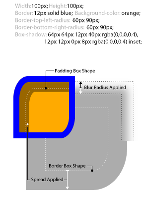
6.6.1. Shadow Shape, Spread, and Knockout
An outer box-shadow casts a shadow as if the border-box of the element were opaque. Assuming a spread distance of zero, its perimeter has the exact same size and shape as the border box. The shadow is drawn outside the border edge only: it is clipped inside the border-box of the element.
An inner box-shadow casts a shadow as if everything outside the padding edge were opaque. Assuming a spread distance of zero, its perimeter has the exact same size and shape as the padding box. The shadow is drawn inside the padding edge only: it is clipped outside the padding box of the element.
If a spread distance is defined, the shadow perimeter defined above is expanded outward (for outer box-shadows) or contracted inward (for inner box-shadows) by outsetting (insetting, for inner shadows) the shadow’s straight edges by the spread distance (and flooring the resulting width/height at zero).
|
|
|
|---|---|---|
|
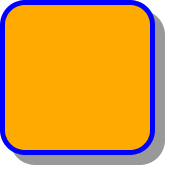
|
|
|
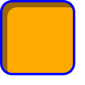
|
|
|
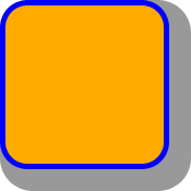
|
|
|
|
|
To preserve the box’s shape when spread is applied, the corner radii of the shadow are also increased (decreased, for inner shadows) from the border-box (padding-box) radii by adding (subtracting) the spread distance (and flooring at zero). For outer shadows, the border radius is then adjusted, independently in each dimension, to preserve the sharpness of rounded corners.
The border-image does not affect the shape of the box-shadow.
6.6.2. Blurring Shadow Edges
A non-zero blur radius indicates that the resulting shadow should be blurred, such as by a Gaussian filter. The exact algorithm is not defined; however the resulting shadow must approximate (with each pixel being within 5% of its expected value) the image that would be generated by applying to the shadow a Gaussian blur with a standard deviation equal to half the blur radius.
Note: This means for a long, straight shadow edge, the blur radius will create a visibly apparent color transition approximately the twice length of the blur radius that is perpendicular to and centered on the shadow’s edge, and that ranges from almost the full shadow color at the endpoint inside the shadow to almost fully transparent at the endpoint outside it.
6.7. Layering, Layout, and Other Details
Drop shadows are declared in the coordinated value list constructed from the box-shadow-* properties, which form a coordinating list property group with box-shadow-offset as the coordinating list base property. See CSS Values 4 § A Coordinating List-Valued Properties.
The shadow effects are applied front-to-back: the first shadow is on top and the others are layered behind. Shadows do not influence layout and may overlap (or be overlapped by) other boxes and text or their shadows. In terms of stacking contexts and the painting order, the outer box-shadows of an element are drawn immediately below the background of that element, and the inner shadows of an element are drawn immediately above the background of that element (below the borders and border image, if any).
Unless otherwise specified, drop shadows are only applied to the principal box. If the affected box has multiple fragments, the shadows are applied as specified in box-decoration-break.
Shadows do not trigger scrolling or increase the size of the scrollable area.
Outer shadows have no effect on internal table elements in the collapsing border model. If a shadow is defined for single border edge in the collapsing border model that has multiple border thicknesses (e.g. an outer shadow on a table where one row has thicker borders than the others, or an inner shadow on a rowspanning table cell that adjoins cells with different border thicknesses), the exact position and rendering of its shadows are undefined.
7. Border Shaping
While corner-shape and border-radius allow some expressiveness to styling a border, they still work with the assumption that the border is rectangular.
The border-shape property augments these capabilities, by enabling the author to use any basic shape to specify the path of the border.
7.1. The border-shape property
| Name: | border-shape |
|---|---|
| Value: | none | [ <basic-shape> <geometry-box>?]{1,2} |
| Initial: | none |
| Applies to: | all elements |
| Inherited: | no |
| Percentages: | see prose |
| Computed value: | list, each item a computed color |
| Canonical order: | per grammar |
| Animation type: | by computed value |
The border-shape property defines custom shapes for element borders using one or two basic shape values.
7.2. Syntax and Usage Modes
The border-shape property accepts either a single <basic-shape> or two <basic-shape>s:
- Single <basic-shape> (Stroke mode)
-
The border is rendered as a stroke along the shape’s path, with the stroke width determined by the relevant side’s computed border width. This mode is useful for creating outlined shapes.
- Two <basic-shape>s (Fill mode)
-
The border is rendered as the area between the two paths. The first shape defines the outer boundary, and the second shape defines the inner boundary. This mode provides precise control over the border region’s geometry. The fill color of the border is the relevant side’s computed border-color.
7.3. Geometry Box References
When a <geometry-box> is not explicitly provided, the default reference box depends on the number of <basic-shape> values:
- Single <basic-shape>
-
The <geometry-box> defaults to the half-border-box value, which positions the stroke to match the default border behavior, with the border extending equally inward and outward from the shape path.
- Two <basic-shape>s
-
The first (outer) shape defaults to the border box, and the second (inner) shape defaults to the padding box. This allows the border-width properties to naturally affect the final shape.
7.4. Examples
.circular-button{ width : 100 px ; height : 100 px ; border : 5 px solid blue; border-shape : circle ( 50 % ); }
This creates a circular border with a 5px stroke width.
.diamond{ width : 200 px ; height : 200 px ; border : 10 px solid crimson; border-shape : polygon ( 50 % 0 % , 100 % 50 % , 50 % 100 % , 0 % 50 % ) polygon ( 50 % 10 % , 90 % 50 % , 50 % 90 % , 10 % 50 % ); }
This creates a diamond border by defining outer and inner polygons.
.custom-shape{ border : 8 px solid green; border-shape : path ( 'M 10,30 A 20,20 0,0,1 50,30 A 20,20 0,0,1 90,30 Q 90,60 50,90 Q 10,60 10,30 z' ); }
This creates a heart-shaped border using an SVG path.
.fancy-box{ width : 100 px ; height : 100 px ; border-top-width : 10 px ; border-right-width : 5 px ; border-bottom-width : 10 px ; border-left-width : 5 px ; border-style : solid; border-color : purple; border-shape : ellipse ( 50 % 40 % ); }
The relevant side for border shape determines which border width is used for the stroke.
7.5. Interactions with Other Properties
7.5.1. Interaction with border-radius and corner-shape
The border-shape property is not compatible with border-radius and corner-shape. When an element’s computed value of border-shape is not none, its border-radius is ignored, as if it was set to 0. corner-shape is implicitly ignored, as it can only work in tandem with border-radius.
Note: Authors should use either border-shape for custom shapes or border-radius/corner-shape for rectangular boxes with styled corners, but not both simultaneously.
7.5.2. Interaction with box-shadow
An outer box-shadow is cast as if the shape defined by the outer path were opaque. An inner box-shadow is cast as if everything outside the shape defined by the inner path were opaque. For both inner and outer shadows, the shadow shape is expanded or contracted by the spread distance, blurred by the blur radius, and then clipped by the border-shape, adhering to the standard box-shadow painting rules.
.shaped-shadow{ border-shape : circle ( 50 % ); box-shadow : 0 4 px 8 px rgba ( 0 , 0 , 0 , 0.3 ); }
The shadow follows the circular shape rather than a rectangular box.
7.5.3. Interaction with Overflow and Clipping
The inner border-shape clips the overflow content of the element, in the same manner as border-radius, as described in corner clipping.
how should this affect clipping replaced elements?
7.5.4. Interaction with Layout
border-shape does not affect geometry or layout, which is still computed using the existing border-width properties. The shaped border is purely a visual effect.
border-shape does not affect the flow of content inside the box.
Note: An author can use border-shape in tandem with shape-inside to create effects that both decorate the box and control its text flow.
7.6. Determining the Relevant Side
-
If element’s computed border-block-start-style is not none, then return block-start.
-
If element’s computed border-inline-start-style is not none, then return inline-start.
-
If element’s computed border-block-end-style is not none, then return block-end.
-
If element’s computed border-inline-end-style is not none, then return inline-end.
-
Return block-start.
Note: This algorithm ensures consistent behavior when multiple border sides have different styles or widths. The first non-none border side (in logical order) determines the border characteristics used for the shaped border.
Tests
Privacy Considerations
No new privacy considerations have been reported on this specification.
Security Considerations
No new security considerations have been reported on this specification.
Changes
Changes since the First Public Working Draft of 22 July 2025
-
Added corner-* shorthands
-
Renamed
cornersto corner -
Added Web Platform Tests coverage
-
Incorporated full text of [CSS3BG] related to borders and shadows
-
Renamed border-clip-* properties to border-*-clip and added logical longhands and shorthands
-
Renamed normal value of border-*-clip properties to none
-
Added new syntax for border-*-*-radius longhands using a slash to separate horizontal and vertical radii
-
Allowed a single <length> value for box-shadow-offset to set both offsets to the same value
-
Changed the special case of border-width having a value of 0 when border-style is none or from a computed-value effect to a resolved-value effect. (Issue 11494)
Additions since [CSS3BG]
-
<image-1D> as value for border-color and its longhands
-
Added physical and logical border-*-radius shorthands
-
Added corner-shape and corner-*-shape shorthands, plus related corner and corner-* shorthands
-
Added border-shape
-
Added partial borders via border-limit and border-*-clip properties
-
Added box-shadow-* longhands and turned box-shadow into a shorthand
-
Moved logical border properties from [CSS-LOGICAL-1] to this spec.
Acknowledgments
In addition to the many contributors to the [CSS1], [CSS2], and [CSS3BG] predecessors to this module, the editors would like to thank Tab Atkins, Noam Rosenthal, Håkon Wium Lie, Oriol Brufau, and Guillaume Lebas for their suggestions and feedback specifically for this Level 4.