Title: CSS Text Decoration Module Level 4
Shortname: css-text-decor
Level: 4
Status: ED
Work Status: Exploring
Group: csswg
ED: https://drafts.csswg.org/css-text-decor-4/
TR: https://www.w3.org/TR/css-text-decor-4/
Previous Version: https://www.w3.org/TR/2020/WD-css-text-decor-4-20200506/
Issue Tracking: Tracker http://www.w3.org/Style/CSS/Tracker/products/10
Editor: Elika J. Etemad / fantasai, Apple, http://fantasai.inkedblade.net/contact, w3cid 35400
Editor: Koji Ishii, Google, kojiishi@gmail.com, w3cid 45369
Abstract: This module contains the features of CSS relating to text decoration, such as underlines, text shadows, and emphasis marks.
spec:css-backgrounds-3; type:property; text:box-shadow
spec:css-text-3; type:dfn; text:character
spec:fill-stroke-3; type:property;
	text: fill
	text: stroke
Introduction
This subsection is non-normative.
This module covers text decoration, i.e. decorating the glyphs
of the text once typeset according to font and typographic rules.
(See [[CSS-TEXT-3]] and [[CSS-FONTS-3]].)
Such features are traditionally used not only for purely decorative purposes,
but also in some cases to show emphasis, for honorifics,
and to indicate editorial changes such as insertions, deletions, and misspellings.
CSS Levels 1 and 2 only defined very basic line decorations
(underlines, overlines, and strike-throughs)
appropriate to Western typographical traditions.
Level 3 of this module added the ability to change
the color, style, position, and continuity of these decorations,
and also introduced
emphasis marks (traditionally used in East Asian typography),
and shadows (which were proposed then deferred from Level 2).
Level 4 introduces additional controls over these decorations.
Module Interactions
This module replaces and extends the text-decorating
features defined in [[CSS-TEXT-DECOR-3]].
All of the properties in this module
can be applied to the ''::first-line'' and ''::first-letter'' [=pseudo-elements=].
Value Definitions
This specification follows the CSS property definition conventions from [[!CSS2]]
using the value definition syntax from [[!CSS-VALUES-3]].
Value types not defined in this specification are defined in CSS Values & Units [[!CSS-VALUES-3]].
Combination with other CSS modules may expand the definitions of these value types.
In addition to the property-specific values listed in their definitions,
all properties defined in this specification
also accept the CSS-wide keywords as their property value.
For readability they have not been repeated explicitly.
Terminology
The terms [=typographic character unit=] (character),
[=typographic letter unit=] ([=letter=]),
and [=content language=]
as used in this specification are defined in [[!CSS-TEXT-3]].
Other terminology and concepts used in this specification are defined
in [[!CSS2]] and [[!CSS-WRITING-MODES-4]].
Line Decoration: Underline, Overline, and Strike-Through
The following properties describe line decorations that are added to the content of an element.
When specified on or propagated to an inline box,
that box becomes a decorating box for that decoration,
applying the decoration to all its box fragments.
The decoration is then further propagated to any in-flow block-level boxes that split the inline
(see CSS2.1 section 9.2.1.1).
When specified on or propagated to a block container that establishes an inline formatting context,
the decorations are propagated to an anonymous inline box that wraps all the in-flow inline-level children of the block container.
When specified on or propagated to a ruby container,
the decorations are propagated only to the ruby base.
For all other box types,
the decorations are propagated to all [=in-flow=] children.
Note that text decorations are not propagated to any out-of-flow descendants,
nor to the contents of atomic inline-level descendants such as inline blocks and inline tables.
They are also not propagated to inline children of inline boxes,
although the decoration is applied to such boxes.
Underlines, overlines, and line-throughs are drawn only for non-replaced inline boxes,
and are drawn across all text (including white space, letter spacing, and word spacing)
except spacing (white space, letter spacing, and word spacing) at the beginning and end of a line.
Atomic inlines, such as images and inline blocks, are not decorated.
Margins, borders, and padding of the [=decorating box=] are always skipped,
however the margins, border, and padding of descendant inline boxes are not.
Note that CSS 2.1 required skipping margins, borders, and padding always.
In Level 3 and beyond, by default
only the margins, borders, and padding of the [=decorating box=]
are skipped.
In the future CSS2.1 may be updated to match this new default.
[=Relatively positioning=] a descendant moves all text decorations
applied to it along with the descendant's text; it does not affect
calculation of the decoration's initial position on that line.
The 'visibility' property, 'text-shadow', filters, and other graphical transformations
likewise also affect all text decorations applied to that box--
including decorations propagated from an ancestor box--
and do not affect the calculation of their initial positions or thicknesses.
(In the case of line decorations drawn over an [=atomic inline=]
or across the margins/borders/padding of a [=non-replaced=] [=inline box=],
they are analogously associated with the affected atomic inline / non-replaced inline box
rather than with the [=decorating box=].)
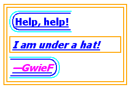
In the following style sheet and document fragment:
		  blockquote { text-decoration: underline; color: blue; }
		  em { display: block; }
		  cite { color: fuchsia; }
		  <blockquote>
		   <p>
		    <span>
		     Help, help!
		     <em> I am under a hat! </em>

		     <cite> —GwieF </cite>
		    </span>
		   </p>
		  </blockquote>
...the underlining for the blockquote element is propagated to an
anonymous inline box that surrounds the span element, causing
the text "Help, help!" to be blue, with the blue underlining from
the anonymous inline underneath it, the color being taken from the
blockquote element. The
<em>text</em>
in the em block is also underlined, as it is in an in-flow block to
which the underline is propagated. The final line of text is fuchsia,
but the underline underneath it is still the blue underline from the
anonymous inline element.
This diagram shows the boxes involved in the example above. The
rounded aqua line represents the anonymous inline element wrapping
the inline contents of the paragraph element, the rounded blue line
represents the span element, and the orange lines represent the
blocks.
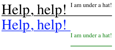
In the following style sheet and document fragment:
		  div { color: black; font-size: 48px; text-decoration: underline; text-shadow: blue 0px 50px 0px; }
		  span { font-size: 20px; vertical-align: top; text-shadow: green 0px 100px 0px; }
<div>Help, help! <span>I am under a hat!</span></div>
...the <div> is the [=decorating box=] for its underline (in black),
which is rendered uninterrupted through both the <div> and the <span>.
Unlike line decorations, however,
`text-shadow` is inherited as a property;
therefore the green text shadow on the <span>
overrides the blue text shadow on the <div>.
As a result, when the shadows are painted,
the shadow of the <div>’s underline is disjoint across the two elements.
Text Decoration Lines: the 'text-decoration-line' property
	Name: text-decoration-line
	Value: none | [ underline || overline || line-through || blink ] | spelling-error | grammar-error
	Initial: none
	Applies to: all elements
	Inherited: no (but see prose, above)
	Computed value: specified keyword(s)
	Animation type: discrete
This property,
which is a sub-property of the 'text-decoration' shorthand,
specifies what line decorations, if any, are added by the element.
Values other than ''text-decoration-line/none''
cause the element to originate the indicated text decorations,
and to apply and propagate it as described [[#line-decoration|above]].
Note: Unless it is desired for the color, style, and thickness of the lines
to be set by declarations lower in the [=cascade=],
it is safer to use the 'text-decoration' [=shorthand=]
instead of this [=longhand=].
Values have the following meanings:
- none
-
Neither produces nor inhibits text decoration.
- underline
-
Each line of text is underlined.
- overline
-
Each line of text has a line over it
(i.e. on the opposite side from an underline).
- line-through
-
Each line of text has a line through the middle.
- blink
-
The text blinks (alternates between visible and invisible).
Conforming user agents may simply not blink the text.
Note that not blinking the text is one technique to satisfy
checkpoint 3.3 of WAI-UAAG.
This value is deprecated
in favor of Animations [[CSS3-ANIMATIONS]].
- spelling-error
-
This value indicates the type of text decoration
used by the user agent to highlight spelling mistakes.
Its appearance is UA-defined,
and may be platform-dependent.
It is often rendered as a red wavy underline.
- grammar-error
-
This value indicates the type of text decoration
used by the user agent to highlight grammar mistakes.
Its appearance is UA defined,
and may be platform-dependent.
It is often rendered as a green wavy underline.
Note: In vertical writing modes,
'text-underline-position' can cause the underline and overline to switch sides.
This allows the position of underlines to key off of language-specific preferences
automatically.
When ''spelling-error'' or ''grammar-error'' apply,
the user agent must disregard
the other sub-properties of 'text-decoration',
as well any other properties typically affecting the appearance of line decorations
(such as 'text-underline-position', 'color', 'stroke', or 'fill')
when rendering these decorations.
However,
the user agent may take into account the 'accent-color' property.
Text Decoration Style: the 'text-decoration-style' property
	Name: text-decoration-style
	Value: solid | double | dotted | dashed | wavy
	Initial: solid
	Applies to: all elements
	Inherited: no
	Computed value: specified keyword
	Animation type: discrete
This property,
which is a sub-property of the 'text-decoration' shorthand,
sets the line-drawing style of underlines, overlines, and line-throughs
specified on the element with 'text-decoration-line',
and affects all decorations originating from this element
even if descendant boxes specify a different style.
Values have the same meaning as for the
border-style properties [[!CSS-BACKGROUNDS-3]].
wavy indicates a wavy line.
Text Decoration Color: the 'text-decoration-color' property
	Name: text-decoration-color
	Value: <>
	Initial: currentcolor
	Applies to: all elements
	Inherited: no
	Computed value: computed color
	Animation type: by computed value type
This property,
which is a sub-property of the 'text-decoration' shorthand,
sets the color of underlines, overlines, and line-throughs
specified on the element with 'text-decoration-line',
and affects all decorations originating from this element
even if descendant boxes specify a different color.
Text Decoration Line Thickness: the 'text-decoration-thickness' property
	Name: text-decoration-thickness
	Value: auto | from-font | <> | <>
	Initial: auto
	Applies to: all elements
	Inherited: no
	Percentages: N/A
	Computed value: as specified, with <> values computed
	Animation type: by computed value
This property,
which is a sub-property of the 'text-decoration' shorthand,
sets the stroke thickness of underlines, overlines, and line-throughs
specified on the element with 'text-decoration-line',
and affects all decorations originating from this element
even if descendant boxes specify a different thickness.
Values have the following meanings:
- auto
-
The UA chooses an appropriate thickness for text decoration lines;
see below.
- from-font
-
If the first available font has
metrics indicating a preferred underline width,
use that width,
otherwise behaves as ''text-decoration-thickness/auto''.
- <>
- <>
-
A length value specifies the thickness of text decoration lines as a fixed length.
Note: A length will inherit as a fixed value,
and will not scale with the font.
A percentage value specifies the thickness of text decoration lines as a percentage of
the used 'font-size'.
Note: A percentage will inherit as a relative value,
and will therefore scale with changes in the font as it inherits.
The UA should round the actual value to the nearest integer device pixel,
and ensure it is at least one device pixel.
Automatic Thickness of Text Decoration Lines
Some font formats (such as OpenType) can offer information
about the appropriate thickness of a line decoration.
The UA should use such font-based information
when choosing ''text-decoration-thickness/auto'' line thicknesses
wherever appropriate.
Determining the Position and Thickness of Line Decorations
Issue: This section is copied over from early drafts of Text Decoration Level 3.
It is still under review, and needs integration with 'text-underline-offset' and 'text-decoration-thickness'.
Since line decorations can span elements with varying font sizes and
vertical alignments, the best position for a line decoration is not
necessarily the ideal position dictated by the decorating box.
Instead, it's calculated, per line, from all text decorated by the decorating box on that line,
the considered text.
However, descendants of the decorating box
that are skipped due to 'text-decoration-skip',
descendant inlines with ''text-decoration-skip: ink'',
and any descendants that do not participate in the decorating box’s inline formatting context
are excluded from the set of considered text.
The line decoration positions are then calculated
per line
as follows
(treating over-positioned underlines as over lines
and under-positioned overlines as under lines):
- over lines
-
Align the line decoration with respect to the highest
over EM-box edge
of the considered text.
- alphabetic underlines
-
The alphabetic underline position is calculated by taking
the ideal offset (from the alphabetic baseline) of each run of considered text,
averaging those, and then using the lowest alphabetic baseline to actually position the line.
(Alphabetic baselines can differ between ''vertical-align/baseline''-aligned boxes
if the dominant baseline is non-alphabetic.)
To prevent superscripts and subscripts from throwing this position off-kilter,
an inline with a non-initial computed 'vertical-align'
is treated as having the ideal underline position of its parent.
- non-alphabetic under lines
-
Position the line decoration with respect to the lowest
under EM-box edge
of the considered text.
- line-throughs
-
Line-throughs essentially use the same sort of averaging as for alphabetic underlines,
but recompute the position when drawing across a descendant with a different computed 'font-size'.
(This ensures that the text remains effectively “crossed out” despite any font size changes.)
For each run of considered text with the same 'font-size',
compute an ideal position averaged from its font metrics.
To prevent superscripts and subscripts from throwing this position off-kilter,
an inline with a non-initial computed 'vertical-align'
is treated as having the ideal underline position of its parent.
Position the portion of the line across each decorated fragment at that position.
For simplicity, line-throughs should draw over each element at that element's preferred/averaged position.
This can produce some undesirable jumpiness,
but there doesn't appear to be any way to avoid that which is correct in all instances,
and all attempts are worryingly complex.
What position should line-throughs adopt over elements that have a different font-size,
but no considered text?
CSS does not define the thickness of line decorations.
In determining the thickness of text decoration lines,
user agents may consider the font sizes, faces, and weights of descendants
to provide an appropriately averaged thickness.
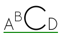
The following figure shows the averaging for underline:
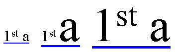 In the three fragments of underlined text, the underline is drawn
consecutively lower and thicker as the ratio of large text to small
text increases.
In the three fragments of underlined text, the underline is drawn
consecutively lower and thicker as the ratio of large text to small
text increases.
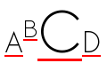
Using the same example, a line-through would in the second fragment,
instead of averaging the two font sizes,
split the line-through into two segments:
 In both cases, however, the superscript, due to the vertical-alignment shift,
has no effect on the position of the line.
In both cases, however, the superscript, due to the vertical-alignment shift,
has no effect on the position of the line.
Text Decoration Shorthand: the 'text-decoration' property
	Name: text-decoration
	Value: <<'text-decoration-line'>> || <<'text-decoration-thickness'>> || <<'text-decoration-style'>> || <<'text-decoration-color'>>
This property is a shorthand for setting
'text-decoration-line',
'text-decoration-thickness',
'text-decoration-style',
and 'text-decoration-color'
in one declaration.
Omitted values are set to their initial values.
The following example underlines unvisited links with a solid blue
underline in CSS1 and CSS2 UAs and a navy dotted underline in CSS3 UAs.
			:link {
			  color: blue;
			  text-decoration: underline;
			  text-decoration: navy dotted underline; /* Ignored in CSS1/CSS2 UAs */
			}
Text Underline Position: the 'text-underline-position' property
	Name: text-underline-position
	Value: auto | [ from-font | under ] || [ left | right ]
	Initial: auto
	Applies to: all elements
	Inherited: yes
	Computed value: specified keyword(s)
	Animation type: discrete
This property,
which is not a sub-property of the 'text-decoration' shorthand,
sets the position of an underline with respect to the text,
and defines its [=zero position=] for further adjustment by 'text-underline-offset'.
It affects all decorations originating from this element,
even if descendant boxes specify a different position.
It does not affect underlines specified by ancestor elements.
The following example styles modern Chinese, Japanese, and Korean
texts with the appropriate underline positions in both horizontal
and vertical text:
			:root:lang(ja), [lang|=ja], :root:lang(ko), [lang|=ko] { text-underline-position: under right; }
			:root:lang(zh), [lang|=zh] { text-underline-position: under left; }
- auto
-
The user agent may use any algorithm to determine the
underline's position; however it must be placed at or under
the alphabetic baseline.
Note: It is suggested that the default underline position
be close to the alphabetic baseline,
unless that would either cross subscripted (or otherwise lowered) text
or draw over glyphs from Asian scripts such as Han or Tibetan
for which an alphabetic underline is too high:
in such cases, shifting the underline lower
or aligning to the em box edge as described for ''text-underline-position/under''
may be more appropriate.
- from-font
-
If the first available font has
metrics indicating a preferred underline offset,
use that offset,
otherwise behaves as ''text-underline-offset/auto''.
- under
-
The underline is positioned [=under=] the element's text content.
In this case the underline usually does not cross the descenders.
(This is sometimes called “accounting” underline.)
This value can be combined with ''text-underline-position/left'' or ''text-underline-position/right''
if a particular side is preferred in vertical typographic modes.
Because 'text-underline-position' inherits, and is not reset
by the 'text-decoration' shorthand, the following example
switches the document to use ''text-underline-position/under'' underlining, which can
be more appropriate for writing systems with long, complicated
descenders. It is also often useful for mathematical or chemical
texts that use many subscripts.
:root { text-underline-position: under; }
- left
-
In vertical typographic modes, the underline is aligned as for
''text-underline-position/under'', except it is always aligned to the left edge of the text.
If this causes the underline to be drawn on the "over" side of
the text, then an overline also switches sides and is drawn on
the "under" side.
- right
-
In vertical typographic modes, the underline is aligned as for
''text-underline-position/under'', except it is always aligned to the right edge of the text.
If this causes the underline to be drawn on the "over" side of
the text, then an overline also switches sides and is drawn on
the "under" side.

|

|
| ''text-underline-position/left''
| ''text-underline-position/right''
|
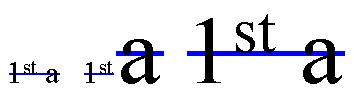
In vertical typographic modes, the 'text-underline-position'
values ''text-underline-position/left'' and ''text-underline-position/right'' allow placing the underline on either
side of the text. (In horizontal typographic modes, both values are
treated as ''text-underline-position/auto''.)
Text Underline Offset: the 'text-underline-offset' property
	Name: text-underline-offset
	Value: auto | <>
	Initial: auto
	Applies to: all elements
	Inherited: yes
	Percentages: N/A
	Computed value: as specified, with <> values computed
	Animation type: by computed value
This property,
which is not a sub-property of the 'text-decoration' shorthand,
sets the offset of underlines from their [=zero position=].
Positive offsets represent distances outward from the text;
negative offsets inward.
It affects all decorations originating from this element,
even if descendant boxes specify a different position.
It does not affect underlines specified by ancestor elements.
Values have the following meanings:
- auto
-
The UA chooses an appropriate offset for underlines.
However, this offset must be zero
if the computed value of 'text-underline-position' is ''text-underline-position/from-font''
and the UA was able to extract an appropriate metric to use
from the font.
- <>
-
A length value specifies the offset of underlines as a fixed length.
Note: A length will inherit as a fixed value,
and will not scale with the font.
A percentage value specifies the offset of underlines as a percentage of the used
'font-size'.
Note: A percentage will inherit as a relative value,
and will therefore scale with changes in the font as it inherits.
When the value of the 'text-decoration-line' property is either
''spelling-error'' or ''grammar-error'',
the UA must ignore the value of 'text-underline-position'.
Underline Offset Origin (Zero Position)
The zero position of the underline
depends on the value of 'text-underline-position'
as detailed below.
Interaction of 'text-underline-position' and 'text-underline-offset'
| 'text-underline-position'
| Zero Position
| Positive Direction
|
| ''text-underline-position/auto''
| alphabetic baseline
| under
|
| ''text-underline-position/from-font''
| position specified by the font metrics, falling back to alphabetic baseline
| under
|
| ''text-underline-position/under''
| text-under edge
| under
|
| ''text-underline-position/left''
| text-under (left) edge
| under
|
| ''text-underline-position/right''
| text-over (right) edge
| over
|
The underline is aligned to the outside of the specified position
(extending its thickness in the positive direction only).
Any automatic adjustments made to accommodate descendant content are maintained;
the 'text-underline-offset' is in addition to those.
Using Font Metrics for Automatic Positioning
Some font formats (such as OpenType) can offer information
about the appropriate position of a line decoration.
The UA should use such font-based information
in its choice of ''text-underline-offset/auto'' offset
wherever appropriate,
and must use such information
when ''text-underline-position/from-font'' is specified for 'text-underline-position'.
Note: Typically, OpenType font metrics give the position
of an ''text-underline-position/alphabetic'' underline;
in some cases (especially in CJK fonts),
it gives the position of a ''under left'' underline.
(In this case, the font's underline metrics typically
touch the bottom edge of the em box).
The UA may but is not required to correct for incorrect font metrics.
Text Decoration Line Uniformity
The exact position and thickness of line decorations
depends on the values of
'text-underline-position', 'text-underline-offset', and 'text-decoration-thickness'
as defined above,
and is otherwise UA-defined.
However, for underlines and overlines
the UA must use a single thickness and position on each line
for the decorations deriving from a single [=decorating box=].
Note, since line decorations can span elements with varying font sizes and
vertical alignments, the best position for a line decoration is not
necessarily the ideal position dictated by the [=decorating box=].
For example, an overline positioned to a small font
will effectively become a line-through if the element contains text in a significantly larger font-size.
Even for underlines, if the text is not aligned to the alphabetic baseline
(for example, in vertical typesetting styles,
text is aligned by its central baseline by default [[CSS-WRITING-MODES-4]])
an underline will cut through descendant text of a larger font-size.
UA consideration of descendant content will therefore result in better typography.
Trimming, Expanding, and Shifting Text Decoration Lines: the 'text-decoration-inset' property
	Name: text-decoration-inset
	Value: <>{1,2} | auto
	Initial: 0
	Applies to: all elements
	Inherited: no
	Percentages: N/A
	Computed value: specified keyword or absolute length
	Animation type: by computed value
This property adjusts the start and end endpoints of line decorations.
Positive values move an endpoint inward, trimming the decoration;
negative values move it outward, extending the decoration.
It controls all text decoration lines drawn by this [=decorating box=],
but not any text decoration lines drawn by its ancestors.
If two component values are given,
the first applies to the [=start=] and the second to the [=end=].
Values have the following meanings:
- <>
-
Adjusts the start or end endpoint of the affected line decorations.
Positive values move the endpoint inward (trimming),
negative values move it outward (extending).
The following example offsets an extra thick underline
1em endwards with respect to the text
					h1 {
						text-decoration: underline 0.3em rgba(36,148,187,0.25);
						text-decoration-inset: 1em -1em;
					}
- auto
-
The UA chooses an inset amount that ensures that
if two identical underlined elements appear side-by-side
they do not appear to have a single underline.
(This is important in Chinese, where underlining is a form of punctuation.)
The adjustment of the text decoration's endpoints is subject to 'box-decoration-break':
* for ''box-decoration-break/slice'' (the default)
endpoint adjustment is only applied to the [=start=] edge of the first fragment
and the [=end=] edge of the last fragment,
and may accumulate to other fragments if the amount of the inset
is more than the length of the fragment.
* for ''box-decoration-break/clone''
endpoint adjustment is applied to each fragment independently.
Text Decoration Line Continuity: the 'text-decoration-skip' shorthand and its sub-properties
Issue: The CSSWG resolved to be split skipping functionality into individual properties
along the lines of 'text-decoration-skip-ink',
to improve its cascading behavior.
See discussion
and resolution.
This section is a rough draft and has not yet been vetted by the CSSWG
	Name: text-decoration-skip
	Value: none | auto
	Initial: See individual properties
	Applies to: all elements
	Inherited: yes
	Percentages: N/A
	Computed value: See individual properties
	Animation type: discrete
The 'text-decoration-skip' property and its sub-properties
('text-decoration-skip-self',
'text-decoration-skip-box',
'text-decoration-skip-spaces',
'text-decoration-skip-ink')
control interruptions in line decorations
for which the element or an ancestor is the [=decorating box=].
The none value
sets all sub-properties to ''text-decoration-skip/none'',
and the auto value
sets all sub-properties to their initial values.
ISSUE: Is this ''text-decoration-skip/none'' definition Web-compatible?
Do we also need to add an ink value for Web-compat?
Note that these properties inherit
and that descendant elements can have a different setting.
The following addition is made to the default UA stylesheet for HTML:
ins, del { text-decoration-skip: none; }
When the value of the 'text-decoration-line' property is either
''spelling-error'' or ''grammar-error'',
the UA may ignore any or all of these properties.
Skipping Spaces: the 'text-decoration-skip-self' property
	Name: text-decoration-skip-self
	Value: auto | skip-all | [ skip-underline || skip-overline || skip-line-through ] | no-skip
	Initial: auto
	Applies to: all elements
	Inherited: no
	Percentages: N/A
	Computed value: specified keyword(s) except for ''text-decoration-skip-self/skip-all'', see below
	Animation type: discrete
This property specifies whether
any text decoration lines drawn by its ancestors
are propagated to or drawn across the element.
Values have the following meanings:
- auto
-
Skip this element (its entire margin box) if it is an atomic inline
(such as an image or inline-block).
- skip-all
-
Skip this element (its entire margin box) unconditionally.
Don't draw across it,
don't propagate to it.
- skip-underline
-
Skip this element (its entire margin box) unconditionally
when drawing ancestor underlines.
- skip-overline
-
Skip this element (its entire margin box) unconditionally
when drawing ancestor overlines.
- skip-line-through
-
Skip this element (its entire margin box) unconditionally
when drawing ancestor line-throughs.
- no-skip
-
Line decorations from ancestor [=decorating boxes=]
are applied to this box unconditionally:
drawn across it as if it were text if it is an [=atomic inline=],
or propagated to it according to the usual rules if it is not.
Note: The ''text-decoration-skip-self/no-skip'' value is provided
to treat images as text when that is necessary,
for example when representing glyphs that are not encoded in Unicode.
The ''text-decoration-skip-self/skip-all'' keyword [=computed value|computes=]
to ''skip-underline skip-overline skip-line-through''.
Note, however, that this combination will serialize
as ''text-decoration-skip-self/skip-all'' (shortest serialization).
Skipping Spaces: the 'text-decoration-skip-box' property
	Name: text-decoration-skip-box
	Value: none | all
	Initial: none
	Applies to: all elements
	Inherited: yes
	Percentages: N/A
	Computed value: specified keyword(s)
	Animation type: discrete
Issue: The CSSWG resolved to split 'text-decoration-skip' into sub-properties,
but this value set has not yet been vetted by the CSSWG.
This property specifies what parts of the element's box area
any text decoration affecting the element must skip over.
It controls only text decoration lines drawn by its ancestors.
Values have the following meanings:
- none
-
Skip nothing: line decorations from ancestor [=decorating boxes=]
are drawn from margin edge to margin edge.
- all
-
When drawing text decoration lines applied to an ancestor [=decorating box=],
skip over the box's own margin, border, and padding areas
and only draw line decorations within its content area.
This value only has an effect for decorations imposed by an ancestor;
a decorating box never draws over its own box decoration.
Skipping Spaces: the 'text-decoration-skip-spaces' property
	Name: text-decoration-skip-spaces
	Value: none | all | [ start || end ]
	Initial: start end
	Applies to: all elements
	Inherited: yes
	Percentages: N/A
	Computed value: specified keyword(s)
	Animation type: discrete
ISSUE: Should the initial value be ''text-decoration-skip-spaces/none'' for Web-compat?
If not, INS and DEL at least should be assigned ''text-decoration-skip-spaces/none'' in the UA default stylesheet.
See also Issue 4653.
This property specifies whether text decoration skips any spaces.
It controls all text decoration lines drawn by the element
and also any text decoration lines drawn by its ancestors.
Values have the following meanings:
- none
-
[=Spacers=] are not skipped.
They are decorated just like any other character.
- all
-
Skip all [=spacers=]
and all word separators
plus any adjacent 'letter-spacing' or 'word-spacing'.
- start
-
Skip all [=spacers=],
plus any adjacent 'letter-spacing' or 'word-spacing',
when located at the start of the line.
- end
-
Skip all [=spacers=],
plus any adjacent 'letter-spacing' or 'word-spacing',
when located at the end of the line.
For the purpose of this property,
a spacer is
any typographic character unit from [=Unicode General Category=] Zs
except U+202F NARROW NO-BREAK SPACE.
Skipping Glyphs: the 'text-decoration-skip-ink' property
	Name: text-decoration-skip-ink
	Value: auto | none | all
	Initial: ''auto''
	Applies to: all elements
	Inherited: yes
	Percentages: N/A
	Computed value: specified keyword
	Animation type: discrete
This property controls how overlines and underlines are drawn
when they cross over a glyph.
It affects all decorations originating from this element
even if descendant boxes specify a different style.
When enabled, decoration lines skip over where glyphs are drawn:
interrupt the decoration line to let the shape of the text show through
where the text decoration would otherwise cross over a glyph.
The UA must also skip a small distance to either side of the glyph outline.
Ideographic scripts do not want to skip when ''text-decoration-skip-ink/auto''.
How can we define this behavior?
Are there more scripts wanting not to skip?
Need some normative text describe how ''text-decoration-skip-ink/auto'' works.
See
telcon minutes,
alreq#86,
csswg#1288
- auto
-
UAs may interrupt underlines and overlines
where the line would cross glyph ink
and to some distance to either side of the glyph outline.
UAs should consider the script of the text (see note below)
when determining whether to apply ink-skipping behavior to a given
range of content.
- all
-
UAs must interrupt underlines and overlines
where the line would cross glyph ink
and to some distance to either side of the glyph outline.
- none
-
UA must draw continuous underlines and overlines,
without interruptions when they cross over a glyph.
Note: Implementation experience shows that ink-skipping behavior often
produces undesirable results when underlined text includes ideographic characters,
as the underline position (depending on the font and user agent involved)
often clashes with almost all the glyphs,
such that only occasional fragments of the line remain to be rendered.
In principle, this could be resolved by authors using
''text-underline-position: under'' (or possibly 'text-underline-offset')
to move the underline to a lower position that does not clash with the glyphs,
but this is not always feasible, even if the user agent supports these properties
and the author is aware of their potential.
In particular, when a page contains arbitrary user-generated content,
the author responsible for the design may not know whether CJK content will be present.
And with mixed-script content,
an underline position designed to work well for CJK content
may look bad if the majority of the text is non-CJK.
Therefore, when ''text-decoration-skip-ink/auto'' is in effect,
a UA that implements ink-skipping
should refrain from doing so in CJK contexts.
(Authors who
do want ink-skipping applied to CJK content can use
the ''text-decoration-skip-ink/always'' value to explicitly request this.)
Primarily, this means
not applying ink-skipping for characters whose
Unicode
Script property
is any of the CJK scripts Han, Hiragana, Katakana, Bopomofo, or Hangul,
or for characters whose Script property is Inherited or Common,
and whose
ScriptExtensions property
includes one or more of the CJK scripts.
In addition, characters with a Unicode script property of Common and Inherited
(primarily generic punctuation and symbols) need to be considered,
as these may be used as part of a run of CJK-script content,
and it is desirable to treat all text within a given script run in a consistent way.
Therefore, the UA
should resolve the text into script runs
as described in the
“Implementation Notes”
of [[!UAX24]] “Unicode Script Property”, in particular subsections 5.1 and 5.2.
After applying the heuristics described there (or a similar analysis of scripts),
the UA
should disable ink-skipping for all ranges of text
that are determined to be in a CJK script.
Issue: Are there other (non-CJK) scripts where it would be preferable
to disable ink-skipping by default
(when ''text-decoration-skip-ink/auto'' is in effect)?
Perhaps Yi? Arabic?
(See also discussion in
Issue 1288.)
Shaping Interruptions
When the UA interrupts underlines or overlines at glyph boundaries,
the shape of the line at that boundary should
follow the shape of the glyph.
Note, this specification intentionally does not mandate a particular method
for “following the shape” of the glyph
so that UAs can take appropriate measures to handle
aesthetic and performance considerations.
For example,
a UA could assume square line endings below a certain size threshold
for performance reasons;
or use trapezoidal endings to approximate curves,
especially on thinner line decorations.
In terms of aesthetic considerations,
the UA might also consider what happens when the glyph boundary
intersects only part of the line thickness
or is slanted close to the horizontal--
following the curve exactly
could result in typographically-awkward wisps of underline.
Whether to show the line within enclosed areas of a glyph is yet
another consideration.
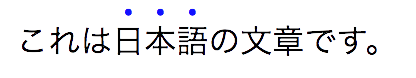
Additional Controls for Emphasis Marks
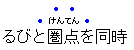
East Asian documents traditionally use small symbols next to each glyph to emphasize
a run of text. For example:
The 'text-emphasis' shorthand, and its 'text-emphasis-style' and 'text-emphasis-color' longhands,
can be used to apply such marks to the text.
The 'text-emphasis-position' property, which inherits separately,
allows setting the emphasis marks’ position with respect to the text.
Issue: See also issue about continuity in size/position.
Emphasis Mark Style: the 'text-emphasis-style' property
	Name: text-emphasis-style
	Value: none | [ [ filled | open ] || [ dot | circle | double-circle | triangle | sesame ] ] | <>
	Initial: none
	Applies to: text
	Inherited: yes
	Computed value: the keyword ''text-emphasis-style/none'', a pair of keywords representing the shape and fill, or a string
	Animation type: discrete
This property applies emphasis marks to the element's text.
Values have the following meanings:
- none
- No emphasis marks.
- filled
- The shape is filled with solid color.
- open
- The shape is hollow.
- dot
- Display small circles as marks.
The filled dot is U+2022 '•', and the open dot is U+25E6 '◦'.
- circle
- Display large circles as marks.
The filled circle is U+25CF '●', and the open circle is U+25CB '○'.
- double-circle
- Display double circles as marks.
The filled double-circle is U+25C9 '◉', and the open double-circle is U+25CE '◎'.
- triangle
- Display triangles as marks.
The filled triangle is U+25B2 '▲', and the open triangle is U+25B3 '△'.
- sesame
- Display sesames as marks.
The filled sesame is U+FE45 '﹅', and the open sesame is U+FE46 '﹆'.
- <>
- Display the given string as marks.
Authors should not specify more than one [=character=] in <string>.
The UA may truncate or ignore strings consisting of more than one grapheme cluster.
If a shape keyword is specified but neither of ''filled'' nor ''open'' is
specified, ''filled'' is assumed. If only ''filled'' or ''open'' is specified,
the shape keyword computes to ''text-emphasis-style/circle'' in horizontal typographic modes and
''sesame'' in vertical typographic modes.
The marks should be drawn using the element's font settings
with the addition of the ''font-variant-east-asian/ruby'' feature
and the size scaled down 50%.
However, since not all fonts have all these glyphs,
and some fonts use inappropriate sizes for emphasis marks in these code points,
the UA may opt to use a font known to be good for emphasis marks,
or the marks may instead be synthesized by the UA.
Marks must remain upright in vertical typographic modes:
like CJK characters, they do not rotate to match the writing mode.
The orientation of marks in horizontal typographic modes of vertical writing modes
is undefined in this level
(but may be defined in a future level if definitive use cases arise).
Note: One example of good fonts for emphasis marks is Adobe's open source
Kenten Generic OpenType Font,
which is specially designed for the emphasis marks.
The marks are drawn once for each typographic character unit.
However, emphasis marks are not drawn for:
- Word separators
or other characters that
belong to the Unicode separator classes (Z*).
(But note that emphasis marks are drawn for a space
that combines with any combining characters.)
- Punctuation--specifically,
any characters that belong to the
Unicode P* general category and
do not
NFKD normalize [[!UAX15]] to
any of the following symbols:
| # | U+0023 | NUMBER SIGN
|
| % | U+0025 | PERCENT SIGN
|
| ‰ | U+2030 | PER MILLE SIGN
|
| ‱ | U+2031 | PER TEN THOUSAND SIGN
|
| ٪ | U+066A | ARABIC PERCENT SIGN
|
| ؉ | U+0609 | ARABIC-INDIC PER MILLE SIGN
|
| ؊ | U+060A | ARABIC-INDIC PER TEN THOUSAND SIGN
|
| & | U+0026 | AMPERSAND
|
| ⁊ | U+204A | TIRONIAN SIGN ET
|
| @ | U+0040 | COMMERCIAL AT
|
| § | U+00A7 | SECTION SIGN
|
| ¶ | U+00B6 | PILCROW SIGN
|
| ⁋ | U+204B | REVERSED PILCROW SIGN
|
| ⁓ | U+2053 | SWUNG DASH
|
| 〽 | U+303D | PART ALTERNATION MARK
|
- Characters belonging to the Unicode classes for control codes
and unassigned characters (Cc, Cf, Cn).
Note: Control over which characters are marked will be added in Level 4.
(The list of punctuation may also be further refined,
particularly for non-CJK punctuation.)
Emphasis Mark Color: the 'text-emphasis-color' property
	Name: text-emphasis-color
	Value: <>
	Initial: currentcolor
	Applies to: text
	Inherited: yes
	Computed value: computed color
	Animation type: by computed value type
This property specifies the foreground color of the emphasis marks.
Note: ''currentcolor'' keyword computes to itself
and is resolved to the value of 'color' after inheritance is performed.
This means 'text-emphasis-color' by default matches the text 'color'
even as 'color' changes across elements.
Emphasis Mark Shorthand: the 'text-emphasis' property
	Name: text-emphasis
	Value: <<'text-emphasis-style'>> || <<'text-emphasis-color'>>
This property is a shorthand for setting
'text-emphasis-style' and 'text-emphasis-color'
in one declaration.
Omitted values are set to their initial values.
Note that 'text-emphasis-position' is not reset in this
shorthand. This is because typically the shape and color vary, but the
position is consistent for a particular language throughout the document.
Therefore the position should inherit independently.
Emphasis Mark Position: the 'text-emphasis-position' property
	Name: text-emphasis-position
	Value: [ over | under ] && [ right | left ]?
	Initial: over right
	Applies to: text
	Inherited: yes
	Computed value: specified keyword(s)
	Animation type: discrete
This property describes where emphasis marks are drawn at.
If ''[ right | left ]'' is omitted, it defaults to ''text-emphasis-position/right''.
The values have following meanings:
- over
- Draw marks over the text in horizontal typographic modes.
- under
- Draw marks under the text in horizontal typographic modes.
- right
- Draw marks to the right of the text in vertical typographic modes.
- left
- Draw marks to the left of the text in vertical typographic modes.
Emphasis marks are drawn exactly as if each character was
assigned the mark as its ruby annotation text with the ruby position
given by 'text-emphasis-position' and the ruby alignment as centered.
Note that this position may be adjusted if it would conflict
with underline or overline decorations.
The effect of emphasis marks on the line height is the same as for
ruby text.
If emphasis marks are applied to characters
for which ruby is drawn in the same position as the emphasis mark,
the emphasis marks are placed outside the ruby.
This includes auto-hidden
and empty ruby annotations.
Some editors prefer to hide emphasis marks when they conflict with ruby.
In HTML, this can be done with the following style rule:
ruby { text-emphasis: none; }
Some other editors prefer to hide ruby when they conflict with emphasis marks.
In HTML, this can be done with the following pattern:
			em { text-emphasis: dot; } /* Set text-emphasis for <em> elements */
			em rt { display: none; }   /* Hide ruby inside <em> elements */
Emphasis Mark Skip: the 'text-emphasis-skip' property
This section is under brainstorming.
It's also not yet clear if this property is needed quite yet, despite differences in desired behavior among publications.
	Name: text-emphasis-skip
	Value: spaces || punctuation || symbols || narrow
	Initial: spaces punctuation
	Applies to: text
	Inherited: yes
	Percentages: N/A
	Computed value: specified keyword(s)
	Animation type: discrete
This property describes for which characters marks are drawn.
The values have following meanings:
- spaces
-
Skip word separators or other characters
belonging to the Unicode separator category (Z*).
(But note that emphasis marks are drawn for a space
that combines with any combining characters.)
- punctuation
-
Skip punctuation.
Punctuation in this definition includes characters belonging to
the Unicode P* category
that are not defined as ''symbols'' (see below).
- symbols
- Skip symbols.
Symbols in this definition includes
all typographic character units belonging to
the Unicode S* general category
as well as any which are
NFKD-equivalent [[!UAX15]]
to the following characters from the Unicode Po category:
| # | U+0023 | NUMBER SIGN
|
| % | U+0025 | PERCENT SIGN
|
| ‰ | U+2030 | PER MILLE SIGN
|
| ‱ | U+2031 | PER TEN THOUSAND SIGN
|
| ٪ | U+066A | ARABIC PERCENT SIGN
|
| ؉ | U+0609 | ARABIC-INDIC PER MILLE SIGN
|
| ؊ | U+060A | ARABIC-INDIC PER TEN THOUSAND SIGN
|
| & | U+0026 | AMPERSAND
|
| ⁊ | U+204A | TIRONIAN SIGN ET
|
| @ | U+0040 | COMMERCIAL AT
|
| § | U+00A7 | SECTION SIGN
|
| ¶ | U+00B6 | PILCROW SIGN
|
| ⁋ | U+204B | REVERSED PILCROW SIGN
|
| ⁓ | U+2053 | SWUNG DASH
|
| 〽️ | U+303D | PART ALTERNATION MARK
|
- narrow
- Skip characters where the
East_Asian_Width property [[!UAX11]]
of the Unicode database [[!UAX44]] is not F (Fullwidth) or W (Wide).
Characters belonging to the Unicode classes for control codes
and unassigned characters (Cc, Cf, Cn) are skipped
regardless of the value of this property.
This syntax requires UA to implement drawing marks for spaces.
Is there any use case for doing so?
If not, should we modify the syntax not to allow drawing marks for spaces?
Issue: See also discussion of the initial value.
Text Shadows: the 'text-shadow' property
	Name: text-shadow
	Value: none | <>#
	Initial: none
	Applies to: text
	Inherited: yes
	Computed value: either the keyword ''box-shadow/none'' or
		a list, each item consisting of four absolute lengths
		plus a computed color
		and optionally also an ''text-shadow/inset'' keyword
	Animation type: as shadow list
This property accepts a comma-separated list of shadow effects
to be applied to the text of the element.
Values are interpreted as for 'box-shadow' [[!CSS-BACKGROUNDS-3]].
Each layer shadows the element's text and all its text decorations
(composited together).
The shadow effects are applied front-to-back:
the first shadow is on top.
The shadows may thus overlay each other.
Unlike 'box-shadow',
the spread distance
is strictly interpreted as outset distance
from any point of the glyph outline,
and therefore, similar to the blur radius,
creates rounded, rather than sharp, corners.
Negative spread values are invalid.
ISSUE(7250): Leave corner shaping undefined?
Outer text shadows
(specified without the ''box-shadow/inset'' keyword)
shadow the text--
including any text stroke [[!FILL-STROKE-3]]--
as if it were cut and raised above the surrounding canvas.
Unlike 'box-shadow',
outer text shadows are not clipped to the shadowed shape
and may show through if the text is partially-transparent.
Inner text shadows
(specified with the ''box-shadow/inset'' keyword)
shadow the canvas--
and any text stroke [[!FILL-STROKE-3]]--
as if the text were cut and dropped below the surrounding canvas.
They are therefore only drawn within the inner edge of the stroke.
[=Outer text shadows=] must be painted at a stack level
between the element's border/background (if present)
and the elements text and text decoration.
[=Inner text shadows=] must be painted
over the text and its decorations.
UAs should avoid painting text shadows over text
in adjacent elements belonging to the same stack level and stacking context.
(This may mean that the exact stack level of the shadows depends
on whether the element has a border or background:
the exact stacking behavior of text shadows is thus UA-defined.)
ISSUE(7251): Stacking relationship to stroke?
Like 'box-shadow', text shadows do not influence layout,
and do not trigger scrolling
or increase the size of the scrollable overflow region.
The ''text-shadow'' property applies to both the
::first-line and ::first-letter
pseudo-elements.
Painting Text Decorations
Painting Order of Text Decorations
As in [[!CSS2]], text decorations are drawn immediately over/under the text they decorate,
in the following order (bottommost first):
- shadows ('text-shadow')
- underlines ('text-decoration')
- overlines ('text-decoration')
- text
- emphasis marks ('text-emphasis')
- line-through ('text-decoration')
Where line decorations are drawn across box decorations or atomic inlines,
they are drawn over non-positioned content and just below any positioned descendants
(immediately below layer #8 in CSS2.1 Appendix E).
Overflow of Text Decorations
Text decorations that leak outside a box
are considered ink overflow:
they do not extend the scrollable overflow region.
[[css-overflow-3]]
Appendix A: Acknowledgements
This specification would not have been possible without the help from:
Ayman Aldahleh, Bert Bos, Tantek Çelik, Stephen Deach, John Daggett,
Martin Dürst,
Laurie Anna Edlund, Ben Errez, Yaniv Feinberg, Arye Gittelman, Ian
Hickson, Martin Heijdra, Richard Ishida, Masayasu Ishikawa,
Michael Jochimsen, Eric LeVine, Ambrose Li, Håkon Wium Lie, Chris Lilley,
Ken Lunde, Nat McCully, Shinyu Murakami, Paul Nelson, Chris Pratley, Marcin Sawicki,
Arnold Schrijver, Rahul Sonnad, Michel Suignard, Takao Suzuki,
Frank Tang, Chris Thrasher, Etan Wexler, Chris Wilson, Masafumi Yabe
and Steve Zilles.
Appendix B: Default UA Stylesheet
This appendix is informative,
and is to help UA developers to implement default stylesheet,
but UA developers are free to ignore or change.
/* typical styling of HTML */
blink {
text-decoration-line: blink;
}
s, strike, del {
text-decoration: line-through;
}
u, ins, :link, :visited {
text-decoration: underline;
}
abbr[title], acronym[title] {
text-decoration: dotted underline;
}
/* disable inheritance of text-emphasis marks to ruby text:
emphasis marks should only apply to base text */
rt { text-emphasis: none; }
/* set language-appropriate default emphasis mark position */
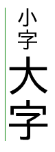
:root:lang(zh), [lang|=zh] { text-emphasis-position: under right; }
[lang|=ja], [lang|=ko] { text-emphasis-position: over right; }
/* set language-appropriate default underline position */
:root:lang(ja), [lang|=ja],
:root:lang(mn), [lang|=mn],
:root:lang(ko), [lang|=ko] { text-underline-position: right; }
:root:lang(zh), [lang|=zh] { text-underline-position: left; }
/* auto is chosen (implied) above instead of under
due to content-compatibility concerns */
If you find any issues, recommendations to add, or corrections,
please send the information to www-style@w3.org
with [css-text-decor] in the subject line.
While ''text-decoration-line: blink'' can't be fully reproduced with other existing properties,
authors can achieve a very similar effect with the following CSS:
			@keyframes blink {
			  0% {
			    visibility: hidden;
			    animation-timing-function: step-end;
			  }
			  25%, 100% {
			    visibility: visible;
			  }
			}
			blink {
			  animation: blink 1s infinite;
			}
Appendix C:
Changes
Changes since the 4 May 2022 Working Draft
Significant changes since the
4 May 2022 Working Draft:
- Redesigned 'text-decoration-skip-self'.
(Issue 2885)
- Replaced text-decoration-skip-edges with 'text-decoration-inset'.
(Issue 4557)
- Redefined [=spacers=] for 'text-decoration-skip-spaces' to reference [=Unicode General Category=]
Zs
and to only additionally include word separators when skipping all spaces.
(Issue 5249)
- Disallowed ''grammar-error'' and ''spelling-error'' from being influenced by
the other sub-properties of 'text-decoration',
as well any other properties typically affecting the appearance of line decorations.
- Fixed errors in Computed Value lines.
(Issue 10044)
- Miscellaneous minor clarifications.
Changes since the 6 May 2020 Working Draft
Significant changes since the
6 May 2020 Working Draft:
- Added spread distance and ''box-shadow/inset'' to 'text-shadow'.
(Issue 6074,
Issue 6971)
- Clarified that 'text-decoration-skip-ink' affects only decorations initiated by the element.
(Issue 2817)
- Explicitly noted properties applying to text in “Applies to” line.
(Issue 5303)
Additions Since Level 3
The following features have been added since Level 3:
- Added ''spelling-error'' and ''grammar-error'' values to 'text-decoration-line'.
- Added 'text-decoration-thickness' and 'text-underline-offset' properties.
- Added ''text-underline-position/from-font'' value to 'text-underline-position'.
- Drafted 'text-decoration-skip' property and its longhands.
- Drafted 'text-emphasis-skip' property.
- Added spread distance and ''box-shadow/inset'' to 'text-shadow'.
Privacy Considerations
No new privacy considerations have been reported on this specification.
Security Considerations
No new security considerations have been reported on this specification.


 vs.
vs.


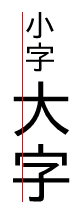
 applied below a fragment of Chinese text")