Title: CSS Table Module Level 3
Shortname: css-tables
Level: 3
Status: WD
Prepare for TR: yes
Date: 2025-12-16
Work Status: Exploring
Group: csswg
ED: https://drafts.csswg.org/css-tables-3/
TR: https://www.w3.org/TR/css-tables-3/
Previous Version: https://www.w3.org/TR/2019/WD-css-tables-3-20190727/
Previous Version: https://www.w3.org/TR/CSS2/tables.html
Repository: w3c/csswg-drafts
Warning: not ready
Editor: Keith Cirkel, Mozilla, w3cid 146197
Former Editor: François Remy, Invited Expert, w3cid 53348
Former Editor: Greg Whitworth, Microsoft, w3cid 69511
Former editor: Bert Bos, W3C
Former Editor: L. David Baron, Google https://www.google.com/, https://dbaron.org/, w3cid 15393
Former editor: Markus Mielke, Microsoft
Former editor: Saloni Mira Rai, Microsoft
Abstract: This CSS module defines a two-dimensional grid-based layout system, optimized for tabular data rendering. In the table layout model, each display node is assigned to an intersection between a set of consecutive rows and a set of consecutive columns, themselves generated from the table structure and sized according to their content.
Ignored Terms: block-level box
WPT Path Prefix: css/css-tables/
WPT Display: open
This section is not normative
Many types of information (ex: weather readings collected over the past year)
are best visually represented in a two-axis grid
where rows represent one item of the list
(ex: a date, and the various weather properties measured during that day),
and where columns represent the successive values of an item's property
(ex: the temperatures measured over the past year).
Sometimes, to make the representation easier to understand,
some cells of the grid are used to represent a description or summary of their parent row/column,
instead of actual data.
This happens more frequently for
the cells found on the first row and/or column (called headers)
or the cells found on the last row and/or column (called footers).
This kind of tabular data representation is usually known as tables.
Tables layout can be abused to render other grid-like representations like calendars or timelines,
though authors should prefer other layout modes
when the information being represented does not make sense as a data table.
The rendering of tables in HTML has been defined for a long time in the HTML specification.
However, its interactions with features defined in CSS remained for a long time undefined.
The goal of this specification is to define
the expected behavior of user agents supporting both HTML tables and CSS.
Please be aware that some behaviors defined in this document
will not be the most logical or useful way of solving the problem they aim to solve,
but such behaviors are often the result of compatibility requirements and not a deliberate choice
of the editors of this specification.
Authors wishing to use more complex layouts
are encouraged to rely on more modern CSS modules such as CSS Grid.
colspan-zero-crash.html
crashtests/caption-repaint-crash.html
crashtests/caption-with-multicol-table-cell.html
crashtests/cell-contents-with-negative-outer-size.html
crashtests/col_span_dynamic_crash.html
crashtests/dialog-table-crash.html
crashtests/dynamic-recompute-baseline.html
crashtests/dynamic_col_width_crash.html
crashtests/dynamic_table_layout_crash.html
crashtests/empty-tbody-after-tall-section-crash.html
crashtests/empty_cells_crash.html
crashtests/empty_table_with_cols.html
crashtests/expression_width_crash.html
crashtests/inline-splitting-crash.html
crashtests/large-border-crash.html
crashtests/large-col-widths.html
crashtests/legacy_ng_mix_crash.html
crashtests/move-oof-inside-section-row-with-borders.html
crashtests/negative-section-distribution.html
crashtests/negative_caption_margin.html
crashtests/orthogonal-cell-borders.html
crashtests/orthogonal-cell-crash.html
crashtests/table-column-display-change-chrome-crash.html
crashtests/textarea-intrinsic-size-crash.html
crashtests/atomic-item-crash.html
crashtests/remove-table-column-group.html
crashtests/transition-table-row-group-crash.html
crashtests/uninitialized_read_crash.html
table-caption-after-crash.html
crashtests/vertical_percentage_crash.html
tfoot-crash-print.html
th-text-align.html
toggle-row-display-property-001.html
table-collapsed-row-or-column-crash.html
absolute-tables-001.html
absolute-tables-006.html
anonymous-table-cell-margin-collapsing.html
chrome-rowspan-bug.html
col_removal.html
colspan-001.html
colspan-002.html
colspan-003.html
colspan-004.html
dynamic-rowspan-change.html
html-display-table.html
inheritance.html
multicol-table-collapsed-border-crash.html
multicol-table-crash.html
remove-caption-from-anon-table.html
remove-colgroup-from-anon-table.html
row-group-order.html
table-position-sticky-computed.html
table-cell-child-overflow-measure.html
table-cell-inline-size-box-sizing-quirks.html
table-cell-scroll-height.html
table-cell-writing-mode-computed.html
zero-rowspan-001.html
zero-rowspan-002.html
subpixel-table-cell-height-001.html
subpixel-table-width-001.html
Value Definitions
This specification follows the CSS property definition conventions from [[!CSS2]]
using the value definition syntax from [[!CSS-VALUES-3]].
Value types not defined in this specification are defined in CSS Values & Units [[!CSS-VALUES-3]].
Combination with other CSS modules may expand the definitions of these value types.
In addition to the property-specific values listed in their definitions,
all properties defined in this specification
also accept the CSS-wide keywords as their property value.
For readability they have not been repeated explicitly.
Content Model
Table Structure
The CSS table model is based on the HTML4 table model,
in which the structure of a table closely parallels the visual layout of the table.
In this model, a table consists of an optional caption and any number of rows of cells.
In addition, adjacent rows and columns may be grouped structurally and
this grouping can be reflected in presentation (e.g., a border may be drawn around a group of rows).
The table model is said to be "row primary" since
authors specify rows, not columns, explicitly in the document language.
Columns are derived once all the rows have been specified:
the first cell of the first row belongs to the first column
and as many other columns as spanning requires (and it creates them if needed),
and the following cells of that row each belong to the next available column
and as many other columns as spanning requires (creating those if needed);
the cells of the following rows each belong to the next available column for that row (taking rowspan into account)
and as many other columns as spanning requires (creating those if needed).
(see [[#dimensioning-the-row-column-grid]]).
To summarize, an instance of the table model consists of:
Two representations of the structure of a table (tree vs layout)
The CSS model does not require that the document language include elements that correspond to each of these components.
For document languages (such as XML applications) that do not have pre-defined table elements,
authors must map document language elements to table elements.
This is done with the 'display' property.
The following 'display' values assign table formatting rules to an arbitrary element:
table (equivalent to HTML: <table>)
Specifies that an element defines a table
that is block-level when placed in flow layout.
Specifies that an element groups some amount of rows.
Unless explicitly mentioned otherwise, mentions of [=table-row-groups=] in this spec also encompass the specialized [=table-header-groups=] and [=table-footer-groups=].
table-header-group (equivalent to HTML: <thead>)
Like [=table-row-group=] but, for layout purposes,
the first such row group is always displayed before all other rows and row groups.
If a table owns multiple display: table-header-group boxes,
only the first is treated as a header;
the others are treated as if they had display: table-row-group.
table-footer-group (equivalent to HTML: <tfoot>)
Like [=table-row-group=] but, for layout purposes,
the first such row group is always displayed after all other rows and row groups.
If a table owns multiple display: table-footer-group boxes,
only the first is treated as a footer;
the others are treated as if they had display: table-row-group.
table-column (equivalent to HTML: <col>)
Specifies that an element describes a column of cells.
table-column-group (equivalent to HTML: <colgroup>)
Specifies that an element groups one or more columns.
table-cell (equivalent to HTML: <td> or <th>)
Specifies that an element represents a table cell.
table-caption (equivalent to HTML: <caption>)
Specifies a caption for the table.
Table captions are positioned between the table margins and its borders.
caption-cyclic-percentage.html
caption-writing-mode-001.html
caption-writing-mode-002.html
Note: [=Replaced elements=] with a 'display' value of
''table-row'',
''table-row-group'',
''table-header-group'',
''table-footer-group'',
''table-column'',
''table-column-group'',
''table-cell'',
and ''table-caption''
are treated as [=inline-level boxes=],
as per [[css-display-3#layout-specific-display]];
[=replaced elements=] with a 'display' value of ''table'' or ''inline-table''
behave according to their [=outer display type=],
as per [[css-display-3#outer-role]].
This is a breaking change from CSS 2.1 but matches implementations.
table-model-fixup-2.html
Terminology
In addition to the table structure display types,
the following wording is also being used in this spec:
Two sibling boxes are consecutive
if they have no intervening siblings
other than, optionally, an anonymous inline containing only white spaces.
A sequence of sibling boxes is consecutive
if each box in the sequence is consecutive to the one before it in the sequence.
whitespace-001.html
A slot(r,c) is an available space created
by the intersection of a row r and a column c in the table grid.
Each slot of the table grid is covered by at least one table-cell (some of them anonymous), and at most two.
Each table-cell of a table-root covers at least one slot.
Table-cells which cover more than one slot do so densely,
meaning the set of slots they cover can always be described as a set of four strictly-positive integers (rowStart, colStart, rowSpan, colSpan)
such that a slot (r,c) is covered by the table-cell
if and only if r lies in the interval between rowStart (included) and rowStart+rowSpan (excluded),
and c lies in the interval between colStart (included) and colStart+colSpan (excluded);
Such table-cell is said to originate from row rowStart and column colStart.
Also:
A table-cell is said to originate a table-row (resp. table-column) if it originates its corresponding row (resp. column)
A table-cell is said to originate a table-row-group (resp. table-column-group) if the group contains the cell's originating row (resp. column)
Such table-cell is said to span all rows r and columns c matching the above condition.
Also:
A table-cell is said to span a table-row (resp. table-column) if it spans its corresponding row (resp. column)
A table-row (resp. table-column) corresponding to a row (resp. column) is said to span this row (resp. column)
A table-row (resp. table-column) is said to span all columns of the grid (resp. row)
A table-row-group (resp. table-column) containing a row (resp. column) is said to span the row (resp. column)
A table-row-group (resp. table-column) is said to span all columns of the grid (resp. row)
Fixup
Document languages other than HTML may not contain all the elements in the CSS 2.1 table model.
In these cases, the "missing" elements must be assumed in order for the table model to work.
Any table-internal element will automatically generate necessary anonymous table objects around itself, if necessary.
Any descendant of a table-root that is not table-internal
must have a set of ancestors in the table consisting of
at least three nested objects corresponding to
a table/inline-table,
a table-row, and
a table-cell.
Missing boxes cause the generation of anonymous boxes according to the following rules:
Fixup Algorithm
For the purposes of these rules, out-of-flow elements are represented as inline elements of zero width and height.
Their containing blocks are chosen accordingly.
The following steps are performed in three stages:
Remove irrelevant boxes:
The following boxes are discarded as if they were display:none:
An anonymous table or inline-table box must be generated
around each sequence of consecutive proper table child boxes
which are misparented.
If the box's parent is an inline, run-in, or ruby box (or any box that would perform inlinification of its children),
then an inline-table box must be generated;
otherwise it must be a table box.
An anonymous table-wrapper box must be generated around each table-root.
Its display type is inline-block for inline-table boxes and block for table boxes.
The table wrapper box establishes a block formatting context.
The table-root box (not the table-wrapper box) is used when doing baseline vertical alignment for an inline-table.
The width of the table-wrapper box is the border-edge width of the table grid box inside it.
Percentages which would depend on the 'width' and 'height' on the table-wrapper box's size are relative to the table-wrapper box's containing block instead, not the table-wrapper box itself.
Please note that some layout modes such as flexbox and grid override the display type of their children.
These transformations happen before the table fixup.
Please note that the 'float' and 'position' properties sometimes affect the computed value of 'display'.
When those properties are used on what should have been table internal boxes, they switch to block instead.
This transformation happens before the table fixup.
We have modified the text of this section from CSS 2.2 to make it easier to read.
If you find any mistakes due to these changes please file an issue
Beside their display type, the anonymous boxes created for fixup purposes
do not receive any specific or default styling,
except where otherwise mentioned by this specification.
This means in particular that
their computed background is “transparent”,
their computed padding is “0px”,
their computed border-style is “none”.
It is also worth reminding that an anonymous box inherits property values through the box tree.
Examples
<div class="row">
<div class="cell">George</div>
<div class="cell">4287</div>
<div class="cell">1998</div>
</div>
Here is the associated styles:
After fixup, this will produce layout boxes as though this was the initial HTML:
<table>
<tr>
<td>George</td>
<td>4287</td>
<td>1998</td>
</tr>
</table>
In this example, three table-cell anonymous boxes are assumed to contain the text in the rows. The text inside
of the divs with a display: table-row are encapsulated in anonymous inline boxes, as explained in
visual formatting model:
<div class="inline-table">
<div class="row">This is the top row.</div>
<div class="row">This is the middle row.</div>
<div class="row">This is the bottom row.</div>
</div>
This will produce layout boxes as though this was the initial HTML:
<table>
<tr>
<td>This is the top row.</td>
</tr>
<tr>
<td>This is the middle row.</td>
</tr>
<tr>
<td>This is the bottom row.</td>
</tr>
</table>
Layout
Core layout principles
Unlike other block-level boxes, tables do not fill their containing block by default.
When their 'width' computes to auto, they behave as if they had fit-content specified instead.
This is different from most block-level boxes, which behave as if they had stretch instead.
The min-content width of a table is
the width required to fit all of its columns min-content widths and its [=undistributable spaces=].
The max-content width of a table is
the width required to fit all of its columns max-content widths and its [=undistributable spaces=].
If the width assigned to a table is larger than its min-content width,
the Available Width Distribution algorithm
will adjust column widths in consequence.
This section overrides the general-purpose rules that apply to calculating widths described in other specifications.
In particular, if the margins of a table are set to 0 and the width to auto,
the table will not automatically size to fill its containing block.
However, once the used value of width for the table is found (using the algorithms given below)
then the other parts of those rules do apply.
Therefore, a table can be centered using left and right auto margins, for instance.
Table layout algorithm
To layout a table, user agents must apply the following actions:
Determine the number of rows/columns the table requires.
This is done by executing the steps described in [[#dimensioning-the-row-column-grid]].
Ensure each cell slot is occupied by at least one cell.
This is done by executing the steps described in [[#missing-cells-fixup]].
Compute the minimum width of each column.
This is done by executing the steps described in [[#content-measure]].
Compute the width of the table.
This is done by executing the steps described in [[#computing-the-table-width]].
Distribute the width of the table among columns.
This is done by executing the steps described in [[#width-distribution-algorithm]].
Compute the height of the table.
This is done by executing the steps described in [[#computing-the-table-height]].
Distribute the height of the table among rows.
This is done by executing the steps described in [[#height-distribution-algorithm]].
[B] Else, an empty table is laid out:
Compute the width of the table.
This is done by returning the largest value of CAPMIN
and the computed width of the table grid box (including borders and paddings)
if it is definite (use zero otherwise).
Compute the height of the table.
This is done by returning the sum of all table-caption heights
(their width being set to the table width,
with margins taken into consideration appropriately)
and the computed height of the table grid box (including borders and paddings)
if it is definite (use zero otherwise).
Assign to each table-caption and table-cell their position and size.
This is done by running the steps of [[#bounding-box-assignment]].
The following schema describes the algorithm in a different way,
to make it easier to understand.
Overview of the table layout algorithm. Not normative.
html5-table-formatting-1.html
Dimensioning the row/column grid
Like mentioned in the Table structure section,
how many rows and columns a table has
can be determined from the table structure.
Both dimensioning the row/column grid and assigning table-cells their slot(s) in that grid
do require running the HTML Algorithms for tables.
HTML Algorithm
CSS Boxes that do not originate from an HTML table element equivalent to their display type
need to be converted to their HTML equivalent before we can apply this algorithm, see below.
There is no way to specify the span of a cell in css only in this level of the spec,
the use of an HTML td element is required to do so.
Apply the HTML5 Table Formatting algorithm,
where boxes act like the HTML element equivalent to their display type,
and use the attributes of their originating element if and only if it is an HTML element of the same type
(otherwise, they act like if they didn't have any attribute).
<ul class="table">
<li><b>One</b><i>1</i></li>
<li><b>Two</b><i>2</i></li>
<li><b>Three</b><i>3</i></li>
</ul>
<style>
ul.table { display: table; }
ul.table > li { display: table-row; }
ul.table > li > * { display: table-cell; }
</style>
produces the same row/column grid as
<table><tbody>
<tr>
<td></td>
<td></td>
</tr>
<tr>
<td></td>
<td></td>
</tr>
<tr>
<td></td>
<td></td>
</tr>
</tbody></table>
<!-- built using dom api, as this would be fixed by the html parser -->
<grid style="display: table">
<row style="display: table-row">
<th rowspan="2">1</th>
<colgroup style="display: table-cell" span="2" colspan="2">2</colgroup>
</row>
<tr>
<td>A</td>
<td>B</td>
<td>C</td>
</tr>
</grid>
produces the same row/column grid as
<table>
<tr>
<th rowspan="2">1</th>
<td>2</td>
</tr>
<tr>
<td>A</td>
<td>B</td>
<td>C</td>
</tr>
</table>
Note how the second cell of the first row doesn't have ```colspan=2``` applied, because its originating element is not an HTML TD element.
Testcase.
!!Testcase.
!Test case.
!!Test case.
!!Test case.
The HTML Table Formatting algorithm sometimes generates more tracks than necessary to layout the table properly.
Those tracks have historically been ignored by user agents,
so the next step just gets rid of them entirely to avoid dealing with them as exceptions later in the spec.
We have tried to maintain the functionality with this change, but if you happen to find any issues
due to this change please file an issue.
Modify iteratively the obtained grid by merging consecutive tracks as follows:
As long as there exists an eligible track in the obtained row/column grid such that
there is no table-column/table-row box defining the said track explicitly, and
both the said track and the previous one are spanned by the exact same set of cells,
those two tracks must be merged into one single track for the purpose of computing the layout of the table.
Reduce the span of the cells that spanned the deleted track by one to compensate,
and shift similarly the tracks from which cells originate when needed.
(see spanning-ghost-rows test cases)
For tables in auto mode, every track is an eligible track for the purpose of the track-merging algorithm.
For tables in fixed mode, only rows are eligible to be merged that way; which means that every column is preserved.
Finally, assign to the table-root grid its correct number of rows and columns (from its mapped element),
and to each table-cell its accurate rowStart/colStart/rowSpan/colSpan (from its mapped element).
column-track-merging.html
Missing cells fixup
The following section clarifies and extends the CSS 2.1 statement saying that
missing cells are rendered as if an anonymous table-cell box occupied their position in the grid
(a "missing cell" is a slot in the row/column grid that is not covered yet by any table-cell box).
Once the amount of columns in a table is known, any table-row box must be modified such that
it owns enough cells to fill all the columns of the table, when taking spans into account.
New table-cell anonymous boxes must be appended to its rows content until this condition is met.
col-definite-max-size-001.html
col-definite-min-size-001.html
col-definite-size-001.html
html5-table-formatting-2.html
html5-table-formatting-3.html
Table layout modes
This section covers the flags which modify the way tables are being laid out.
There are three major flags for table layout: 'table-layout', 'border-collapse', and 'caption-side'.
The 'border-collapse' flag has an optional 'border-spacing' parameter.
The Table-Layout property
				Name: table-layout
				Value: auto | fixed
				Initial: auto
				Applies to: table grid boxes
				Inherited: no
				Computed value: specified keyword
				Animation type: discrete
parsing/table-layout-computed.html
parsing/table-layout-invalid.html
parsing/table-layout-valid.html
A table-root is said to be laid out in fixed mode
whenever the computed value of the 'table-layout' property is equal to fixed,
and the specified width of the table root is either
a <length-percentage>,
min-content or
fit-content.
When the specified width is not one of those values,
or if the computed value of the 'table-layout' property is auto,
then the table-root is said to be laid out in auto mode.
When a table-root is laid out in fixed mode,
the content of its table-cells is ignored for the purpose of width computation,
the aggregation algorithm for column sizing considers only table-cells belonging to the first row track,
such that layout only depends on the values explicitly specified for the table-columns or cells of the first row of the table;
columns with indefinite widths are attributed their fair share of the remaining space
after the columns with a definite width have been considered, or 0px if there is no remaining space
(see [[#computing-column-measures]]).
The Border-Collapse property
				Name: border-collapse
				Value: separate | collapse
				Initial: separate
				Applies To: table grid boxes
				Inherited: yes
				Computed value: specified keyword
				Animation type: discrete
When the 'border-collapse' property has collapse as its value,
the borders of adjacent cells are merged together such that each cell draws only half of the shared border.
As a result, some other properties like 'border-spacing' will not applied in this case (see [[#collapsed-style-overrides]]),
(see [[#border-collapsing]]).
A table-root is said to be laid out in collapsed-borders mode in this case.
Otherwise, the table-root is said to be laid out in separated-borders mode.
background-clip-001.html
box-shadow-001.html
collapsed-border-color-change-with-compositing.html
collapsed-border-remove-row-group.html
collapsed-scroll-overflow.html
parsing/border-collapse-computed.html
parsing/border-collapse-invalid.html
parsing/border-collapse-valid.html
The Border-Spacing property
				Name: border-spacing
				Value: <>{1,2}
				Initial: 0px 0px
				Inherited: yes
				Applies To: table grid boxes when 'border-collapse' is ''border-collapse/separate''
				Computed Value: two absolute lengths
				Animation type: by computed value
The lengths specify the distance that separates adjoining cell borders in separated-borders mode,
and must be non-negative.
If one length is specified, it gives both the horizontal and vertical spacing.
If two are specified, the first gives the horizontal spacing and the second the vertical spacing.
See [[#computing-undistributable-space]] for details on how this affects the table layout.
animations/border-spacing-interpolation.html
parsing/border-spacing-computed.html
parsing/border-spacing-invalid.html
parsing/border-spacing-valid.html
The Caption-Side property
				Name: caption-side
				Value: top | bottom
				Initial: top
				Applies to: table-caption boxes
				Inherited: yes
				Computed value: specified keyword
				Animation type: discrete
caption-side-1.html
parsing/caption-side-computed.html
parsing/caption-side-invalid.html
parsing/caption-side-valid.html
This property specifies the position of the caption box with respect to the table grid box.
Values have the following meanings:
top
Positions the caption box above the table grid box.
bottom
Positions the caption box below the table grid box.
CSS2 described a different width and horizontal alignment behavior.
That behavior was supposed to be introduced in CSS3
using the values top-outside and bottom-outside.
#REF
Gecko also supports the "left" and "right" values, but currently this specification
is not attempting to define their implementation of said values.
Gecko has a bug when dealing with multiple captions.
!Testcase
To align caption content horizontally within the caption box, use the 'text-align' property.
In this example, the 'caption-side' property places captions below tables.
The caption will be as wide as the parent of the table, and caption text will be left-justified.
					caption {
						caption-side: bottom;
						width: auto;
						text-align: left
					}
Style overrides
Some css properties behave differently inside css tables.
The following sections list the exceptions and their effects.
Overrides applying in all modes
The following rules apply to all tables, irrespective of the layout mode in use.
The computed values of properties 'position', 'float', 'margin'-*, 'top', 'right', 'bottom', and 'left' on the table
are used on the table-wrapper box and not the table grid box;
the same holds true for the properties whose use could force the used value of 'transform-style' to flat (see [[css-transforms-2#grouping-property-values|list]]) and their shorthands/longhands relatives:
this list currently includes 'overflow', 'opacity', 'filter', 'clip', 'clip-path', 'isolation', 'mask'-*, 'mix-blend-mode', 'transform'-* and 'perspective'.
Where the specified values are not applied on the table grid and/or wrapper boxes,
the unset values are used instead for that box (inherit or initial, depending on the property).
caption-relative-positioning.html
The 'overflow' property on the table-root and table-wrapper box, when its value is not either visible, clip or hidden,
is ignored and treated as if its value was visible.
All css properties of table-column and table-column-group boxes are ignored,
except when explicitly specified by this specification.
The 'padding' of the table-root is ignored (as if it was set to 0px).
The 'border-spacing' of the table-root is ignored (as if it was set to 0px).
The 'border-radius' of both table-root and table-non-root boxes
is ignored (as if it was set to 0px).
The values used for the layout and rendering of the borders of the table-root
and the table-cell boxes it owns are
determined using a special conflict resolution algorithm described in [[#border-collapsing]].
Border-collapsing
This entire section is a proposal to make the rendering of collapsed borders sane.
As implementations diverge very visibly, it is expected to require more discussion than some other parts.
Since browsers handle this so differently, convergence cannot happen without reimplementation.
A major concern for this proposal was to support as many cases as possible, and yet
keep the effort required for a new implementation of tables as low as possible.
Background:
CSS+HTML allow unprecedented combinations of border modes for table junctions,
and it makes it difficult to support all cases properly;
in fact some combinations are not well-posed problems,
so no rendering algorithm could be optimal.
Because they grew from something simple (HTML) to something very complex (HTML+CSS),
the current table rendering models (backgrounds and borders) used by web browsers are insane
(in the sense they are buggy, not interoperable and not CSSish at all).
Many usual CSS assumptions are broken, and renderings diverge widely.
This proposal aims at fixing this situation.
border-conflict-resolution.html
When they are laid out in collapsed-borders mode,
table-root and table-cell boxes sharing a border attempt to unify their borders
so that they render using the same style, width, and color (whenever this is possible).
This is accomplished by running the following algorithm.
Conflict Resolution Algorithm for Collapsed Borders
For the purpose of this algorithm, “harmonizing” a set of borders means
applying the “Harmonization Algorithm for Collapsed Borders” on the given set of borders, and
set those borders' used values to the value resulting from the algorithm,
except for cells having a 'border-image-source' different from none:
those keep their initial values.
Let S be an ordered set of table-cell border styles, sorted by cell in RowStart/ColumnStart order;
initially, let S contain only C°’s border-right style
Add to the set S the border-left style of all cells
sharing a section of their left border with C°’s right border
Repeat the following two instructions, until no new border style is added to S:
For all newly-added left borders from cell Ci having a rowspan greater than one,
add to the set S the border-right style of all cells
sharing a section of their border-right with Ci’s border-left
For all newly-added right borders from cell Ci having a rowspan greater than one,
add to the set S the border-left style of all cells
sharing a section of their border-left with Ci’s border-right
Harmonize the conflicting borders of S
Resolve conflicts with border-bottom:
Let S be an ordered set of table-cell border styles, sorted by cell in RowStart/ColumnStart order;
initially, let S contain only C°’s border-bottom style
Add to the set S the border-top style of all cells
sharing a section of their top border with C°’s bottom border
Repeat the following two instructions, until no new border style is added to S:
For all newly-added top borders from cell Ci having a rowspan greater than one,
add to the set S the border-bottom style of all cells
sharing a section of their bottom border with Ci’s top border
For all newly-added bottom borders from cell Ci having a rowspan greater than one,
add to the set S the border-top style of all cells
sharing a section of their top border with Ci’s bottom border
Harmonize the conflicting borders of S
Divide the used width of all borders by two.
This effect will be compensated at rendering time wherever needed,
but is required for layout correctness.
(see [[#drawing-collapsed-borders-2]])
Harmonize the table-root border-{top,bottom,left,right}
with the corresponding border of all cells forming the border of the table (independently),
without actually modifying the border properties of the table-root.
If the table and the cell border styles have the same specificity,
keep the cell border style.
Once this is done, set the table-root border-{…}-width
to half the maximum width found during the harmonization processes for that border,
then set border-{…}-style to solid, and border-{…}-color to transparent.
Implementations may of course choose to skip some of the steps of the previous algorithm,
provided they can prove those have no visible impact on the final results;
certain borders are harmonized more than once using the previous steps,
but preventing this would make the spec harder to read.
To help the reader get a better idea of what this algorithm is doing,
the main steps of applying the previous algorithm over a sample table have been outlined here:
For the purpose of this algorithm, “considering” a border’s properties means
that “if its properties are more specific than CurrentlyWinningBorderProperties,
set CurrentlyWinningBorderProperties to its properties”.
ISSUE(606): Change specificity in harmonization of collapsed borders?
Given an ordered set of border styles (BC1, BC2, … located in cells C1, C2, …)
execute the following algorithm to determine the used value of the border properties for those conflicting borders.
Set CurrentlyWinningBorderProperties to “border: 0px none transparent”
For each border BCi:
Consider the BCi border’s properties
If the border separates two columns:
For each border BCi:
For each table-column spanned by the Ci cell, if any.
Consider the border’s properties of any border of the table-column that would be drawn contiguously to BCi.
For each border BCi:
For each table-column-group containing a column spanned by the Ci cell, if any.
Consider the border’s properties of any border of the table-column-group that would be drawn contiguously to BCi.
If the border separates two rows:
For each border BCi:
For each table-row spanned by the Ci cell, if any.
Consider the border’s properties of any border of the table-row that would be drawn contiguously to BCi.
For each border BCi:
For each table-row-group containing a row spanned by the Ci cell, if any.
Consider the border’s properties of any border of the table-row-group that would be drawn contiguously to BCi.
Return CurrentlyWinningBorderProperties
rowspan-cell-border-after-color.html
Specificity of a border style
Given two borders styles, the border style having the most specificity is the border style which…
… has the value "hidden" as 'border-style', if only one does
… has the biggest 'border-width', once converted into css pixels
… has the 'border-style' which comes first in the following list:
The undistributable space of the table is the sum of
the distances between the borders of consecutive table-cells
(and between the border of the table-root and the table-cells).
The distance between the borders of two consecutive table-cells is the 'border-spacing', if any.
The distance between
the table border and
the borders of the cells on the edge of the table
is
the table's padding for that side,
plus the relevant border spacing distance (if any).
For example, on the right hand side, the distance is padding-right + horizontal border-spacing.
Computing Cell Measures
The following terms are parameters of tables or table cells.
These parameters encapsulate the differences
between tables with different values of 'border-collapse' (separate or collapse)
so that the remaining subsections of this section do not need to refer to them differently.
cell intrinsic offsets
The cell intrinsic offsets is a term to capture the parts of padding and border of a table cell
that are relevant to intrinsic width calculation.
It is a set of computed values for border-left-width, padding-left, padding-right, and border-right-width
(along with zero values for margin-left and margin-right)
defined as follows:
In collapsed-borders mode: the computed horizontal padding of the cell and, for border values,
the used border-width values of the cell (half the winning border-width)
table intrinsic offsets
The table intrinsic offsets capture the parts of the padding and border of a table
that are relevant to intrinsic width calculation.
It is a set of computed values for border-left-width, padding-left, padding-right, and border-right-width
(along with zero values for margin-left and margin-right)
defined as follows:
The margins are not included in the [=table intrinsic offsets=]
because handling of margins depends on the 'caption-side' property.
ISSUE(608): Handling of intrinsic offsets when in border collapsing mode
total horizontal border spacing
The total horizontal border spacing is defined for each table:
For tables laid out in separated-borders mode containing at least one column,
the horizontal component of the computed value of the border-spacing property times one plus
the number of columns in the table
Otherwise, 0
offsets-adjusted min-width, width, and max-width
For table-track and table-track-group boxes,
the offsets-adjusted value of width properties is their computed value,
irrespective of the value of 'box-sizing' applied on the element.
For table-cell boxes,
the offsets-adjusted value of width properties is their computed value
from which the cell's border-{left|right}-width and/or padding-{left|right} have eventually been deduced,
depending on the value of 'box-sizing'.
The outer min-content and max-content widths are defined for table cells, columns, and column groups.
The 'width', 'min-width', and 'max-width' values used in these definitions are the offsets-adjusted values defined above:
The outer min-content width of a table-cell is
max('min-width', min-content width)
adjusted by the [=cell intrinsic offsets=].
The outer min-content width of a table-column or table-column-group is
max('min-width', 'width').
The outer max-content width of a table-cell in a [=constrainedness|non-constrained column=] is
max('min-width', 'width', min-content width, min('max-width', max-content width))
adjusted by the [=cell intrinsic offsets=].
The outer max-content width of a table-cell in a [=constrainedness|constrained column=] is
max('min-width', 'width', min-content width, min('max-width', 'width'))
adjusted by the [=cell intrinsic offsets=].
The outer max-content width of a table-column or table-column-group is
max('min-width', min('max-width', 'width')).
percentage contributions
The percentage contribution of a table cell, column, or column group
is defined in terms of the computed values of 'width' and 'max-width'
that have computed values that are percentages:
min(percentage 'width', percentage 'max-width').
If the computed values are not percentages,
then 0% is used for 'width', and
an infinite percentage is used for 'max-width'.
Please note that 'min-width' is not included in this computation.
As a result, a percentage 'min-width' is ignored.
Since 'width' functions like a 'min-width' in table layout
and column sizing cannot be both length-based and percent-based,
authors should not use 'min-width' on table-internal boxes
and prefer to rely on 'width' only instead.
fractional-percent-width.html
Computing Column Measures
This subsection defines three important values associated with each column of a table:
their min-content width (the smallest possible width attributed to this column),
their max-content width (the width that would be attributed to the column if no other constraint applied),
their intrinsic percentage width (the percentage of the table width the column desires to get, and could end up overriding its max-content width).
To compute these values, an iterative algorithm is used.
First, these values are computed ignoring any cell spanning more than one column.
Then, these values are updated by taking into account cells spanning incrementally more columns.
When cells that spanned all columns of the table have been considered, this algorithm ends and the values are then finalized.
For the purpose of measuring a column when laid out in fixed mode,
only cells which originate in the first row of the table
(after reordering the header and footer)
will be considered, if any.
In addition, the min-content and max-content width of cells
is considered zero unless they are directly specified
as a length-percentage, in which case they are resolved
based on the table width (if it is definite, otherwise use 0).
For the purpose of calculating the outer min-content width of cells,
descendants of table cells whose width depends on percentages of their parent cell's width
are considered to have an auto width.
TestcaseTestcase
min-content width of a column based on cells of span up to 1
The largest of:
the width specified for the column:
the outer min-content width of its corresponding table-column, if any (and not auto)
the outer min-content width of its corresponding table-column-group, if any
intrinsic percentage width of a column based on cells of span up to 1
The largest of the [=percentage contributions=] of
each cell that spans the column whose colSpan is 1,
of its corresponding table-column (if any), and
of its corresponding table-column-group (if any)
min-content width of a column based on cells of span up to N (N > 1)
the largest of the min-content width of the column based on cells of span up to N-1 and the contributions
of the cells in the column whose colSpan is N,
where the contribution of a cell is the result of taking the following steps:
Define the baseline min-content width
as the sum of the min-content widths based on cells of span up to N-1
of all columns that the cell spans.
Define the baseline max-content width
as the sum of the max-content widths based on cells of span up to N-1
of all columns that the cell spans.
Define the baseline border spacing as the sum of the horizontal
border-spacing for any columns spanned by the cell,
other than the one in which the cell originates.
The contribution of the cell is the sum of:
the min-content width of the column based on cells of span up to N-1
the product of:
the ratio of:
the max-content width of the column based on cells of span up to N-1 of the column
minus the min-content width of the column based on cells of span up to N-1 of the column, to
the baseline max-content width minus the baseline min-content width
or zero if this ratio is undefined, and
the outer min-content width of the cell
minus the baseline min-content width and the baseline border spacing,
clamped to be at least 0 and at most the difference
between the baseline max-content width and the baseline min-content width
the product of:
the ratio of the max-content width
based on cells of span up to N-1 of the column to the baseline max-content width
the outer min-content width of the cell
minus the baseline max-content width and baseline border spacing,
or 0 if this is negative
max-content width of a column based on cells of span up to N (N > 1)
The largest of the max-content width
based on cells of span up to N-1 and the contributions of the cells in the column whose colSpan is N,
where the contribution of a cell is the result of taking the following steps:
Define the baseline max-content width as
the sum of the max-content widths based on cells of span up to N-1
of all columns that the cell spans.
Define the baseline border spacing as
the sum of the horizontal border-spacing
for any columns spanned by the cell,
other than the one in which the cell originates.
The contribution of the cell is the sum of:
the max-content width of the column based on cells of span up to N-1
the product of:
the ratio of the max-content width
based on cells of span up to N-1 of the column to the baseline max-content width
the outer max-content width of the cell
minus the baseline max-content width and the baseline border spacing,
or 0 if this is negative
intrinsic percentage width of a column based on cells of span up to N (N > 1)
If the intrinsic percentage width of a column based on cells of span up to N-1 is greater than 0%,
then the intrinsic percentage width of the column based on cells of span up to N is
the same as the intrinsic percentage width of the column based on cells of span up to N-1.
Otherwise, it is the largest of the contributions of the cells in the column
whose colSpan is N,
where the contribution of a cell is the result of taking the following steps:
Start with the [=percentage contribution=] of the cell.
Subtract the intrinsic percentage width of the column based on cells of span up to N-1 of all columns that the cell spans.
If this gives a negative result, change it to 0%.
Multiply by the ratio of
the column's non-spanning max-content width to
the sum of the non-spanning max-content widths of all columns spanned by the cell
that have an intrinsic percentage width of the column based on cells of span up to N-1 equal to 0%.
However, if this ratio is undefined because the denominator is zero,
instead use the 1 divided by the number of columns spanned by the cell
that have an intrinsic percentage width of the column based on cells of span up to N-1 equal to zero.
min-content width of a column
the min-content width of the column based on cells of span up to N, where N is the number of columns in the table
max-content width of a column
the max-content width of the column based on cells of span up to N, where N is the number of columns in the table
intrinsic percentage width of a column
the smaller of:
the intrinsic percentage width of the column based on cells of span up to N,
where N is the number of columns in the table
100% minus the sum of the intrinsic percentage width of all prior columns in the table
(further left when direction is "ltr" (right for "rtl"))
Testcase
The clamping of the total of the intrinsic percentage widths of columns to a maximum of 100%
means that the table layout algorithm is not invariant under switching of columns.
constrainedness
A column is constrained if
its corresponding table-column-group (if any),
its corresponding table-column (if any),
or any of the cells spanning only that column
has a computed 'width' that is not "auto",
and is not a percentage.
In a future revision of this specification, this algorithm will need to account
for character-alignment of cells ('<>' values of the 'text-align' property).
This requires (based on the 9 March 2011 editor's draft of css3-text) separately tracking max-content widths
for the part of the column before the center of the alignment string and
the part of the column after the center of the alignment string.
For tracking min-content widths, there are two options:
either not track them, or track three values:
two values as for max-content widths for any cells that do not have break points in them,
and a fourth value for any cells that do have break points in them
(and to which character alignment is therefore not mandatory).
EDITORIAL.
The way this describes distribution of widths from colspanning cells is wrong.
For min-content and max-content widths it should refer to the rules
for distributing excess width to columns for intrinsic width calculation.
Before deciding on the final width of all columns,
it is necessary to compute the width of the table itself.
As noted before, this would usually be the sum of preferred width of all columns, plus any extra.
In this case, the width distribution will result in giving each column its preferred width.
There are however a few cases where the author asks for some other width explicitly,
as well as a few cases where the table cannot be given the width it requires.
The caption width minimum (CAPMIN) is
the largest of the table captionsmin-content contribution.
The row/column-grid width minimum (GRIDMIN) width is
the sum of the min-content width of all the columns
plus cell spacing or borders.
The row/column-grid width maximum (GRIDMAX) width is
the sum of the max-content width of all the columns
plus cell spacing or borders.
The used min-width of a table is
the greater of
the resolved 'min-width',
CAPMIN, and
GRIDMIN.
The used width of a table depends on the columns and captions widths as follows:
absolute-tables-002.html
absolute-tables-003.html
The assignable table width is
the used width of the table
minus the [=total horizontal border spacing=] (if any).
This is the width that we will be able to allocate to the columns.
In this algorithm, rows (and row groups) and columns (and column groups) both constrain
and are constrained by the dimensions of the cells they contain.
Setting the width of a column might indirectly influence the height of a row, and vice versa.
Ideally, each column should get its preferred width (usually its max-content width).
However, the assignable table width calculated before
could be either too big or too small to achieve this result,
in which case the user agent must assign adhoc widths to columns
as described in the width distribution algorithm.
This algorithm follows three rules when determining a column's used width:
Rule 0: In fixed mode,
auto and percentages columns are assigned a minimum width of zero pixels, and
percentage resolution follows a different set of rules,
whose goal is to ensure pixel columns always get assigned their preferred width.
Rule 1:
When assigning preferred widths,
specified percent columns have a higher priority
than specified unit value columns, which have a higher priority
than auto columns.
Rule 2:
Columns using the same sizing type (percent columns, pixel columns, or auto columns) follow the same distribution method.
For example, they all get their min-content width or they all get their max-content width.
There is one exception to this rule.
When giving its preferred percent width to a percent-column,
if that would result in a size smaller than its min-content width,
the column will be assigned its min-content width instead
though the percent-columns group as a whole is still regarded
as being assigned the preferred percent widths.
Rule 3:
The sum of width assigned to all columns should be equal to the assignable table width.
percent-width-cell-dynamic.html
Available sizings
All three types of columns have the following possible used widths.
min-content width: The size required to fit the content of the column
min-content width + delta: A value between the min-content and preferred widths
preferred width: The size specified for the column,
or the size required to fit the content of the column without breaking
preferred width + delta A value larger than the preferred width
The distribution algorithm defines those values and explains when to use them.
Distribution algorithm
When a table is laid out at a given used width,
the used width of each column must be determined as follows,
eventually after considering the changes to this algorithm
applied in fixed mode.
First, each column of the table is assigned a sizing type:
- percent-column:
a column whose any constraint is defined to use a percentage only (with a value different from 0%)
- pixel-column:
column whose any constraint is defined to use a defined length only (and is not a percent-column)
- auto-column:
any other column
Then, valid sizing methods are to be assigned to the columns by sizing type, yielding the following sizing-guesses:
The min-content sizing-guess is the set of column width assignments where
each column is assigned its min-content width.
The min-content-percentage sizing-guess is the set of column width assignments where:
its intrinsic percentage width times the assignable width and
its min-content width
all other columns are assigned their max-content width.
Note that:
- The assignable table width is always greater than or equal
to the table width resulting from the min-content sizing-guess.
- The widths for each column in the four sizing-guesses
(min-content, min-content-percentage, min-content-specified, and max-content)
are in nondecreasing order.
If the assignable table width is less than or equal to the max-content sizing-guess,
the used widths of the columns must be the linear combination (with weights adding to 1)
of the two consecutive sizing-guesses whose width sums bound the available width.
Otherwise, the used widths of the columns are the result of starting from the max-content sizing-guess
and distributing the excess width to the columns of the table
according to the rules for distributing excess width to columns (for used width).
The following schema describes the algorithm in a different way,
to make it easier to understand.
Legend
Sizing algorithms:
Each drawing of the table represents a way of sizing the columns.
The four cases on the left are the sizing-guesses described above in the spec:
min-content,
min-content-percentage,
min-content-specified, and
max-content.
The cases on the right are interpolations required for available sizes that do not match exactly one of the four sizing-guesses.
Choice of sizing method:
The sizing method selection always starts at the min-content sizing-guess (top left),
and then proceeds by comparing the available width and the width consumed by the method currently in use.
Green arrows indicate the direction you should follow
if you have extra space to distribute after applying the current method.
Red arrows indicate the direction you should follow
if you have distributed too much space by applying the current method and need to backtrack.
Columns types:
Each type of column (auto, px, %) has its own color in the schema (yellow, blue, orange).
In an interpolation:
columns that get shrunk down from their size in previous sizing-guess are repainted red, and
columns that get expanded from their size in previous sizing-guess are repainted green.
Overview of the width distribution algorithm. Not normative.
Changes to width distribution in fixed mode
The following changes to previous algorithm apply in fixed mode:
- The min-content width of percent-columns and auto-columns is considered to be zero
- Cells ignore their border and padding size if their width is a percentage ('box-sizing' is ignored)
- If, when percentages are resolved based on the assignable table width,
the sum of columns widths based on this resolution would exceed the assignable table width,
they are instead to be resolved relative to their percentage value such that
the sum of columns width meets the assignable table width exactly.
- Columns whose size is computed as a sum of a percentage and a pixel length must be sized as if they counted as two columns,
one with the pixel value, the other with the percentage value. This is different from resolving the percentage away,
because of how width distribution works for percentage-based columns.
fixed-layout-1.html
fixed-layout-2.html
Distributing excess width to columns
The rules for distributing excess width to columns can be invoked in two ways:
for distributing the excess width of a table to its columns
during the computation of the used widths of those columns (for used width calculation), or
for distributing the excess max-content or min-content width of a cell spanning more than one column
to the max-content or min-content widths of the columns it spans (for intrinsic width calculation).
The rules for these two cases are largely the same, but there are slight differences.
The remainder of this section uses the term distributed width to refer to the one of these widths that is being distributed,
and the excess width is used to refer to the amount by which the width being distributed
exceeds the sum of the distributed widths of the columns it is being distributed to.
If there are [=constrainedness|non-constrained columns=] that have originating cells
with intrinsic percentage width of 0% and
with nonzero max-content width
(aka the columns allowed to grow by this rule),
the [=distributed widths=] of the columns allowed to grow by this rule
are increased in proportion to max-content width
so the total increase adds to the [=excess width=].
Otherwise, if there are [=constrainedness|non-constrained columns=] that have originating cells
with intrinsic percentage width of 0%
(aka the columns allowed to grow by this rule,
which thanks to the previous rule must have zero max-content width),
the [=distributed widths=] of the columns allowed to grow by this rule
are increased by equal amounts
so the total increase adds to the [=excess width=].
Otherwise, if there are [=constrainedness|constrained columns=]
with intrinsic percentage width of 0% and
with nonzero max-content width
(aka the columns allowed to grow by this rule, which, due to other rules, must have originating cells),
the [=distributed widths=] of the columns allowed to grow by this rule
are increased in proportion to max-content width
so the total increase adds to the [=excess width=].
Otherwise, if there are columns
with intrinsic percentage width greater than 0%
(aka the columns allowed to grow by this rule, which, due to other rules, must have originating cells),
the [=distributed widths=] of the columns allowed to grow by this rule
are increased in proportion to intrinsic percentage width
so the total increase adds to the [=excess width=].
Otherwise, if there is any such column,
the [=distributed widths=] of all columns that have originating cells
are increased by equal amounts
so the total increase adds to the [=excess width=].
Otherwise,
the [=distributed widths=] of all columns
are increased by equal amounts
so the total increase adds to the [=excess width=].
These rules do not apply when the table is laid out in fixed mode.
In this case, the simpler rules that follow apply instead:
If there are any columns with no width specified, the [=excess width=] is distributed in equally to such columns
otherwise, if there are columns with non-zero length widths from the base assignment, the excess width is distributed proportionally to width among those columns
otherwise, if there are columns with non-zero percentage widths from the base assignment, the excess width is distributed proportionally to percentage width among those columns
otherwise, the excess width is distributed equally to the zero-sized columns
?Testcase?Testcase?Testcase
The height of a table is the sum of the row heights plus any cell spacing or borders.
If the table has a 'height' property with a value other than auto, it is treated as a minimum height for the table grid,
and will eventually be distributed to the height of the rows if their collective minimum height ends up smaller than this number.
If their collective size ends up being greater than the specified 'height', the specified 'height' will have no effect.
The minimum height of a row is the maximum of:
the computed 'height' (if definite, percentages being considered 0px) of its corresponding table-row (if any)
the computed 'height' of each cell spanning the current row exclusively (if definite, percentages being treated as 0px), and
the minimum height (ROWMIN) required by the cells spanning the row.
ROWMIN is defined as
the sum of the minimum height of the rows
after a first row layout pass.
To compute the height of a table, it is therefore necessary to
perform a first-pass layout on all its rows,
compute the sum of all minimum row heights plus spacings/borders,
and return the greater of either that value or the table-root specified 'height' (min-height).
Once the table height has been determined,
rows will usually get a second layout pass (where their cells' heights are no longer considered auto),
then height distribution will happen to adjust their heights to collectively meet the table height,
then table-cell descendants might get a second layout (where their percentage heights are resolved).
absolute-crash.html
absolute-tables-004.html
absolute-tables-005.html
absolute-tables-007.html
empty-table-height.html
max-height-table.html
min-height-table.html
min-height-table-2.html
min-max-size-table-content-box.html
paint/table-border-paint-caption-change.html
percentages-grandchildren-quirks-mode-001.html
percentages-grandchildren-quirks-mode-002.html
table-as-item-cell-percentage-001.html
table-as-item-cell-percentage-002.html
table-as-item-cell-percentage-003.html
table-as-item-cell-percentage-004.html
visibility-collapse-non-rowcol-001.html
visibility-collapse-row-001.html
visibility-collapse-row-002-dynamic.html
visibility-collapse-row-003-dynamic.html
visibility-collapse-row-004.html
visibility-collapse-row-005.html
visibility-collapse-row-group-001.html
visibility-collapse-row-group-002.html
visibility-collapse-rowcol-001.html
visibility-collapse-rowcol-002.html
visibility-collapse-rowspan-001.html
visibility-collapse-rowspan-003-border-separate.html
visibility-collapse-rowspan-003.html
visibility-hidden-row-001.html
visibility-hidden-row-002.html
Row layout (first pass)
The minimum height of a row (without spanning-related height distribution)
is defined as the height of
a hypothetical linebox containing the cells originating in the row
and where cells spanning multiple rows are considered having a height of 0px
(but their correct baseline).
In this hypothetical linebox, cell heights are considered auto,
their width (including borders and paddings) is forced to the widths and inner spacings of the columns they span,
but their other properties are conserved.
For the purpose of calculating this height,
descendants of table cells whose height depends on percentages of their parent cell's height
(see section below)
are considered to have an auto height
if they have 'overflow' set to ''overflow/visible'', ''overflow/clip'', or ''overflow/hidden''
or if they are replaced elements,
and a 0px height if they have not.
Testcase!!Testcase
For table-cell descendants whose percentage height was ignored as a result of the above,
a second layout pass of the table-cell content will happen once height distribution has concluded
to attempt to properly take this sizing into account
(see section below)
The baseline of a cell is defined as
the baseline of the first in-flow line box in the cell, or
the first in-flow table-row in the cell,
whichever comes first.
If there is no such line box or table-row,
the baseline is the bottom of content edge of the cell box.
baseline-vertical.html
baseline-empty-cell-001.html
table-cell-baseline-static-position.html
table-cell-overflow-auto.html
Here is how this works out in practice:
td { vertical-align: baseline; outline: 3px solid silver; }
img { float: left; clear: left; width: 32px; height: 32px; }
img[title] { float: none; }
<table><tr>
<td>Baseline</td>
<td>Baseline<table><tr><td>After</td></tr></table></td>
<td><table><tr><td>Baseline</td></tr></table>After</td>
<td><table align=right><tr><td>Before</td></tr></table><p>Baseline</p></td>
<td><img src="http://w3.org/favicon.ico"><p>Baseline</p></td>
<td><img src="http://w3.org/favicon.ico" title="Baseline"/><br/><img src="http://w3.org/favicon.ico" title="After"></td>
<td><img src="http://w3.org/favicon.ico"><img src="http://w3.org/favicon.ico"><!--Baseline--></td>
</tr></table>
Rendering of this example in a compliant browser
For the purposes of finding a baseline,
in-flow boxes with a scrolling mechanisms (see the 'overflow' property)
must be considered as if scrolled to their origin position.
The baseline of a cell may end up below its bottom border,
see the example below.
The cell in this example has a baseline below its bottom border:
div { height: 0; overflow: hidden; }
<table>
<tr>
<td>
<div> Test </div>
</td>
</tr>
</table>
The 'vertical-align' property of each table cell determines its alignment within the row.
Each cell's content has a baseline, a top, a middle, and a bottom, as does the row itself.
In the context of table cells, values for 'vertical-align' have the following meanings:
baseline
The baseline of the cell is aligned with the baseline of the other cells of the first row it spans (see the definition of baselines of cells and rows).
top
The top of the cell box is aligned with the top of the first row it spans.
bottom
The bottom of the cell box is aligned with the bottom of the last row it spans.
middle
The center of the cell is aligned with the center of the rows it spans.
...
Other values do not apply to cells; the cell is aligned at the baseline instead.
The maximum distance between
the top of the cell box
and the baseline over all cells that have 'vertical-align: baseline'
is used to set the baseline of the row.
If a row doesn't have any cell that has 'vertical-align: baseline',
the baseline of that row is the bottom content edge of the lowest cell in the row.
The baseline of a table-root is the baseline of its first row, if any.
Otherwise, it is the bottom content edge of the table-root.
Testcase!!Testcase
To avoid ambiguous situations,
the alignment of cells proceeds in the following order:
First the cells that are aligned on their baseline are positioned.
This will establish the baseline of the row.
Next the cells with 'vertical-align: top' are positioned.
The row now has a top, possibly a baseline, and a provisional height,
which is the distance from the top to the lowest bottom of the cells positioned so far.
If any of the remaining cells, those aligned at the bottom or the middle,
have a height that is larger than the current height of the row,
the height of the row will be increased to the maximum of those cells,
by lowering the bottom.
Finally, assign their position to the remaining cells.
Example showing how the previous algorithm creates the various alignment lines of a row.
Diagram showing the effect of various values of 'vertical-align' on table cells.
Cell boxes 1 and 2 are aligned at their baselines. Cell box 2 has the largest height above the baseline, so that determines the baseline of the row.
Since during row layout the specified heights of cells in the row were ignored
and cells that were spanning more than one row have not been sized correctly,
their height will need to be eventually distributed to the set of rows they spanned.
This is done by running the same algorithm as the column measurement,
with the span=1 value being initialized (for min-content) with the largest of
the resulting height of the previous row layout,
the height specified on the corresponding table-row (if any),
and the largest height specified on cells that span this row only
(the algorithm starts by considering cells of span 2 on top of that assignment).
EDITORIAL. Import the relevant section of [[#computing-column-measures]] here.
Rows that see their size increase as a result of applying these steps
adjust by lowering their bottom.
The cells whose position depended on the bottom of any updated row
must be positioned correctly again in their respective rows.
At this point, cell boxes that are smaller than the collective height of the rows they span
receive extra top and/or bottom padding
such that their content does not move vertically
but their top/bottom edges meet the ones of the first/last row they span.
Please note that heights being defined on row groups are being ignored by this algorithm
Once the table height has been determined, a second row layout pass will be performed, if necessary,
to assign the correct minimum height to table rows, by taking percentages used in rows/cells specified 'height' into account.
Other than that, all instructions for the first-pass row layout apply (see above).
Please note that this second-pass minimum height therefore still treats percentage heights of table-cell descendants as advised for the first pass
(see above).
For this reason, it is not required to relayout the content of table-cells to compute the new row minimum height.
If necessary, table-cell content will undergo a relayout later,
after table height distribution has concluded
(see below).
Then, if the sum of the new heights of the table rows after this second pass
is different from what is needed to fill the table height previously determined,
the height distribution algorithm defined below is applied
(either to shrink rows by sizing them intermediately between their first-pass minimum height and their second-pass one,
or to increase the heights of all rows beyond their second-pass minimum height to fill the available space;
in neither case, this will have an impact on the baseline of the rows).
Core distribution principles
EDITORIAL. TODO. For current proposal, skip to [[#height-distribution-algorithm]].
Investigations on height distribution
Distribution algorithm
The first step is to attribute to each row its base size and its reference size.
Its base size is the size it would have got
if the table didn’t have a specified height
(the one it was assigned when ROWMIN was evaluated).
Its reference size is the largest of
its initial base height and
its new base height
(the one evaluated during the second layout pass,
where percentages used in rowgroups/rows/cells' specified heights
were resolved according to the table height,
instead of being ignored as 0px).
The second step is to compute the final height of each row based on those sizes.
If the table height is equal or smaller than sum of reference sizes,
the final height assigned to each row will be
the weighted mean of the base and the reference size
that yields the correct total height.
Else, if the table owns any “auto-height” row
(a row whose size is only determined by its content size and none of the specified heights),
each non-auto-height row receives its reference height
and auto-height rows receive their reference size plus some increment
which is equal to the height missing to amount to the specified table height
divided by the amount of such rows.
Else, all rows receive their reference size plus some increment
which is equal to the height missing to amount to the specified table height
divided by the amount of rows.
The cells whose position depended on the bottom of any updated row
must be positioned correctly again in their respective rows.
At this point, cell boxes that are smaller than the collective height of the rows they span
receive extra top and/or bottom padding
such that their content does not move vertically
but their top/bottom edges meet the ones of the first/last row they span.
Once table-height distribution has concluded, and the sum of row heights plus spacing/border is equal to the table height,
the content of table-cells which contained descendants whose percentage heights were ignored
or treated as 0px by the first-pass row layout rules (see above)
must undergo a second layout pass, as defined below.
Note that this means UAs are either required to keep track of the usage of percentages
in the properties of any direct child of the table-cell including (but not limited to)
the 'height' and 'min-height' properties for horizontal flows and
the 'width' and 'min-width' properties for vertical flows,
or else required to perform this second layout pass on table-cell content in all cases.
Resolve percentage heights in table-cell content:
Once the final size of the table and the rows has been determined,
after height distribution has concluded,
the content of the table-cells must also go through a second layout pass,
where, if appropriate, percentage-based heights are this time resolved
against their parent cell used height.
It is appropriate to resolve percentage heights on direct children of a table-cell
if the cell is considered to have its height specified explicitly
or the child is absolutely positioned, see CSS 2.
For compat reasons, it is further clarified that
a cell is considered to have its height specified explicitly
if the computed height of the cell is a length, or
if the computed height of its table-root ancestor is a length or percentage,
regardless of whether that percentage does behave as auto or not.
To clarify the preceding statements, here is a table of the resulting "A" div height based on the value being used:
<section style="height: var(--wrapper-height)">
<table style="height: var(--table-height)">
<tr>
<td style="height: var(--table-cell-height)">
<div style="height:100%; background:yellow">A</div>
</td>
<td style="height: var(--other-table-cell-height)">
B<br>C
</td>
</tr>
</table>
</section>
--table-cell-height
--table-height
result
<length>
<any>
<any>
<length>
<any>
<percentage>
auto
auto
<percentage>
auto
Note that neither --other-table-cell-height nor --wrapper-height do influence the algorithm's outcome.
A previous version of this specification incorrectly stated that --wrapper-height was taken into account when the table had a percentage height,
but compat issues appeared when an implementation landed, and the behavior was then special-cased.
It is possible that this second layout pass (where height percentages are being resolved)
will make some cell contents overflow their parent cell,
for instance if the sum of all percentages used is superior to 100%.
This is by design.
Positioning of cells, captions and other internal table boxes
border-spacing-included-in-sizes-001.html
bounding-box-computation-1.html
bounding-box-computation-2.html
bounding-box-computation-3.html
table-cell-overflow-auto-scrolled.html
ISSUE(478): We need a resolution on what visibility:collapse does.
Once the width of each column and the height of each row of the table grid has been determined,
the final step of algorithm is to assign to each table-internal box its final position.
The width/height/left/top calculated below define the dimensions of the CSS Layout Box,
which means that they are accessible via the offset* properties defined in CSSOM-VIEW,
(currently limited to css boxes for which you can obtain a corresponding HTMLElement reference).
The table-wrapper box is then sized such that
it contains the margin box of all table-non-root boxes
as well as the table-root border-box.
The position defined here is the position of the children
inside the space reserved for the table-wrapper, which excludes only its margins.
This is because the captions of the table are located outside the border-box area of the table-root.
The position of any table-caption having "top" as 'caption-side' within the table is defined as the rectangle whose:
width/height is:
the width/height assigned to the caption during layout
top location is the sum of:
the height reserved for previous top captions (including margins), if any
any necessary extra top margin remaining after collapsing margins with the previous caption, if any.
left location is the sum of:
the margin left of the caption
half of (the table width minus the width of caption and its total horizontal margin).
The position of any table-cell, table-track, or table-track-group box within the table is defined as the rectangle whose:
the horizontal/vertical 'border-spacing' times the amount of spannedvisible columns/rows minus one
left/top location is the sum of:
for top: the height reserved for top captions (including margins), if any
the padding-left/padding-top and border-left-width/border-top-width of the table
the widths/heights of all previous visible columns/rows
the horizontal/vertical 'border-spacing' times the amount of previous visible columns/rows plus one
Reminder:
For table-track and table-track-group boxes,
all tracks of the opposite direction to the grouping are considered spanned.
For instance, a table-header-group is considered to span all the columns,
and a table-column-group is considered to span all the rows.
The above formula takes into account 'border-spacing', and it might not be directly obvious what the effect of these mean, so here are a couple of properties of those formula:
the border-spacing before the first track or after the last track in a direction is not included in any track's or track-group's breadth.
the border-spacing between tracks is not included in any track's breadth, but is included in the breadth of track-groups spanning both tracks.
The position of any table-caption having "bottom" as 'caption-side' within the table is defined as the rectangle whose:
width/height is:
the width/height assigned to the caption during layout
top location is the sum of:
the height reserved for top captions (including margins), if any
padding-bottom and border-bottom-width of the table
the height reserved for previous bottom captions (including margins), if any
any necessary extra top margin remaining after collapsing margins with the previous bottom caption, if any.
left location is the sum of:
the margin left of the caption
half of (the table width minus the width of caption and its total horizontal margin).
Cell overflow:
If the table is laid out in fixed mode,
if the content of some cell has grown more than the cell during its second layout pass
or if some tracks spanned by visible cells are deemed not visible,
the content of some cells may exceed the available space,
and cause an overflow.
Such overflow should behave exactly
like if the cell was an absolutely positioned display:block box
with the appropriate alignment in place to keep its content in place relative to its inline-start block-start corner (usually top left).
!Testcase!TestcaseTestcase
Visible tracks:
For the purpose of this algorithm, a column or row
is considered a visible track
if neither its corresponding table-track nor its table-track-group parent (if any) have 'visibility' set to collapse.
If an absolutely positioned element's containing block
is generated by a table-wrapper box,
the containing block corresponds to the area around which the table margins are applied,
including the area where the table border is drawn and the margin area of any table-caption.
The offset properties ('top'/'right'/'bottom'/'left')
then indicate offsets inwards from the corresponding edges
of this containing block, as normal.
Absolute positioning occurs after layout of the table and its in-flow contents,
and does not contribute to the sizing of any table grid tracks
or affect the size/configuration of the table grid in any way.
The figure below shows how a box absolutely-positioned relative to a table should be rendered.
The yellow area is the table content edge, yellow arrows the table margins.
The green area is the table caption, green arrows the caption margins.
The blue area is the table background area, and the darker blue area where the table border area.
The black area is the descendant positioned relative to the table, the arrows represent the top/left/bottom/right displacements.
This is done so that hiding column does not trigger a layout in the absolutely-positioned boxes, and the content being clipped doesn't seem to be moving.
!!Testcase!!Testcase
The offset properties ('top'/'right'/'bottom'/'left')
then indicate offsets inwards from the corresponding edges
of this containing block, as normal.
ISSUE(858): This only works in Firefox. It would make it easier to implement position:sticky in the future, though.
[Chrome bug][Interop risk: Firefox bug]
abspos-container-change-dynamic-001.html
internal-containing-block-001.html
With a table-internal box as non-containing block parent
The only influence of non-containing block parent of an absolutely-positioned box is to define its static position,
in case both top+bottom and/or left+right end up being auto.
For table-cells, the absolutely-positioned content is positioned follows the rules for block layout as usual.
Due to table fixup,
it is not possible to create an absolutely-positioned box
that is the child of a table-internal box that is not a table-cell
(see note about float and position for more details).
Table cells are painted in a table-root in DOM order as usual,
independently of where cells end up actually being drawn.
Empty cell rendering (separated-borders mode)
			Name: empty-cells
			Value: show | hide
			Initial: show
			Applies to: table-cell boxes
			Inherited: yes
			Computed value: specified keyword
			Animation type: discrete
parsing/empty-cells-computed.html
parsing/empty-cells-invalid.html
parsing/empty-cells-valid.html
In collapsed-borders mode,
this property has no effect.
In separated-borders mode,
when this property has the value hide,
no borders or backgrounds are drawn around/behind empty cells.
An empty cell is a table-cell containing neither:
floating content, nor
in-flow content (other than white space that has been collapsed away by the 'white-space' property handling).
ISSUE(605): Can we simplify empty-cells:hide?
For example, take the following markup and css:
<table>
<td><span></span></td>
<td></td>
<td><span></span></td>
</table>
table {
width: 500px; height: 300px;
empty-cells: hide;
}
table { background: black; border: 10px solid black; }
td { background: white; }
table { border-spacing: 0px; }
td { padding: 0; }
The correct rendering of this code snippet is depicted here:
Rendering of three columns whose middle one is hidden by empty-cells:hide
Drawing backgrounds and borders
Drawing table backgrounds and borders
Unlike other boxes types, table and inline-table boxes
do not paint their background and borders around their entire client rect.
Indeed, the table captions are to be visually positioned between the table margins and its borders,
which means the drawing areas of various effects applied to the table-root need to be modified.
Painting areas:
Backgrounds, borders and outlines painted relative to the content-box of a table-root are painted relative to the rectangular area occupied by the table grid and its border spacings.
Backgrounds, borders and outlines painted relative to the padding-box of a table-root are painted relative to the rectangular area occupied by the table grid and its border spacings, extended on each side by the table-root padding.
Backgrounds, borders and outlines painted relative to the border-box of a table-root are painted relative to the rectangular area occupied by the table grid and its border spacings, extended on each side by the table-root padding and border-width.
When a table is laid out in collapsed-borders mode,
the rendering of its borders on and those of its table-cells is modified.
The following rules describe in which way.
The rules for background and borders painting defined in [[#drawing-backgrounds-and-borders]]
still apply if they are not overridden.
Borders of a non-emptytable-root are not painted in collapsed-borders mode,
except if the 'border-image' property is set.
In this latter case, the border is drawn as if the table border was twice as big as its used value specify,
and as if that excess was rendered inside the padding area of the table-root.
Even if they are not drawn by the table, the table borders still occupy their space in the layout.
Cells will render those shared borders.
collapsed-border-paint-phase-001.html
collapsed-border-paint-phase-002.html
collapsed-border-partial-invalidation-001.html
collapsed-border-partial-invalidation-002.html
collapsed-border-partial-invalidation-003.html
collapsed-border-positioned-tr-td.html
Drawing cell backgrounds
Anonymous table-cells added by the missing cells fixup step
do not render any of their backgrounds.
In addition to its own 'background', table-cell boxes also
render the backgrounds of the table-track and table-track-group boxes in which they belong.
This is actually different from simply inheriting their background
because the 'background-origin' and 'background-size' computations will actually be done
on the bounds of the grouping boxes, and not on those of the cell.
For the purposes of finding the background of each table cell,
the different table boxes may be thought of as being on six superimposed layers.
The background set in one of the layers will only be visible
if the layers above it have a transparent background.
Schema of table layers.
The table background is being rendered by the table,
and does not affect the cell background.
The first background drawn by a cell is the background of its originating table-column-group (if any).
For the purpose of background-positioning,
it is expected that a column group occupies
the largest possible area a single cell could occupy in the row/column grid
while originating in the column group and not entering any column not part of the column group.
The second background drawn by a cell is the background of its originating table-column (if any).
For the purpose of background-positioning,
it is expected that a column occupies
the largest possible area a single cell could occupy in the row/column grid
while originating in the column and not entering any other column.
The third background drawn by a cell is the background of its originating table-row-group (if any).
For the purpose of background-positioning,
it is expected that a row group occupies
the largest possible area a single cell could occupy in the row/column grid
while originating in the row group and not entering any row not part of the row group.
The fourth background drawn by a cell is the background of its originating table-row (if any).
For the purpose of background-positioning,
it is expected that a row occupies
the largest possible area a single cell could occupy in the row/column grid
while originating in the row and not entering any other row.
The fifth background drawn by a cell is its own background.
This is the one that appears on top once all backgrounds have been rendered.
As the figure above shows, although all rows contain the same number of cells,
not every cell may have specified content.
In separated-borders mode, if the value of their 'empty-cells' property is hide,
these empty cells are not rendered at all,
as if visibility: hidden was specified on them,
letting the table background show through.
paint/col-change-span-bg-invalidation-001.html
paint/col-change-span-bg-invalidation-002.html
paint/col-paint-htb-rtl.html
paint/col-paint-vrl-rtl.html
paint/row-background-paint-remove-last-cell.html
table-row-group-color-inheritance-001.html
Drawing cell borders
In separated-borders mode, borders of table cells are rendered as usual.
Changes in collapsed-borders mode
Borders of a table-cell are rendered in collapsed-borders mode
as if the cell border was twice as big as its used value specify,
and as if that excess was rendered in the margin area of the cell,
with the added constraint that
for each side of the border which isn’t located at one of the table edges,
the border is actually clipped to the border-box drawing area as its real used value define
except if the 'border-image' property is set.
If applying the previously-mentioned clipping behavior results in clipping a border over a non-integer amount of device pixels,
browsers may decide to snap the clipping area to a device pixel instead by ceiling the x- and y-values of the clipping area.
Ceiling the values ensures that in a normal writing mode,
the cell which gets the contested pixels between multiple cells is actually the most top left one,
which has a greater specificity than the other ones according to this spec.
See [[#paint-order]] and [[#border-conflict-resolution-algorithm]].
border-writing-mode-dynamic-001.html
collapsed-border-sideways-rl-rtl-overflow.html
collapsed-border-vertical-lr-rtl-overflow.html
collapsed-border-vertical-rtl-overflow.html
Border styles (collapsed-borders mode)
Some of the values of the 'border-style' have different meanings for tables in collapsed-borders mode than usual.
Those definitions override the default behavior for 'border-style' values.
: hidden
:: Same as none, but also inhibits any other border (see [[#border-specificity]]).
: inset
:: Same as ridge.
: outset
:: Same as groove.
Rendering for visibility: collapse
When a table part has visibility: collapse set, the rendering is handled
differently depending if it is on a table-cell, spanning table-cell, or a table-track/table-track-group.
visibility-collapse-border-spacing-001.html
visibility-collapse-border-spacing-002.html
visibility-hidden-collapsed-borders.html
Rendering a visibility: collapse table cell
As stated in CSS 2.2, if a table-cell has its visibility set to that of collapse, it is rendered the same as
if it had visibility: hidden set.
This happens when you set visibility:collapse on a table-row that contains a table-cell.
If you want to hide a row but continue to display its cells that span other rows,
set visibility:visible on those cells to prevent them from inheriting their value.
If the table-cell is spanning more than one table-track, and at least one of those table-track is set to
visibility: collapse then clip the content
to the table-cell's border-box. This means that the top left (top right in rtl) content of the cell will continue to show,
regardless of which of the tracks the cell spans has been collapsed.
Rendering a visibility: collapse table-track or table-track-group
When a table-track or table-track-group has visibility: collapse,
all the backgrounds, borders or outlines that are contributed by the cells within the given table-track or
table-track-group will continue to be painted on cells that have not been fully collapsed
(because they spanned multiple tracks).
visibility-collapse-colspan-003.html
visibility-collapse-colspan-crash.html
visibility-collapse-rowspan-002-border-separate.html
visibility-collapse-rowspan-002.html
visibility-collapse-rowspan-004-dynamic.html
visibility-collapse-rowspan-005.html
visibility-collapse-rowspan-crash.html
Fragmentation
Breaking across fragmentainers
When fragmenting a table, user agents must attempt
to preserve the table rows unfragmented
if the cells spanning the row do not span any subsequent row, and
their height is at least twice smaller than both the fragmentainer height and width.
Other rows are said freely fragmentable.
When a table doesn't fit entirely in a fragmentainer,
at least one row did fit entirely in the fragmentainer,
and the first row that does not fit in the fragmentainer is not freely fragmentable.
the user agent has to insert some vertical gap
between the rows located before and at the overflow point
such that the two rows end up separated in sibling fragmentainers.
If the fragmentation requires repeating headers and footers, and the footer is repeated,
then the footer must come directly after the last row in the fragmentainer
and the vertical gap must be inserted after the repeated footer.
Expected rendering of table fragmented across two pages
When there is no row fitting entirely in the current fragmentainer
or when the first row that does not fit in the fragmentainer is freely fragmentable,
user agents must attribute all the remaining height in the fragmentainer to the cells
of that row, and fit as much content as it can in each of the cells independently,
then break to the next fragment and start the content of each cell where it was stopped
in its previous fragment (top borders must not be repainted in continuation fragments).
Expected rendering of table containing a tall row fragmented across two pages
When 'break-before' or 'break-after' is applied
to a table-row-group or a table-row box,
the user agent has to insert some vertical gap
between the rows located before and after the breaking point
such that the two rows end up separated in sibling fragmentainers
as required by the property value.
If the fragmentation requires repeating headers and footers, and the footer is repeated,
then the footer must come directly after the last row in the fragmentainer
and the vertical gap must be inserted after the repeated footer.
Repeating headers across pages
When rendering the document into a [=paged media=],
user agents must repeat
header rows and
footer rows
on each page spanned by a table
if the page is the table's fragmentainer,
if the header/footer has avoid 'break-inside' applied to it,
if the height required to do so is inferior to
two quarters of the page height
(up to one quarter for header rows, and
up to one quarter for footer rows), and
if that doesn't cause a row to be displayed twice
on that page.
When the header rows are being repeated, user agents must
leave room and if needed render the table top border.
The same applies for footer rows and the table bottom border.
Expected rendering of table with headers and footers fragmented across two pages
User agents may decide to extend this behavior to more fragmentation contexts,
for instance repeat headers/rows across columns in addition to pages.
User-agents that are rendering static documents are more likely to adopt this behavior,
though this is not required per spec.
Security Considerations
Using CSS Tables does not incur any security risk to mitigate.
Privacy Considerations
Using CSS Tables does not incur any privacy risk to mitigate.
Some of the content here came from the WHATWG spec on the
HTML to CSS mapping of tables.
However, since they include things which are not true in most browsers, this is not a simple copy.
Investigations are therefore required for each and any merge being made from one source to another!
![[see-caption-below]](images/table-structure.png)
![[see-caption-below]](images/CSS-Tables-Layout-Merged.svg)
![[see-caption-below]](images/CSS-Tables-Column-Width-Assignment.svg)
![[see-caption-below]](images/td-baseline-example-rendering.png)
![[see-caption-below]](images/cell-align-explainer.png)
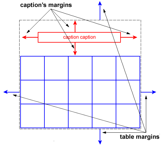
![[see-caption-above]](images/css-tables-abspos.svg)
![[see-caption-below]](images/empty-cells-example.gif)
![[see-caption-below]](images/tbl-layers.png)
![[see-caption-below]](./images/CSS-Tables-Fragmentation-1.svg)
![[see-caption-below]](./images/CSS-Tables-Fragmentation-2.svg)
![[see-caption-below]](./images/CSS-Tables-Repeating-Headers.svg)