This section is not normative.
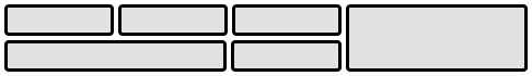
Grid Layout is a layout model for CSS
that has powerful abilities to control the sizing and positioning
of boxes and their contents.
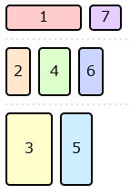
Grid Layout is optimized for 2-dimensional layouts:
those in which alignment of content is desired in both dimensions.
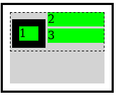
Representative Grid layout example
Although many layouts can be expressed with regular Grid Layout,
restricting items into a grid in both axes also makes it impossible
to express some common layouts on the Web.
This module defines a variant of [=Grid Layout=] that removes that restriction
so that items can be placed into Grid-like tracks in one axis
while stacking one after another in the other.
Items not explicitly placed into specific tracks
are placed into the column (or row) with the most remaining space
based on the layout size of the items placed so far.
Background and Motivation
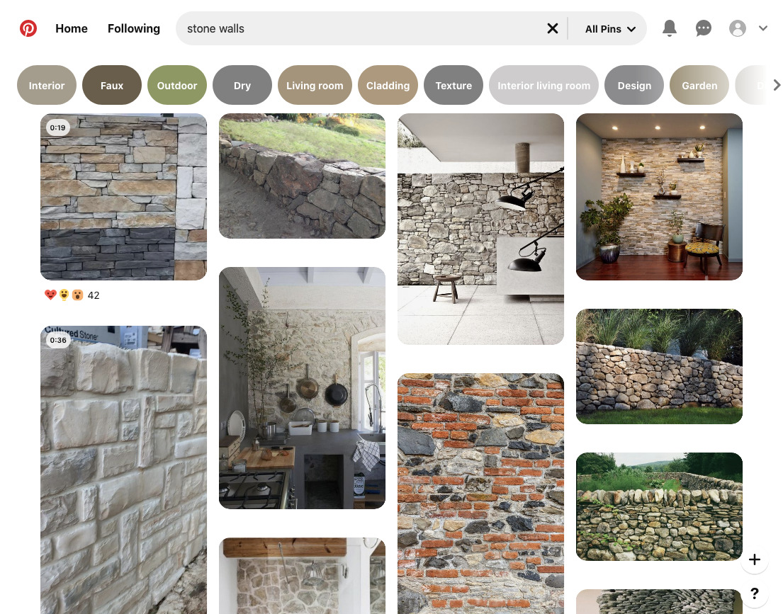
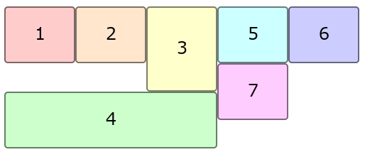
Waterfall Layout with Auto-placed Items
[=Grid lanes layout=], sometimes also called “masonry layout” or “waterfall layout”,
is a common Web design pattern where a number of items--
commonly images or short article summaries--
are placed one by one into columns
in a way that loosely resembles masonry construction.
Unlike [[CSS-MULTICOL-1|multi-column layout]] and [[CSS-FLEXBOX-1|multi-line column flex layout]],
where content is placed vertically in the first column
until it must spills over to the second column,
[=automatic placement=] in [=grid lanes layout=] selects a column for each new item
such that it is generally closer to the top of the layout than items placed later.
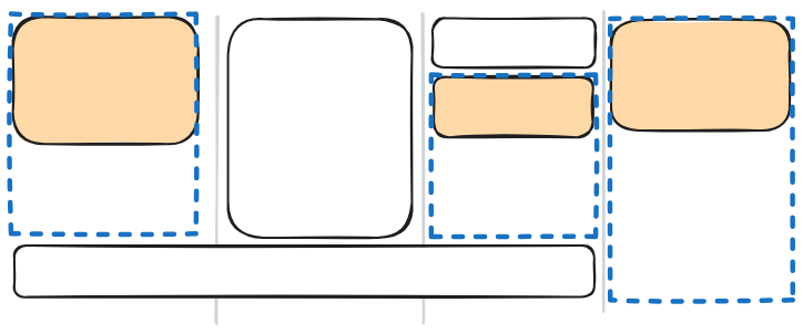
The traditional Pinterest search results page exemplifies this layout:
Representative grid lanes layout example
Here, each item has a different height
(depending on the content and the width of the column),
and inspecting the DOM reveals
(as the visual content itself gives no indication of ordering)
that each item has been placed into the column with the smallest height so far.
This layout superficially looks similar to multi-column layout;
but it has the advantage that scrolling down
will naturally lead to “later” items in the layout
(such as those less relevant in the search results).
It's not possible to achieve this layout using earlier CSS layout models,
unless you know up-front how tall each item will be,
or use JavaScript for content measurement or placement.
Using ''display: grid-lanes'' together with 'grid-template-columns'
yields this type of [=grid lanes layout=]
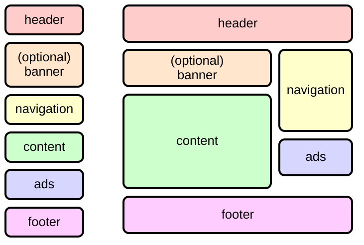
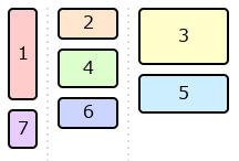
One-dimensional Grid Layout
[=Grid layout=] allows for powerful track sizing and explicit placement in two axes,
but sometimes a layout only needs alignment of its items in one dimension.
Using [=grid lanes layout=] together with explicitly-positioned items
allows for this type of one-dimensional grid layout.
This example by Douglas Graham
uses explicit positioning to place each item into its assigned column;
but there are no rows.
Instead, items in each column stack one after the other.
This layout can't be duplicated in [=grid layout=]
because the “spanning” relationships among the items in adjacent columns
is not fixed: it depends on their relative heights
and whether the optional banner or advertisement items are included.
It also can't be duplicated in [=flex layout=]
because the source order of the items
(which is used for reading, sequential navigation, and one-column mobile phone layout)
goes back and forth between the two columns.
Comparison of one-column and two-column variants of a one-dimensional grid layout.
Value Definitions
This specification follows the CSS property definition conventions from [[!CSS2]]
using the value definition syntax from [[!CSS-VALUES-3]].
Value types not defined in this specification are defined in CSS Values & Units [[!CSS-VALUES-3]].
Combination with other CSS modules may expand the definitions of these value types.
In addition to the property-specific values listed in their definitions,
all properties defined in this specification
also accept the CSS-wide keywords as their property value.
For readability they have not been repeated explicitly.
Grid Lanes Layout Model
Grid lanes layout
lays out items into pre-defined tracks similar to [=grid layout=] in one axis
(called the grid axis),
but flows them freely similar to [=flex layout=] in the other
(called the stacking axis).
Similar to [=grid layout=] and unlike [=flex layout=],
[=grid lanes layout=]’s auto-placement
distributes items across the tracks
to keep the lengths of those tracks as similar as possible.
[=Grid items=] are formed and [=blockified=]
exactly the same as in a regular [=grid container=].
All CSS properties work the same as in a regular [=grid container=]
unless otherwise specified by this specification.
For example, 'order' can be used to specify a different layout order for the items.
Note: Subgrid items are supported,
but subgridding only occurs in the [=grid axis=];
see [[#subgrids]] for details.
A grid lanes container is a [=grid container=] whose contents participate in [=grid lanes layout=].
A [=grid lanes container=] creates column [=grid tracks|tracks=]
if its [=stacking axis=] is the [=block axis=],
or row [=grid tracks|tracks=]
if its [=stacking axis=] is the [=inline axis=].
Comparing Grid Lanes Containers
Column Lanes
grid-template-columns: 1fr 2fr 3fr;
Row Lanes
grid-template-rows: 1fr 2fr 3fr;
Reordering and Accessibility
Although [=grid lanes layout=] generally progresses in a forwards fashion
(placing the next item endward of the current item in at least one axis,
matching the natural “reading order”),
it can switch between endward in the inline or block axis in a seemingly arbitrary manner.
In simple cases, the 'flow-tolerance' property can help reduce
the feeling of backtracking due to small sizing differences in the [=stacking axis=]
when laying out auto-placed items.
But when [[#grid-lanes-layout-algorithm|auto-placement]] is mixed with [=definite position|explicit placement=] or spanning items,
some amount of backtracking may occur.
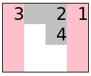
For example, in the following markup sample,
the fourth item is a spanner that doesn't fit
in the remaining empty column on the first line.
It ends up positioned into the into the first column,
which is the highest available space into which it will fit.
The next few items, which have a span of 1,
end up laying out “above” it in the empty column,
violating the natural reading order.
<section class=masonry>
<div class=item>1</div>
<div class=item>2</div>
<div class="item tall">3</div>
<div class="item wide">4</div>
<div class=item>5</div>
<div class=item>6</div>
<div class=item>7</div>
</section>
<style>
.masonry {
display: grid-lanes;
grid-template-columns: repeat(5, auto);
}
.item { height: 50px; }
.item.wide { grid-column: span 3; }
.item.tall { height: 90px; }
</style>
Auto-placed grid lanes layout with mixed-height items and mixed span sizes
Similarly, items explicitly placed into specific tracks can leave gaps behind them,
into which subsequent auto-placed items can be placed visually out-of-order.
Authors should be aware of these possibilities
and design layouts where such backtracking is minimized
so that focus and reading order can be more easily followed.
Alternatively, if the items do not have an inherent order,
use the 'reading-flow' property to allow the UA to re-order the items
for reading and linear navigation.
ISSUE: Or should reordering be the default behavior for auto-placed items here?
Techniques for reducing backtracking include:
* Using appropriate values for 'flow-tolerance',
i.e. values large enough to avoid gratuitous differentiation among similarly-sized tracks,
but not so large that meaningful differences get ignored.
* Using explicit placement in ways that help group related items together,
rather than ways that disrupt the natural order of items
* Avoiding the combination of mixed span sizes in the [=grid axis=]
and disparate item sizes in the [=stacking axis=],
which can cause items to get pulled out of order (see example above).
As with [=grid layout=] and [=flex layout=]
authors can use the 'order' property to re-order items;
the same caveats apply.
See [[css-grid-2#order-accessibility]]
and [[css-display-4#order-accessibility]].
Establishing Grid Lanes Layout
	Name: display
	New values: grid-lanes | inline-grid-lanes
grid-lanes
This value causes an element to generate a [=block-level=] [=grid lanes container=] box.
inline-grid-lanes
This value causes an element to generate an [=inline-level=] [=grid lanes container=] box.
A [=grid lanes container=] that is not [=subgridded=] in its [=grid axis=] establishes
an [=independent formatting context=]
for its contents.
ISSUE(12820): Write up how grid/masonry formatting contexts work more formally?
Orienting Grid Lanes Layout
The orientation of a [=grid lanes container=],
i.e. whether its [=grid axis=] is
the [=inline axis=] (establishing columns)
or the [=block axis=] (establishing rows)
is determined by the TBD property.
The [=initial value=] of this property is normal,
which determines the orientation from the 'grid-template-*' properties:
* If 'grid-template-columns' is ''grid-template-columns/none''
and 'grid-template-rows' is not ''grid-template-rows/none'',
the [=grid container=]’s [=block axis=] is the [=grid axis=] (establishing rows).
* Otherwise (thus by default),
the [=grid container=]’s [=inline axis=] is the [=grid axis=] (establishing columns).
The following code will create a 2-column (“waterfall style”) [=grid lanes container=]
that grows downward:
ISSUE(12803): Figure out whether we are re-using 'grid-auto-flow' here
(and what it's values mean)
or defining a new property like grid-lanes-direction.
Grid Lanes Track Specification
In the [=grid axis=],
the full power of [=grid layout=] is available for track specification:
* Track sizes, line names, and areas can be specified on the [=grid lanes container=]’s [=grid axis=],
just like in [=grid layout=].
* The [=explicit grid=] and [=implicit grid=] are formed in the same way as for a regular [=grid container=].
* Items can be [[#grid-lanes-track-placement|placed]] against these grid templates just as in [=grid layout=].
However,
auto-placed items contribute sizing to all tracks,
not just the track into which they are ultimately placed;
see [[#track-sizing]].
Note: This is because auto-placed items must be laid out as they are placed,
so that each track knows how “full” it is
(and therefore which track should receive the next auto-placed item);
thus, the tracks themselves must already have a definite size
so that the items know their [=available space=] during layout.
Declaring Grid Lanes Track Templates: the 'grid-template-*' properties
The 'grid-template-*' and 'grid-auto-rows'/'grid-auto-columns' properties
(and their shorthands)
apply in the [=grid axis=] of the [=grid lanes container=]
and establish tracks just as on regular [=grid containers=].
(They are ignored in the [=stacking axis=].)
Intrinsic Tracks and repeat()
Level 3 extends the ''repeat()'' notation to allow repetitions where
neither the [=min track sizing function=] nor the [=max track sizing function=] is [=definite=];
in other words, the syntax for <> is relaxed to the following:
In order to resolve the number of repetitions,
a hypothetical size is calculated for such tracks
by initializing the track sizes (per [[css-grid-2#algo-init]])
and resolving intrinsic track sizes (per [[css-grid-2#algo-content]])
in accordance with [[#track-sizing]]
with the following assumptions:
* Ignore explicit item placement.
(That is, assume all items have an [=automatic position=].)
* Do not [=collapsed grid track|collapse=] any tracks.
* Expand the repeated track listing to capture all possible [=automatic placements=] of each item,
i.e. repeat the track listing 2 + (largest span - 2)/(number of tracks in repeat()) times,
rounded down to a whole number.
The hypothetical size of each track in the ''repeat()'' listing
is given by the largest track corresponding to that entry (by index) in the listing.
For example,
given a template of ''repeat(auto-fill, 50px auto auto)''
and a largest spanner of 2,
you need to repeat the track listing twice,
giving ''50px auto auto 50px auto auto''.
After doing the hypothetical layout,
the 2nd and 5th tracks are maxed together to provide a hypothetical size for the first auto
and the 3rd and 6th tracks are maxed together to provide a hypothetical size for the second auto.
Those concrete sizes are then used to determine how many repetitions will fill the container.
ISSUE(10915): Should this work also in Grid Layout somehow, or fall back to a single repetition? If so, how?
Note: This simplified layout heuristic is defined to be "good enough",
while remaining fast and consistent.
Ignoring placement is required just to make the concept coherent;
before you know how many repetitions you need,
you can't tell what track an item
(even one with a definite placement)
will end up in.
ISSUE: Technically, if your explicit placement does not enter or cross over the repetition,
we can know its placement prior to resolving the reptition.
Do we want to adjust the algorithm above to account for this?
That is, given ''auto repeat(auto-fill, ...) auto'',
if you explicitly place an item against line 1 or -1,
we could let it only affect that track
(rather than pretending it'll go in every track).
Subgrids
[=Subgridding=] allows nested [=grid lanes containers=] (and [=grid containers=])
to share track sizes.
If the parent's corresponding axis is a [=grid axis=],
the subgridded axis is taken from the parent container
[[css-grid-2#subgrids|as specified for grid containers]];
if the parent's corresponding axis is a [=stacking axis=],
the subgridded axis also acts as a [=stacking axis=].
ISSUE: What if this conflicts with the lanes orientation, or results in both axes stacking?
In [=grid lanes layout=], auto-placed [=subgrids=]
don't inherit any line names from their parent grid,
because that would make the placement of the item
dependent on layout results;
but the subgrid's tracks are still aligned to the parent's tracks as usual.
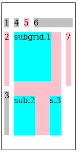
```
The rendering of the subgrid example above.
Note how the subgrid's first item ("subgrid.1") contributes
to the intrinsic size of the 2nd row in the parent grid.
This is possible since the subgrid specified a definite position
so we know which tracks it will occupy.
Note also that trying to subgrid the parent's [=stacking axis=]
results in the subgrid converting to a [=grid lanes container=]
with its [=inline axis=] as the [=stacking axis=].
A [=subgrid=] that is a [=grid lanes container=]
can be referred to as a grid lanes subgrid.
To distinguish, a regular [=grid container=] [=subgrid=]
can be referred to as a regular grid subgrid.
Track Repetition: the ''repeat()'' notation
This specification introduces new keywords and grid-lanes–specific behavior
for the ''repeat()'' notation.
repeat(auto-fit)
In [=grid lanes containers=] (as in regular [=grid containers=])
''repeat()/auto-fit'' acts like ''repeat()/auto-fill'',
but with empty tracks [=collapsed grid tracks|collapsed=].
However, because placement occurs after track sizing,
[=grid lanes containers=] use a heuristic
to determine if a track will be occupied:
* All tracks occupied by explicitly placed items are considered occupied.
* With the sum of the spans of all auto-placed items as N,
all unoccupied tracks up to the Nth such track
are considered occupied.
All tracks produced by the ''repeat()/auto-fit'' repetition and considered unoccupied by this heuristic
are assumed “empty” and are [=collapsed grid tracks|collapsed=].
A [=collapsed grid track=] cannot accept placement of auto-placed items.
Note: It is possible for an auto-placed item to be placed in a track when ''repeat()/auto-fill'' is used
that would be collapsed if ''repeat()/auto-fit'' is used
if there are auto-placed items with a span greater than 1
mixed with explicitly-placed items that leave gaps too small for the auto-placed items.
Grid Axis Track Sizing
Track sizing works the same as in [[css-grid-2#algo-track-sizing|CSS Grid]],
except that when considering which items contribute to intrinsic sizes:
* All items explicitly placed in that track contribute, and
* All items with an [=automatic grid position=] contribute
(regardless of whether they are ultimately placed in that track).
For example, suppose there are two columns in the [=grid axis=]
and that
* Items A, B, and C have no explicit position.
* Item D is explicitly placed into the first column.
In this case, items A, B, C, and D all contribute to sizing the first column,
while only A, B, and C (and not D) contribute to the second column.
In the case of spanning items with an [=automatic grid position=],
they are assumed to be placed at every possible start position,
and contribute accordingly.
For example, suppose there are 5 columns in the [=grid axis=],
with the middle having a fixed size of ''100px''
and the other two being ''grid-template/auto''-sized.
For the purpose of track sizing,
an item that spans 2 tracks
and has an intrinsic contribution of 220px
is essentially copied and assumed to exist:
* At grid line 1,
contributing 110px to each of the first two tracks.
* At grid line 2,
contributing 120px to the second track.
* At grid line 3,
contributing 120px to the fourth track.
* At grid line 4,
contributing 110px to the fourth and fifth tracks.
Note: This algorithm ensures that each track is at least big enough
to accommodate every item that is ultimately placed in it,
and does not create dependency cycles between placement and track sizing.
However, depending on the variation in sizes,
tracks could be larger than necessary:
an exact fit is only guaranteed if
all items are explicitly placed in the [=grid axis=]
or all items are the same size
(or matching multiples of that size, in the case of spanning items).
Subgrid Item Contributions
When sizing the tracks of either a regular [=grid container=] or a [=grid lanes container=],
a [=grid lanes subgrid=] has special handling of items that have an [=automatic grid position=]:
* Any such item is placed into every possible [=parent grid=] track
that could be spanned by the [=grid lanes subgrid=].
(If the subgrid has a [=definite grid position=], thus only the spanned tracks;
if it has an [=automatic grid position=], then all tracks in the parent grid.)
* Any such item receives the largest margin/border/padding contribution
of each edge at which it could hypothetically be placed.
If the item spans the entire subgrid, it receives both.
(See CSS Grid Layout §9.)
When sizing the tracks of a [=grid lanes container=],
a [=subgrid=] with an [=automatic grid position=]
(whether a [=regular grid subgrid=] or [=grid lanes subgrid=])
also has special handling of its items:
* Every item is placed into every possible [=parent grid=] track
that could be spanned by the [=subgrid=],
(ignoring any explicit placement of the item).
* Explicitly-placed sub-items only receive the subgrid's margin/border/padding contribution
when their explicit placement is at an edge of the subgrid
(as usual).
Note: Explicitly placed items inside an explicitly placed [=subgrid=]
only ever contribute to their actual [=parent grid=] tracks.
This is because in this case, just like in regular [=grid layout=],
the item's placement is known prior to track sizing.
Optimized Track Sizing
Track sizing can be optimized by aggregating items
that have the same span size and placement
into a single virtual item
as follows:
Separate all the [=grid items=] into item groups, according to the following properties:
* the span of the item
* the placement of the item,
i.e. which tracks it is allowed to be placed in
* the item's [=baseline-sharing group=]
Note: For example, an item with span 2 placed in the second track
will be in a different group than an item with span 2 that has an [=automatic grid position=].
For each [=item group=], synthesize a virtual grid item
that has the maximum of every intrinsic size contribution
among the items in that group.
If the items apply [=baseline alignment=],
determine the baselines of the [=virtual grid item=]
by placing all of its items into a single hypothetical grid track
and finding their shared baseline(s) and shims.
Increase the group's intrinsic size contributions accordingly.
Place hypothetical copies of each [=virtual grid item=] into the [=grid axis=] tracks
in every position that the item could potentially occupy,
and run the [[css-grid-2#algo-track-sizing|track sizing algorithm]] with those items.
The resulting track sizes are the [=grid lanes container's=] track sizes.
Note: This optimization should give the same results
as the track sizing description [[#track-sizing|above]];
if not this is an error, please
report it to the CSSWG.
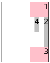
Grid Lanes Item Placement
In the [=grid axis=],
items can be explicitly placed into tracks and span them using the familiar [=grid-placement properties=]’ syntax.
Auto-placement, however, uses the [[#grid-lanes-layout-algorithm]],
placing each item with an [=automatic grid position=]
into the “shortest” track available.
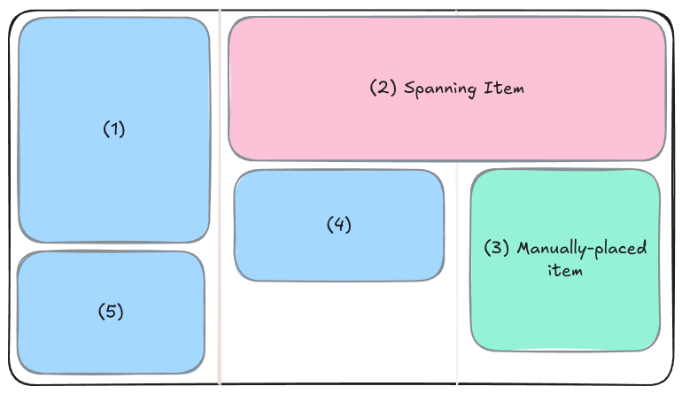
Here's a grid lanes layout demonstrating explicitly placed and spanning items:
		.container {
			grid-template-columns: repeat(3, auto);
		}
		.container > :nth-child(2) {
			/* auto-placed, but spanning. */
			grid-column: span 2;
		}
		.container > :nth-child(3) {
			/* manually placed */
			grid-column: 3;
		}
		/* all other children are auto-placed */
Rendering of the example above.
Specifying Grid Axis Item Placement: the 'grid-column-*' and 'grid-row-*' properties
The 'grid-column-*' and 'grid-row-*' properties
(and their shorthands)
apply in the [=grid axis=] of the items
and establish placement just as in regular [=grid layout=].
Placement Precision: the 'flow-tolerance' property
	Name: flow-tolerance
	Value: normal | <> | infinite
	Initial: normal
	Percentages: relative to the [=grid-axis=] [=content box=] size of the [=grid lanes container=]
	Inherited: no
	Applies to: [=grid lanes containers=]
	Computed value: a computed <> value
	Animation type: as length
[=Grid lanes containers=] are filled
by placing each [=grid item=]
in whichever [=grid track=] is currently the least filled.
When multiple tracks are tied for least-filled,
placing the items in order looks good.
But if tracks are only very slightly different heights,
it can look strange to have them not fill in order,
as the height differences aren't perceived as meaningfully different.
The 'flow-tolerance' property specifies what the threshold is
for considering tracks to be “the same height”,
causing them to fill in order.
: <>
:: Specifies the tie threshold
for the [=grid lanes container=].
Placement positions are considered to be equally good (“tied”)
if they are within the specified distance
from the shortest position.
Note: The initial value is a “small” distance (''1em'')
that is probably appropriate to represent “close enough”.
: normal
:: Resolves to a [=used value=] of ''1em'' in [=grid lanes layout=]
and a [=used value=] of ''0'' in all other layout modes.
: infinite
:: Specifies an infinite [=tie threshold=].
This makes items distribute themselves strictly in order,
without considering the length of the tracks at all.
Note: This value can result in consecutive items being placed
in dramatically different positions in the [=stacking axis=],
which can be confusing to readers.
If the initial value (`1em`) is too small,
consider a larger value (such as `10em` or `50vh`)
instead of `infinite`.
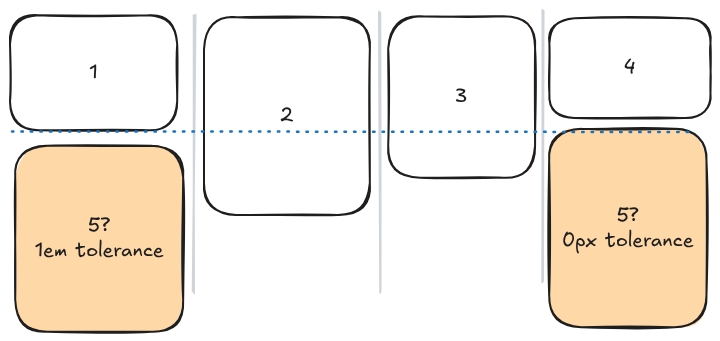
In the following example,
when placing the 5th item,
the fourth column is the shortest,
but the first column is almost as short.
With the default tolerance of ''1em'',
both the first and fourth columns are considered to be "tied",
and so the first is chosen.
If, instead, the tolerance is set to ''0px'',
then there is no tie;
only the fourth column is a possible placement.
Note: We expect to apply this property to [=flex layout=] in the future also,
see discussions
on how that might work.
Dense Placement: the ''grid-auto-flow/dense'' keyword
In [=grid layout=], ''grid-auto-flow: dense'' allows backtracking
during the [[css-grid-2#auto-placement-algo|grid item placement algorithm]].
The ''grid-auto-flow/dense'' keyword similarly allows backtracking
during the [[#grid-lanes-layout-algorithm|grid lanes placement algorithm]].
However, because item placement and sizing are intertwined in [=grid lanes layout=],
an item can only backtrack into a compatible empty slot if
the total used size of that slot’s tracks
matches the used size of the item’s normal-placement tracks.
Note: This restriction avoids laying out the item more than once.
Grid Lanes Layout and Placement Algorithm
For each of the tracks in the [=grid axis=],
keep a running position initialized to zero.
Maintain also a auto-placement cursor,
initially pointing to the first line.
For each item in [=order-modified document order=]:
If the item has a [=definite grid position=] in the [=grid axis=],
use that placement.
ISSUE: Should this also update the placement cursor?
Otherwise, resolve its [=grid axis=] placement using these substeps:
Starting at the first [=grid axis=] line in the [=implicit grid=],
find the largest [=running position=] of the [=grid axis=] tracks
that the item would span if it were placed at this line,
and call this position max_pos.
Repeat the previous step for each successive line number
until the item would no longer fit inside the grid.
Let |possible lines| be the line that resulted in the smallest max_pos,
and all lines that result in a max_pos within the [=tie threshold=] of this max_pos.
Choose the first line in |possible lines| greater than or equal to the [=auto-placement cursor=]
as the item's position in the [=grid axis=];
or if there are none such, choose the first one.
Update the [=auto-placement cursor=] to point to item's last line.
Place the item in its [=grid axis=] tracks
at the maximum of the [=running position=]s
of the tracks it spans.
Calculate the size of the item's containing block
and then layout the item.
Set the [=running position=] of the spanned [=grid axis=] tracks
to max_pos + [=outer size=] + 'grid-gap'.
For this purpose, the [=outer sizes=] of the box are floored at zero.
Note: That is, if the box has sufficiently large negative margins,
it won't somehow count as a negative size here.
The [=running position=] of a track never decreases,
so a negative-sized box
won't cause future normally-sized items placed in the track
to overlap previous items.
If the [=grid lanes container=] uses ''grid-auto-flow/dense'' packing,
and there exists skipped spaces in the layout
(e.g. due to spanning items)
into which the item, as it is sized now,
could have fit if it were placed earlier,
and where the spanned tracks have the same total used size
as the tracks into which it is currently placed,
then instead place it into the highest such space.
If there are multiple valid spaces within the [=tie threshold=] of the highest space,
place it in the [=start=]-most of them.
Rewind the [=auto-placement cursor=] and the [=running position=]
to their values before this item’s placement.
Note: Items that visually intrude into preceding empty spaces
(via negative margins, ''position: relative'', transforms, etc.),
do not affect the size of those empty spaces.
Later items can get placed in those spaces
and visually overlap these previous items.
Note: Dense packing both ignores the [=auto-placement cursor=] when backfilling,
and does not update it after placement.
If there aren't any acceptable placement gaps to backfill, though,
it places items exactly as when ''grid-auto-flow/dense'' were not specified.
Note: This algorithm chooses the track
that would result in the item being placed as highly as possible.
If there are ties, it chooses the earliest such track,
after the most recently placed item if possible
(ensuring that it always “moves forward” even in the presence of ties).
Containing Block
The [=containing block=] for a [=grid item=] participating in [=grid lanes layout=]
is formed by its [=grid area=] in the [=grid axis=]
and the [=grid container=]'s [=content box=] in the [=stacking axis=].
Placement and Writing Modes
Note: Like all of [=grid layout=],
grid lanes layout and placement is sensitive to the [=writing mode=].
For example, for ''direction: rtl'',
items are placed right-to-left rather than left-to-right,
whether the inline axis is a [=grid axis=] or a [=stacking axis=].
Here's a simple example using ''direction: rtl'' in the [=grid axis=]:
```css
```
```html
1234
```
Rendering of the ''direction: rtl'' example above.
Here's a simple example
using ''direction: rtl'' in the [=stacking axis=]:
```css
```
```html
1234
```
Rendering of the ''direction: rtl'' example above.
Sizing Grid Containers
[[css-grid-2#intrinsic-sizes|Sizing Grid Containers]] works the same as for regular [=grid containers=]
but with the following replacement for the [=stacking axis=]:
The max-content size (min-content size) of a [=grid container=] in the [=stacking axis=]
is the size of the [=stacking range=]
when the [=grid lanes container=] is sized under a max-content constraint (min-content constraint)
in that axis.
The stacking range is the range between
the startmost [=outer edge=] among the first items of each track
and the endmost [=outer edge=] among the last items of each track.
```
Rendering of the [=grid container=] intrinsic sizing example above.
Alignment and Spacing
Gutters: the 'row-gap', 'column-gap', and 'gap' properties
[[css-grid-2#gutters|Gutters]] are supported in both axes
using the 'row-gap' and 'column-gap' properties (and their 'gap' [=shorthand=]).
In the [=grid axis=] they work the same as in a regular [=grid container=];
see [[css-grid-2#alignment]].
In the [=stacking axis=],
the gap is applied between the margin boxes of each pair of adjacent items.
Margins do not collapse in either axis.
Grid-axis Alignment: the 'align-content'/'justify-content', 'align-self'/'justify-self', and 'align-items'/'justify-items' properties
In the [=grid axis=],
the [=box alignment properties=]
work the same as in a regular [=grid container=].
See [[css-grid-2#alignment]] and [[css-align-3|CSS Box Alignment Level 3]].
Stacking-axis Content Distribution: the 'align-content'/'justify-content' properties
In the [=stacking axis=],
[[css-align-3#content-distribution|content-distribution]] is applied
to the content as a whole, similarly to how it behaves in block containers.
More specifically, the alignment subject is the [=stacking range=].
The extent of the alignment subject is indicated by the dashed border,
while the alignment container is the whole container
(indicated by the height of the column dividers).
It defaults to start-aligning,
but depending on (in this case) 'align-content',
the items can move down, as a block,
to center- or end-align vertically.
Note: There is only ever one alignment subject
for these properties in the [=stacking axis=],
so the unique 'align-content' / 'justify-content' values boil down to
''align-content/start'',
''align-content/center'',
''align-content/end'',
and [=baseline alignment=].
(The behavior of ''align-content/normal'' and ''align-content/stretch''
is identical to ''align-content/start'',
and the [=distributed alignment=] values behave as their [=fallback alignments=].)
If the [=grid items=] overflow
the [=grid container=]'s [=content box=] in the [=stacking axis=],
then the [=stacking range=] will be larger than the [=grid container=]'s [=content box=].
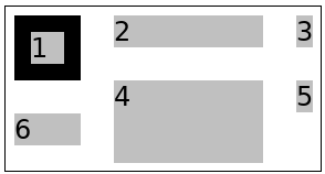
Stacking-axis Self Alignment: the 'align-self'/'justify-self' and 'align-items'/'justify-items' properties
In the [=stacking axis=],
the [=self-alignment properties=] only apply to items that are adjacent to a “gap” in the layout,
i.e. placed in their [=grid track=](s) either immediately before a spanning item
or as the last item.
The [=alignment subject=] is the item's [=margin box=],
and the [=alignment container=] is that box plus the adjacent “gap”.
For the last item in a track, the [=alignment container=]
extends to the lowest bottom outer edge
among all the last items in all tracks.
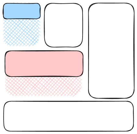
The three highlighted items are the only ones with "gaps" following them,
so they're the only ones that will respond to 'align-items'.
Their [=alignment containers=] are indicated by the cross-hatched areas.
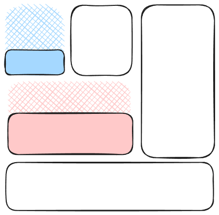
''align-self: start''
''align-self: end''
Alignment of an item does not affect the size or position
of other items' [=alignment containers=].
Baseline Alignment
Item [=baseline alignment=] inside the [=grid axis=] tracks
works as usual for a regular [=grid container=],
and the [=grid container=]'s baseline is determined
the same as for a regular [=grid container=] in that axis.
[=Baseline alignment=] is not supported in the [=stacking axis=].
The [=baseline alignment=] values of the [=self-alignment properties=]
on [=grid items=] are treated as their [=fallback alignment=] in this axis.
The first baseline set of the [=grid container=] in this axis
is generated from the highest [=alignment baseline=]
among the [=grid items=] placed first in each track,
and the last baseline set from the lowest [=alignment baseline=]
among the [=grid items=] placed last in each track.
Note: Whether an item is “first” or “last” depends only on placement
(including ''grid-auto-flow/dense'' packing adjustments),
and is not affected by its actual position on the page,
e.g. negative margins or [=relative positioning=] are not considered.
Fragmentation
Fragmentation in the stacking axis
Each [=grid axis=] track is fragmented independently in the [=stacking axis=].
If a [=grid item=] is fragmented,
or has a [=forced break=] before/after it,
then the [=running position=] for the tracks that it spans in the [=grid axis=]
are set to the size of the [=fragmentainer=]
so that no further items will be placed in those tracks.
An item that is split into multiple fragments
retains its placement in the [=grid axis=] for all its fragments.
A grid item that is pushed, however,
is placed again by the next [=grid container=] fragment.
Placement continues until all items are placed or pushed to a new fragment.
Here's an example
illustrating fragmentation of grid lanes layout with [=stacking axis|stacking=] in its [=block axis=].
It renders like this:
Visualization of fragmentation in a [=block-axis=] [=grid lanes layout=].
Fragmentation in the Grid Axis
Fragmentation in the [=grid axis=] of a [=grid lanes container=]
is also supported.
In this case the fragmentation behaves more like in a regular [=grid container=];
however, there's a separate step to determine which [=grid-axis=] track
each item is placed into,
before fragmentation occurs.
Here's an example
illustrating fragmentation of grid lanes layout with [=stacking axis|stacking=] in its [=inline axis=].
In this case the breaks occurs between the [=grid-axis=] rows.
It renders like this:
Visualization of fragmentation in the [=block axis=] with [=inline-axis=] [=grid lanes layout=].
Absolute Positioning
[[css-grid-1#abspos-items|Grid-aligned absolute-positioned descendants]] are supported
in [=grid lanes containers=] just as for regular [=grid containers=];
however, in the [=stacking axis=] there exist only two lines (in addition to the ''grid-area/auto'' lines) for placement:
* line 1 (line -2) corresponds to the start edge of the [=stacking range=]
* line 2 (line -1) corresponds to the end edge of the [=stacking range=]
ISSUE: It might be useful to define a static position in the [=stacking axis=].
Maybe it could defined as the max (or min?) current [=running position=]
of the [=grid-axis=] tracks at that point? Or the end of the item before it?
Graceful Degradation
Typically, a grid lanes design can be expected to degrade quite nicely
in a UA that supports [=grid layout=] but not [=grid lanes layout=].
Here's an example
to illustrate this.
```css
display: grid;
display: grid-lanes; /* ignored in UAs that don't support grid lanes layout */
grid-template-columns: 150px 100px 50px;
```
This creates a layout with three columns,
but will have "more gaps" in the [=block axis=] if the UA doesn't support [=grid lanes layout=].
Here's what it looks like with grid lanes support for comparison:
Rendering of the example in a UA with grid lanes support.
Acknowledgements
Special thanks goes to Cameron McCormack who wrote a masonry layout explainer document
(from which was lifted the Background chapter) and presented it to the CSSWG,
and to Mats Palmgren who developed the original version of this specification
alongside a prototype implementation in Firefox.
Thanks also to everyone who provided feedback on the initial proposal for this feature
as well as the many subsequent issues,
and to Noam Rosenthal particularly for naming it.
Security Considerations
As a layout specification,
this spec introduces no new security considerations
beyond that exposed by CSS layout in general.
Privacy Considerations
As a layout specification,
this spec introduces no new privacy considerations
beyond that exposed by CSS layout in general.
Changes
Additions Since Level 2
The following features have been added since
Level 2:
Added [=grid lanes layout=].
Expanded ''repeat(auto-fill)'' and ''repeat(auto-fit)'' to accept indefinite track sizing functions.
(Issue 9321,
Issue 12899)
Introduced the 'flow-tolerance' property.
Recent Changes
The following changes have been made since the
21 January 2026 Working Draft:
* Dropped the 'item-*' proposal for unified flow controls across layout modes.
(Issue 11480)
* Simplified the sizing calcs for automatic-positioned [=subgrids=] in a [=grid lanes container=].
(Issue 10926)
* Clarify that baseline values for [=self-alignment properties=] in the stacking axis
fall back to their fallback value.
(Issue 10275)
The following changes have been made since the
23 December 2025 Working Draft:
* Renamed item-tolerance to 'flow-tolerance'.
(Issue 10884)
The following changes have been made since the
16 December 2025 Working Draft:
* Defined ''grid-auto-flow/normal'' as the initial value
for [[#grid-lanes-orientation|setting the track orientation]].
* Defined the [=self-alignment properties=]’ effect in the [=stacking axis=].
See [[#stacking-self-alignment]].
The following changes have been made since the
17 September 2025 Working Draft:
* Defined a new inner display type, ''display/grid-lanes'', to establish [=grid lanes layout=],
and updated spec vocabulary to match.
(Issue 12022)
* Dropped the unnecessary auto-areas value from ''repeat()''.
(Issue 10854)
* Adjusted heuristic for ''repeat(auto-fill)'' and ''repeat(auto-fit)'' with indefinite track sizing functions.
(Issue 12899)
* Floored the contribution of items to a track's [=running position=] at zero.
(Issue 12918)
* Renamed ''item-tolerance'' to ''flow-tolerance''.
(Issue 10884)
See also earlier changes.
abspos/column-grid-lanes-alignment.html
abspos/column-grid-lanes-intrinsic-sizing-oof.html
abspos/column-grid-lanes-out-of-flow-001.html
abspos/column-grid-lanes-out-of-flow-002.html
abspos/column-grid-lanes-out-of-flow-003.html
abspos/column-grid-lanes-positioned-item-dynamic-change.html
abspos/row-grid-lanes-alignment.html
abspos/row-grid-lanes-intrinsic-sizing-oof.html
abspos/row-grid-lanes-out-of-flow-001.html
abspos/row-grid-lanes-out-of-flow-002.html
abspos/row-grid-lanes-out-of-flow-003.html
abspos/row-grid-lanes-positioned-item-dynamic-change.html
alignment/column-grid-lanes-alignment-positioned-items-001.html
alignment/column-grid-lanes-alignment-positioned-items-002.html
alignment/column-grid-lanes-alignment-positioned-items-003.html
alignment/column-grid-lanes-alignment-positioned-items-004.html
alignment/column-grid-lanes-justify-self-001.html
alignment/column-grid-lanes-justify-self-002.html
alignment/column-grid-lanes-justify-self-003.html
alignment/column-justify-items-center-001.html
alignment/column-justify-items-end-justify-self-start-001.html
alignment/column-overflow-alignment-001.html
alignment/grid-lanes-align-content-001.html
alignment/grid-lanes-align-content-002.html
alignment/grid-lanes-align-content-003.html
alignment/grid-lanes-align-content-004.html
alignment/grid-lanes-justify-content-001.html
alignment/grid-lanes-justify-content-002.html
alignment/grid-lanes-justify-content-003.html
alignment/grid-lanes-justify-content-004.html
alignment/row-align-items-center-001.html
alignment/row-align-items-end-align-self-start-001.html
alignment/row-grid-lanes-align-self-001.html
alignment/row-grid-lanes-align-self-002.html
alignment/row-grid-lanes-align-self-003.html
alignment/row-grid-lanes-alignment-positioned-items-001.html
alignment/row-grid-lanes-alignment-positioned-items-002.html
alignment/row-grid-lanes-alignment-positioned-items-003.html
alignment/row-grid-lanes-alignment-positioned-items-004.html
alignment/row-overflow-alignment-001.html
baseline/column-grid-lanes-container-baseline-001a.html
baseline/column-grid-lanes-container-baseline-001b.html
baseline/column-grid-lanes-container-baseline-002a.html
baseline/column-grid-lanes-container-baseline-002b.html
baseline/column-grid-lanes-container-baseline-003a.html
baseline/column-grid-lanes-container-baseline-003b.html
baseline/column-grid-lanes-container-baseline-003c.html
baseline/column-grid-lanes-container-baseline-004a.html
baseline/column-grid-lanes-container-baseline-004b.html
baseline/column-grid-lanes-container-baseline-005a.html
baseline/column-grid-lanes-container-baseline-005b.html
baseline/column-grid-lanes-container-baseline-006.html
baseline/column-grid-lanes-container-baseline-007a.html
baseline/column-grid-lanes-container-baseline-007b.html
baseline/column-grid-lanes-container-baseline-008.html
baseline/grid-lanes-grid-item-content-baseline-001.html
baseline/grid-lanes-grid-item-self-baseline-001.html
baseline/grid-lanes-grid-item-self-baseline-002a.html
baseline/grid-lanes-grid-item-self-baseline-002b.html
column-empty-grid-lanes-container-001.html
column-empty-grid-lanes-container-002.html
fragmentation/grid-lanes-fragmentation-001.html
fragmentation/grid-lanes-fragmentation-002.html
fragmentation/grid-lanes-fragmentation-003.html
gap/column-gaps-001.html
gap/grid-lanes-gap-001.html
gap/grid-lanes-gap-002.html
gap/row-gaps-001.html
grid-lanes-columns-item-containing-block-is-grid-content-width.html
grid-lanes-fieldset-crash.html
grid-lanes-grid-template-columns-computed-withcontent.html
grid-lanes-not-inhibited-001.html
grid-placement/column-explicit-placement-001.html
grid-placement/column-explicit-placement-002.html
grid-placement/column-explicit-placement-003.html
grid-placement/grid-lanes-grid-placement-named-lines-001.html
grid-placement/grid-lanes-grid-placement-named-lines-002.html
grid-placement/grid-lanes-grid-placement-named-lines-dense-packing-001.html
grid-placement/row-explicit-placement-001.html
grid-placement/row-explicit-placement-002.html
grid-placement/row-explicit-placement-003.html
grid-placement/row-explicit-placement-004.html
grid-placement/row-explicit-placement-005.html
grid-placement/row-explicit-placement-006.html
grid-placement/row-explicit-placement-007.html
grid-placement/row-explicit-placement-008.html
intrinsic-sizing/column-intrinsic-inline-container-size.html
intrinsic-sizing/grid-lanes-intrinsic-sizing-cols-001-auto.html
intrinsic-sizing/grid-lanes-intrinsic-sizing-cols-001-fr.html
intrinsic-sizing/grid-lanes-intrinsic-sizing-cols-001-mix1.html
intrinsic-sizing/grid-lanes-intrinsic-sizing-cols-001-mix2.html
intrinsic-sizing/grid-lanes-intrinsic-sizing-cols-002-auto.html
intrinsic-sizing/grid-lanes-intrinsic-sizing-cols-002-fr.html
intrinsic-sizing/grid-lanes-intrinsic-sizing-cols-002-mix1.html
intrinsic-sizing/grid-lanes-intrinsic-sizing-cols-002-mix2.html
intrinsic-sizing/grid-lanes-intrinsic-sizing-cols-003-auto.html
intrinsic-sizing/grid-lanes-intrinsic-sizing-cols-003-fr.html
intrinsic-sizing/grid-lanes-intrinsic-sizing-cols-003-mix1.html
intrinsic-sizing/grid-lanes-intrinsic-sizing-cols-003-mix2.html
intrinsic-sizing/grid-lanes-intrinsic-sizing-cols-004-auto.html
intrinsic-sizing/grid-lanes-intrinsic-sizing-cols-004-fr.html
intrinsic-sizing/grid-lanes-intrinsic-sizing-cols-004-mix1.html
intrinsic-sizing/grid-lanes-intrinsic-sizing-cols-004-mix2.html
intrinsic-sizing/grid-lanes-intrinsic-sizing-cols-005.html
intrinsic-sizing/grid-lanes-intrinsic-sizing-cols-006.html
intrinsic-sizing/grid-lanes-intrinsic-sizing-cols-007.html
intrinsic-sizing/grid-lanes-intrinsic-sizing-rows-001-auto.html
intrinsic-sizing/grid-lanes-intrinsic-sizing-rows-001-fr.html
intrinsic-sizing/grid-lanes-intrinsic-sizing-rows-001-mix1.html
intrinsic-sizing/grid-lanes-intrinsic-sizing-rows-001-mix2.html
intrinsic-sizing/grid-lanes-intrinsic-sizing-rows-002-auto.html
intrinsic-sizing/grid-lanes-intrinsic-sizing-rows-002-fr.html
intrinsic-sizing/grid-lanes-intrinsic-sizing-rows-002-mix1.html
intrinsic-sizing/grid-lanes-intrinsic-sizing-rows-002-mix2.html
intrinsic-sizing/grid-lanes-intrinsic-sizing-rows-003-auto.html
intrinsic-sizing/grid-lanes-intrinsic-sizing-rows-003-fr.html
intrinsic-sizing/grid-lanes-intrinsic-sizing-rows-003-mix1.html
intrinsic-sizing/grid-lanes-intrinsic-sizing-rows-003-mix2.html
intrinsic-sizing/grid-lanes-intrinsic-sizing-rows-004-auto.html
intrinsic-sizing/grid-lanes-intrinsic-sizing-rows-004-fr.html
intrinsic-sizing/grid-lanes-intrinsic-sizing-rows-004-mix1.html
intrinsic-sizing/grid-lanes-intrinsic-sizing-rows-004-mix2.html
intrinsic-sizing/grid-lanes-intrinsic-sizing-rows-005.html
intrinsic-sizing/grid-lanes-intrinsic-sizing-rows-006.html
intrinsic-sizing/grid-lanes-intrinsic-sizing-rows-007-ref.html
intrinsic-sizing/grid-lanes-intrinsic-sizing-rows-007.html
intrinsic-sizing/row-defined-height.html
intrinsic-sizing/row-intrinsic-inline-container-size.html
item-placement/column-auto-placement-001.html
item-placement/column-negative-margin-001.html
item-placement/column-reverse-001.html
item-placement/column-reverse-002.html
item-placement/column-reverse-003.html
item-placement/column-reverse-dense-packing-001.html
item-placement/column-reverse-dense-packing-multi-span-001.html
item-placement/column-reverse-dense-packing-multi-span-002.html
item-placement/column-reverse-dense-packing-multi-span-003.html
item-placement/column-reverse-dense-packing-multi-span-004.html
item-placement/column-reverse-dense-packing-multi-span-005.html
item-placement/column-reverse-dense-packing-multi-span-006.html
item-placement/dense-packing/column-dense-packing-001.html
item-placement/dense-packing/column-dense-packing-002.html
item-placement/dense-packing/column-dense-packing-003.html
item-placement/dense-packing/column-dense-packing-004.html
item-placement/dense-packing/column-dense-packing-005.html
item-placement/dense-packing/column-dense-packing-006.html
item-placement/dense-packing/column-dense-packing-007.html
item-placement/dense-packing/column-dense-packing-008.html
item-placement/dense-packing/column-dense-packing-multi-span-001.html
item-placement/dense-packing/column-dense-packing-multi-span-002.html
item-placement/dense-packing/column-dense-packing-multi-span-003.html
item-placement/dense-packing/column-dense-packing-multi-span-004.html
item-placement/dense-packing/column-dense-packing-multi-span-006.html
item-placement/dense-packing/column-dense-packing-multi-span-007.html
item-placement/dense-packing/column-dense-packing-multi-span-008.html
item-placement/dense-packing/column-dense-packing-multi-span-009.html
item-placement/dense-packing/column-dense-packing-multi-span-010.html
item-placement/dense-packing/column-dense-packing-multi-span-011.html
item-placement/dense-packing/column-dense-packing-multi-span-012.html
item-placement/dense-packing/row-dense-packing-001.html
item-placement/dense-packing/row-dense-packing-002.html
item-placement/dense-packing/row-dense-packing-003.html
item-placement/dense-packing/row-dense-packing-004.html
item-placement/dense-packing/row-dense-packing-multi-span-001.html
item-placement/dense-packing/row-dense-packing-multi-span-002.html
item-placement/dense-packing/row-dense-packing-multi-span-003.html
item-placement/dense-packing/row-dense-packing-multi-span-004.html
item-placement/dense-packing/row-dense-packing-multi-span-005.html
item-placement/grid-lanes-item-placement-001.html
item-placement/grid-lanes-item-placement-002.html
item-placement/grid-lanes-item-placement-003.html
item-placement/grid-lanes-item-placement-004.html
item-placement/grid-lanes-item-placement-005.html
item-placement/grid-lanes-item-placement-006.html
item-placement/grid-lanes-item-placement-007.html
item-placement/grid-lanes-item-placement-008.html
item-placement/grid-lanes-rows-with-grid-width-changed.html
item-placement/flow-tolerance/column-initial-flow-tolerance.html
item-placement/flow-tolerance/column-flow-tolerance-infinite.html
item-placement/flow-tolerance/flow-tolerance-column-001.html
item-placement/flow-tolerance/flow-tolerance-column-002.html
item-placement/flow-tolerance/flow-tolerance-column-003.html
item-placement/flow-tolerance/flow-tolerance-column-004.html
item-placement/flow-tolerance/flow-tolerance-row-001.html
item-placement/flow-tolerance/flow-tolerance-row-002.html
item-placement/flow-tolerance/flow-tolerance-row-003.html
item-placement/flow-tolerance/flow-tolerance-row-004.html
item-placement/flow-tolerance/row-initial-flow-tolerance.html
item-placement/flow-tolerance/row-flow-tolerance-infinite.html
item-placement/row-auto-placement-001.html
item-placement/row-auto-placement-002.html
item-placement/row-auto-placement-max-content.html
item-placement/row-auto-placement-min-content.html
item-placement/row-negative-margin-001.html
item-placement/row-reverse-001.html
item-placement/row-reverse-002.html
item-placement/row-reverse-003.html
item-placement/row-reverse-dense-packing-001.html
item-placement/row-reverse-dense-packing-002.html
item-placement/row-reverse-dense-packing-multi-span-001.html
item-placement/row-reverse-dense-packing-multi-span-002.html
item-placement/row-reverse-dense-packing-multi-span-003.html
item-placement/row-reverse-dense-packing-multi-span-004.html
item-placement/row-reverse-dense-packing-multi-span-005.html
items/column-automatic-minimum-for-auto.html
items/column-fit-content-percentage.html
items/column-flex-and-intrinsic-sizes.html
items/column-flex-spanning-items.html
items/column-flex-track-intrinsic-sizes.html
items/column-intrinsic-maximums.html
items/column-intrinsic-track-sizes-min-size.html
items/column-intrinsic-track-sizes.html
items/column-item-minmax-img-001.html
items/column-item-minmax-img-002.html
items/column-item-percentage-sizes-001.html
items/column-item-percentage-sizes-002.html
items/column-item-percentage-sizes-003.html
items/column-minimum-contribution-baseline-shim-vertical-lr.html
items/column-minimum-contribution-baseline-shim-vertical-rl.html
items/column-minimum-contribution-with-percentages.html
items/column-minimum-size-grid-items-001.html
items/column-minimum-size-grid-items-002.html
items/column-minimum-size-grid-items-003.html
items/row-automatic-minimum-for-auto.html
items/row-flex-and-intrinsic-sizes.html
items/row-flex-spanning-items.html
items/row-flex-track-intrinsic-sizes.html
items/row-intrinsic-track-sizes.html
items/row-item-minmax-img-001.html
items/row-item-minmax-img-002.html
items/row-item-percentage-sizes-001.html
items/row-item-percentage-sizes-002.html
items/row-item-percentage-sizes-003.html
items/row-minimum-contribution-baseline-shim.html
items/row-minimum-contribution-with-percentages.html
items/row-minimum-size-grid-items-001.html
items/row-minimum-size-grid-items-002.html
items/row-minimum-size-grid-items-003.html
order/column-order-property-auto-placement-001.html
order/column-order-property-auto-placement-002.html
order/column-order-property-auto-placement-003.html
order/column-order-property-auto-placement-004.html
order/column-order-property-auto-placement-005.html
order/grid-lanes-order-001.html
order/row-order-property-auto-placement-001.html
order/row-order-property-auto-placement-002.html
order/row-order-property-auto-placement-003.html
order/row-order-property-auto-placement-004.html
order/row-order-property-auto-placement-005.html
parsing/grid-lanes-direction-computed.html
parsing/grid-lanes-direction-invalid.html
parsing/grid-lanes-direction-valid.html
parsing/grid-lanes-shorthand-computed.html
parsing/grid-lanes-shorthand-invalid.html
parsing/grid-lanes-shorthand-serialization.html
parsing/grid-lanes-shorthand-valid.html
parsing/flow-tolerance-computed.html
parsing/flow-tolerance-invalid.html
parsing/flow-tolerance-valid.html
row-empty-grid-lanes-container-001.html
row-empty-grid-lanes-container-002.html
row-min-max-content-container.html
subgrid/column/grid-lanes-subgrid-001a.html
subgrid/column/grid-lanes-subgrid-001b.html
subgrid/column/grid-lanes-subgrid-001c.html
subgrid/column/grid-lanes-subgrid-001d.html
subgrid/column/grid-lanes-subgrid-001e.html
subgrid/column/grid-lanes-subgrid-002a.html
subgrid/column/grid-lanes-subgrid-002b.html
subgrid/column/grid-lanes-subgrid-002c.html
subgrid/column/grid-lanes-subgrid-002d.html
subgrid/column/grid-lanes-subgrid-002e.html
subgrid/column/grid-lanes-subgrid-002f.html
subgrid/column/grid-lanes-subgrid-002g.html
subgrid/column/grid-lanes-subgrid-002h.html
subgrid/column/grid-lanes-subgrid-002i.html
subgrid/row/grid-lanes-subgrid-001a.html
subgrid/row/grid-lanes-subgrid-001b.html
subgrid/row/grid-lanes-subgrid-001c.html
subgrid/row/grid-lanes-subgrid-001d.html
subgrid/row/grid-lanes-subgrid-002a.html
subgrid/row/grid-lanes-subgrid-002b.html
subgrid/row/grid-lanes-subgrid-002c.html
subgrid/row/grid-lanes-subgrid-002d.html
subgrid/row/grid-lanes-subgrid-002e.html
subgrid/row/grid-lanes-subgrid-002f.html
subgrid/row/grid-lanes-subgrid-002g.html
subgrid/row/grid-lanes-subgrid-002h.html
subgrid/row/grid-lanes-subgrid-002i.html
subgrid/track-sizing/grid-lanes-subgrid-flex.html
subgrid/track-sizing/grid-lanes-subgrid-intrinsic-sizing.html
subgrid/track-sizing/grid-lanes-subgrid.html
track-sizing/auto-repeat/auto-repeat-no-children-crash.html
track-sizing/auto-repeat/column-auto-repeat-001.html
track-sizing/auto-repeat/column-auto-repeat-002.html
track-sizing/auto-repeat/column-auto-repeat-003.html
track-sizing/auto-repeat/column-auto-repeat-004.html
track-sizing/auto-repeat/column-auto-repeat-005.html
track-sizing/auto-repeat/column-auto-repeat-006.html
track-sizing/auto-repeat/column-auto-repeat-007.html
track-sizing/auto-repeat/column-auto-repeat-008.html
track-sizing/auto-repeat/column-auto-repeat-009.html
track-sizing/auto-repeat/column-auto-repeat-010.html
track-sizing/auto-repeat/column-auto-repeat-011.html
track-sizing/auto-repeat/column-auto-repeat-012.html
track-sizing/auto-repeat/column-auto-repeat-013.html
track-sizing/auto-repeat/column-auto-repeat-014.html
track-sizing/auto-repeat/column-auto-repeat-015.html
track-sizing/auto-repeat/column-auto-repeat-016.html
track-sizing/auto-repeat/column-auto-repeat-017.html
track-sizing/auto-repeat/column-auto-repeat-018.html
track-sizing/auto-repeat/column-auto-repeat-019.html
track-sizing/auto-repeat/column-auto-repeat-020.html
track-sizing/auto-repeat/column-auto-repeat-021.html
track-sizing/auto-repeat/column-auto-repeat-022.html
track-sizing/auto-repeat/column-auto-repeat-023.html
track-sizing/auto-repeat/column-auto-repeat-024.html
track-sizing/auto-repeat/column-auto-repeat-025.html
track-sizing/auto-repeat/column-auto-repeat-026.html
track-sizing/auto-repeat/column-auto-repeat-027.html
track-sizing/auto-repeat/intrinsic-auto-repeat/column-auto-repeat-auto-001.html
track-sizing/auto-repeat/intrinsic-auto-repeat/column-auto-repeat-auto-002.html
track-sizing/auto-repeat/intrinsic-auto-repeat/column-auto-repeat-auto-003.html
track-sizing/auto-repeat/intrinsic-auto-repeat/column-auto-repeat-auto-004.html
track-sizing/auto-repeat/intrinsic-auto-repeat/column-auto-repeat-auto-005.html
track-sizing/auto-repeat/intrinsic-auto-repeat/column-auto-repeat-auto-006.html
track-sizing/auto-repeat/intrinsic-auto-repeat/column-auto-repeat-auto-007.html
track-sizing/auto-repeat/intrinsic-auto-repeat/column-auto-repeat-auto-008.html
track-sizing/auto-repeat/intrinsic-auto-repeat/column-auto-repeat-auto-009.html
track-sizing/auto-repeat/intrinsic-auto-repeat/column-auto-repeat-auto-010.html
track-sizing/auto-repeat/intrinsic-auto-repeat/column-auto-repeat-auto-011.html
track-sizing/auto-repeat/intrinsic-auto-repeat/column-auto-repeat-auto-012.html
track-sizing/auto-repeat/intrinsic-auto-repeat/column-auto-repeat-auto-013.html
track-sizing/auto-repeat/intrinsic-auto-repeat/column-auto-repeat-auto-014.html
track-sizing/auto-repeat/intrinsic-auto-repeat/column-auto-repeat-auto-015.html
track-sizing/auto-repeat/intrinsic-auto-repeat/column-auto-repeat-auto-016.html
track-sizing/auto-repeat/intrinsic-auto-repeat/column-auto-repeat-auto-017.html
track-sizing/auto-repeat/intrinsic-auto-repeat/column-auto-repeat-auto-018.html
track-sizing/auto-repeat/intrinsic-auto-repeat/column-auto-repeat-auto-019.html
track-sizing/auto-repeat/intrinsic-auto-repeat/column-auto-repeat-auto-020.html
track-sizing/auto-repeat/intrinsic-auto-repeat/column-auto-repeat-auto-021.html
track-sizing/auto-repeat/intrinsic-auto-repeat/column-auto-repeat-auto-022.html
track-sizing/auto-repeat/intrinsic-auto-repeat/column-auto-repeat-auto-023.html
track-sizing/auto-repeat/intrinsic-auto-repeat/column-auto-repeat-auto-024.html
track-sizing/auto-repeat/intrinsic-auto-repeat/column-auto-repeat-auto-025.html
track-sizing/auto-repeat/intrinsic-auto-repeat/column-auto-repeat-auto-026.html
track-sizing/auto-repeat/intrinsic-auto-repeat/column-auto-repeat-auto-027.html
track-sizing/auto-repeat/intrinsic-auto-repeat/column-auto-repeat-auto-028.html
track-sizing/auto-repeat/intrinsic-auto-repeat/column-auto-repeat-auto-029.html
track-sizing/auto-repeat/intrinsic-auto-repeat/column-auto-repeat-auto-no-items-crash.html
track-sizing/auto-repeat/intrinsic-auto-repeat/column-auto-repeat-fit-content-001.html
track-sizing/auto-repeat/intrinsic-auto-repeat/column-auto-repeat-fit-content-002.html
track-sizing/auto-repeat/intrinsic-auto-repeat/column-auto-repeat-fit-content-003.html
track-sizing/auto-repeat/intrinsic-auto-repeat/column-auto-repeat-fit-content-004.html
track-sizing/auto-repeat/intrinsic-auto-repeat/column-auto-repeat-fit-content-005.html
track-sizing/auto-repeat/intrinsic-auto-repeat/column-auto-repeat-max-content-001.html
track-sizing/auto-repeat/intrinsic-auto-repeat/column-auto-repeat-max-content-002.html
track-sizing/auto-repeat/intrinsic-auto-repeat/column-auto-repeat-max-content-003.html
track-sizing/auto-repeat/intrinsic-auto-repeat/column-auto-repeat-max-content-004.html
track-sizing/auto-repeat/intrinsic-auto-repeat/column-auto-repeat-max-content-005.html
track-sizing/auto-repeat/intrinsic-auto-repeat/column-auto-repeat-min-content-001.html
track-sizing/auto-repeat/intrinsic-auto-repeat/column-auto-repeat-min-content-002.html
track-sizing/auto-repeat/intrinsic-auto-repeat/column-auto-repeat-min-content-003.html
track-sizing/auto-repeat/intrinsic-auto-repeat/column-auto-repeat-min-content-004.html
track-sizing/auto-repeat/intrinsic-auto-repeat/column-auto-repeat-min-content-005.html
track-sizing/auto-repeat/intrinsic-auto-repeat/column-auto-repeat-mixed-intrinsic-001.html
track-sizing/auto-repeat/intrinsic-auto-repeat/column-auto-repeat-mixed-intrinsic-002.html
track-sizing/auto-repeat/intrinsic-auto-repeat/column-auto-repeat-mixed-intrinsic-003.html
track-sizing/auto-repeat/intrinsic-auto-repeat/column-auto-repeat-mixed-intrinsic-004.html
track-sizing/auto-repeat/intrinsic-auto-repeat/repeat-auto-fit-auto-crash.html
track-sizing/auto-repeat/intrinsic-auto-repeat/row-auto-repeat-auto-001.html
track-sizing/auto-repeat/intrinsic-auto-repeat/row-auto-repeat-auto-002.html
track-sizing/auto-repeat/intrinsic-auto-repeat/row-auto-repeat-auto-003.html
track-sizing/auto-repeat/intrinsic-auto-repeat/row-auto-repeat-auto-004.html
track-sizing/auto-repeat/intrinsic-auto-repeat/row-auto-repeat-auto-005.html
track-sizing/auto-repeat/intrinsic-auto-repeat/row-auto-repeat-auto-006.html
track-sizing/auto-repeat/intrinsic-auto-repeat/row-auto-repeat-auto-007.html
track-sizing/auto-repeat/intrinsic-auto-repeat/row-auto-repeat-auto-008.html
track-sizing/auto-repeat/intrinsic-auto-repeat/row-auto-repeat-auto-009.html
track-sizing/auto-repeat/intrinsic-auto-repeat/row-auto-repeat-auto-010.html
track-sizing/auto-repeat/intrinsic-auto-repeat/row-auto-repeat-auto-011.html
track-sizing/auto-repeat/intrinsic-auto-repeat/row-auto-repeat-auto-012.html
track-sizing/auto-repeat/intrinsic-auto-repeat/row-auto-repeat-auto-013.html
track-sizing/auto-repeat/intrinsic-auto-repeat/row-auto-repeat-auto-014.html
track-sizing/auto-repeat/intrinsic-auto-repeat/row-auto-repeat-auto-015.html
track-sizing/auto-repeat/intrinsic-auto-repeat/row-auto-repeat-auto-016.html
track-sizing/auto-repeat/intrinsic-auto-repeat/row-auto-repeat-auto-017.html
track-sizing/auto-repeat/intrinsic-auto-repeat/row-auto-repeat-auto-018.html
track-sizing/auto-repeat/intrinsic-auto-repeat/row-auto-repeat-auto-019.html
track-sizing/auto-repeat/intrinsic-auto-repeat/row-auto-repeat-auto-020.html
track-sizing/auto-repeat/intrinsic-auto-repeat/row-auto-repeat-auto-021.html
track-sizing/auto-repeat/intrinsic-auto-repeat/row-auto-repeat-auto-022.html
track-sizing/auto-repeat/intrinsic-auto-repeat/row-auto-repeat-auto-023.html
track-sizing/auto-repeat/intrinsic-auto-repeat/row-auto-repeat-auto-024.html
track-sizing/auto-repeat/intrinsic-auto-repeat/row-auto-repeat-auto-025.html
track-sizing/auto-repeat/intrinsic-auto-repeat/row-auto-repeat-auto-026.html
track-sizing/auto-repeat/intrinsic-auto-repeat/row-auto-repeat-auto-027.html
track-sizing/auto-repeat/intrinsic-auto-repeat/row-auto-repeat-auto-028.html
track-sizing/auto-repeat/intrinsic-auto-repeat/row-auto-repeat-auto-no-items-crash.html
track-sizing/auto-repeat/intrinsic-auto-repeat/row-auto-repeat-fit-content-001.html
track-sizing/auto-repeat/intrinsic-auto-repeat/row-auto-repeat-fit-content-002.html
track-sizing/auto-repeat/intrinsic-auto-repeat/row-auto-repeat-fit-content-003.html
track-sizing/auto-repeat/intrinsic-auto-repeat/row-auto-repeat-fit-content-004.html
track-sizing/auto-repeat/intrinsic-auto-repeat/row-auto-repeat-fit-content-005.html
track-sizing/auto-repeat/intrinsic-auto-repeat/row-auto-repeat-max-content-001.html
track-sizing/auto-repeat/intrinsic-auto-repeat/row-auto-repeat-max-content-002.html
track-sizing/auto-repeat/intrinsic-auto-repeat/row-auto-repeat-max-content-003.html
track-sizing/auto-repeat/intrinsic-auto-repeat/row-auto-repeat-max-content-004.html
track-sizing/auto-repeat/intrinsic-auto-repeat/row-auto-repeat-max-content-005.html
track-sizing/auto-repeat/intrinsic-auto-repeat/row-auto-repeat-min-content-001.html
track-sizing/auto-repeat/intrinsic-auto-repeat/row-auto-repeat-min-content-002.html
track-sizing/auto-repeat/intrinsic-auto-repeat/row-auto-repeat-min-content-003.html
track-sizing/auto-repeat/intrinsic-auto-repeat/row-auto-repeat-min-content-004.html
track-sizing/auto-repeat/intrinsic-auto-repeat/row-auto-repeat-min-content-005.html
track-sizing/auto-repeat/intrinsic-auto-repeat/row-auto-repeat-mixed-intrinsic-001.html
track-sizing/auto-repeat/intrinsic-auto-repeat/row-auto-repeat-mixed-intrinsic-002.html
track-sizing/auto-repeat/row-auto-repeat-001.html
track-sizing/auto-repeat/row-auto-repeat-002.html
track-sizing/auto-repeat/row-auto-repeat-003.html
track-sizing/auto-repeat/row-auto-repeat-004.html
track-sizing/auto-repeat/row-auto-repeat-005.html
track-sizing/auto-repeat/row-auto-repeat-006.html
track-sizing/auto-repeat/row-auto-repeat-007.html
track-sizing/auto-repeat/row-auto-repeat-008.html
track-sizing/auto-repeat/row-auto-repeat-009.html
track-sizing/auto-repeat/row-auto-repeat-010.html
track-sizing/auto-repeat/row-auto-repeat-011.html
track-sizing/auto-repeat/row-auto-repeat-012.html
track-sizing/auto-repeat/row-auto-repeat-013.html
track-sizing/auto-repeat/row-auto-repeat-014.html
track-sizing/auto-repeat/row-auto-repeat-015.html
track-sizing/auto-repeat/row-auto-repeat-016.html
track-sizing/auto-repeat/row-auto-repeat-017.html
track-sizing/auto-repeat/row-auto-repeat-018.html
track-sizing/auto-repeat/row-auto-repeat-019.html
track-sizing/auto-repeat/row-auto-repeat-020.html
track-sizing/auto-repeat/row-auto-repeat-021.html
track-sizing/auto-repeat/row-auto-repeat-022.html
track-sizing/auto-repeat/row-auto-repeat-023.html
track-sizing/auto-repeat/row-auto-repeat-024.html
track-sizing/auto-repeat/row-auto-repeat-025.html
track-sizing/column-track-sizing-001.html
track-sizing/column-track-sizing-002.html
track-sizing/column-track-sizing-003.html
track-sizing/column-track-sizing-004.html
track-sizing/column-track-sizing-005.html
track-sizing/dynamic-grid-track-direction.html
track-sizing/grid-lanes-track-sizing-check-grid-height-on-resize.html
track-sizing/grid-lanes-track-sizing-explicit-block.html
track-sizing/grid-lanes-track-sizing-overflow-left-side.html
track-sizing/grid-lanes-track-sizing-overflow-right-side.html
track-sizing/grid-lanes-track-sizing-span-row.html
track-sizing/row-track-sizing-001.html
track-sizing/row-track-sizing-002.html
track-sizing/row-track-sizing-003.html
track-sizing/row-track-sizing-004.html
track-sizing/row-track-sizing-005.html
baseline/column-grid-lanes-item-baseline-001.html
baseline/column-grid-lanes-item-baseline-002.html
baseline/column-grid-lanes-item-baseline-003.html
baseline/column-grid-lanes-item-baseline-004a.html
baseline/column-grid-lanes-item-baseline-004b.html
baseline/column-grid-lanes-item-baseline-005.html
baseline/column-grid-lanes-item-baseline-cyclic-dependency-001.html
baseline/column-grid-lanes-item-baseline-cyclic-dependency-002.html
baseline/column-grid-lanes-item-baseline-cyclic-dependency-003.html
baseline/column-grid-lanes-item-baseline-synthesized-001.html
baseline/column-grid-lanes-item-baseline-synthesized-002.html
baseline/row-grid-lanes-item-baseline-001.html
baseline/row-grid-lanes-item-baseline-002.html
baseline/row-grid-lanes-item-baseline-003.html
baseline/row-grid-lanes-item-baseline-004.html
baseline/row-grid-lanes-item-baseline-005.html
baseline/row-grid-lanes-item-baseline-cyclic-dependency-001.html
baseline/row-grid-lanes-item-baseline-cyclic-dependency-002.html
baseline/row-grid-lanes-item-baseline-cyclic-dependency-003.html
column-empty-grid-lanes-container-content-editable-001.html
grid-lanes-direction-style-map-crash.html
intrinsic-sizing/grid-lanes-contain-intrinsic-size-001.html
intrinsic-sizing/grid-lanes-contain-intrinsic-size-002.html
intrinsic-sizing/grid-lanes-contain-intrinsic-size-003.html
intrinsic-sizing/grid-lanes-contain-intrinsic-size-004.html
intrinsic-sizing/grid-lanes-contain-intrinsic-size-005.html
intrinsic-sizing/grid-lanes-contain-intrinsic-size-006.html
intrinsic-sizing/grid-lanes-contain-intrinsic-size-007.html
intrinsic-sizing/grid-lanes-contain-intrinsic-size-008.html
intrinsic-sizing/grid-lanes-contain-intrinsic-size-009.html
intrinsic-sizing/grid-lanes-contain-intrinsic-size-010.html
intrinsic-sizing/grid-lanes-contain-intrinsic-size-011.html
intrinsic-sizing/grid-lanes-contain-intrinsic-size-012.html
intrinsic-sizing/grid-lanes-contain-intrinsic-size-013.html
intrinsic-sizing/grid-lanes-contain-intrinsic-size-014.html
intrinsic-sizing/grid-lanes-contain-intrinsic-size-015.html
intrinsic-sizing/grid-lanes-contain-intrinsic-size-column-001.html
intrinsic-sizing/grid-lanes-contain-intrinsic-size-column-002.html
intrinsic-sizing/grid-lanes-contain-intrinsic-size-column-003.html
intrinsic-sizing/grid-lanes-contain-intrinsic-size-logical-001.html
intrinsic-sizing/grid-lanes-contain-intrinsic-size-row-001.html
intrinsic-sizing/grid-lanes-contain-intrinsic-size-row-002.html
intrinsic-sizing/grid-lanes-contain-intrinsic-size-row-003.html
intrinsic-sizing/grid-lanes-contain-intrinsic-size-row-004.html
intrinsic-sizing/grid-lanes-contain-intrinsic-size-row-005.html
intrinsic-sizing/grid-lanes-quirks-fill-viewport.html
item-placement/flow-tolerance/flow-tolerance-dynamic-update.html
parsing/grid-lanes-pack-computed.html
parsing/grid-lanes-pack-invalid.html
parsing/grid-lanes-pack-valid.html
row-empty-grid-lanes-container-content-editable-001.html
track-sizing/auto-repeat/intrinsic-auto-repeat/column-auto-repeat-auto-030.html
track-sizing/auto-repeat/intrinsic-auto-repeat/column-auto-repeat-auto-031.html
track-sizing/auto-repeat/intrinsic-auto-repeat/column-auto-repeat-auto-032.html
track-sizing/auto-repeat/intrinsic-auto-repeat/column-auto-repeat-auto-033.html
track-sizing/auto-repeat/intrinsic-auto-repeat/row-auto-repeat-auto-029.html
track-sizing/auto-repeat/intrinsic-auto-repeat/row-auto-repeat-auto-030.html
track-sizing/auto-repeat/intrinsic-auto-repeat/row-auto-repeat-auto-031.html
track-sizing/auto-repeat/intrinsic-auto-repeat/row-auto-repeat-auto-032.html