1. Introduction
This section is non-normative.
User agents have long provided non-standard ways of styling form controls. However, all of these controls are implemented inconsistently across user agents, creating unnecessary friction for authors.
This module aims to define a set of form control parts in enough detail that they can be used interoperably.
It also defines some new ways of customizing form controls, covering common use cases that were previously only possible by implementing custom controls from scratch, which was a lot of work, hard to get right, and often broke either accessibility or platform conventions.
2. Opting Into Basic Appearance: the appearance: base value
Move definition of appearance here.
| Name: | appearance |
|---|---|
| New values: | base |
A control that has basic appearance is consistently styleable using standard CSS and the pseudo-elements defined below, and applies overridable default styles that are consistent across UAs. When a control is in that state, the user agent applies styles from the Appendix A: Basic Appearance User Agent Stylesheet to that control.
The user agent must also enable the pseudo-elements defined by § 4 Pseudo-Elements. These pseudo-elements (excluding ::picker()) always inherit appearance from their originating element. The user agent may implement this using an appearance: inherit !important declaration.
NOTE: The inheritance prevents authors from mixing native and non-native parts for the same control.
2.1. Design Principles for the Basic Appearance
The following design principles apply to the design of the basic appearance stylesheet for form controls, in approximate order of descending importance:
-
The styles are identical in every user agent.
-
The controls are recognizable and usable on their own without additional styles.
-
The controls target accessiblity out of the box, ideally passing WCAG 2.2 AA standards.
NOTE: Authors may need to do extra adjustments to ensure their controls are accessible depending on any customizations as well as the context the form control is placed into. The basic appearance does not prevent adjustments by the author that are inaccessible.
-
The styles are consistent across controls…
-
…in look & feel.
-
…in how they are defined in code.
-
…in sizing and interaction.
-
-
The styles are easily adapted to the website’s branding, without needing complex reset stylesheets:
-
They use minimal code and are easy to override.
-
They do not have a strong voice & tone of their own, and are visually as simple as possible.
-
They inherit page styles rather than define new styles whenever possible.
-
They are resilient to adjustments…
-
…when changed themselves (e.g. changing font, border, layout).
-
…when put in context (e.g. ready to be flex or grid children).
-
-
-
They are comprehensive:
-
Covering all states for each control.
-
Supporting all writing modes and color schemes.
-
For HTML form controls specifically, these principles are applied through the required user agent stylesheet defined in Appendix A: Basic Appearance User Agent Stylesheet.
2.2. Examples
Refine these examples through implementation, experimentation, bikeshedding and improvements to the user agent stylesheet.
The main purpose of these examples is to show how the design principles for the basic appearance apply in practice.
To apply the basic appearance on individual controls, the following code is used:
input, textarea, meter, progress, button, select, fieldset, legend{ appearance : base; }
NOTE: The form layout used by the following examples is not detailed.
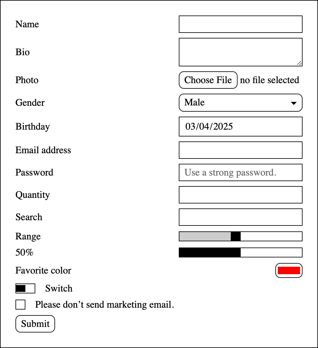
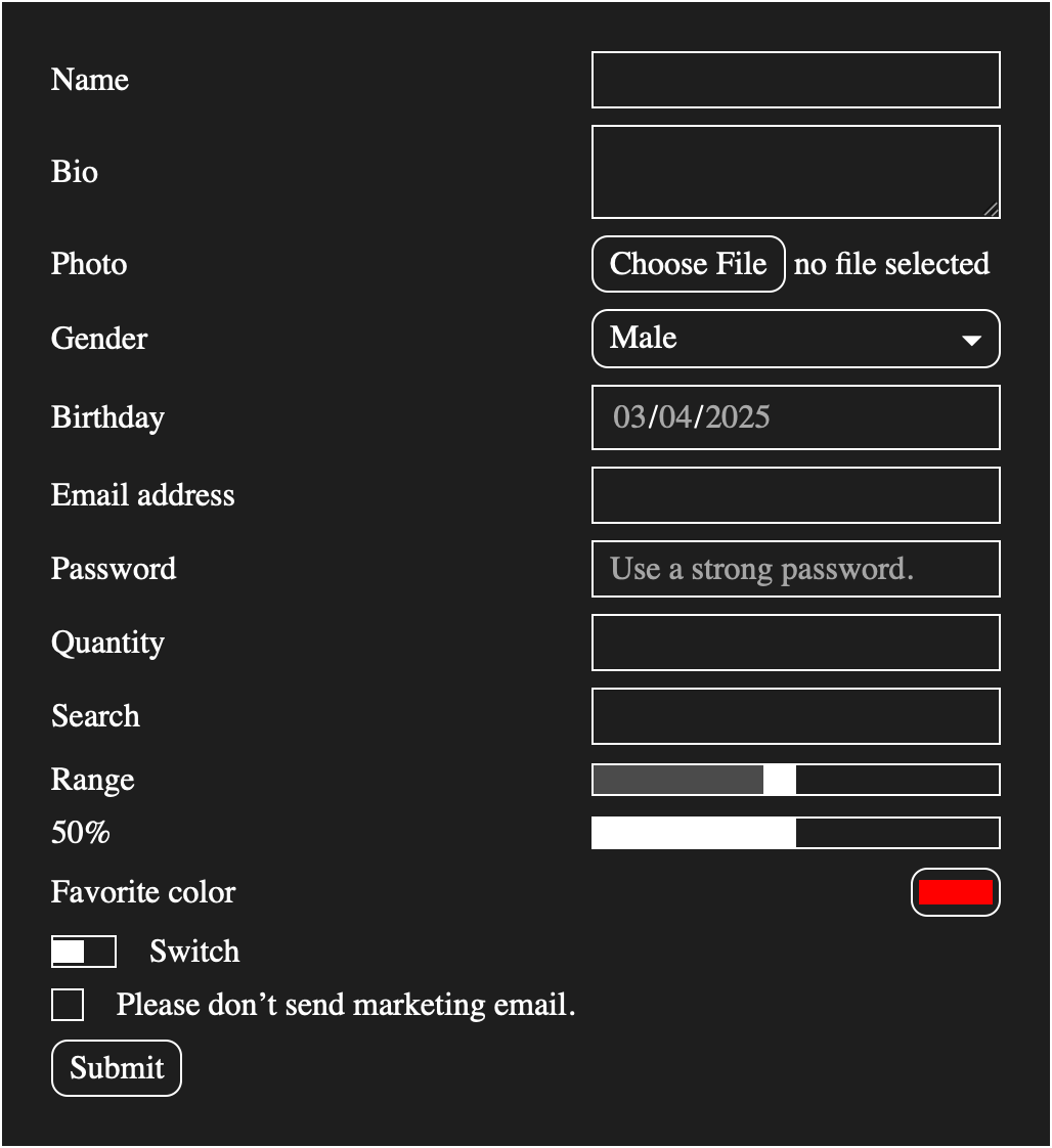
2.2.1. Default User Agent Colors
Here are the basic appearance colors inheriting respectively the default light and dark mode colors from the root element:
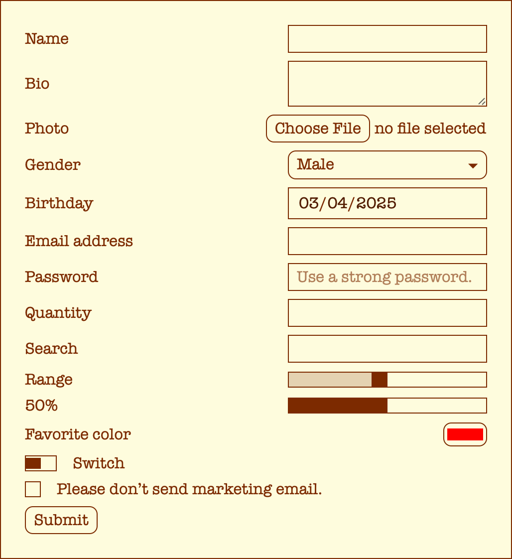
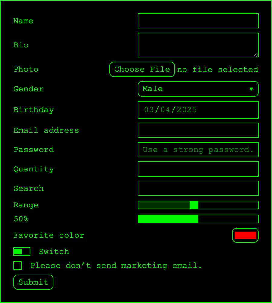
2.2.2. Color/Font Customization
Here are some examples of customization being done on top of the basic appearance:
form{ font-family : "American Typewriter" ; background-color : rgb ( 254 , 252 , 221 ); color : rgb ( 131 , 17 , 0 ); } input, textarea, meter, progress, button, select, fieldset, legend{ appearance : base; }
form{ font-family : "Courier New" ; font-size : 14 px ; background-color : rgb ( 0 , 0 , 0 ); color : rgb ( 0 , 249 , 0 ); } input, textarea, meter, progress, button, select, fieldset, legend{ appearance : base; }
3. Styling Pickers
3.1. The ::picker() pseudo-element
The ::picker() pseudo-element represents the part of the form control that pops out of the page.
::picker() = ::picker( <form-control-identifier>+ )
<form-control-identifier> = select
The ::picker() pseudo-element only matches when the originating element supports basic appearance and has a popup picker. The
specified <form-control-identifier> must also match the unique picker name of the
originating element. For example, the unique picker name for
the select element is select.
In order for the ::picker() pseudo-element to be rendered, it and its originating element must both have a computed appearance of base.
select, select::picker( select) { appearance : base; } select::picker( select) { border : 5 px solid red; background-color : blue; }
NOTE: The non-functional form of ::picker() currently doesn’t work to prevent unintended styling of pickers as new pickers become supported. Once styling for all form control pickers is finalized, this non-functional form will work for all pickers.
4. Pseudo-Elements
Form controls are composed of many parts that authors may want to style separately, hence the need for user agents to provide pseudo-elements for individual form controls.
The section below introduces a set of pseudo-elements that attempts to cover the most common use cases, so they can be addressed in a consistent manner across user agents.
| Control | Pseudo-elements |
|---|---|
<progress>
|
├─ ''::slider-track'' │ └─ ''::slider-fill'' └─ ''::slider-thumb'' |
<meter>
| |
<input type=checkbox switch>
| |
<input type=range>
| |
<input type=checkbox>
| ::checkmark |
<input type=radio>
| |
<input type=file>
| ::file-selector-button |
<input type=date>
|
├─ ''::field-text'' │ ├─ ''::field-component'' │ └─ ''::field-separator'' └─ ''::picker-icon'' |
<input type=datetime-local>
| |
<input type=time>
| |
<input type=month>
| |
<input type=week>
| |
<input> (with no type)
| See § 4.5 Styling Parts for Text Fields: the ::placeholder, ::field-text, ::reveal-icon, and ::clear-icon pseudo-elements |
<input type=text>
| |
<input type=search>
| |
<input type=email>
| |
<input type=password>
| |
<input type=tel>
| |
<input type=url>
| |
<input type=number>
| See § 4.7 Styling Parts for Number Fields: the ::step-control, ::step-up and ::step-down pseudo-elements |
<input type=color>
| ::color-swatch |
<textarea>
| See § 4.6 Styling Parts for textareas: the ::placeholder and ::field-text pseudo-elements |
<select>
| ::picker-icon |
<option>
| ::checkmark |
<fieldset> and <legend>
| |
| Buttons |
4.1. Picker Opener Icon: the ::picker-icon pseudo-element
The ::picker-icon pseudo-element represents the part of the control that represents the icon denoting the presence of the picker. It is only generated when the originating element has basic appearance and if it opens a picker. It is a fully styleable pseudo-element and inherits from its originating element.
::picker-icon generates a box as if it was an child of its originating element, after any boxes generated by the ::after pseudo-element, with content as specified by content.
4.2. File Selector Button: the ::file-selector-button pseudo-element
The ::file-selector-button pseudo-element represents the button used to open a file picker, if the UA renders such a button.
It typically targets the button inside an input element with type=file.
::file-selector-button{ border : 3 px solid green}
4.3. Styling Checkmarks: the ::checkmark pseudo-element
The ::checkmark pseudo-element represents an indicator of whether the item is checked, and is present on checkboxes, radios, and option elements.
It is only generated when the originating element supports the :checked pseudo-class, and either has basic appearance or an ancestor with basic appearance. It is a fully styleable pseudo-element and inherits from its originating element.
For checkboxes and radio elements, it generates a box as if it was an child of its originating element, between the boxes generated by the ::before and ::after pseudo-element, with content as specified by content.
For option elements, it generates a box as if it was an child of its originating element, preceding any boxes generated by the ::before pseudo-element, with content as specified by content.
::checkmark{ background-image : url ( ... ) }
It may also be used in combination with :indeterminate to style the indeterminate checkmark:
:indeterminate::checkmark{ background-image : url ( ... ) }
4.4. Styling Parts of Slider-Like Controls: the ::slider-thumb, ::slider-track and ::slider-fill pseudo-elements
Slider-like controls are form controls that represent progress. That progress may be adjustable by the user.
The following pseudo-elements are provided to style their different parts:
- ::slider-thumb
-
The ::slider-thumb pseudo-element represents
the portion that allows the user to adjust the progress of the control.
NOTE: It is typically natively rendered as a circle in most user agents.
- ::slider-track
- The ::slider-track pseudo-element represents the portion containing both the progressed and unprogressed portions of the control.
- ::slider-fill
-
The ::slider-fill pseudo-element represents
the portion containing the progressed portion of the control.
When the progress of control is indeterminate (like with <progress>), the user agent must give this portion an inline-size of zero.
These pseudo-elements are fully styleable pseudo-elements and their structure is the following:
<input type="range">
├─ ::slider-track
│  └─ ::slider-fill
└─ ::slider-thumb
The list of slider-like controls depends on the host language. For HTML, this corresponds to:
4.5. Styling Parts for Text Fields: the ::placeholder, ::field-text, ::reveal-icon, and ::clear-icon pseudo-elements
- ::placeholder
-
The ::placeholder pseudo-element represents
the portion of the
inputthat contains the placeholder text. - ::field-text
-
The ::field-text pseudo-element represents
the portion of the
inputthat contains the editable text. - ::reveal-icon
-
The ::reveal-icon pseudo-element represents
the portion of the
inputthat allows the user to temporarily disable obscuring of sensitive text input when clicked if provided by the user agent.User agents providing ::reveal-icon may choose to remove it in some circumstances to help protect sensitive text input from being revealed unintentionally.
Example mitigations to avoid unintentionally revealing sensitive text input:- If focus moves away from the field, remove the ::reveal-icon.
- If script modifies field content, remove the ::reveal-icon.
- If the ::reveal-icon is removed due to either of the above, the user must delete the contents of the field to make the ::reveal-icon appear again. This behavior prevents someone from making a minor change to field content to expose the ::reveal-icon on an unattended device.
- If the field is filled by a user agent autofill feature, remove the ::reveal-icon.
- ::clear-icon
-
The ::clear-icon pseudo-element represents
the portion of the
inputthat allows the user to clear theinputwhen clicked if provided by the user agent.With appearance: textfield, the user agent must not generate this part.
::field-text, ::reveal-icon, and ::clear-icon must be siblings.
Collect parts used by autofill.
Define how ::placeholder interacts with ::field-text. [Issue #11844]
4.6. Styling Parts for textareas: the ::placeholder and ::field-text pseudo-elements
- ::placeholder
-
The ::placeholder pseudo-element represents
the portion of the
textareathat contains the placeholder text. - ::field-text
-
The ::field-text pseudo-element represents
the portion of the
textareathat contains the editable text.
Define something for the resizer. [Issue #11850]
Define how ::placeholder interacts with ::field-text. [Issue #11844]
4.7. Styling Parts for Number Fields: the ::step-control, ::step-up and ::step-down pseudo-elements
These pseudo-elements are provided for number inputs. They are fully styleable pseudo-elements.
- ::step-control
- The ::step-control pseudo-element represents the portion of a number input that contains the up and down buttons.
- ::step-up
- The ::step-up pseudo-element represents the button that increments the value inside a number input when activated.
- ::step-down
- The ::step-down pseudo-element represents the button that decrements the value inside a number input when activated.
Their structure is defined as follows:
<input type="number">
├─ ::field-text
└─ ::step-control
   ├─ ::step-up
   └─ ::step-down
< input type = "number" >
can be re-styled like this:
[ + 2 - ]
using the following styles:
input[ type=number] { appearance : base; &::step-control{ display : contents; } &::step-up{ order : 1 ; content : "+" ; } &::field-text{ order : 2 ; } &::step-down{ order : 3 ; content : "-" ; } }
With appearance: textfield, the user agent must not generate this part.
4.8. Styling Parts for Date/Time Input Fields: the ::field-component and ::field-separator pseudo-elements
- ::field-component
- The ::field-component pseudo-element represents the portions of the control that contain the date/time component values.
- ::field-separator
- The ::field-separator pseudo-element represents the portions of the control that separate the date/time component values if the user agent provides those portions.
Those pseudo-elements are siblings. The exact structure of the control is determined by internationalization and by the host language, but must be consistent across user-agents. ::field-component and ::field-separator pseudo-elements are all contained within a ::field-text pseudo-element.
< input type = "date" >
may render like this in US locales:
[ 08 / 22 / 2024 [v]]
The resulting tree is:
<input type="date">
  ├─ ::field-text
  │  ├─ ::field-component (08)
  │  ├─ ::field-separator (/)
  │  ├─ ::field-component (22)
  │  ├─ ::field-separator (/)
  │  └─ ::field-component (2024)
  └─ ::picker-icon
4.9. Color Swatch: the ::color-swatch pseudo-element
The ::color-swatch pseudo-element represents the portion of the control that displays the chosen color value.
input[ type=color], ::color-swatch{ border-radius : 100 % ; }
4.10. Compatibility With Vendor Pseudo-Element Extensions
When possible, the user agent should use aliasing to implement any non-standard pseudo-elements.
When not possible, the user agent must reserve the standard pseudo-elements for appearance: base and use any non-standard ones for appearance: none.
5. Pseudo-Classes
5.1. Targeting Different Meter States: the :low-value / :high-value / :optimal-value pseudo-classes
Make sure this is able to replicate UA logic. [Issue #11336]
Link these to the HTML definitions.
The :low-value pseudo-class matches on a meter element when its value is under the value specified by the low HTML attribute.
The :high-value pseudo-class matches on a meter element when its value is over the value specified by the high HTML attribute.
The :optimal-value pseudo-class matches on a meter element when its value is in the range determined by the optimum / low / high HTML attributes.
5.2. Targeting Selects that are Listboxes
Define something. [Issue #7422]
6. The control-value() function
This is not ready for implementation, file an issue regarding this.
Consider privacy implications, regarding data exfiltration. [Issue #11860]
Consider adding more types. [Issue #11842]
The control-value() function computes to the current value of the form control it is on. If it is used on an element that is not a form control, it returns an empty string.
<control-value()> = control-value( <type>? )

<type> = '<' [ number | string ] '>'
If used on a pseudo-element, it is evaluated against its originating element.
input[ type=range] ::after{ content : control-value (); }
7. Styling Widgets
7.1. Switching form control sizing: the field-sizing property
| Name: | field-sizing |
|---|---|
| Value: | fixed | content |
| Initial: | fixed |
| Applies to: | elements with default preferred size |
| Inherited: | no |
| Percentages: | N/A |
| Computed value: | as specified |
| Canonical order: | per grammar |
| Animation type: | discrete |
For the purpose of this specification,
an element with default preferred size is an element
whose intrinsic size is fixed regardless of the size of its content.
The host language defines which elements are applicable to it.
For example, in HTML textarea is an element with default preferred size.
- fixed
- For element with default preferred size, the UA must set the intrinsic size to the default preferred size defined by the host language for that element. Otherwise, the UA must behave the same as content.
- content
- The UA must determine the element’s intrinsic size based on its content, and must ignore any default preferred size defined by the host language for that element. If the element is an element with default preferred size and is listed in compressible replaced elements, the UA must stop treating the element as a replaced element for min-content contribution.
textarea has a fixed size regardless of its content by default:
⎸ The quick brown fox jumps over the lazy dog.
If field-sizing: content is applied, the size of the former should fit to a text caret. ⎸
If field-sizing: content is applied and its width property has a fixed value like width: 10em, the element height depends on the number of the content lines:
The quick brown fox jumps over the lazy dog.⎸
7.2. Fieldset layout
When a fieldset is in base appearance mode the layout and rendering behaviour as defined in the HTML specification, do not apply to the fieldset or its legend.
7.3. Changing the Orientation of a Slider-Like Control: slider-orientation
| Name: | slider-orientation |
|---|---|
| Value: | auto | left-to-right | right-to-left | top-to-bottom | bottom-to-top |
| Initial: | auto |
| Applies to: | all elements |
| Inherited: | no |
| Percentages: | n/a |
| Computed value: | as specified |
| Canonical order: | per grammar |
| Animation type: | discrete |
- auto
- The slider-like control orientation is defined by the writing mode and direction.
- left-to-right
- The slider-like control is rendered horizontally and ::slider-fill is left-aligned within the control.
- right-to-left
- The slider-like control is rendered horizontally and ::slider-fill is right-aligned within the control.
- top-to-bottom
- The slider-like control is rendered vertically and ::slider-fill is top-aligned within the control.
- bottom-to-top
- The slider-like control is rendered vertically and ::slider-fill is bottom-aligned within the control.
7.4. Obscuring sensitive input: the input-security property
The CSSWG has agreed that while we believe that providing this piece of functionality to users is important, doing it via CSS+JS is the wrong approach, and that instead it should be built into user agents: this needs to work consistently from site to site for it to be discoverable and understandable by users, this needs to work even when JS is turned off, and this needs to have consistently solid accessibility… We therefore intend to remove this from the specification, and instead, we would like to see this behavior specified in the HTML specification as part of the interaction model of password fields. Holding off deleting until the situation with HTML is clarified. See https://github.com/w3c/csswg-drafts/issues/6788 and https://github.com/whatwg/html/issues/7293.
| Name: | input-security |
|---|---|
| Value: | auto | none |
| Initial: | auto |
| Applies to: | sensitive text inputs |
| Inherited: | no |
| Percentages: | N/A |
| Computed value: | as specified |
| Canonical order: | per grammar |
| Animation type: | by computed value type |
For the purpose of this specification,
a sensitive text input is
a text input whose purpose is to accept sensitive input,
as defined by the host language.
For example, in HTML <input type=password> is a sensitive text input.
By default, user agents obscure the contents of sensitive text inputs in order to prevent onlookers from seeing it. Users may wish to temporarily disable this obscuring in order to confirm that they’ve typed their sensitive information correctly. The input-security property may be used by authors to enable or disable this obscuring.
- none
- The UA must not obscure the text in the control, so that it can be read by the user.
- auto
- The UA should obscure the text in the control, so that it cannot be read by the user.
While the exact mechanism by which user agents obscure the text in the control is undefined, user agents typically obscure sensitive text inputs by replacing each character with some suitable replacement such as U+002A ASTERISK (*) or U+25CF BLACK CIRCLE (●).
input[ type=password] {
input-security : auto;
} < input type = password value = MySecret794 >
<input type=password> like so:
●●●●●●●●●●●
Appendix A: Basic Appearance User Agent Stylesheet
This section needs refining with implementation.
Basics
input, textarea, button, ::file-selector-button, ::color-swatch, meter, progress, fieldset, legend{ color : inherit; font : inherit; box-sizing : border-box; background-color : transparent; }
Layout
input : not ([ type=file], [ type=range], [ type=checkbox][ switch]), textarea, button, ::file-selector-button, ::slider-track, fieldset{ border : 1 px solid currentColor; background-color : transparent; }
Sliders
Refine meter, progress, switch and range input styling. [Issue #12267]
input[ type="checkbox" ][ switch], input[ type="range" ] { display : inline-flex; position : relative; align-items : center; inline-size : 100 % ; } input[ type="checkbox" ][ switch] ::slider-track, input[ type="range" ] ::slider-track, meter::slider-track, progress::slider-track{ block-size : 1 em ; inline-size : 100 % ; } input[ type=range] ::slider-track{ block-size : 0.5 em ; } input[ type=checkbox][ switch] ::slider-track{ border-radius : 1 em ; } input[ type="checkbox" ][ switch] ::slider-fill, input[ type="range" ] ::slider-fill, meter::slider-fill, progress::slider-fill{ block-size : 100 % ; background-color : currentColor; } progress:indeterminate::slider-fill{ inline-size : 0 ; } input[ type="range" ] ::slider-fill, input[ type=checkbox][ switch] ::slider-fill{ background-color : color-mix ( currentColor25 % , transparent); border-radius : inherit; block-size : 100 % ; } input[ type=checkbox][ switch] ::slider-fill{ inline-size : 0 % ; } input[ type="checkbox" ][ switch] :checked::slider-fill{ inline-size : 100 % ; } input[ type="checkbox" ][ switch] ::slider-thumb, input[ type="range" ] ::slider-thumb{ border-radius : 0 ; border : none; background-color : currentColor; appearance : none; inline-size : 1 em ; block-size : 1 em ; border-radius : 100 % ; position : absolute; } input[ type=checkbox][ switch] :checked::slider-thumb{ inset-inline-end : 0 ; }
Checkboxes & radios
input[ type=checkbox] :not([ switch]), input[ type=radio] { /* These size rules ensure accessibility by following WCAG rules: * https://www.w3.org/WAI/WCAG22/Understanding/target-size-minimum.html */ block-size:1 em ; inline-size : 1 em ; font-size : max ( 1 em , 24 px ); display : inline-flex; align-items : center; justify-content : center; } input[ type=checkbox] :not([ switch]) ::checkmark{ content : '\2713' /'' ; } input[ type=radio] ::checkmark{ content : '' ; } input[ type=checkbox] :not([ switch], :checked, :indeterminate) ::checkmark{ input[ type=radio] :not( :checked) ::checkmark{ visibility : hidden; } input[ type=checkbox] :indeterminate::checkmark{ content : '\2500' /'' ; } input[ type=radio] { border-radius : 50 % ; } input[ type=radio] :checked::checkmark{ background-color : currentColor; display : inline-block; border-radius : inherit; height : 100 % ; width : 100 % ; }
Buttons (and button-like controls)
button, ::file-selector-button, input:is([ type="color" ], [ type="button" ], [ type="reset" ], [ type="submit" ]) { border : 1 px solid currentColor; background-color : transparent; color : inherit; /* Padding prevents the text from sticking to the borders. * optically centered to account for half leading */ padding-block:0.25 em ; padding-inline : 0.5 em ; /* <select>s and <button>s should have border-radius to be * distinct from <input>s: https://github.com/w3c/csswg-drafts/issues/10857#issuecomment-2520875011*/ border-radius:0.5 em ; /* These min-size rules ensure accessibility by following WCAG rules: * https://www.w3.org/WAI/WCAG22/Understanding/target-size-minimum.html * The 1lh is there to make sure that options without text don't change * the block size of the button. */ min-block-size:calc-size ( auto, max ( size, 24 px , 1 lh )); min-inline-size : calc-size ( auto, max ( size, 24 px )); /* box-sizing comes from existing UA styles which happen to * already be interoperable. */ box-sizing: border-box; /* Push picker icon to the right of the box and have some space * in between it and the text. */ display: inline-flex; gap : 0.5 em ; user-select : none; text-transform : initial; text-align : initial; text-indent : initial; } button:enabled:hover, input:is([ type="color" ], [ type="button" ], [ type="reset" ], [ type="submit" ]) :enabled:hover, input[ type="file" ] :enabled::file-selector-button:hover{ background-color : color-mix ( currentColor10 % , transparent); } button:enabled:active, input:is([ type="color" ], [ type="button" ], [ type="reset" ], [ type="submit" ]) :enabled:active, input[ type="file" ] :enabled::file-selector-button:active{ background-color : color-mix ( currentColor20 % , transparent); } button:disabled, input:is([ type="color" ], [ type="button" ], [ type="reset" ], [ type="submit" ]) :disabled, input[ type="file" ] :disabled::file-selector-button{ color : color-mix ( currentColor50 % , transparent); }
Color Input
input[ type="color" ] { padding : 0 ; overflow : clip; } ::color-swatch{ inline-size : stretch; block-size : stretch; /* These prevent forced dark mode or forced colors mode from changing the background. */ color-scheme: light only; forced-color-adjust : none; /* Uses a linear gradient to handle showing the alpha channel of chosen color */ background:linear-gradient ( control-value ()), linear-gradient ( to bottom right, black50 % , white50 % ); }
Selects
See base appearance user agent styles specified in HTML.
Text inputs
input : :field-text{ display : flow !important; } input::field-component, input::field-separator{ position : static !important; }
Changes
Since the First Public Working Draft of 25 March 2025
- Added !important to select buttons inertness.
- Removed "Appendix B: Explorations" with obsolete ideas.
- Added "slider-" prefix to slider pseudo-elements.
- Moved field-sizing and input-security properties from css-ui-4.
- Added the ::reveal-icon pseudo-element.
Privacy Considerations
No new privacy considerations have been reported on this specification.
Security Considerations
No new security considerations have been reported on this specification.
Acknowledgements
Thanks to Aditya Keerthi, Anne van Kesteren, Elika Etemad, Jen Simmons, Joey Arhar, Jon Davis, Simon Fraser and Theresa O’Connor for their input on this proposal.
Thanks to Ana Tudor for her detailed analysis of input[type=range] styling.