Abstract
CSS Exclusions define arbitrary areas around which inline content ([[!CSS21]]) content can flow.
CSS Exclusions can be defined on any CSS block-level elements. CSS
Exclusions extend the notion of content wrapping previously limited to
floats.
CSS Shapes control the geometric shapes used for wrapping inline flow
content outside or inside an element. CSS Shapes can be applied to any
element. A circle shape on a float will cause inline content to wrap around
the circle shape instead of the float's bounding box.
Combining CSS Exclusions and CSS Shapes allows sophisticated layouts,
allowing interactions between shapes in complex positioning schemes.
Status of this document
Table of contents
Introduction
This section is not normative.
The exclusions section of this specification defines features that allow inline flow
content to wrap around outside the exclusion area of elements.
The shapes section of the specification defines properties to control the geometry of
an element's exclusion area as well as the geometry used for wrapping
an element's inline flow content.
Definitions
Exclusion box
A box ([[!CSS3BOX]]) that defines an exclusion area for other boxes. The 'wrap-flow'
property is used to make an element's generated box an exclusion box. An exclusion box contributes
its exclusion area to its
containing block's wrapping context. An element with a 'float'
computed value other than 'none' does not become an exclusion.
Exclusion area
The area used for excluding inline flow content around an exclusion box. The
exclusion area is equivalent to the
border box for an exclusion box.
This specification's
'shape-outside' property
can be used to define arbitrary,
non-rectangular exclusion areas.
The 'shape-inside' property also defines an exclusion area,
but in this case it is the area outside the shape that inline content avoids.
Float area
The area used for excluding inline flow content around a float element. By default, the
float area is the float element's
margin box.
This specification's
'shape-outside' property can be used to define arbitrary, non-rectangular float
areas.
Exclusion element
An block-level element which is not a float and generates an exclusion box.
An element generates an exclusion box when its 'wrap-flow' property's computed value is not 'auto'.
Wrapping context
Issue-15086
should the wrapping context be generic and include floats?
The wrapping context of a box is a collection of exclusion areas
contributed by its associated exclusion boxes and elements with 'shape-inside'. During layout,
a box wraps its inline flow content in the wrapping area that corresponds to the subtraction of
its wrapping context from its own content area.
A box inherits its
containing block's
wrapping context unless it specifically
resets it using the 'wrap-through' property.
Content area
The content area
is normally used for layout of the inline flow content of a box.
Wrapping area
The area used for layout of inline flow content of a box affected by a wrapping context, defined by subtracting the wrapping context from its content area
Outside and inside
In this specification, 'outside' refers to DOM content that is not a descendant of an element
while 'inside' refers to the element's descendants.
Exclusions
Exclusion elements define exclusion areas that contribute to their containing block's
wrapping context. As a consequence, exclusions impact the layout of their
containing block's descendants.
Elements layout their inline content in their content area and wrap around the
exclusion areas in their associated wrapping context. If the element is itself an exclusion, it
does not wrap around its own exclusion shape and the impact of other exclusions on other
exclusions is controlled by the 'z-index' property as explained in the
exclusions order section.
The shape properties can be used to change the shape of
exclusion areas.
Declaring exclusions
An element becomes an exclusion when its 'wrap-flow' property has a computed value other than
'auto'.
The 'wrap-flow' property
| Name: |
wrap-flow |
| Value: |
auto | both | start | end | minimum | maximum | clear |
| Initial: |
auto |
| Applies to: |
block-level elements. |
| Inherited: |
no |
| Percentages: |
N/A |
| Computed value: |
as specified except for element's whose 'float' computed value is not
none, in which case the computed value is 'auto'. |
The values of this property have the following meanings:
- auto
-
No exclusion is created. Inline flow content interacts with the element as usual.
In particular, if the element is a
float (see [[CSS21]]), the
behavior is unchanged.
- both
-
Inline flow content can flow on all sides of the exclusion.
- start
-
Inline flow content can flow
around the start edge
of the exclusion area
but must leave the area
next to the end edge
of the exclusion empty.
- end
-
Inline flow content can flow
around the end edge
of the exclusion area
but must leave the area
next to the start edge
of the exclusion empty.
- minimum
-
Inline flow content can flow
around the edge of the exclusion
with the smallest available space
within the flow content's containing block,
and must leave the other edge
of the exclusion empty.
- maximum
-
Inline flow content can flow
around the edge of the exclusion
with the largest available space
within the flow content's containing block,
and must leave the other edge
of the exclusion empty.
- clear
-
Inline flow content can only flow
before and after the exclusion
in the flow content's block direction
and must leave the areas
next to the start and end edges
of the exclusion empty.
If the property's computed value is 'auto', the element does not become an
exclusion.
Otherwise, a computed 'wrap-flow' property value of 'both', 'start', 'end', 'minimum',
'maximum' or 'clear' on an element makes that element an exclusion element.
It's exclusion shape is contributed to its containing block's
wrapping context, causing the containing block's descendants to wrap around
its exclusion area.
Determining the relevant edges of the exclusion depends on the writing mode [[!CSS3-WRITING-MODES]] of the content wrapping around the exclusion area.
An exclusion element establishes a
new block formatting context (see [[!CSS21]]) for its content.
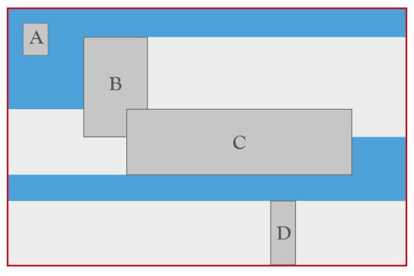
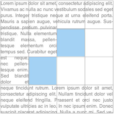
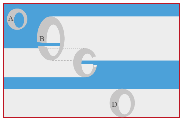
The above figure illustrates how exclusions are combined.
The outermost box represents an element's content box.
The A, B, C and D darker gray boxes represent exclusions
in the element's wrapping context.
A, B, C and D have their respective 'wrap-flow'
computed to 'both', 'start', 'end' and 'clear' respectively.
The lighter gray areas show the additional areas
that are excluded for inline layout
as a result of the 'wrap-flow' value.
For example, the area to the right of 'B'
cannot be used for inline layout
of left-to-right writing mode content
because the 'wrap-flow' for 'B' is 'start'.
The background 'blue' area shows what areas are available
for a left-to-right writing mode element's inline content layout.
All areas represented with a light or dark shade of gray
are not available for (left-to-right writing mode) inline content layout.
Issue-15084
Fluidity of the layout with respect to different amounts of content
Scope and effect of exclusions
An exclusion affects
the inline flow content descended
from the exclusion's containing block
(defined in
CSS 2.1 10.1)
and that of all descendant elements
of the same containing block.
All inline flow content
inside the containing block
of the exclusions is affected.
To stop the effect of exclusions
defined outside an element,
the 'wrap-through' property can be used
(see the propagation of exclusions
section below).
As a reminder,
for exclusions with 'position:fixed',
the containing block is that
of the root element.
Propagation of Exclusions
By default, an element inherits its parent wrapping context. In other words
it is subject to the exclusions defined outside the element.
Setting the 'wrap-through' property to 'none' prevents an element from inheriting its parent
wrapping context. In other words, exclusions defined 'outside' the element, have not effect
on the element's children layout.
Exclusions defined by an element's descendants still contribute to their containing block's
wrapping context. If that containing block is a child of an element with 'wrap-through'
computes to none, or the element itself, then exclusion still have an effect on the children of that
containing block element.
The 'wrap-through' Property
| Name: |
wrap-through |
| Value: |
wrap | none |
| Initial: |
wrap |
| Applies to: |
block-level elements |
| Inherited: |
no |
| Percentages: |
N/A |
| Computed value: |
as specified |
The values of this property have the following meanings:
- wrap
-
The element inherits its parent node's wrapping context. Its descendant
inline content wraps around exclusions defined outside
the element.
- none
-
The element does not inherit its parent node's wrapping context. Its
descendants are only subject to exclusion shapes defined inside
the element.
Using the 'wrap-through' property to control the effect of exclusions.
<style type="text/css">
    #grid {
        display: grid;
        grid-columns: 25% 50% 25%;
        grid-rows: 25% 25% 25% 25%;
    }

    #exclusion {
        grid-row: 2;
        grid-row-span: 2;
        grid-column: 2;
        wrap-flow: <see below>
    }

    #rowA, #rowB {
        grid-row-span: 2;
        grid-column: 1;
        grid-column-span: 3;
    }

    #rowA {
        grid-row: 1;
    }

    #rowB {
        grid-row: 3;
    }
    </style>

<style type="text/css">
    .exclusion  {
    	wrap-flow: both;
    	position: absolute;
    	left: 20%;
    	top: 20%;
    	width: 50%;
    	height: 50%;
    	background-color: rgba(220, 230, 242, 0.5);
    }
</style>

<div id="grid">
    <div class=”exclusion”></div>
    <div id="rowA" style=”wrap-through: wrap;”> Lorem ipsum dolor sit amet...</div>
    <div id="rowB" style=”wrap-through: none;”> Lorem ipsum dolor sit amet...</div>
</div>
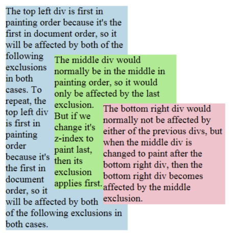
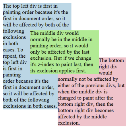
Exclusions order
Exclusions follow the painting order (See [[!CSS21]] Appendix E). Exclusions are
applied in reverse to the document order in which they are defined. The last exclusion
appears on top of all other exclusion, thus it affects the inline flow content of
all other preceding exclusions or elements descendant of the same containing block.
The 'z-index' property can be used to change the ordering of
positioned exclusion
boxes (see [[!CSS21]]). Statically positioned exclusions are not affected by the
'z-index' property and thus follow the painting order.
Ordering of exclusions.
<style type="text/css">
    .exclusion  {
    	wrap-flow: both;
    	position: absolute;
    	width: 50%;
    	height: auto;
    }
</style>

<div class=”exclusion” style=”top: 0px; left: 0px;”>
    Lorem ipsum dolor sit amet...
</div>
<div id="orderedExclusion" class=”exclusion” style=”top: 25%; left: 25%;”>
    Lorem ipsum dolor sit amet...
</div>
<div class=”exclusion” style=”top: 50%; left: 50%;”>
    Lorem ipsum dolor sit amet...
</div>
#orderedExclusion{ z-index: auto; } |
#orderedExclusion{ z-index: 1; } |
 |
 |
Issue-15183
Is the CSS exclusions processing model incorrect?
The current draft provides a model for exclusions
without a collision-avoidance model.
The existing exclusion model in CSS uses floats,
which have both exclusion and collision-avoidance behavior.
Concerns have been raised that allowing exclusions
without collision avoidance could be harmful,
particularly with absolutely-positioned elements.
Three options should be considered:
- Allow exclusions in positioning schemes
with no collision avoidance.
- Disallow exclusions in positioning schemes
with no collision avoidance.
- Define collision-avoidance behavior
for positioning schemes without it,
and use this behavior by default with exclusions.
Processing model
Description
Applying exclusions is a two-step process:
- Step 1: resolve exclusion boxes belonging to each wrapping context
- Step 2: resolve wrapping contexts and lay out each containing block in turn:
- Step 2-A: resolve the position and size of exclusion boxes
- Step 2-B: lay out containing block, wrapping around exclusion areas
Step 1: resolve exclusion boxes belonging to each wrapping context
In this step, the user agent determines which containing block each
exclusion area belongs to. This is a simple step, based on the
definition of containing blocks and elements with a computed value for 'wrap-flow'
that is not auto.
Step 2: resolve wrapping contexts and lay out containing blocks
In this step, starting from the
top of the rendering tree (see [[!CSS21]]),
the agent processes each containing block in two sub-steps.
Step 2-A: resolve the position and size of exclusion boxes
Resolving the position and size
of exclusion boxes
in the wrapping context
may or may not require a layout.
For example,
if an exclusion box
is absolutely positioned and sized,
a layout may not be needed
to resolve its position and size.
In other situations,
laying out the containing block's content is required.
When a layout is required,
it is carried out
without applying any exclusion area.
In other words,
the containing block is laid out
without a wrapping context.
Step 2-A yields a position and size
for all exclusion boxes
in the wrapping context.
Each exclusion box is processed in turn,
starting from the top-most,
and each exclusion area
is computed and contributed
to the containing block's
wrapping context.
Scrolling is ignored in this step
when resolving the position and size
of 'position:fixed' exclusion boxes.
Once the containing block's
wrapping context is computed,
all exclusion boxes
in that wrapping context
are removed from the normal flow.
Step 2-B: lay out containing block applying wrapping
Finally, the content
of the containing block is laid out,
with the inline content wrapping around
the wrapping content's
exclusion areas
(which may be different
from the exclusion box
because of the 'shape-outside' property).
When the containing block itself is an exclusion box, then
rules on exclusions order define which exclusions
affect the inline and descendant content of the box.
Example
This section illustrates the exclusions processing model with an example. It is meant
to be simple. Yet, it contains enough complexity to address the issues of
layout dependencies and re-layout.
The code snippet in the following example has two exclusions affecting
the document's inline content.
<html>
<style>
#d1 {
    position:relative;
    height: auto;
    color: #46A4E9;
    border: 1px solid gray;
}

#e1 {
    wrap-flow: both;
    position: absolute;
    left: 50%;
    top: 50%;
    width: 40%;
    height: 40%;
    border: 1px solid red;
    margin-left: -20%;
    margin-top: -20%;
}

#d2 {
    position: static;
    width: 100%;
    height: auto;
    color: #808080;
}

#e2 {
    wrap-flow: both;
    position: absolute;
    right: 5ex;
    top: 1em;
    width: 12ex;
    height: 10em;
    border: 1px solid lime;
}
</style>
<body>
    <div id="d1">
        Lorem ipsusm ...
        <p id="e1"></p>
    </div>
    <div id="d2">
        Lorem ipsusm ...
        <p id="e2" ></p>
    </div>
</body>
</html>
The following figures illustrate:
- the document's DOM tree
- the layout tree of generated block boxes
Step 1: resolve exclusion boxes belonging to each wrapping context
The figures illustrate how the boxes corresponding to the element sometimes
have a different containment hierarchy in the layout tree than in the DOM tree.
For example, the box generated by e1 is positioned in
its containing block's box, which is the d1-box, because
e1 is absolutely positioned and d1
is relatively positioned. However, while e2 is also absolutely
positioned, its containing block is the initial containing block (ICB). See the
section 10.1 of the CSS 2.1 specification ([[!CSS21]]) for details.
As a result of the computation of containing blocks for the tree, the boxes belonging
to the wrapping contexts of all the elements can be determined:
- The wrapping context for the html element contains the
e2 box: WC-1 (Wrapping Context 1)
- The wrapping context for the body element inherits the html element's wrapping context: WC-1
- The wrapping context for
d1 inherits the body element's
wrapping context and adds the e1-box to it. So the wrapping
context is made of both the e1-box and the
e2-box: WC-2
- The wrapping context for
d2 inherits the body element's
wrapping context: WC-1
Step 2: resolve wrapping contexts and lay out containing blocks
In this step, each containing block is processed in turn. For each containing block,
we (conceptually) go through two phases:
- resolve the wrapping context: resolve the position and size of its exclusions
- lay out the containing block
In our example, this breaks down to:
- resolve the position and size of the exclusions belonging to WC-1: RWC-1 (Resolved Wrapping Context 1).
- lay out the initial containing block (i.e., lay out its content):
- resolve the html element's wrapping context: RWC-1
- lay out the html element:
- resolve the body element's wrapping context: RWC-1
- lay out the body element:
- resolve the
d1 element's wrapping context: RWC-2
- lay out the
d1 element
- resolve the
d2 element's wrapping context: RWC-1
- lay out the
d2 element
Resolving RWC-1
The top-most wrapping context in the layout tree contains the e2
exclusion. Its position and size needs to be resolved. In general, computing an
exclusion's position and size may or may not require laying out other content.
In our example, no content needs to be laid out to resolve the e2
exclusion's position because it is absolutely positioned and its size can be resolved
without layout either. At this point, RWC-1 is resolved and can be used when
laying inline content out.
Resolving RWC-2
The process is similar: the position of the
e1 exclusion needs to be resolved. Again, resolving the exclusion's
position and size may require processing the containing block (d1 here).
It is the case here because the size and position of
e1 depend on resolving the percentage lengths. The percentages are relative
to the size of
d1's box. As a result, in order to resolve
a size for d1's box, a first layout of d1
is done without any wrapping context (i.e., no exclusions applied). The layout yields a
position and size for e1's box.
At this point, RWC-2 is resolved because the position and size of both
e1 and e2 are resolved.
The important aspect of the above processing example is that once an element's wrapping context
is resolved (by resolving its exclusions' position and size), the position and size of the
exclusions are not re-processed if the element's size changes between the layout that may be done
without considering any wrapping context (as for RWC-2) and the layout done with the resolved wrapping context.
This is what breaks the possible circular dependency between the resolution of wrapping contexts
and the layout of containing blocks.
Floats and exclusions
Similarities
There are similarities between floats and exclusions in that inline content wraps around floats
and also wraps around exclusion areas. However, there are very significant differences.
Differences
- scope. While floats apply to content that follows in the
document, exclusions apply to content in their containing block.
- positioning. Floats are part of the inline flow and 'float' on the
line box. Authors can control how the floats move on the line box, to the right or to the
left. By contrast, exclusions can be positioned using any positioning scheme such
as grid layout ([[CSS3-GRID-LAYOUT]]), flexible box ([[CSS3-FLEXBOX]]) or any other
CSS positioning scheme.
- separation of concerns. Making an element a float determines both
its positioning scheme and its effect on inline content. Making an element an
exclusion only determines its impact on inline content and does not impose constraints
on its positioning method.
Interoperability
Effect of floats on exclusions
Floats have an effect on the positioning of exclusions and the layout of their inline content. For
example, if an exclusion is an inline-box which happens to be on the same line as a float,
its' position, as computed in Step 2-A will be impacted by the float, as
is any other inline content.
Effect of exclusions on floats
Exclusions have an effect on the positioning of floats as they have an effect on inline content.
Therefore, in Step 2-B, floats will avoid exclusion areas.
Shapes
Issue-16716
Handling visible content as a shape for Exclusions
Shapes define arbitrary geometric contours around which or into which inline flow
content flows. There are two different types of shapes – 'outside' and 'inside'.
The outside shape defines the exclusion area for an exclusion element
or the float area for a float.
The inside shape defines an element's content shape and the element's inline
content will flow within that shape.
It is important to note that while outside shapes only apply to
exclusions and floats, inside shapes apply to all block-level elements.
Relation to the box model and float behavior
While the boundaries used for wrapping inline flow content outside and inside
an element can be defined using shapes, the actual box model does not change. If
the element has specified margins, borders or paddings they will be computed and
rendered according to the [[!CSS3BOX]] module.
However, floats are an exception. If a float has an outside shape, its positioning
is resolved as
defined in
[[!CSS21]] but using the
outside shape's bounding box is used in lieu of the float's margin box.
CSS 'shape-outside' and CSS box model relation: the red box illustrates the exclusion element's
content box, which is unmodified and subject to normal CSS positioning (here absolute positioning).
<style type="text/css">
    .exclusion  {
    	wrap-flow: both;
    	position: absolute;
    	top: 25%;
    	left: 25%;
    	width: 50%;
    	height: 50%;
    	shape-outside: circle(50%, 50%, 50%);
    	border: 1px solid red;
    }
</style>

<div style=”position: relative;”>
    <div class=”exclusion”></div>
    Lorem ipsum dolor sit amet...
</div>

In the following example the left and right floating div elements
specify a triangular shape using the 'shape-outside' property.
<div style="text-align:center;">
      <div id="float-left"></div>
      <div id="float-right"></div>
      <div>
      Sometimes a web page's text content appears to be
      funneling your attention towards a spot on the page
      to drive you to follow a particular link.  Sometimes
      you don't notice.
      </div>
</div>

<style type="text/css">
#float-left {
      shape-outside: polygon(0,0 100%,100% 0,100%);
      float: left;
      width: 40%;
      height: 12ex;
  }

#float-right {
      shape-outside: polygon(100%,0 100%,100% 0,100%);
      float: right;
      width: 40%;
      height: 12ex;
  }
  </style>
</div>

Basic Shapes
Shapes can be specified using
syntax similar to SVG's basic shapes.
The definitions use
<length> type
and the <percentage> types (see [[!CSS3VAL]]).
Percentages are resolved
from the computed value of the
'box-sizing'
property [[!CSS3UI]]
on the element to which the property applies.
For the radius r of the circle shape,
a percentage value is resolved as
specified
in the SVG recommendation (see [[!SVG11]]).
Path styling like stroking is not considered part of the specified shape.
Supported Shapes
The following basic shapes are supported.
- rectangle([<length>|<percentage>]{4} [ curve [<length>|<percentage>]{1,2} ]? )
-
-
The four values represent
x, y, width and
height.
They define the bounding box
of the rectangle.
Negative values for width and height are invalid.
-
The two 'curve' values represent
rx and ry.
For rounded rectangles they define
the x-axis radius and y-axis radius
of the ellipse used to round off
the corners of the rectangle.
Negative values for rx and ry are invalid.
- inset-rectangle([<length>|<percentage>]{4} [ curve [<length>|<percentage>]{1,2} ]? )
-
-
The four values represent the
top, right, bottom and
left insets that
define the bounding box
of the inset rectangle.
Negative values for any of these insets are invalid.
-
The two 'curve' values represent
rx and ry.
For rounded inset rectangles they define
the x-axis radius and y-axis radius
of the ellipse used to round off
the corners of the inset rectangle.
Negative values for rx and ry are invalid.
- circle([<length>|<percentage>]{3})
-
-
The three values represent
cx,
cy,
and r.
They define the x-axis and y-axis coordinates
of the center of the circle
and the radius of the circle.
A negative value for r is invalid.
- ellipse([<length>|<percentage>]{4})
-
-
The four values represent
cx,
cy,
rx, and
ry.
They define the x-axis and y-axis coordinates
of the center of the ellipse
and the x-axis and y-axis radius
of the ellipse.
Negative values for rx and ry are invalid.
- polygon([<fill-rule>,]? [<length>|<percentage>]{2}#)
-
- fill-rule - The filling rule used to determine the interior of the
polygon. See fill-rule property in SVG for details. Possible values are nonzero
or evenodd. Default value when omitted is nonzero.
-
The two length values represent xi and yi -
the x and y axis coordinates of the i-th vertex of the polygon.
The UA will close a polygon
by connecting the last vertex
with the first vertex of the list.
Referencing SVG shapes
An SVG shape can be referenced using the url() syntax. The shape can be
any of the SVG basic shapes or a
path element.
<style>
div {
    height: 400px;
    width: 400px;
}
.in-a-circle {
    shape-inside: url(#circle_shape);
}

.in-a-path {
    shape-inside: url(#path-shape);
}

</style>

<svg ...>
<circle id="circle_shape" cx="50%" cy="50%" r="50%" />
<path id="path-shape" d="M 100 100 L 300 100 L 200 300 z" />
</svg>

<div class="in-a-circle">...</div>
<div class="in-a-path">...</div>
When using the SVG syntax
or referencing SVG elements
to define shapes,
the relevant box is determined
by the computed value of the
'box-sizing'
property.
All the lengths expressed in percentages
are resolved from the relevant box.
The coordinate system for the shape
has its origin on the top-left corner of the
relevant box with the x-axis
running to the right
and the y-axis running downwards.
If the SVG element uses unitless coordinate values,
they are equivalent to using
'px' units.
If the relevant box of the element
is dependent on auto sizing
(i.e., the element's 'width' or 'height' property is 'auto'),
then the percentage values
resolve to 0.
Interpolation of Basic Shapes
For interpolating between
one basic shape and a second,
the rules described below are applied.
- If both basic shapes are of the same type and not of type polygon:
- Interpolate between each value.
- If one basic shape is of type rectangle and the second of type circle or ellipse:
- Replace the circle/ellipse with a temporary rectangle of equal dimension.
- Set the values for rx and ry on the temporary rectangle to ‘50%’.
- Interpolate between the two rectangles as above.
- If one basic shape is an inset-rectangle and the second is of type rectangle, circle or ellipse:
- Replace the inset-rectangle with a temporary rectangle of equal dimension.
- Interpolate between the basic shapes as above.
- If both basic shapes are of type polygon and if both polygons have the same number of vertices:
- Interpolate between each value.
- In all other cases:
- No interpolation is specified.
Shapes from Image
Issue-15093
Do we need to provide properties to repeat exclusion images as for the background-image property?
Issue-15090
Use the contour keyword in shape-outside property?
Issue-16112
Address security concern with automatic shape extractions for images
Another way of defining shapes is by specifying a source image whose alpha channel
is used to compute the inside or outside shape. The shape is computed to be the
path that encloses the area where the opacity of the specified image is greater
than the 'shape-image-threshold' value. If the 'shape-image-threshold' is not specified,
the initial value to be considered is 0.5.
Note, images can define cavities and inline flow content should wrap inside
them. In order to avoid that, another exclusion element can be overlaid.
For animated raster image formats (such as GIF), the first frame of the animation
sequence is used. For SVG images
([[SVG11]]), the image is rendered without animations applied.
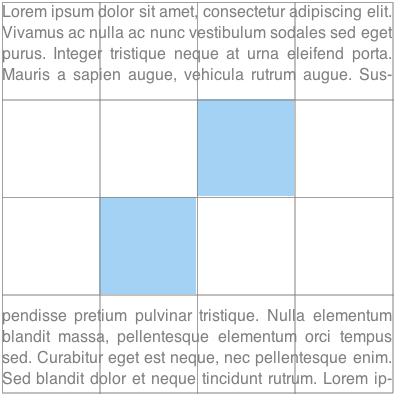
An image is floating to the left of a paragraph. The image shows the 3D version of the
CSS logo over a transparent background. The logo has a shadow using an alpha-channel.
The image defines its float area through the 'shape-outside' property and
specifies a value of 35 pixels for the 'shape-margin' property.
<p>
  <img id="CSSlogo" src="CSS-logo1s.png"/>
  blah blah blah blah...
</p>

<style>
  #CSSlogo {
    float: left;
    shape-outside: url("CSS-logo1s.png");
    shape-image-threshold: 0.1;
    shape-margin: 35px;
  }
</style>
The image needs two references to the image because this example uses the same image
- to render it
- as a shape defining the float area of the image
It is perfectly possible to display an image and use a different image for its
float area.
In the figure below, the alpha-channel threshold is represented by the dotted line around
the CSS logo and the 35px shape-margin is visible between that line and the edges of
each individual line of the paragraph.
It's then possible to affect where the lines of the paragraph start in three ways:
- Changing the value of the 'shape-margin' property
- Changing the value of the 'shape-image-threshold' property
- Modifying the alpha channel in the image
Declaring Shapes
Shapes are declared with
the 'shape-outside'
or 'shape-inside' properties,
with possible modifications
from the 'shape-margin'
and 'shape-padding' properties.
The shape defined by
the 'shape-outside'
and 'shape-margin' properties
changes the geometry
of an exclusion element's
exclusion area
or a float element's
float area.
If the element is not
an exclusion element
(see the 'wrap-flow' property)
or a float,
then the 'shape-outside' property
has no effect.
The shape defined by the 'shape-inside'
and 'shape-padding' properties
defines an exclusion area
that contributes
to the element's wrapping context.
The 'shape-inside' property applies
to all block-level elements.
The 'shape-outside' Property
| Name: |
shape-outside |
| Value: |
auto | <basic-shape> | <uri> |
| Initial: |
auto |
| Applies to: |
exclusion elements and floats |
| Inherited: |
no |
| Percentages: |
N/A |
| Computed value: |
computed lengths for <basic-shape>, the absolute URI for <uri>, otherwise as specified |
The values of this property have the following meanings:
- auto
- The shape is computed
based on the border box of the element for exclusions,
or computed based on the margin box for floats.
- <basic-shape>
-
The shape is computed based on the values of one of 'rectangle', 'inset-rectangle', 'circle', 'ellipse'
or 'polygon'.
- <uri>
-
If the <uri> references an SVG shape element, that element defines the shape.
Otherwise, if the <uri> references an image, the shape is extracted and computed
based on the alpha channel of the specified image.
If the <uri> does not reference an SVG shape element or an image, the
effect is as if the value 'auto' had been specified.
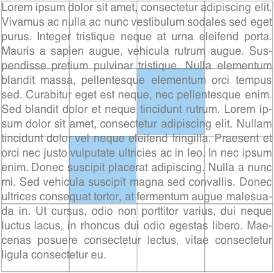
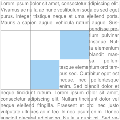
The above figure shows how
'shape-outside' shapes
impact the exclusion areas.
The red box represents an element's content box
and 'A', 'B', 'C' and 'C' represent exclusions
with a complex shape
and their 'wrap-flow' property
computes to 'both', 'start', 'end' and 'clear',
respectively.
As illustrated in the picture,
when an exclusion allows wrapping
on all sides,
text can flow inside 'holes'
in the exclusion
(as for exclusion 'A').
Otherwise, the exclusion clears
the area on the side(s)
defined by 'wrap-flow',
as illustrated
for 'B', 'C' and 'D' above.
The 'shape-inside' Property
The 'shape-inside' property adds
one or more exclusion areas
to the element's wrapping context.
This modifies the normal rectangular shape
of the content area
to a possibly non-rectangular wrapping area.
The exclusion areas
are defined by subtracting the shape
from the element's content area.
Any part of the shape outside
the element's content area
has no effect.
| Name: |
shape-inside |
| Value: |
outside-shape | auto | <basic-shape> | <uri> |
| Initial: |
outside-shape |
| Applies to: |
block-level elements |
| Inherited: |
no |
| Percentages: |
N/A |
| Computed value: |
computed lengths for <basic-shape>, the absolute URI for <uri>, otherwise as specified |
Issue-16448
Should we revisit the decision to not allow SVG path syntax in the shape-inside, shape-outside properties
The values of this property have the following meanings:
- outside-shape
-
The shape is computed
based on the computed value
of the 'shape-outside' property.
E.g., when shape-outside
computes to 'auto',
use the meaning of 'auto' below
to compute the shape.
- auto
-
The shape is computed based on the content box of the element.
- <basic-shape>
-
The shape is computed based on the values of one of 'rectangle', 'inset-rectangle', 'circle', 'ellipse'
or 'polygon'.
- <uri>
-
If the <uri> references an SVG shape element, that element defines the shape.
Otherwise, if the <uri> references an image, the shape is extracted and computed
based on the alpha channel of the specified image.
If the <uri> does not reference an SVG shape element or an image, the
effect is as if the value 'auto' had been specified.
The 'shape-inside' property applies to floats.
The 'shape-inside' property may not apply on some elements such as elements with a
computed 'display' value of 'table'.
Overflow content avoids
the exclusion area(s) added
by 'shape-inside' and 'shape-padding'
(as well as any other exclusion areas
in the element's wrapping context).
The 'shape-image-threshold' Property
The 'shape-image-threshold' defines the alpha channel threshold used to extract
the shape using an image. A value of 0.5 means that all the pixels that are more
than 50% transparent define the path of the exclusion shape. The 'shape-image-threshold'
applies to both 'shape-outside' and 'shape-inside'.
The specified value of 'shape-image-threshold' is applied to both images used for
'shape-outside' and 'shape-inside'.
| Name: |
shape-image-threshold |
| Value: |
<alphavalue> |
| Initial: |
0.5 |
| Applies to: |
block-level elements |
| Inherited: |
no |
| Percentages: |
alpha channel of the image specified by <uri> |
| Computed value: |
The same as the specified value after clipping the <alphavalue> to the range [0.0,1.0]. |
The values of this property have the following meanings:
- <alphavalue>
-
A <number> value used to set the threshold used for extracting a shape from
an image. Any values outside the range 0.0 (fully transparent) to 1.0 (fully opaque)
will be clamped to this range.
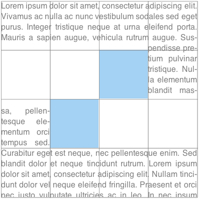
The 'shape-margin' property
The 'shape-margin' property adds a margin to a shape-outside.
This defines a new shape where every point
is the specified distance from the shape-outside.
This property takes on positive values only.
| Name: |
shape-margin |
| Value: |
<length> |
| Initial: |
0 |
| Applies to: |
exclusion elements and floats |
| Inherited: |
no |
| Percentages: |
N/A |
| Computed value: |
the absolute length |
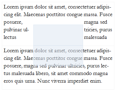
A 'shape-margin' creating an offset
from a circular shape-outside.
The blue rectangles represent
inline content affected
by the shape created
by the margin.

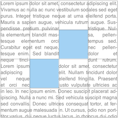
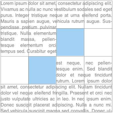
The 'shape-padding' Property
The 'shape-padding' property adds padding to a shape-inside.
This defines a new shape where every point
is the specified distance from the shape-inside.
This property takes on positive values only.
| Name: |
shape-padding |
| Value: |
<length> |
| Initial: |
0 |
| Applies to: |
block-level elements |
| Inherited: |
no |
| Percentages: |
N/A |
| Computed value: |
the absolute length |
A 'shape-padding' creating an offset
from a circular shape-inside.
The light blue rectangles represent
inline content affected
by the shape created
by the padding.

Note that the 'shape-padding' property only affects layout of content inside
the element it applies to while the 'shape-margin' property only affects layout of content
outside the element.
Acknowledgments
This specification is made possible by input from
Andrei Bucur,
Alexandru Chiculita,
Arron Eicholz,
Daniel Glazman,
Arno Gourdol,
Chris Jones,
Bem Jones-Bey,
Marcus Mielke,
Alex Mogilevsky,
Hans Muller,
Mihnea Ovidenie,
Virgil Palanciuc,
Peter Sorotokin,
Bear Travis,
Eugene Veselov,
Stephen Zilles
and the CSS Working Group members.
References
Normative references
Other references
Index
Property index
Change Log
- added inset-rectangle() to basic shapes
- Changed shape-inside overflow diagrams to show exclusion behavior
- Changed shape-inside to contribute to the wrapping context
- Defined exclusion edges relative to wrapping content's writing mode
- Made use of start, end, before and after consistent
- Added interpolation for basic shapes
- Changed basic shapes to depend on box specified with box-sizing
- Added overflow behavior for shape-inside.
- Added wrap-flow:minimum.
- Clarified processing model.
- Changed wrap-margin and wrap-padding to shape-margin and shape-padding.
- Removed wrap shorthand.
- Clarified processing model.
- Clarified interaction with floats.
- Clarified that an exclusion element establishes a new block formatting context.